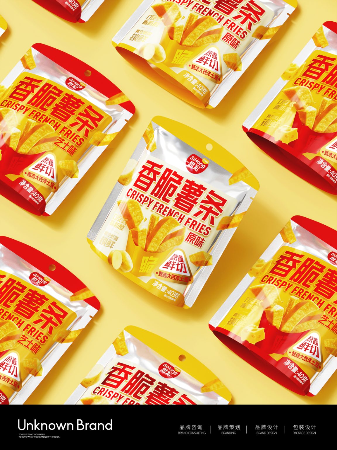

Project: Sihong / Crispy Fries Series
Service: Packaging Design
Channel: All Channels
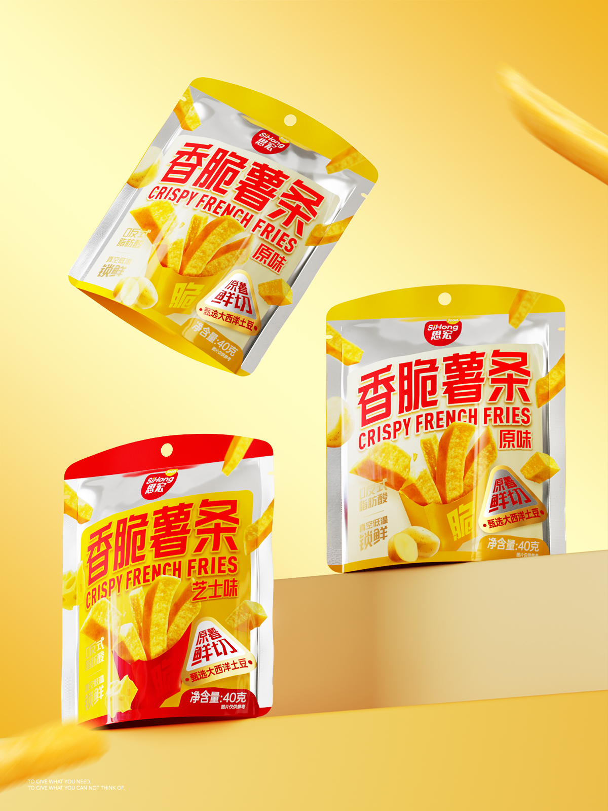
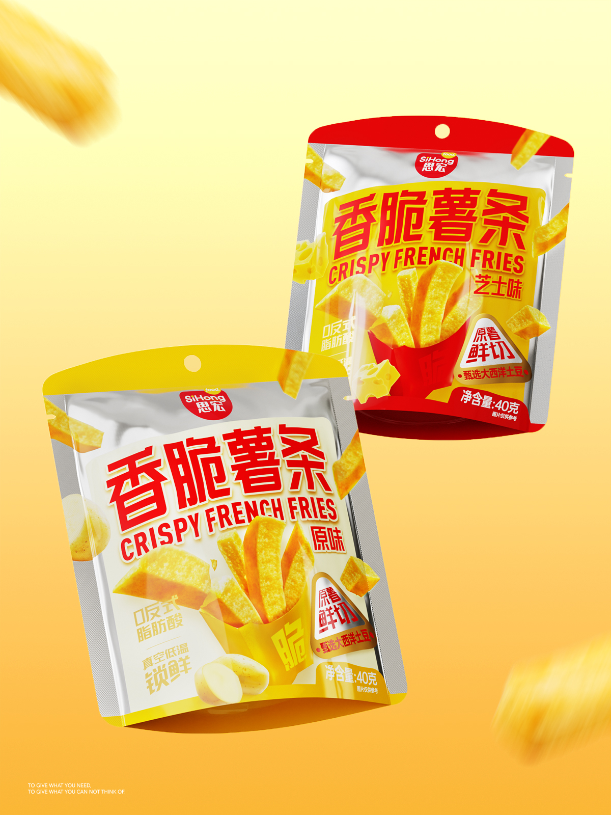
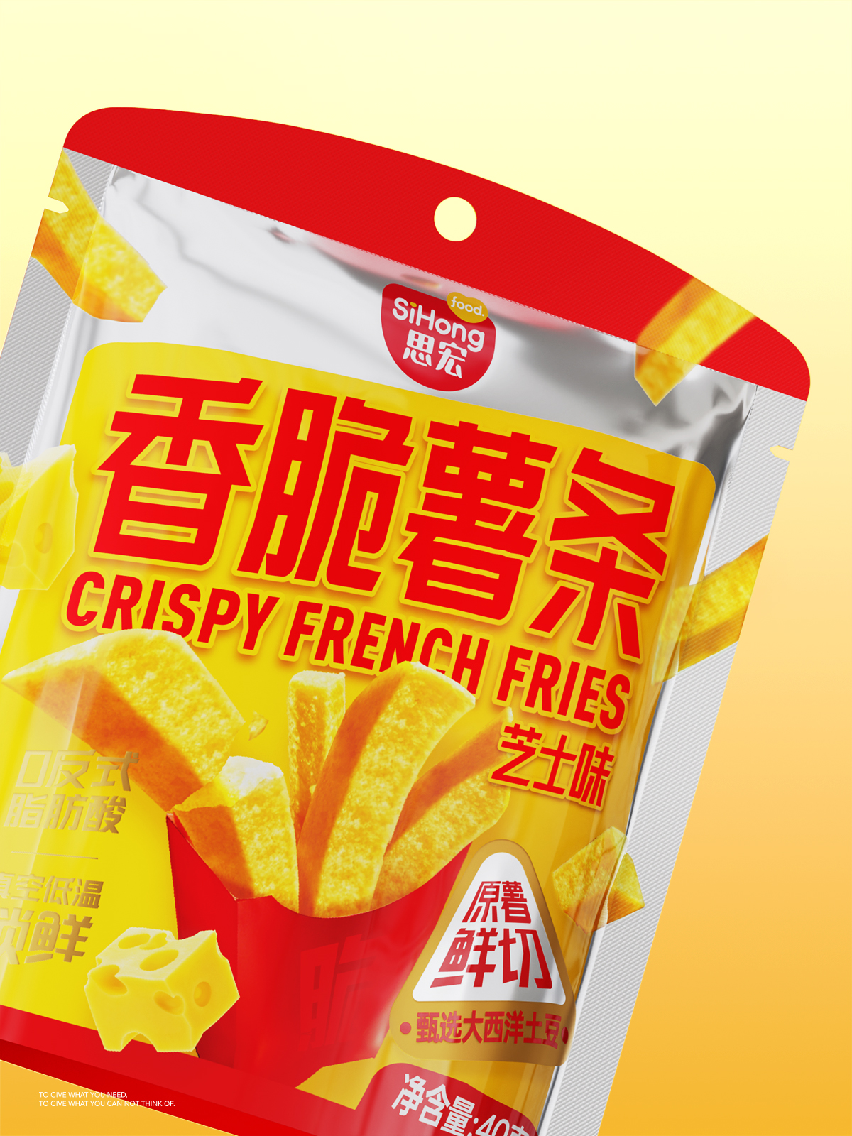
The packaging design for the “Sihong” Crispy Fries series centers on bold visual impact and efficient communication. By aligning with snack consumption scenarios and consumer psychology, the design leverages color, visual symbols, and clear information hierarchy to build strong differentiation in a competitive market.
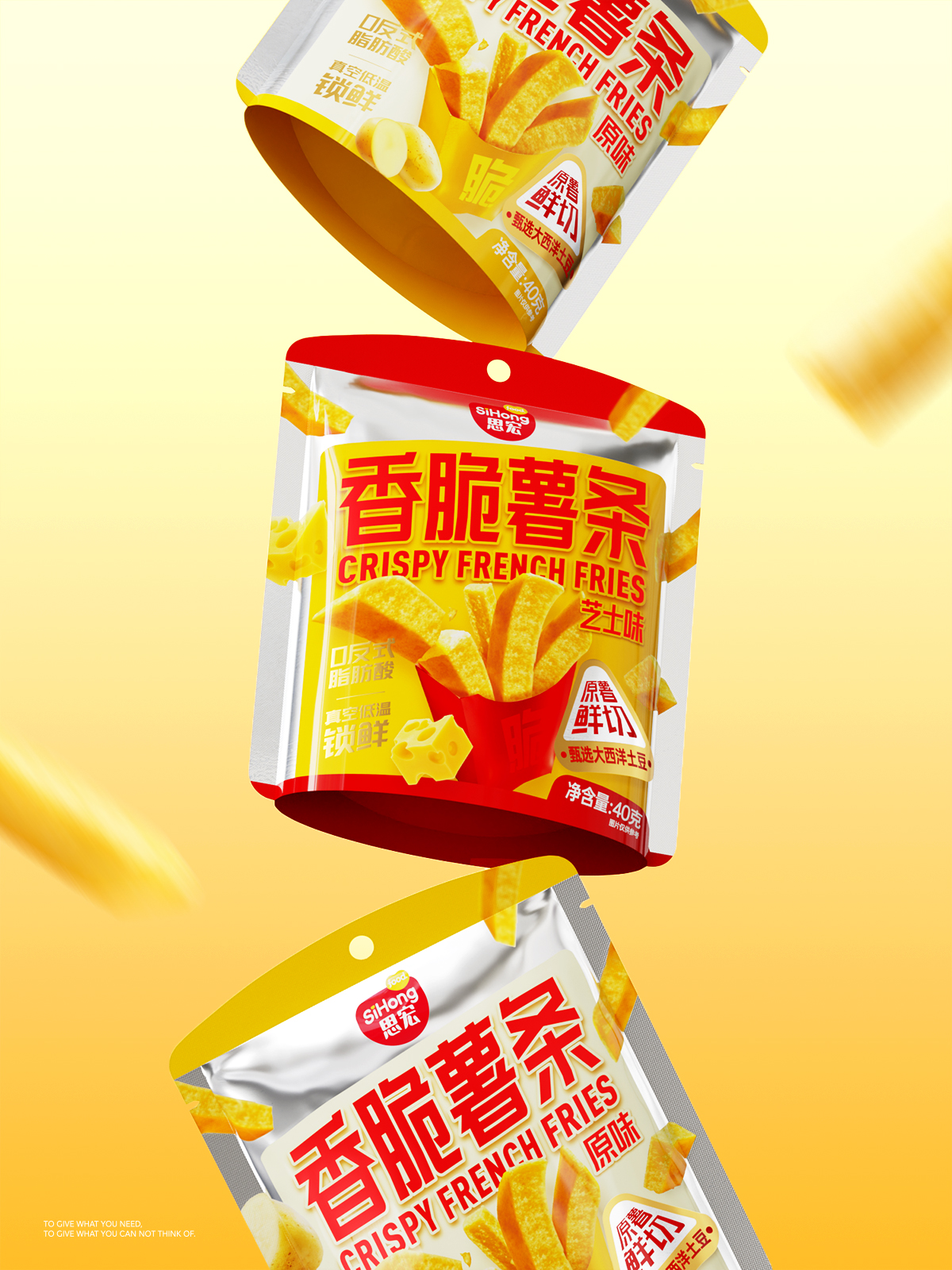
To enhance shelf presence and unify the product range, red and yellow are used to distinguish flavors, creating a striking color contrast in final displays and improving visibility at retail. An oversized, golden crispy fry takes center stage, instantly highlighting the product’s crunchiness and stimulating purchase desire. Key selling points such as “Zero Trans Fat,” “Vacuum Low-Temperature Freshness,” and “Selected Atlantic Potatoes” are prominently featured to communicate quality and trustworthiness.
The product is packaged in a stand-up pouch with a hanging hole, making it suitable for both supermarket shelves and convenience store peg displays. Overall, the youthful visual language—bright colors paired with clean graphics—positions “Sihong” as a modern, healthier snack option, helping establish a distinctive brand identity and supporting stronger purchase decisions.

 butterflyhunters
 monther al omari
 Asprey Creative
 About House of Ta
 Up-Brands
 KJS CRAFT
 hello ocean
 PG Branding
 CF Napa Brand Design
 booouuuche
 Hyejung Choi
 Abbydraw Designs Unique Conceptual Branding & Packaging Designing Ideas
 Hollóka Grafikai Műhely / Graphic Design Studio
 Minim Brand Design
 saerom81
 YNL
YNL bilel tkouri
 vitoramockup
 Lampra
 Sanavala
 www.branding.uz
 alchimistestudioParis
 Estudio Argo
 Modern Theory