
Sillene Cider — Packaging Design
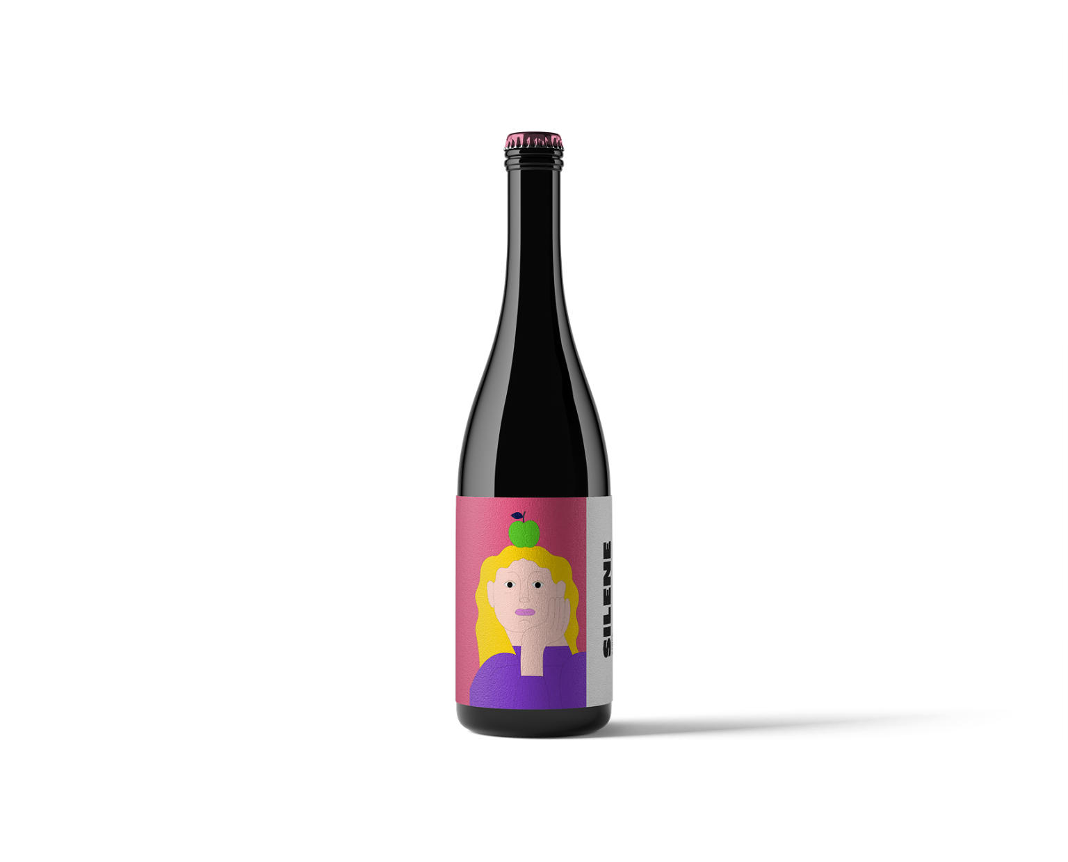
Sillene is a concept cider brand inspired by quiet moments, introspection and the simple pleasure of a well-crafted drink. The visual identity focuses on calm, expressive characters paired with minimal typography and bold color compositions.
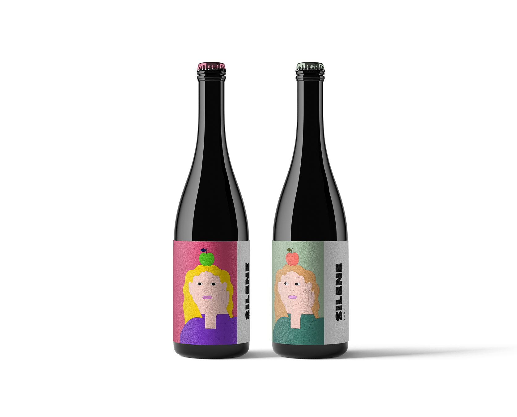
Each label features a contemplative illustrated figure with an apple placed above the head — a playful metaphor for ideas, flavor and the origin of cider itself.
The illustrations create a distinctive visual language where emotion becomes the main storytelling element of the brand. Different color palettes represent various cider flavors while maintaining a cohesive identity across the product line.
The vertical “SILLENE” logotype adds a modern editorial feel and balances the playful character illustrations with a clean typographic structure.
The result is a packaging system that feels both artistic and contemporary, designed to stand out on shelves while maintaining a refined and thoughtful aesthetic.
Project type: Packaging Design
Product: Craft Cider
Scope: Brand concept, illustration, label design


 IDEOLOGO
 Eva Chistyakova
 Open Strategy & Design
 cem kutlu
 monther al omari
 Bonsanco Creative Studio
 Confetti Design Studio
 古戈品牌
古戈品牌 Rare Ideas
 Studio Pistache
 Studio Tumpic/Prenc
 Atiq Alam
 bachir bachchar
 Akshita Agarwal
 Carreto Concepts Design Studio
 Hollóka Grafikai Műhely / Graphic Design Studio
 Arsen Avetisyan
 Derrick Lin
 Axiniya Knyazeva
 Hadi Samir
 Furt Goods