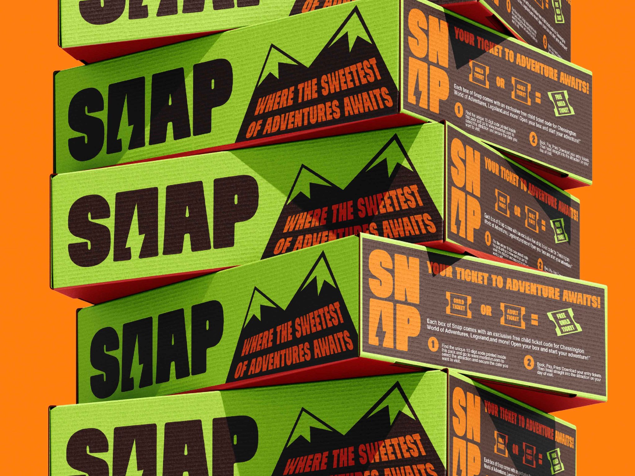

The goal of this project was to design bold, playful packaging for a Swiss chocolate brand aimed at kids aged 5-12, with a focus on creating an overall experience that sparks joy, curiosity, and loyalty among young audiences. The goal was to build a visual identity that felt fun and exciting for kids, but also intentional and clever, so it could be taken more seriously by parents and retailers.
Many kids’ chocolate brands play it safe-relying on bubbly typefaces, chocolate brown backgrounds, and cartoonish mascots. But Snap needed to feel fresher and more adventurous. One core challenge was designing a visual identity that stood out in the confectionery aisle without leaning on the typical tropes. That meant avoiding the overused white-outlined, puffy lettering and finding a different way to capture playfulness. Colour played a huge role in breaking category norms. The use of zesty greens and energetic oranges was not only to avoid the standard chocolate palette, but to evoke the feeling of outdoor play and wild exploration, like running through a rainforest or climbing up a treehouse.
The packaging embodies the brand’s playful, adventurous personality while building brand loyalty with its target audience. The use of vibrant colours and playful nature illustrations, paired with an interactive call to action, encourages both kids and parents to continue the adventure, turning a simple purchase into an experience they always come back to.
The entire identity leans into this sense of imaginative freedom, proving that chocolate branding doesn’t have to follow the rules to win hearts (and taste buds).

 abubakrdesign
 Derrick Lin
 monther al omari
 43oz
43oz lilyz design23
 Modern Theory
 Eighteen Brand Studio
 Bhumika Singh
 MohamedMashaly
 Pixels Studio
 Gulya
Gulya UPRISE
 Lizaveta Kharitonyuk
 Bonsanco Creative Studio
 DesignRepublic
 GIRAFA STUDIO
 PiotrWisniewski
 Sophiagdotcom
 CreativeWise
 SoreThumbStudio®
 Modern World Studio
 Palashcc
 Valérie Colace