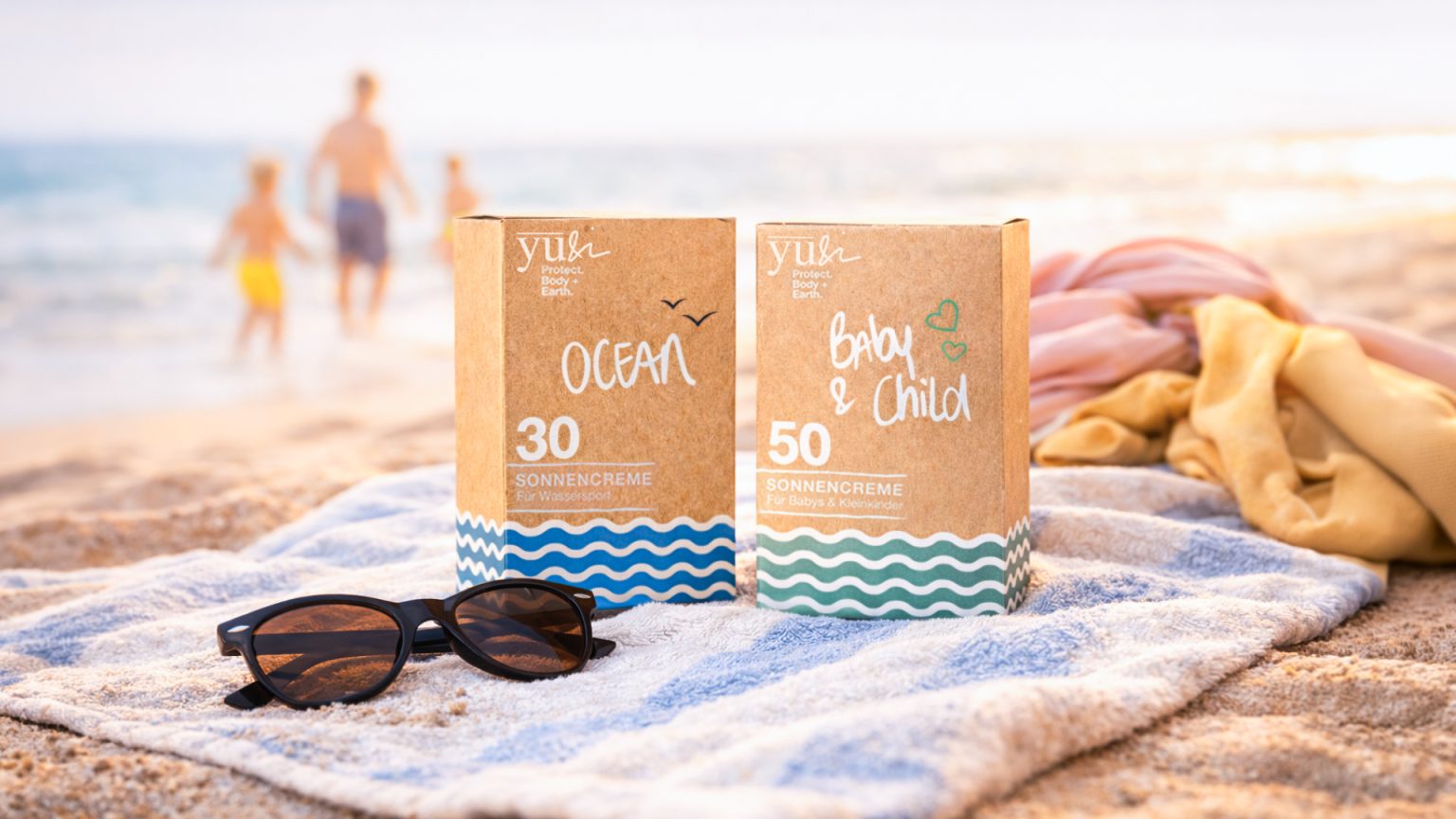

YU&I SUNSCREEN PACKAGING
yu&i is a sustainable sunscreen brand from Braunschweig, Germany, that sees sun protection as a double promise: protection for the skin and respect for the environment. The products rely on mineral UVA/UVB filters, do not contain nanoparticles or microplastics, and are vegan and dermatologically tested. They are produced in Switzerland, and the tubes are made from recycled material.
The challenge in packaging was to make this credibility and performance visible without slipping into the typical “pharmacy aesthetic.” Mineral sun protection is often designed to be cool, austere, or in need of explanation. yu&i, on the other hand, should feel like midsummer: light, friendly, modern—and yet immediately understandable. Especially with variants such as Ocean, Sun, and Baby & Child, the decision to reach for the shelf must happen in seconds.
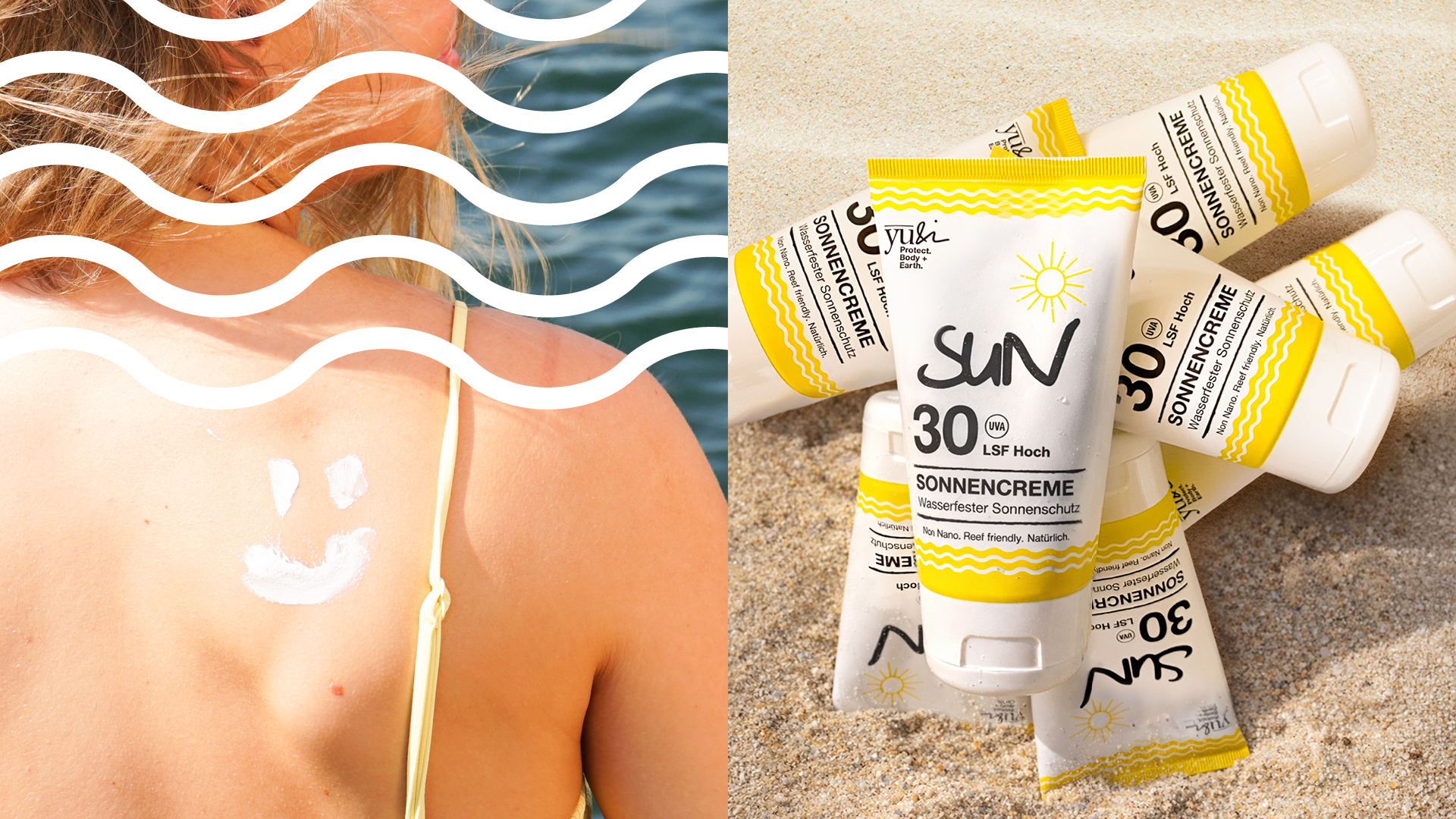
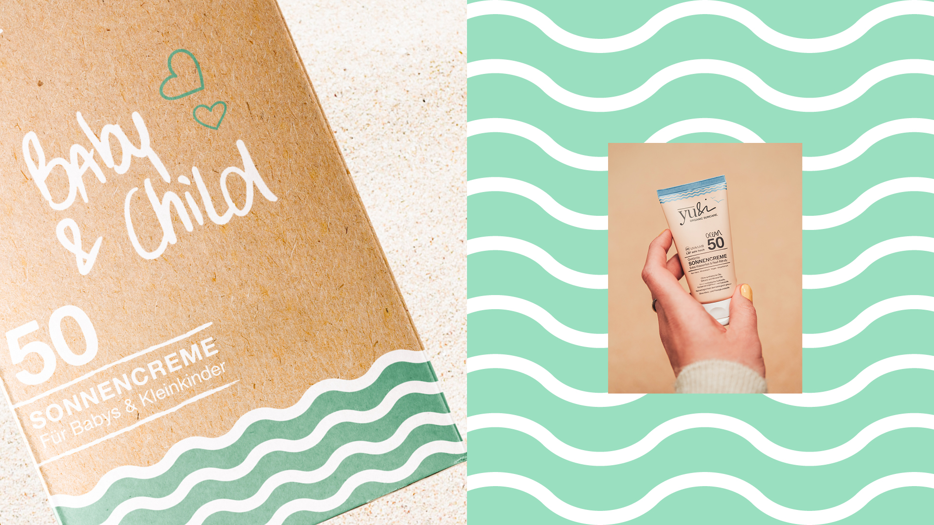
In terms of design, the system is based on a warm, natural kraft paper look as an honest foundation. On top of this sits a clear, reduced typographic hierarchy that immediately brings the most important information to the fore: variant, SPF, and product type. A waveband runs through all packages and tubes as a recurring trademark. It anchors the brand in the beach and sea context, creates recognition from a distance, and at the same time serves as an uncomplicated code for variety differentiation. Handwritten elements and small, precise icons bring closeness.
This transforms functional sun protection into packaging that doesn’t “preach” responsibility but lets it speak for itself: natural, summery, and shelf-strong—with a look that builds trust and feels like a vacation at the same time.



 United Creatives Studio
 Kingdom & Sparrow
 Anastasia Bakhmatskaya
 CreativeWise
 Great and Golden
 Ximena Ureta Design Studio.
 Sorted Branding
 Lisa Sirbaugh Creative
 vitoramockup
 YQIAN
YQIAN Navegante
 Anastasia Cherepanova | xtramez
 Polaris Designs
 pavlyai
 Milena Kocharyan
 monther al omari
 Mohamed sherif midoo
 DESIGN CONCEPTS
 mmdesign
 markcreativestudio
 Rosario Lo Iacono