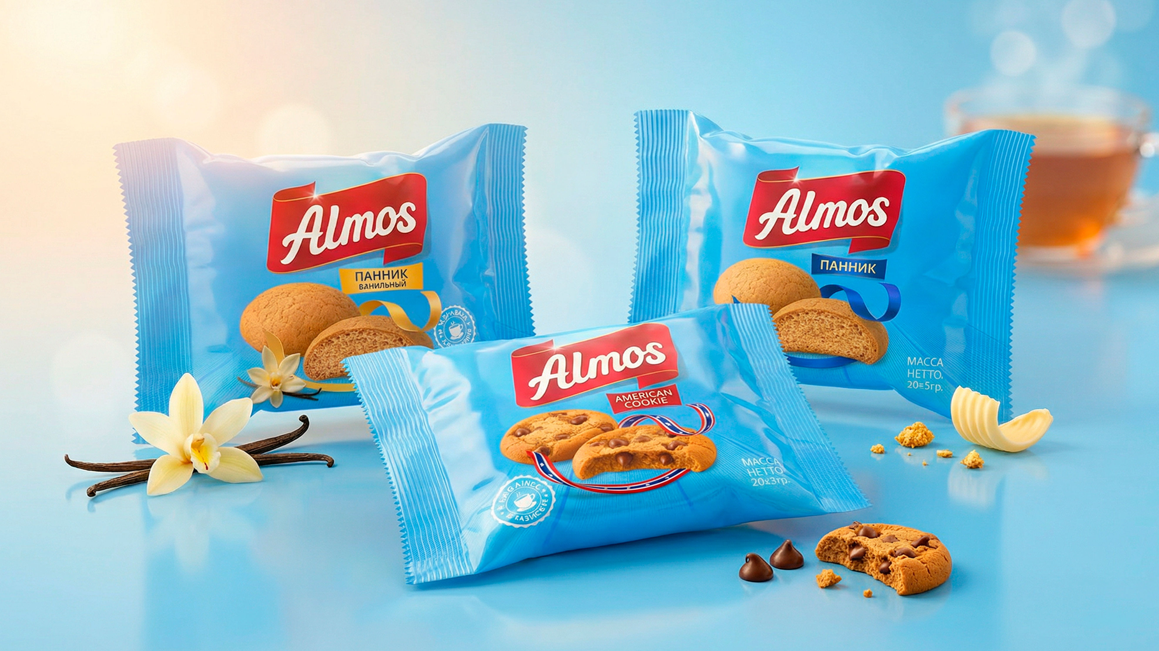

Client: Almos (Tajikistan)
Category: Confectionery
Scope: Full rebranding, logo, packaging design, design system
Timeline: August 11 – November 11 (3 months of intensive work)
Packaging Design / Marketing Strategy / Logo
1. The Problem
There are businesses that run for years, producing and selling in large volumes, yet remain invisible in the market. One of Tajikistan’s major confectionery factories, Almos (comparable to brands like Crafers or N’medov), faced exactly this issue.
Founded in 2017, the factory operated continuously for seven years. However, its situation resembled the saying: “we cook, but others eat.” Why?
Because the factory worked entirely on orders from distributors and wholesale buyers. Although the products were made by Almos, pricing, brand direction, and sales strategy were fully controlled by distributors. The factory was not the owner of its own product, merely a contractor.
By 2025, leadership decided to take control. The goal for 2026 was to increase numeric distribution in Tajikistan from around 17% to 67%. To achieve this, they needed full control of the value chain, pricing, and a strong brand capable of standing firm against competitors.
This challenge was entrusted to the Minim team.
2. Research
This was not a small project, so four core departments were mobilized:
- Marketing: market and competitor analysis
- Brand design: visual solutions
- Creative: ideas and copywriting
- Print: ensuring real-world packaging execution
The process was led by an experienced project manager.
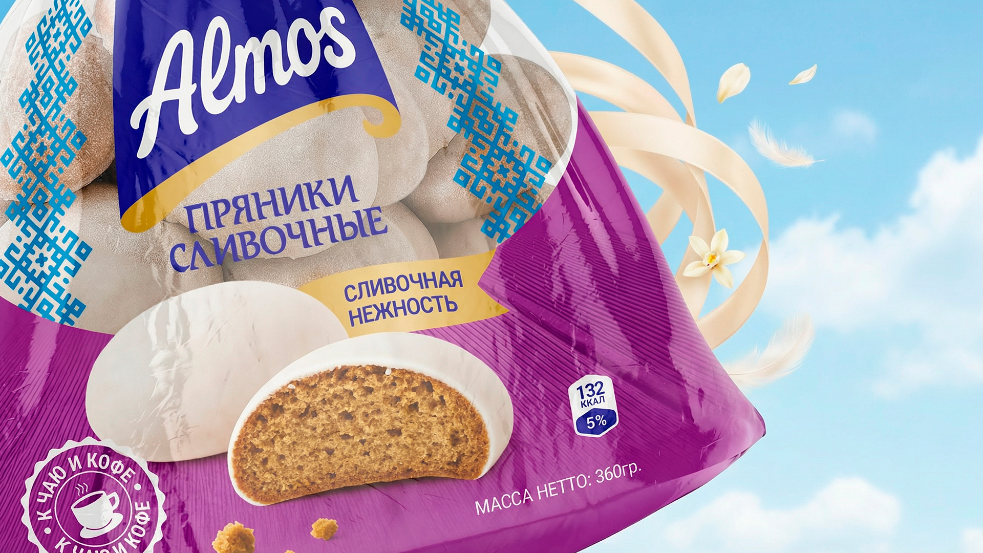
The initial audit revealed a fragmented visual identity. Each product looked like it came from a different factory. For example, 360g and 180g gingerbread packs had completely different designs.
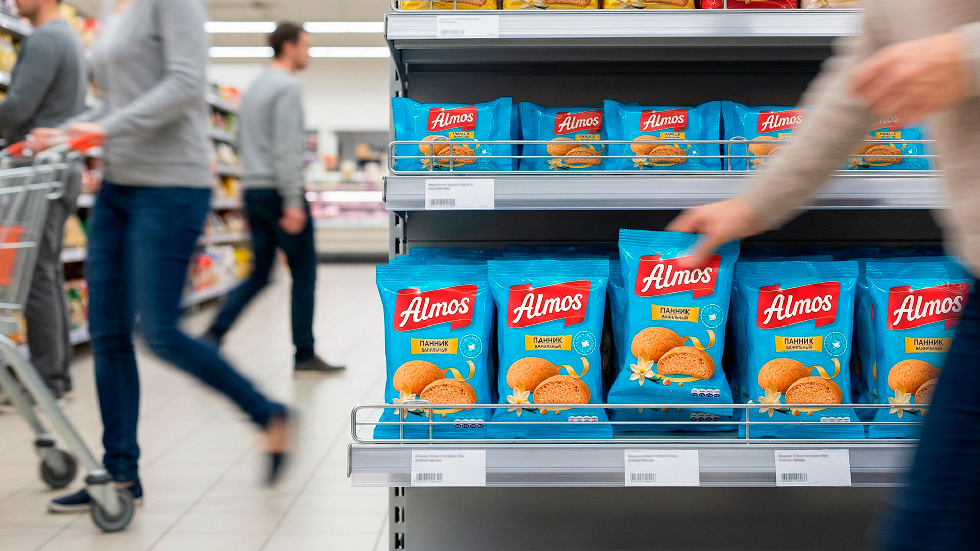
The mission was clear: create a unified visual system recognizable from 10 meters away, similar to strong retail brands.
3. Solution: First Attempt
Transparency is key, so it’s worth noting: the first attempt missed the mark.
The initial logo and design concept failed internal quality control. Two of the eight key requirements in the brief were not fully addressed.
The team regrouped, conducted a brainstorming session, analyzed mistakes, reassigned tasks, and developed a completely new concept.
This decision paid off. The second attempt met the client’s expectations.
4. Solution: Second Attempt
Through consumer psychology research, one key insight emerged:
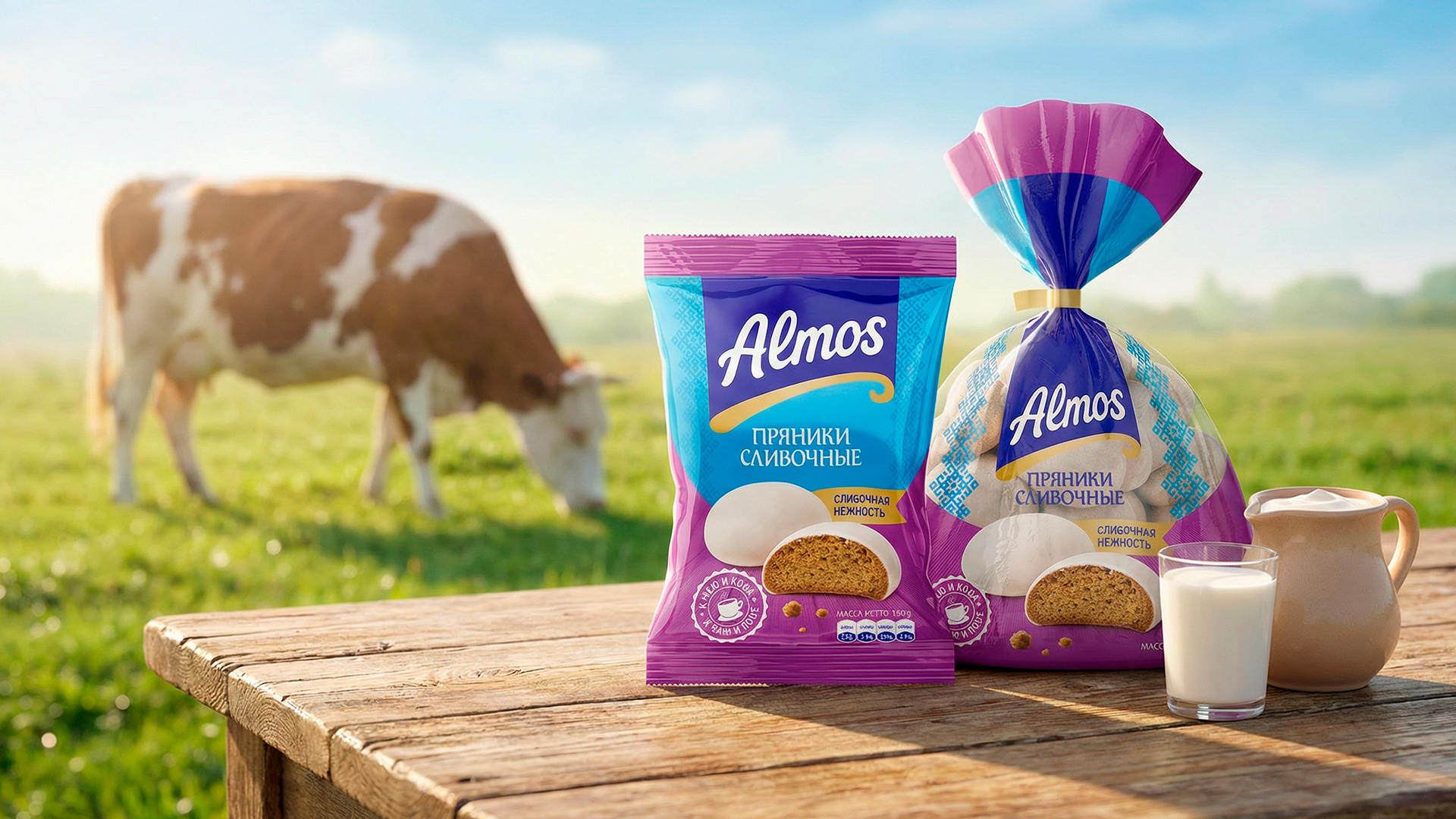
The main trigger when choosing gingerbread is softness. If the product appears dry or hard on the packaging, it will not be purchased.
The new design addressed this directly through a ribbon-based visual language:
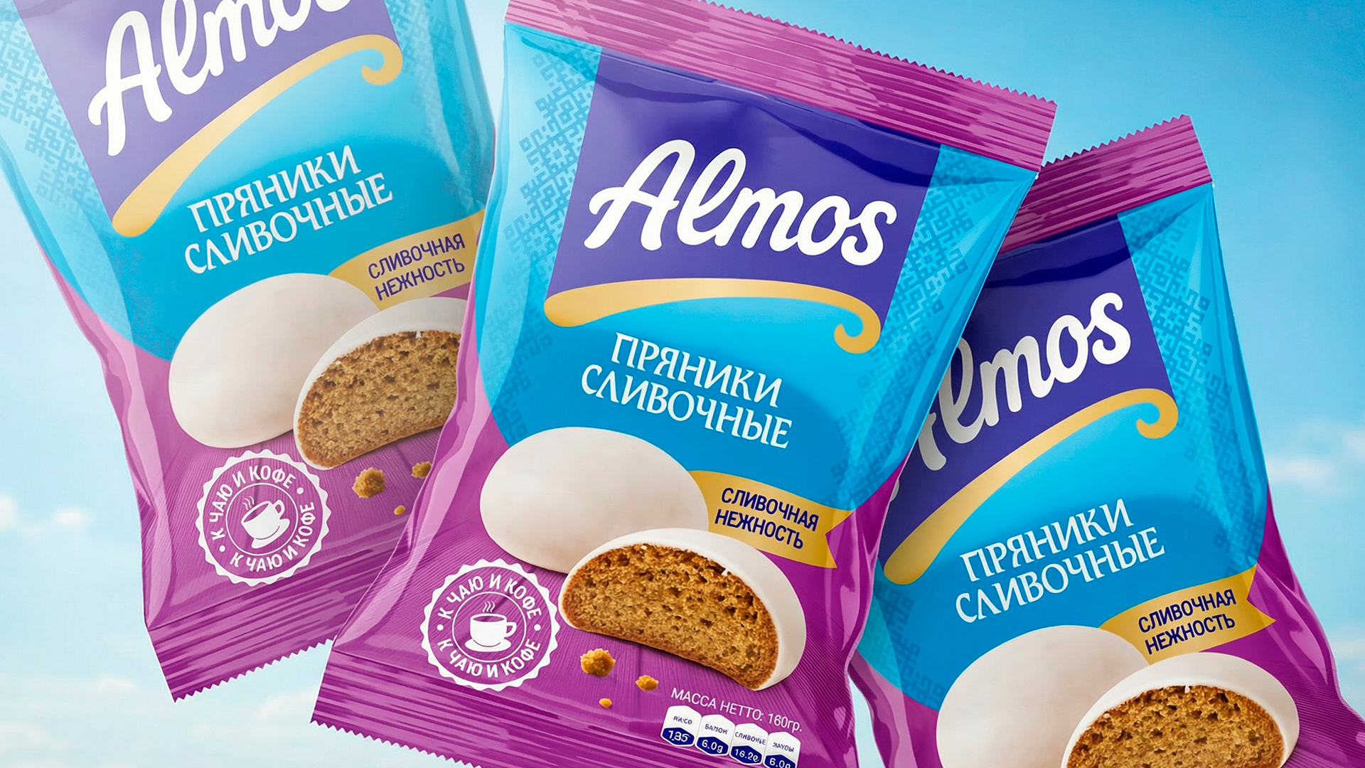
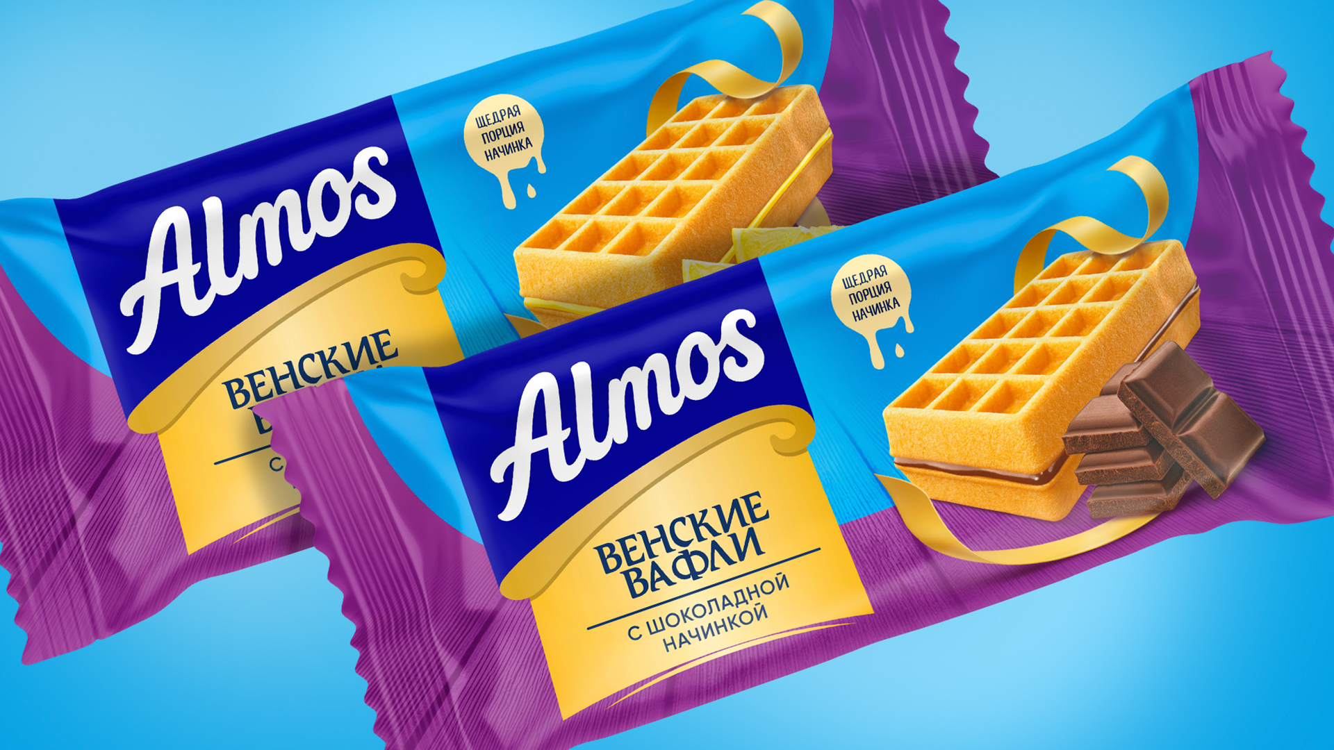
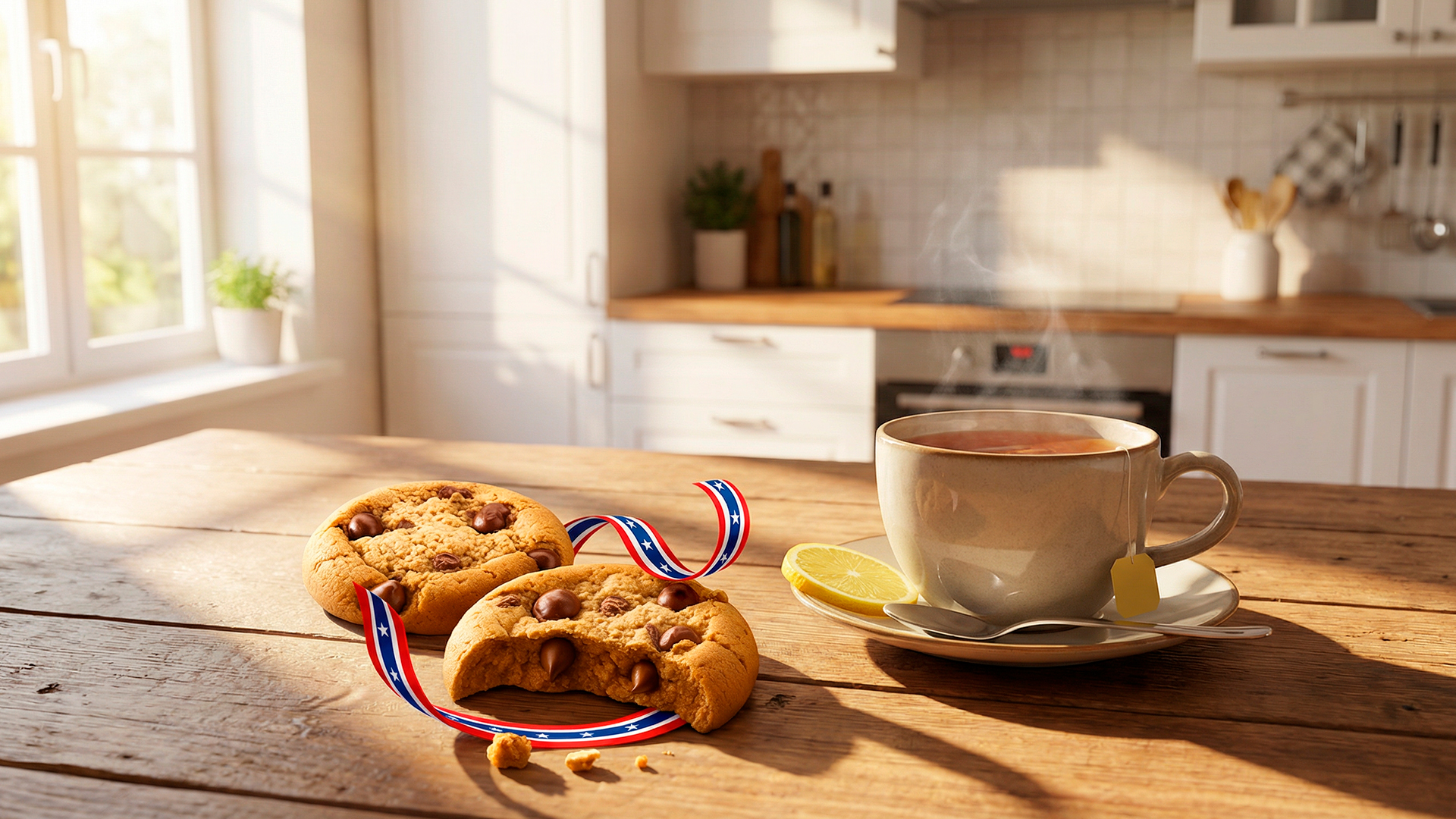
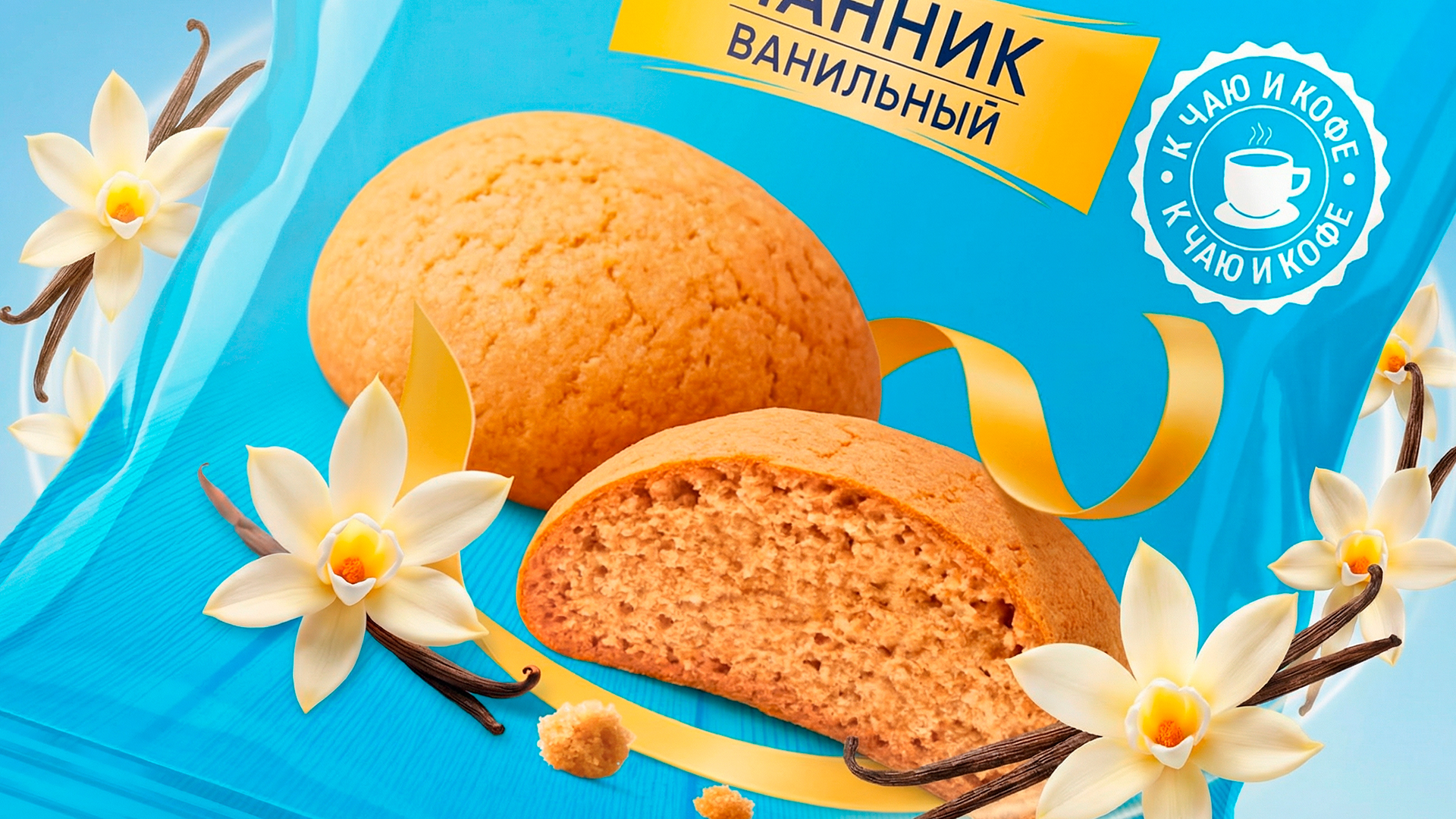
- Softness expression: Flowing ribbon elements in gold, red, and other colors replaced rigid shapes, symbolizing delicacy and melt-in-the-mouth texture.
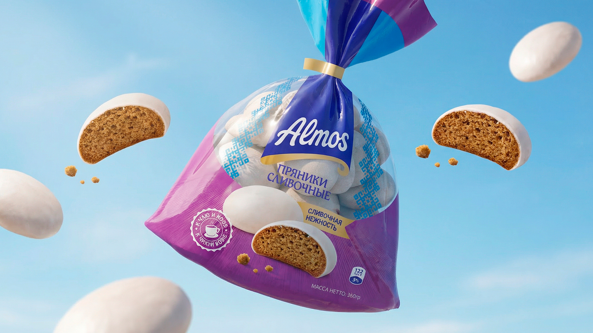
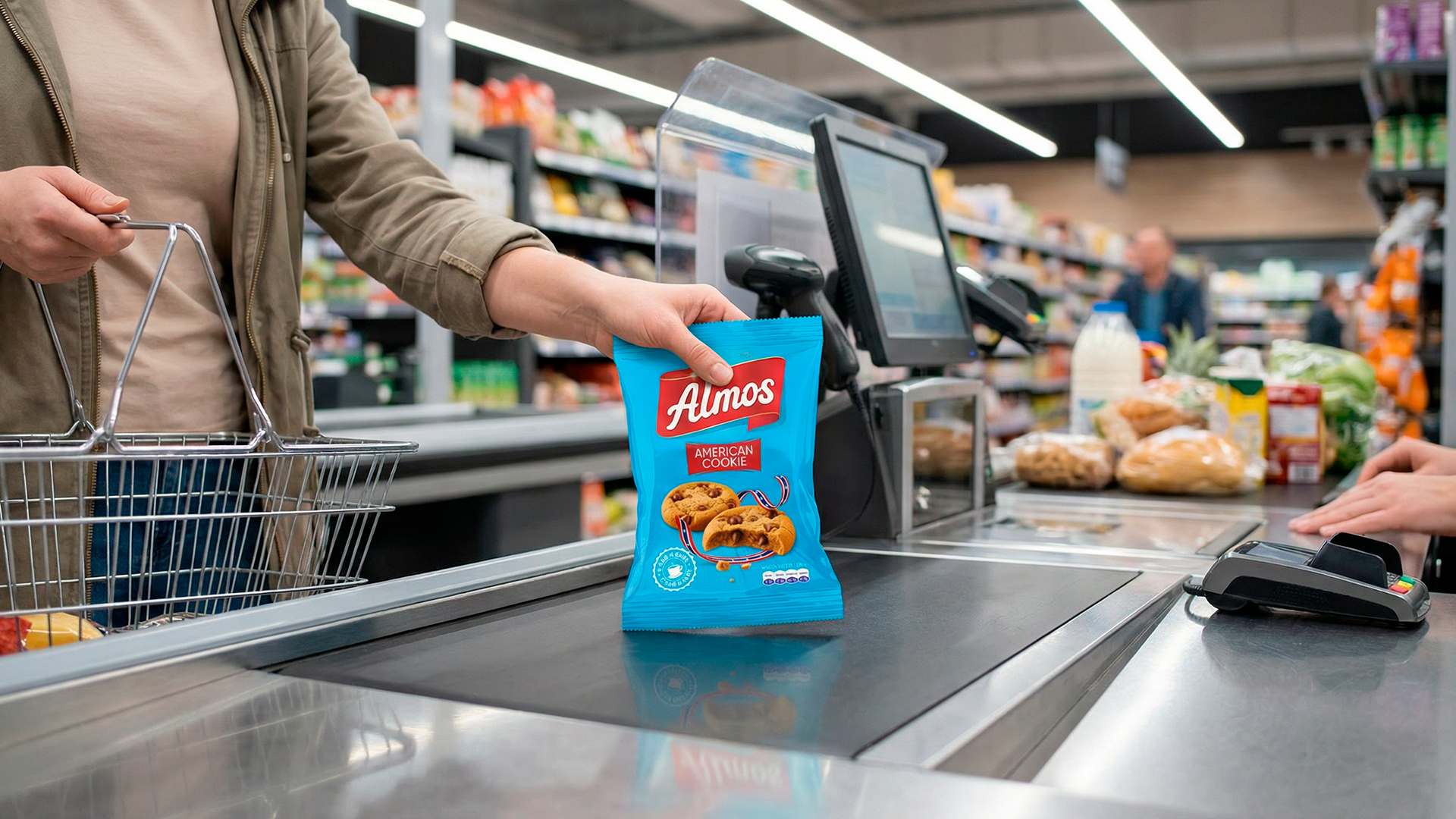
- Color strategy: The goal was not just beauty, but shelf impact. Several Pantone options were explored: turquoise (freshness), red (classic appetite appeal), green (naturalness), and purple (premium). Ultimately, a distinctive Tiffany blue was selected for its strong visual contrast and magnetic shelf presence.
- Logo: The established Almos name was retained but modernized with a contemporary typeface. Placed on a red block, it enhances visibility and recognition.
- Unified system: Products are differentiated not only by imagery but also through colored ribbons and labeled nameplates, ensuring consistency across the range.
5. Additional Work
Design alone doesn’t drive sales, so trade marketing strategies were also developed:
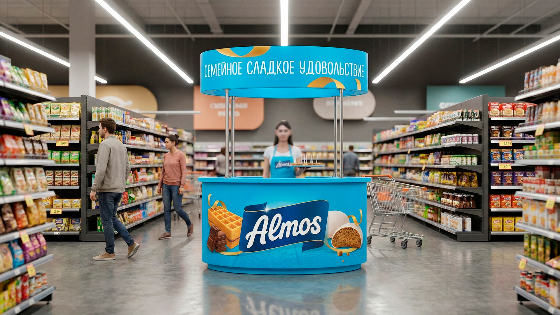
- USP: A family-oriented positioning with an emotional slogan
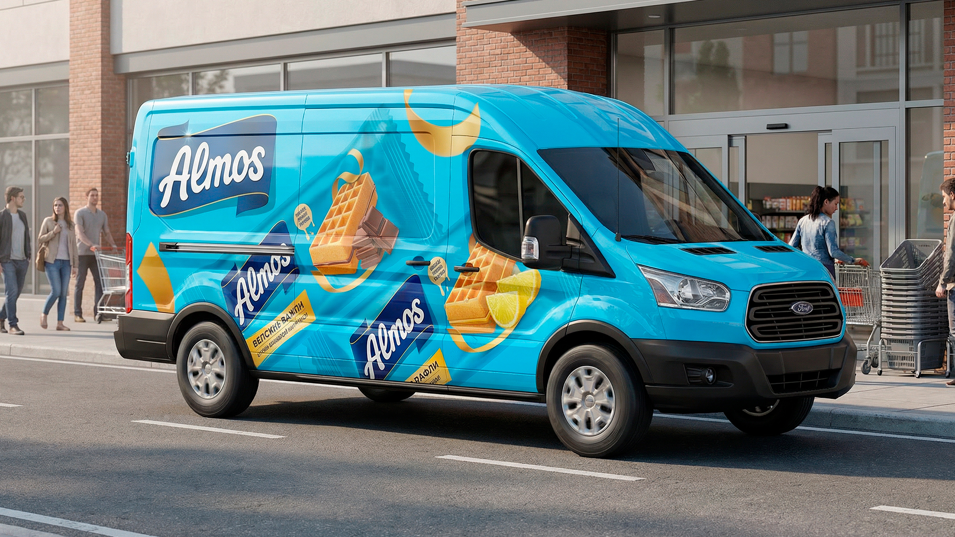
- Visual communication: Applications across POS materials, display boxes, corrugated packaging, and branded vehicles
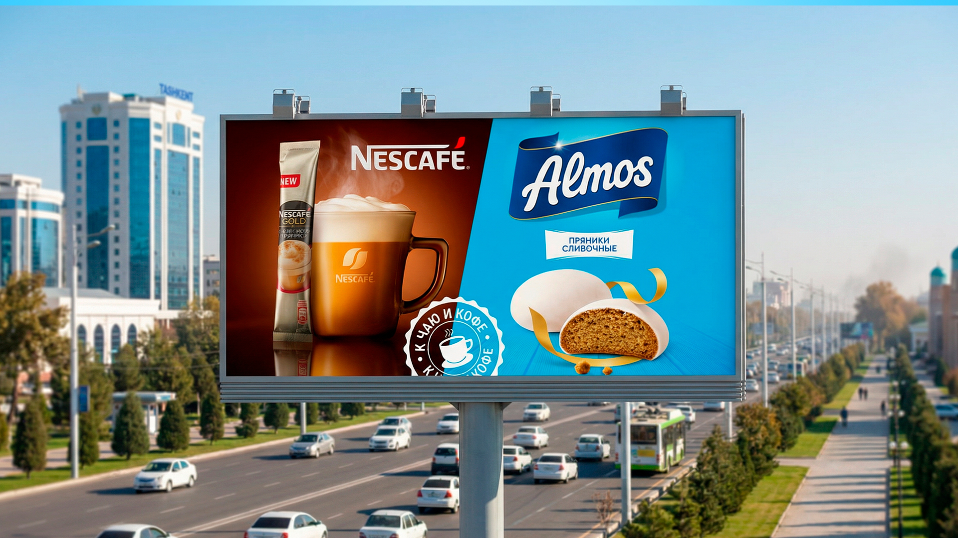
- Cross-marketing: A collaboration concept with 3-in-1 coffee brands. Coffee and gingerbread form a natural pairing, helping Almos reach its audience faster while optimizing marketing budgets
- Technical execution: Packaging text was standardized according to local and international regulations, including barcode, ingredients, and QR code integration for website access
Result
The project initially covered three SKUs (gingerbread 180g, 360g, and Viennese waffles). Due to the success of the design system, the collaboration expanded to additional product adaptations.
The final outcome is not a flashy, experimental concept, but a commercially effective packaging system. It functions as a true sales tool on the shelf, confidently communicating: “Buy me.”
P.S. Working with Tajik partners also came with a bonus, picking up some of the language along the way. Salomat boshed 😉
 butterflyhunters
 monther al omari
 Asprey Creative
 About House of Ta
 Up-Brands
 KJS CRAFT
 hello ocean
 PG Branding
 CF Napa Brand Design
 booouuuche
 Hyejung Choi
 Abbydraw Designs Unique Conceptual Branding & Packaging Designing Ideas
 Hollóka Grafikai Műhely / Graphic Design Studio
 saerom81
 YNL
 bilel tkouri
 vitoramockup
 Lampra
 Sanavala
 www.branding.uz
 alchimistestudioParis
 Estudio Argo
 Modern Theory
 Ohmybrand