

A gourmet snack designed for the horeca sector that extends a traditional seafood brand beyond preserved products, using a radical, colour-reduced visual system to translate flavour into a sensory experience rather than a product display.
This project was developed to expand the brand’s portfolio beyond its traditional preserved seafood products, introducing it into a new consumption moment: the gourmet aperitivo within the horeca and hospitality sector. The anchovy-flavoured artisanal chips act as a bridge between heritage and contemporary food culture, allowing the brand to be experienced in a more informal yet refined context.
The main challenge was to avoid the visual language typically associated with mass-market snacks and large-scale retail. Instead of relying on appetite-driven imagery or descriptive product representation, the project adopts a more conceptual approach, designed to resonate with professional environments where atmosphere, gesture and experience play a central role.
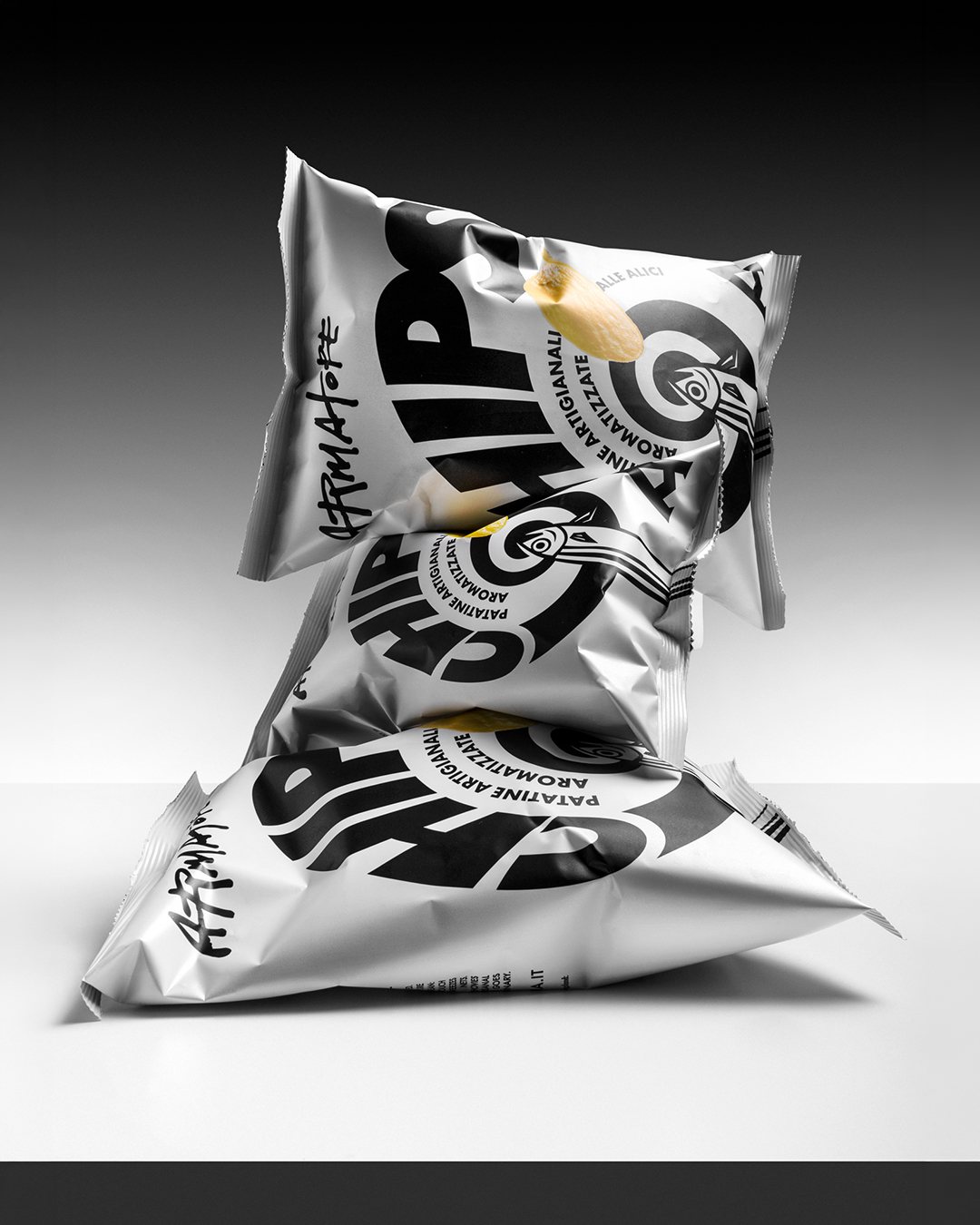
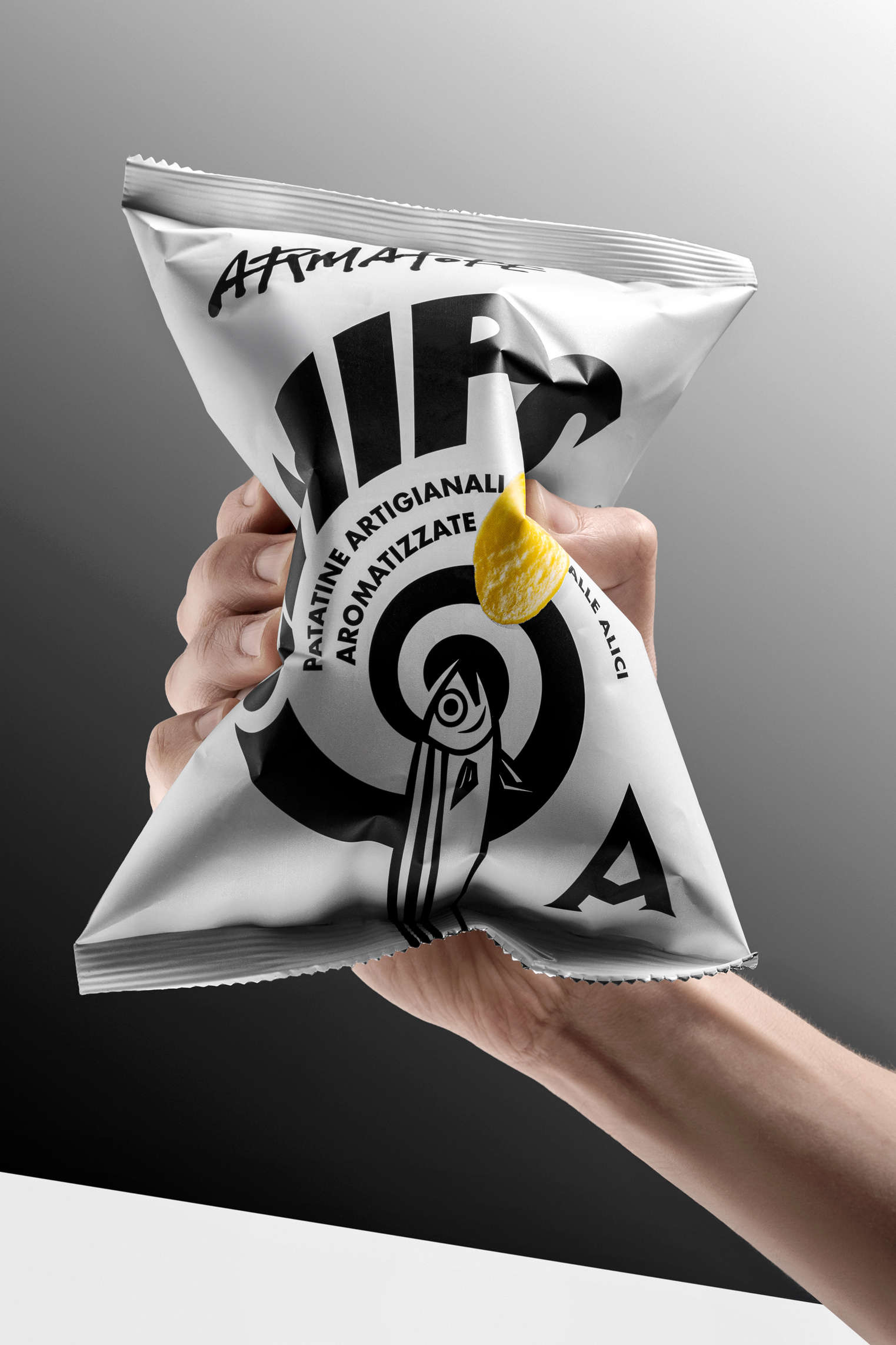
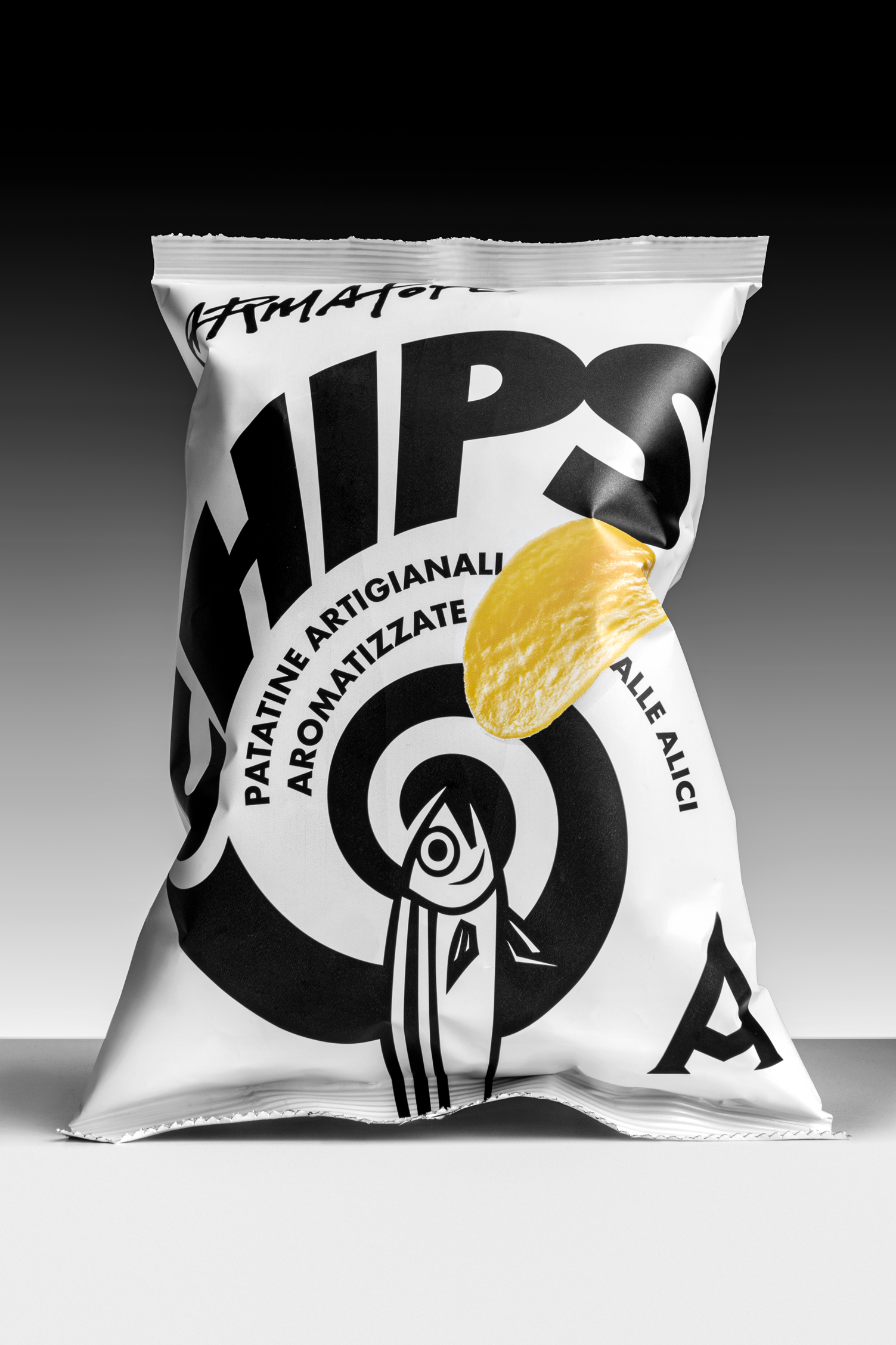
The core idea is built around the concept of a “vortex of flavour”: a dynamic visual composition that conveys intensity, depth and movement, transforming taste into a visual sensation. This vortex becomes the true protagonist of the packaging, while the product itself remains visible but deliberately secondary, reinforcing the idea of the snack as a gastronomic gesture rather than a conventional consumer good.
The near-total absence of colour is a conscious and radical design decision. It represents a clear, elegant and essential stance, distancing the product from the visual noise and rhetorical excess typical of the snack category. This reduction allows the design to communicate restraint, confidence and distinction, positioning the product within a more refined and curated context.
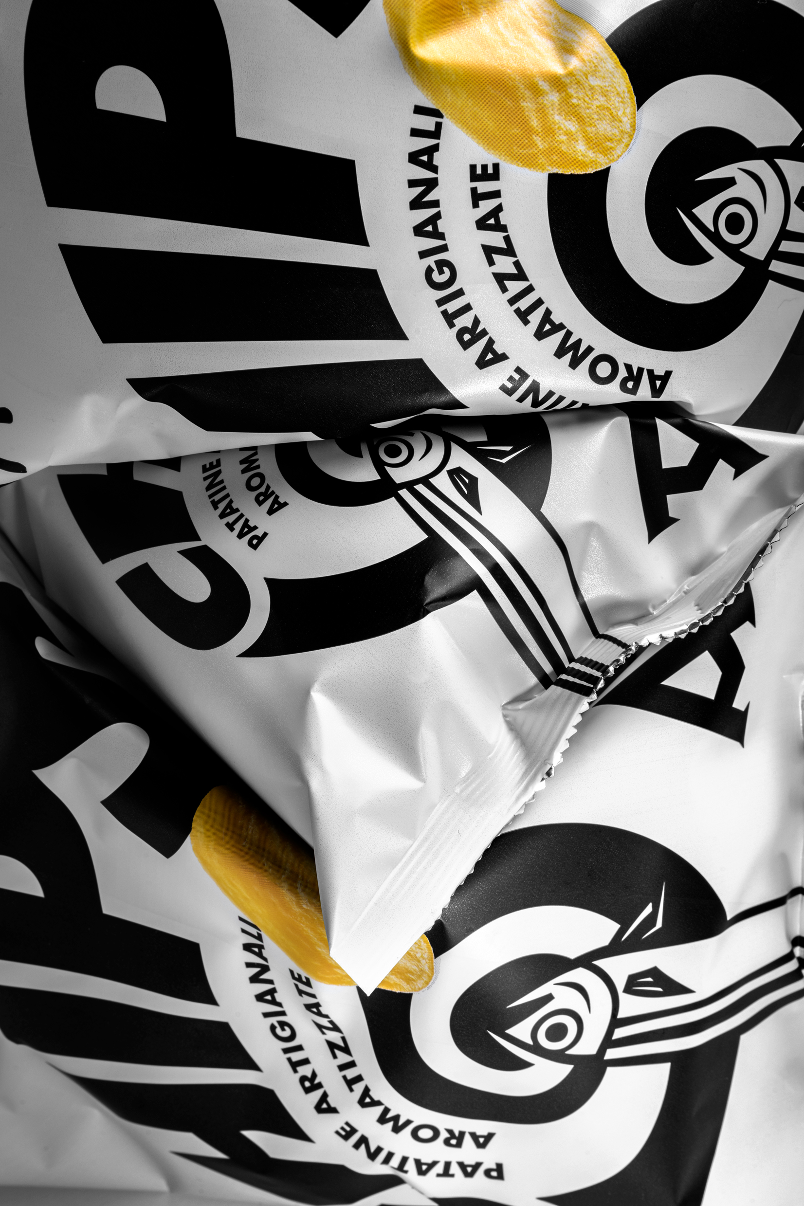
The graphic language draws inspiration from traditional artisanal printing techniques, particularly linocut and woodcut, reinterpreted through a contemporary lens. Bold contrasts, strong typography and a controlled visual system create a recognisable identity that is expressive without being decorative.
The project ultimately provides the brand with a coherent tool to enter new channels and usage occasions, maintaining a strong connection to its cultural and territorial roots while expressing them through a modern, essential and unconventional packaging language.
Curator’s Insight
The most interesting decision here isn’t the spiral… it’s the single chip.
In a category where colour photography of the product is practically mandatory, Armatore’s designers chose to render the chip small, off-centre, and in isolation against a field of black and white. It doesn’t dominate. It punctuates. And that restraint completely reframes what you’re looking at: this stops being a snack bag and starts reading as a poster, a label, a piece of print culture.
What’s also worth noting is how the hand-drawn logotype and the geometric spiral coexist without competing. The scratched, imperfect letterforms of “Armatore” sit above a composition that is otherwise rigorous and controlled. That contrast… between the handmade and the architectural… is where the brand’s identity actually lives. It signals heritage without nostalgia, craft without rusticity.
The choice to reference linocut and woodcut traditions is strategically precise for the horeca context. These are visual codes that communicate to hospitality professionals and food-literate consumers without needing to explain themselves. The packaging doesn’t need to say “artisanal”, the graphic language already does that work, and does it with considerably more credibility than a stamp or a serif font ever could.


 United Creatives Studio
 Kingdom & Sparrow
 Anastasia Bakhmatskaya
 CreativeWise
 Great and Golden
 Ximena Ureta Design Studio.
 Sorted Branding
 Lisa Sirbaugh Creative
 vitoramockup
 YQIAN
YQIAN Navegante
 Anastasia Cherepanova | xtramez
 Polaris Designs
 pavlyai
 Milena Kocharyan
 monther al omari
 Mohamed sherif midoo
 DESIGN CONCEPTS
 mmdesign
 markcreativestudio
 Rosario Lo Iacono