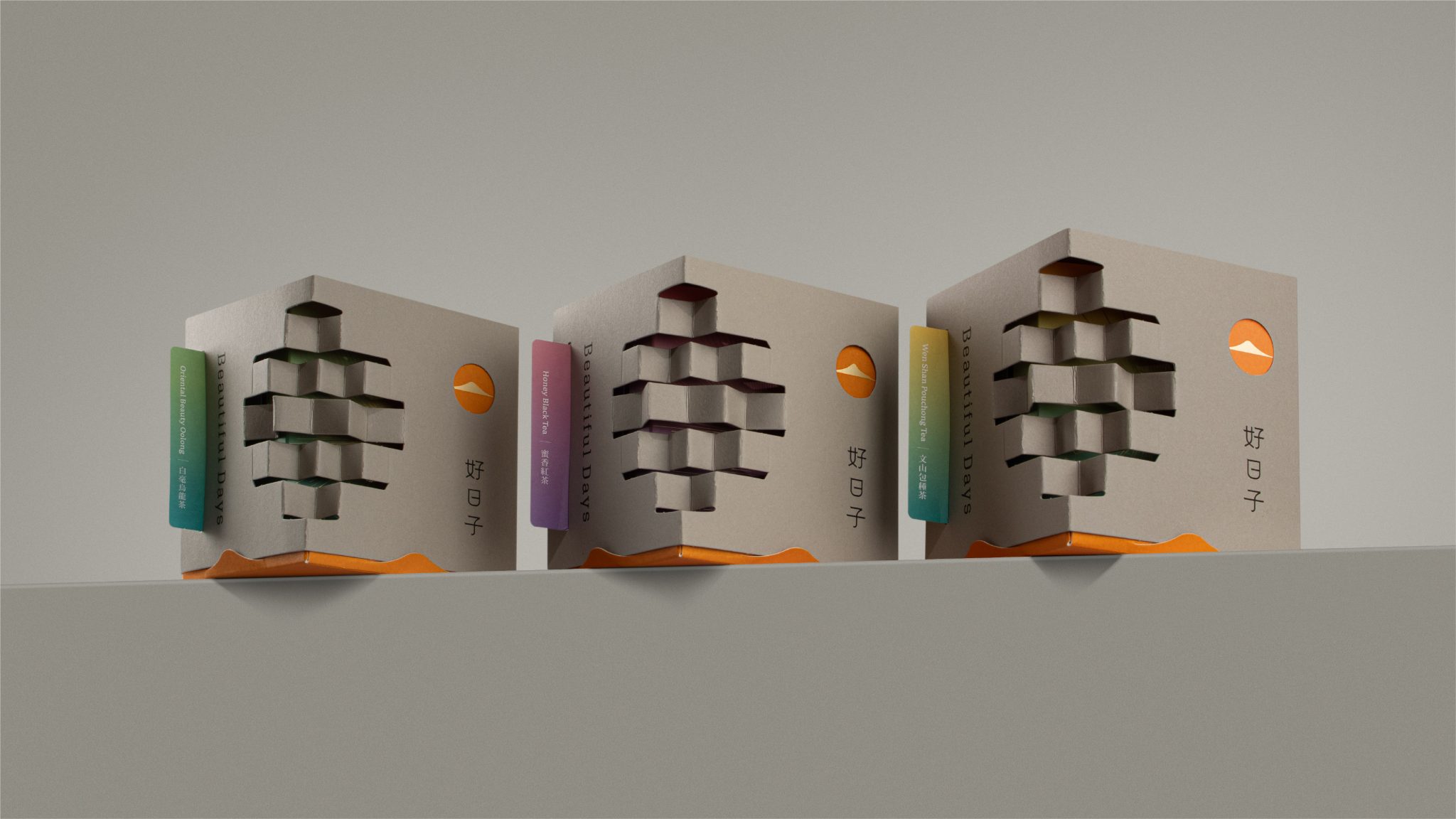

Beautiful Days Brand Identity & Packaging Design
Project Overview:
Beautiful Days is a Taiwanese tea brand, with its tea sourced from the Feitsui Reservoir protected area. As the brand evolved, its original identity no longer fully reflected its natural farming philosophy, the origin of its tea, or its expanding product range.
Design Challenge:
In the tea market, many brands rely on similar visual symbols rooted in traditional culture, making differentiation increasingly difficult. The challenge was to preserve the cultural essence of Taiwanese tea while developing a modern brand identity system that is clearer in structure, more recognizable, and adaptable across a wider range of applications.
Design Solution:
The project revolves around the concept: “A beautiful day begins at dawn.”
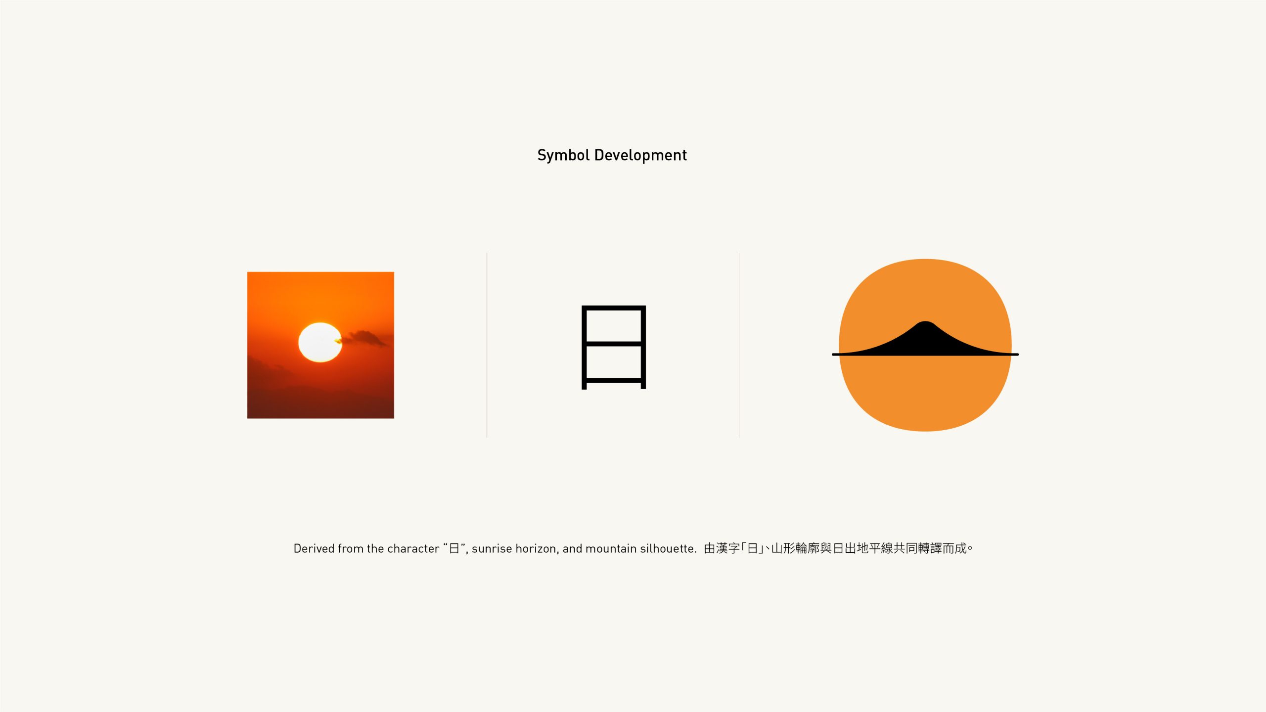
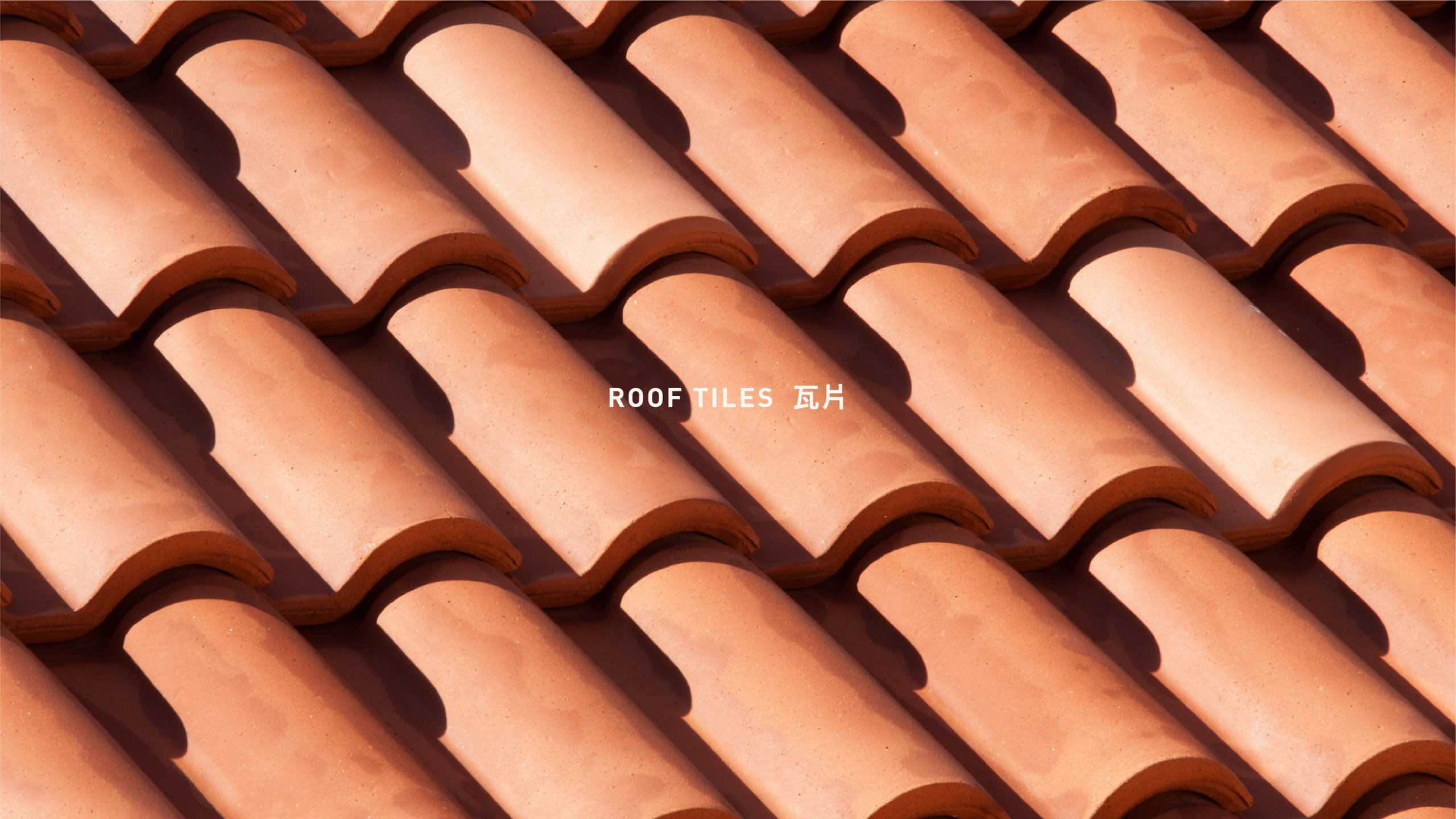
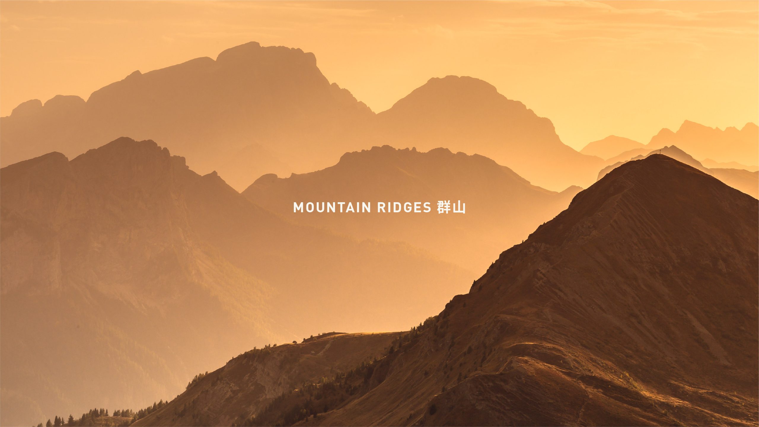
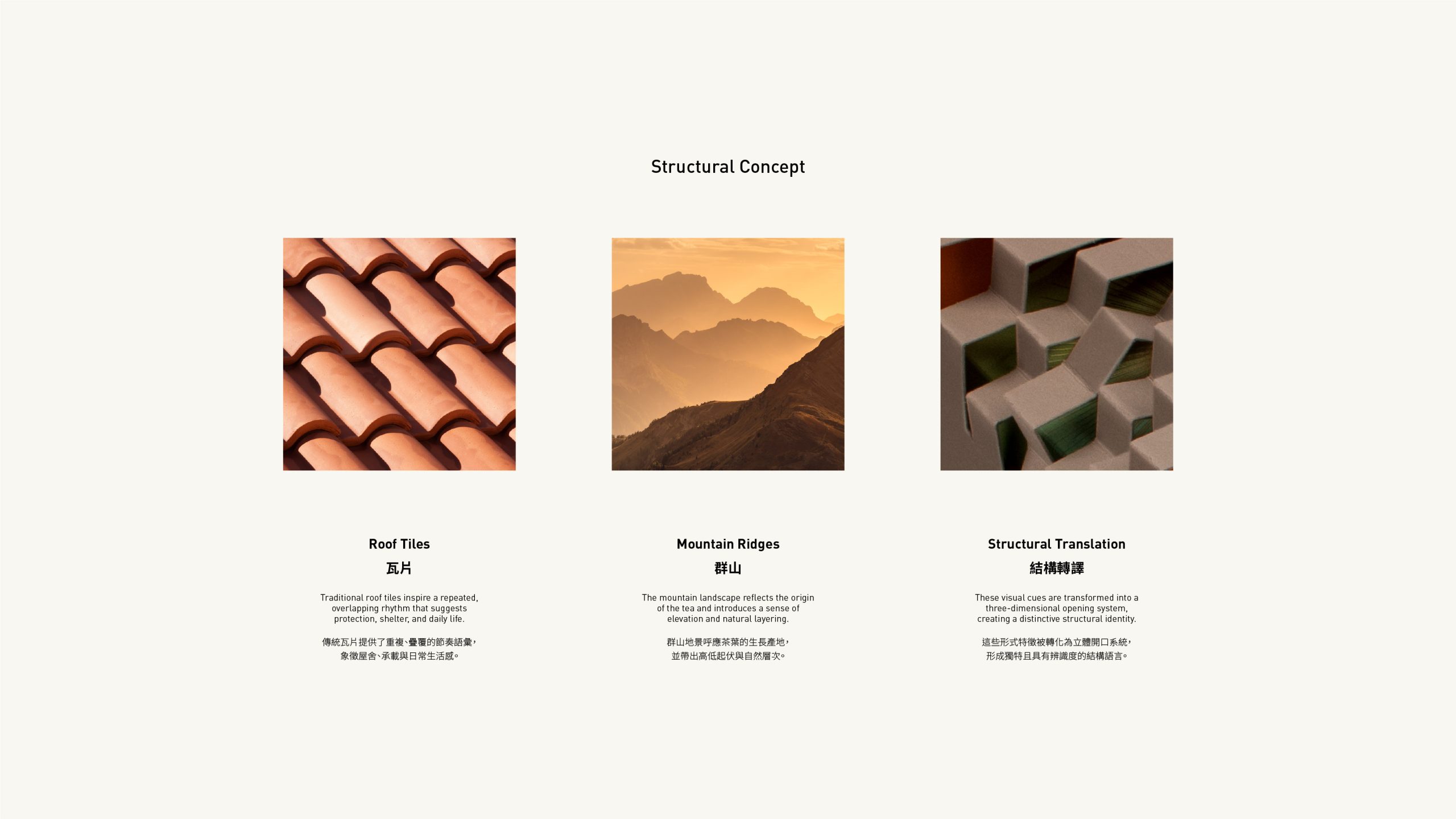
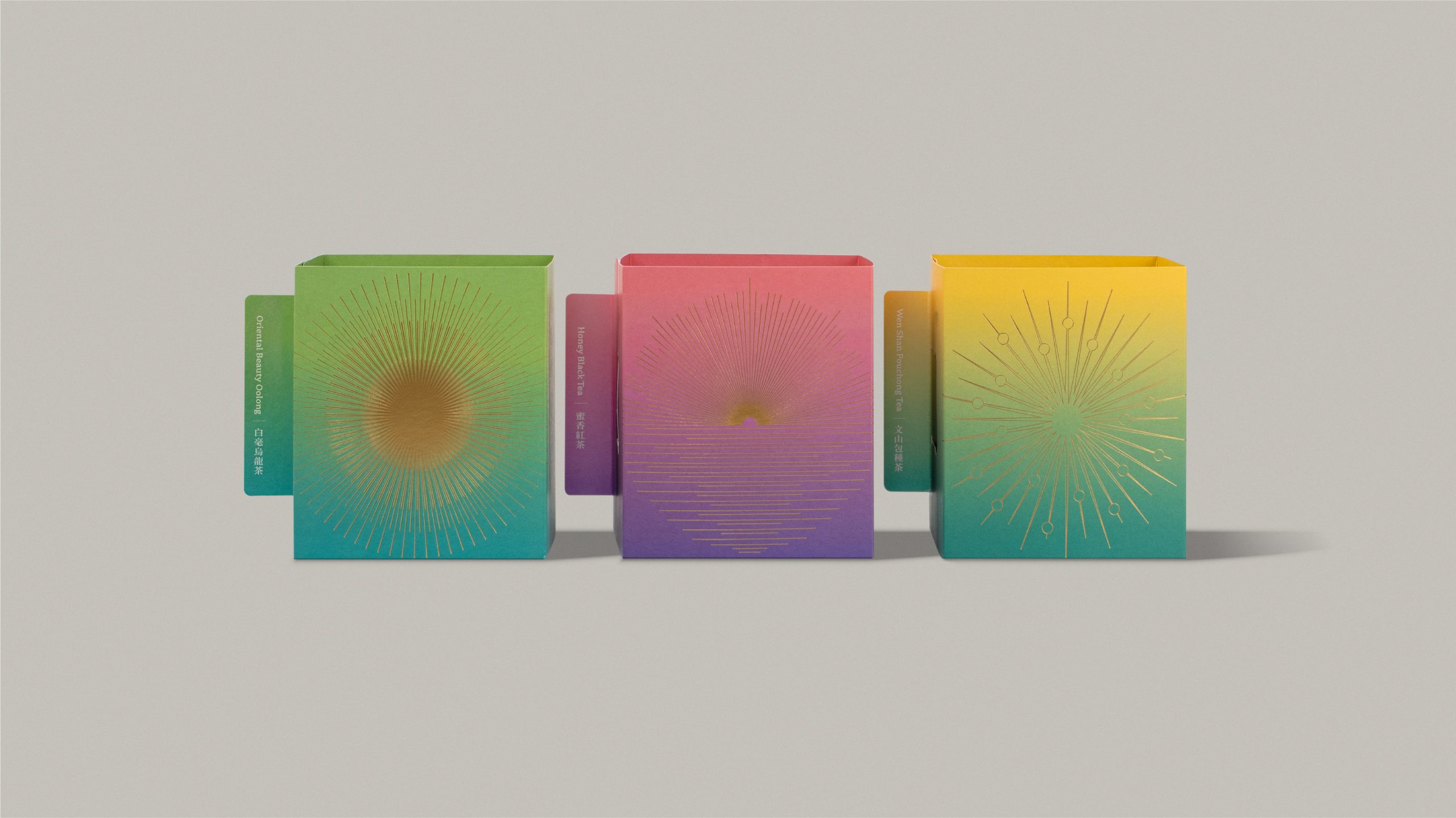
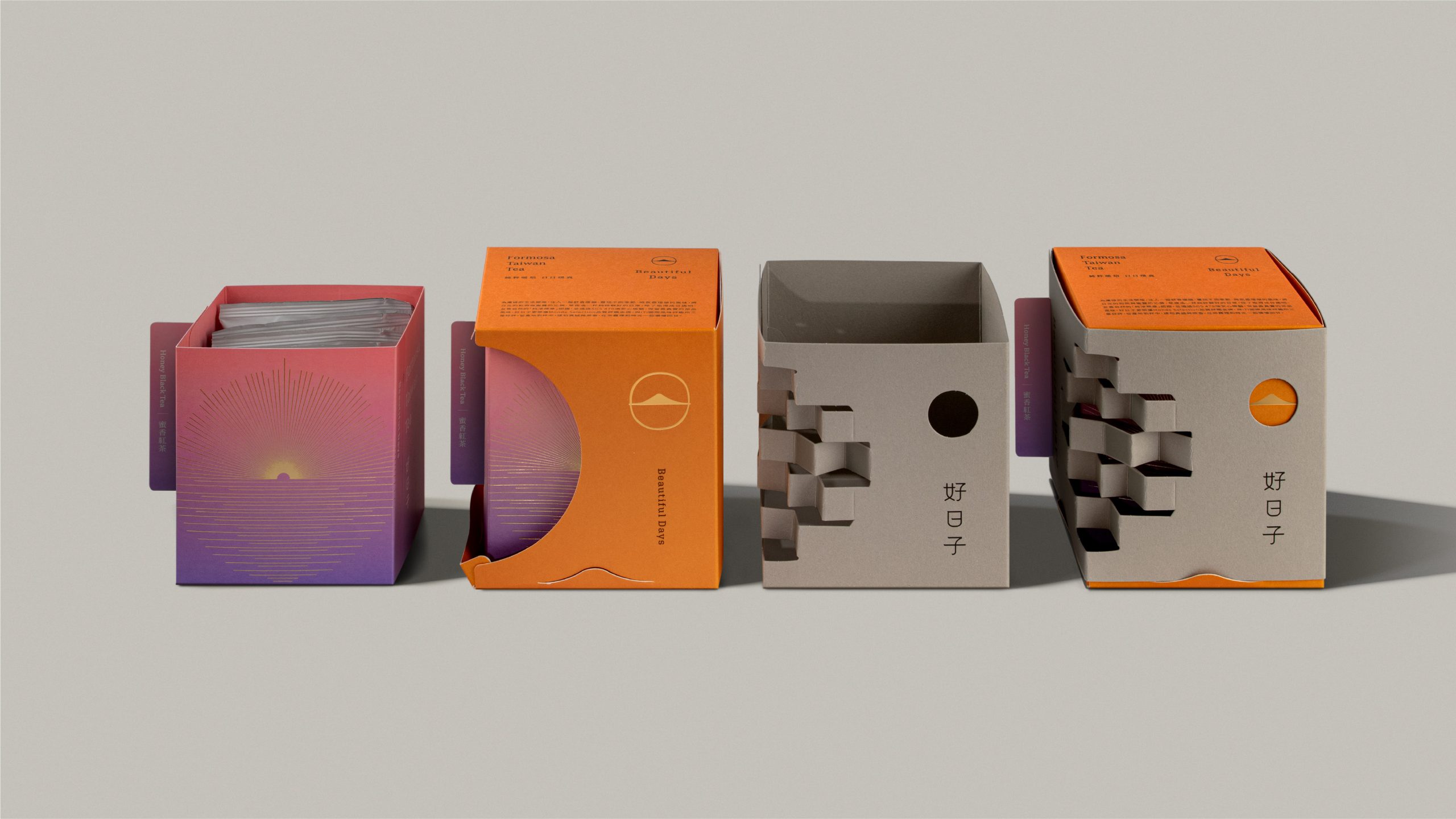
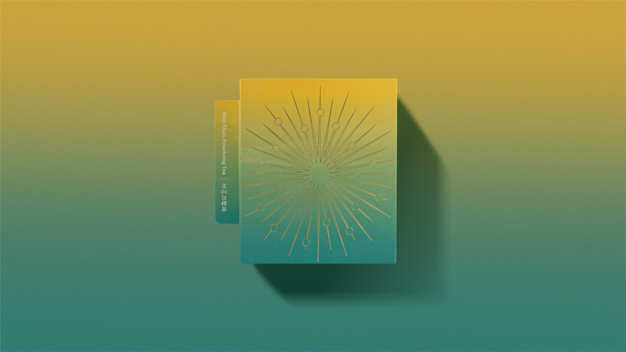
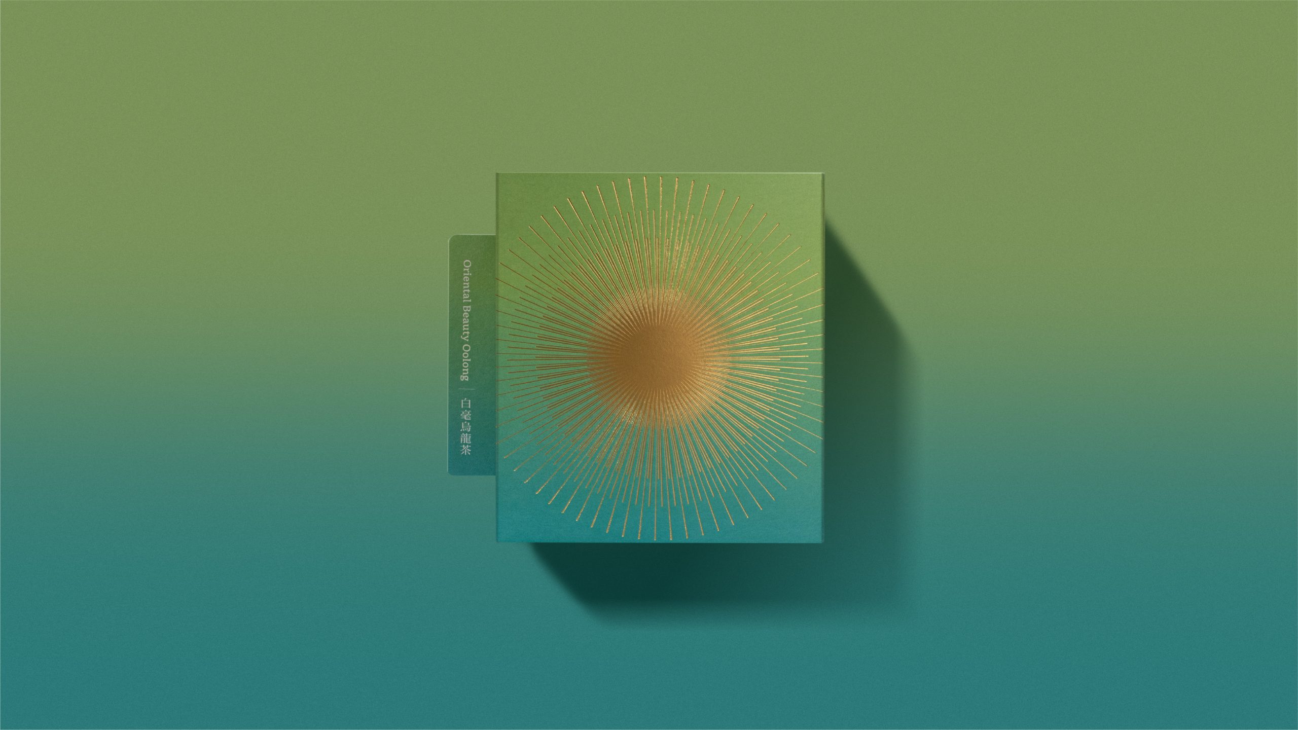
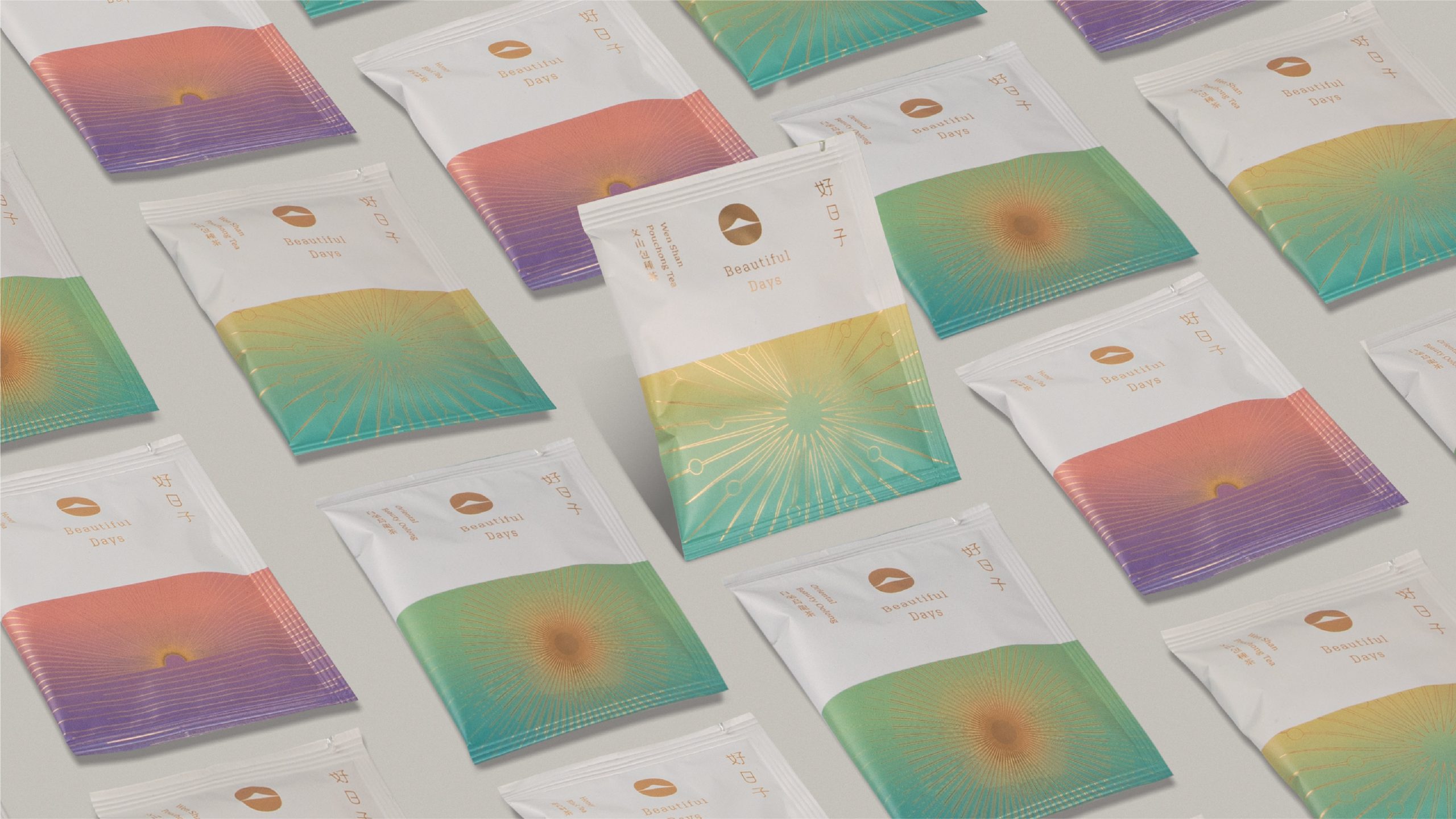
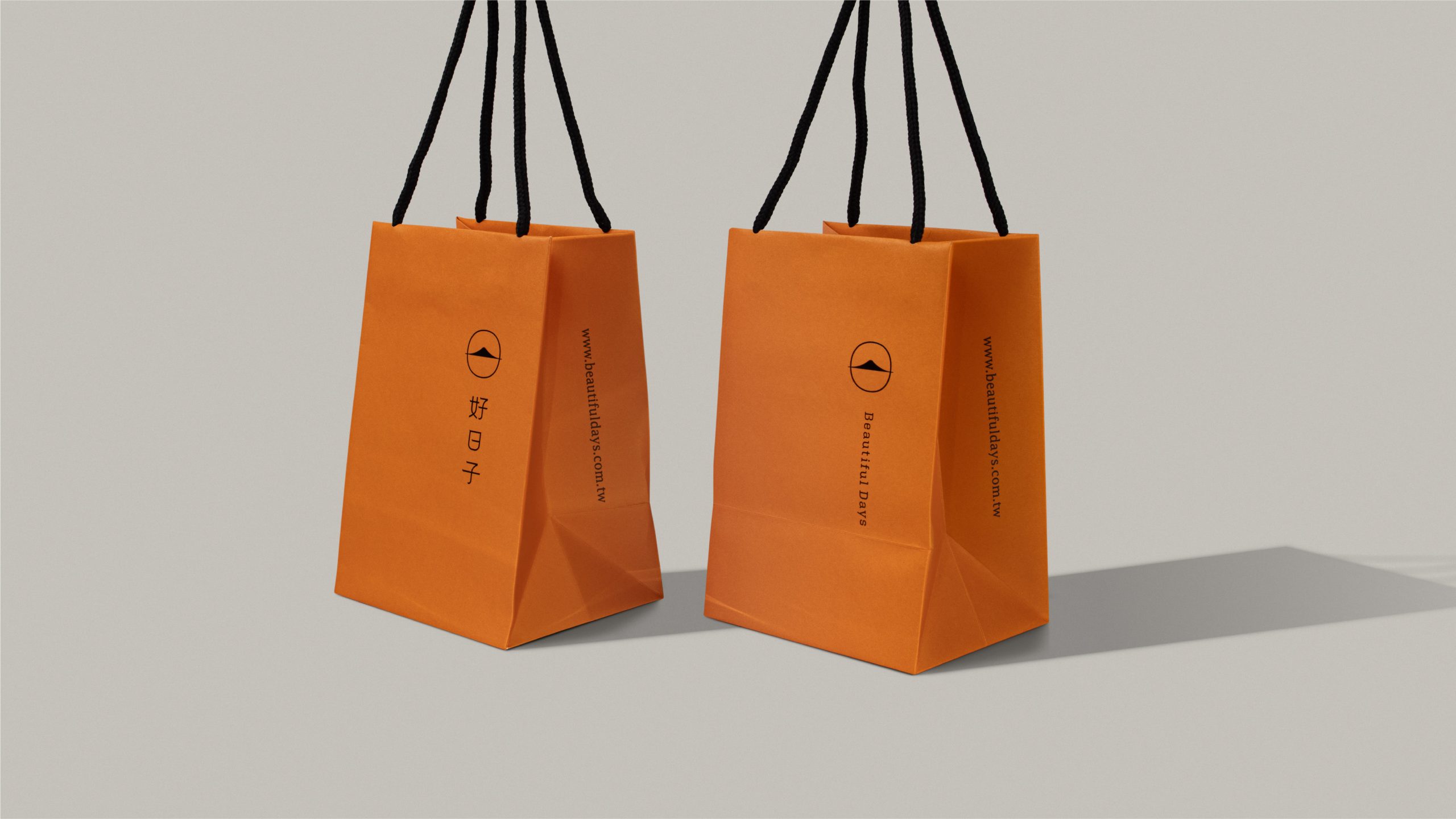
Inspired by the meaning behind the brand name, the logo transforms the imagery of the sun into a core visual element. It integrates motifs of mountains, roof tiles, and morning light, reflecting both the high-altitude origin of the tea and the quiet ritual of starting a new day. A palette of soft beige-grey and warm orange creates a fresh and welcoming atmosphere, while color coding and gold foil textures differentiate tea varieties and establish a cohesive hierarchy across the product line.
Design Highlights:
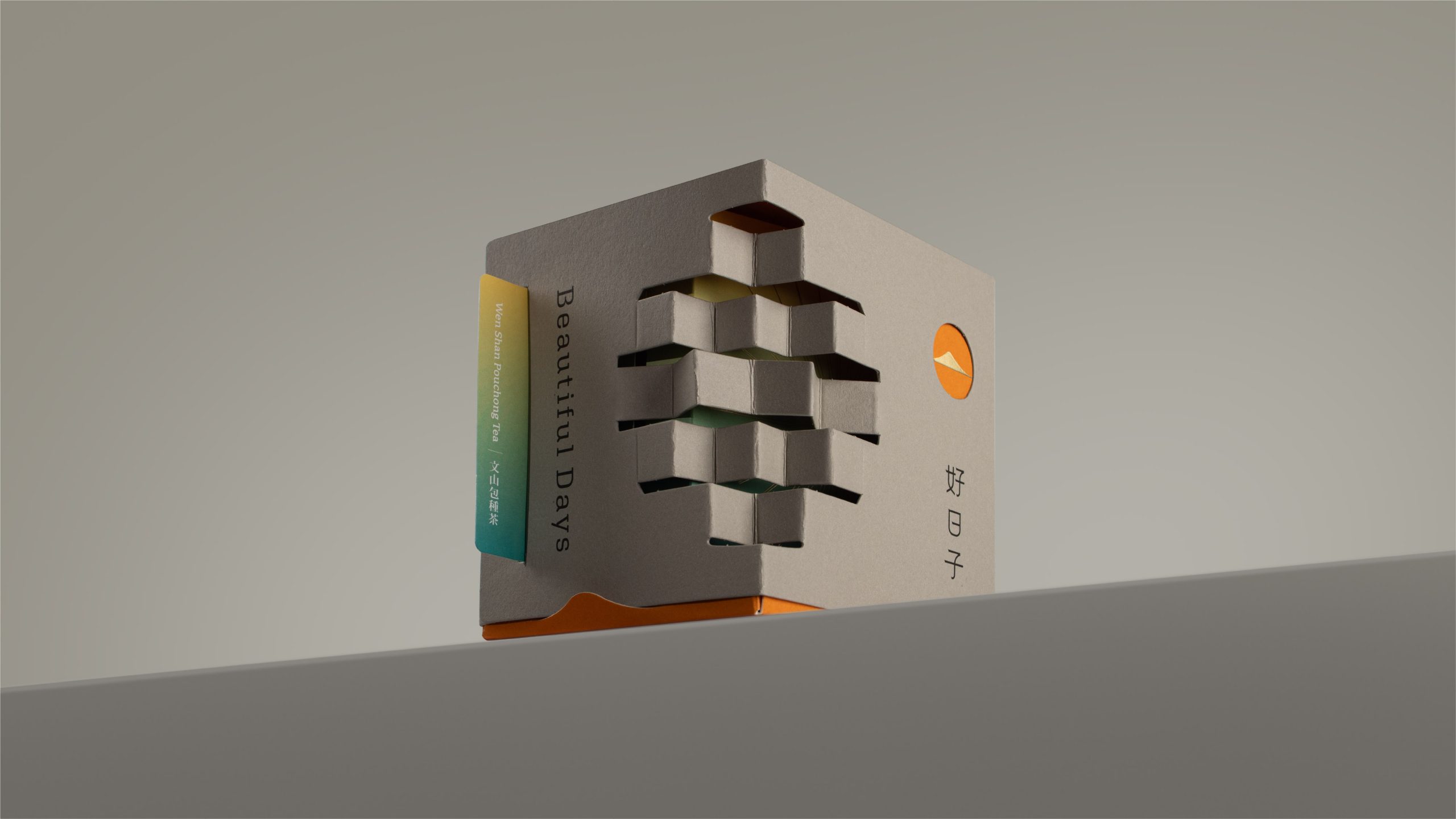
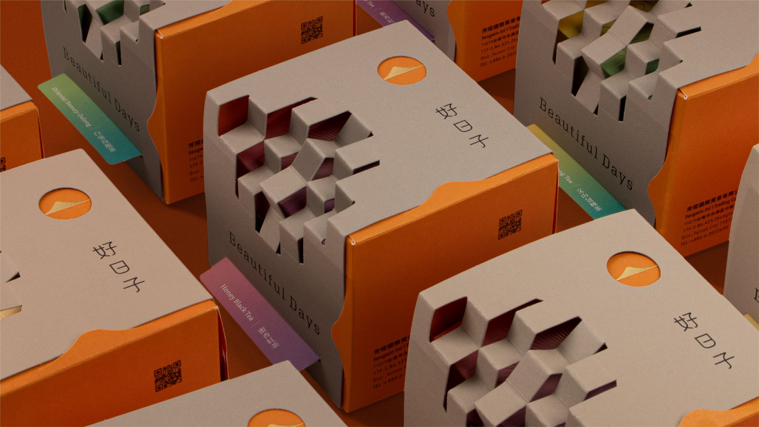
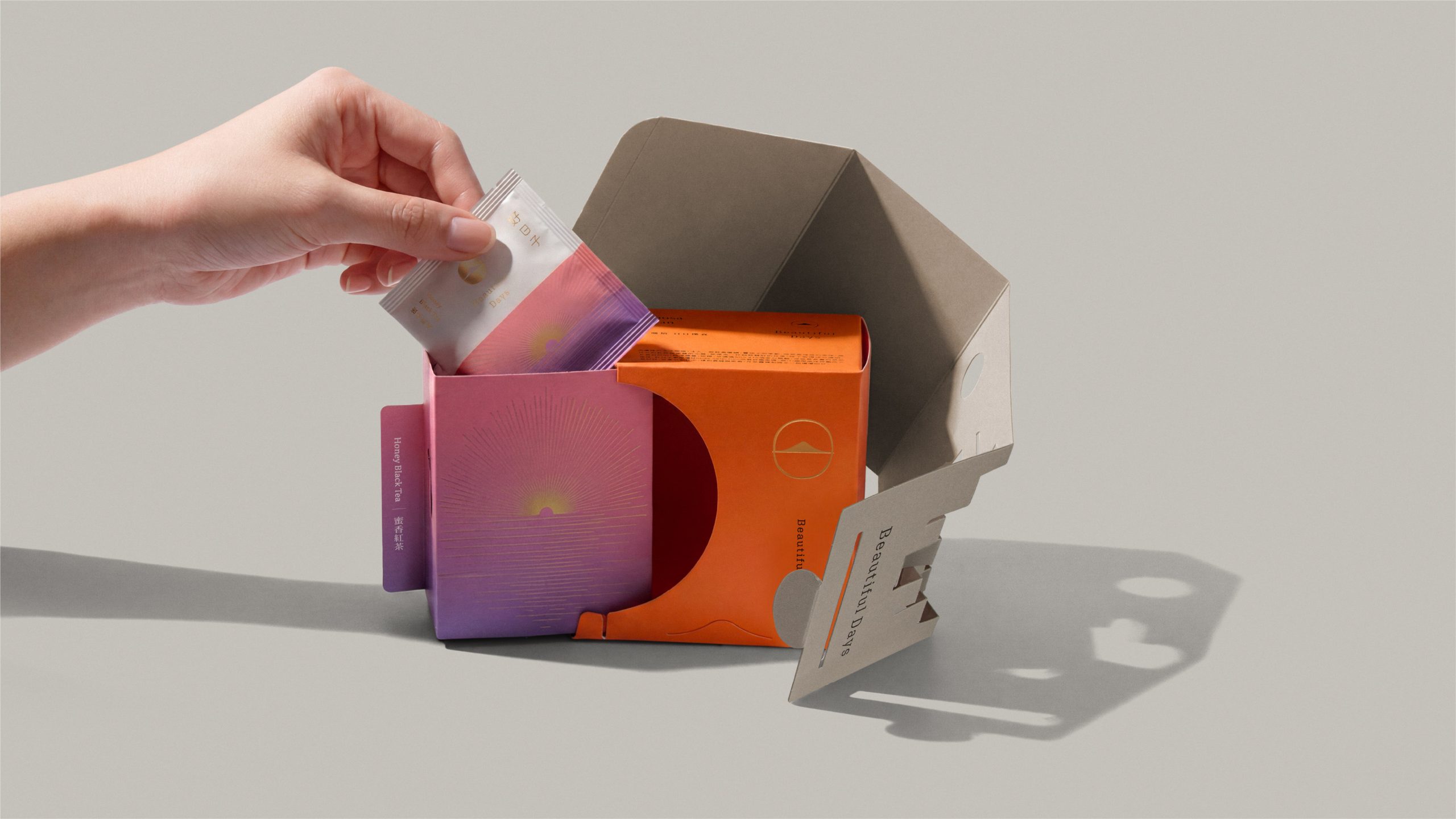
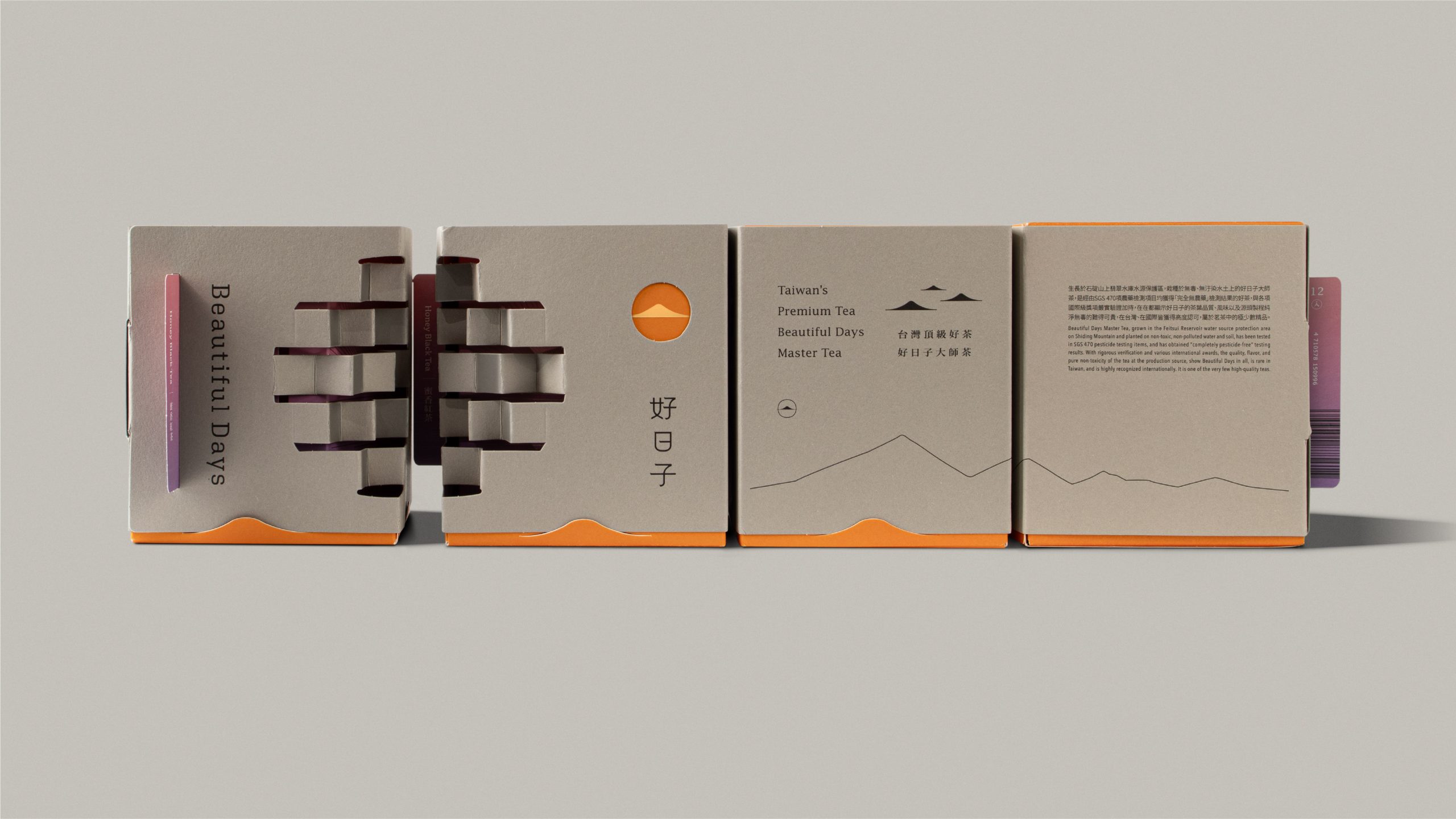
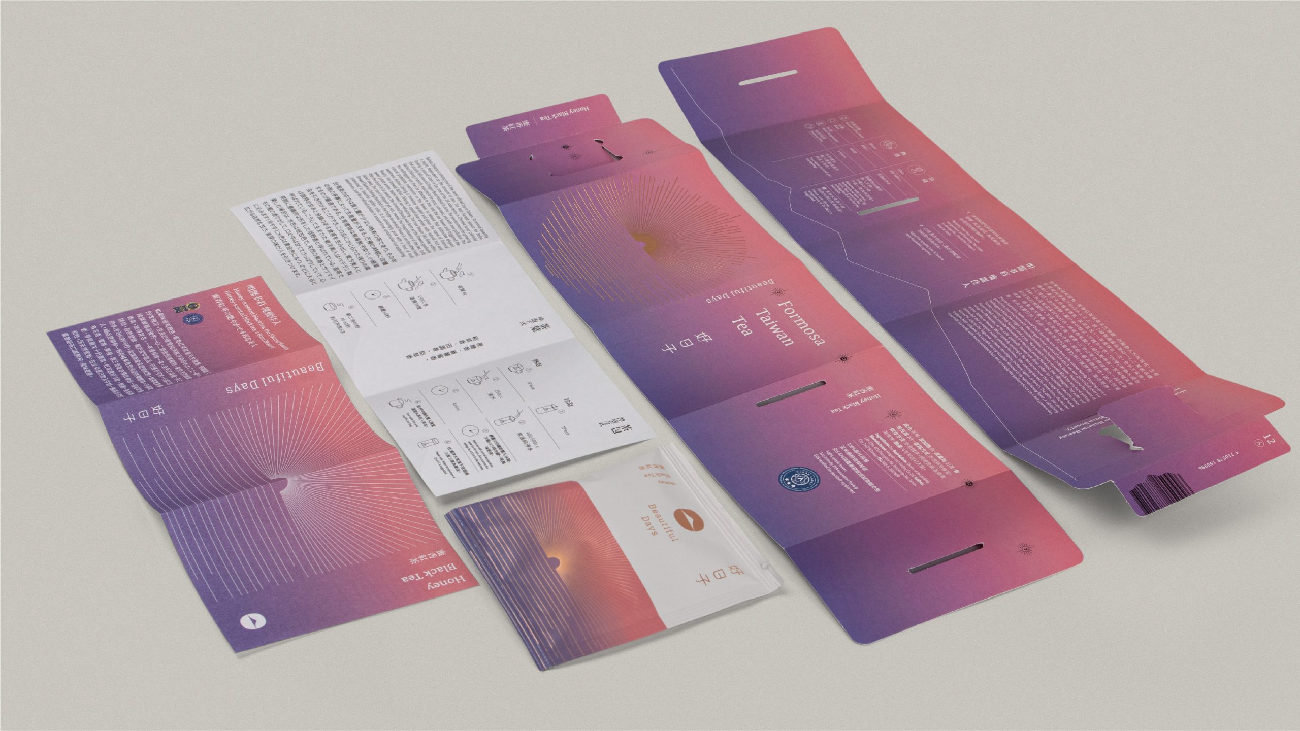
A key feature of this project is the integration of packaging structure into the overall brand narrative. The packaging design draws inspiration from mountain ridges and roof tiles, turning the process of opening, handling, and presenting the product into a more meaningful and expressive experience. This structural logic extends across gift boxes, tea tins, and tea bags, ensuring consistency throughout the entire product system.
Result:
The redesigned identity strengthens overall brand consistency across all touchpoints and enhances market recognition. By treating packaging as an integral part of the brand system rather than just a functional container, the project lays a clearer foundation for Beautiful Days’ future product development and brand expansion.
Curator’s Insight
What strikes you first is the restraint. The outer sleeve resists every temptation to announce itself — no hero colour, no bold typography dominating the surface. Instead, the designers let the material speak through an embossed cube-weave relief that rewards close looking. It’s a structural choice that functions almost architecturally: the box becomes a small object worth holding, not just opening.
The second act is the reveal. Sliding the sleeve off to expose the vivid orange inner box is a deliberate tonal shock — warm, celebratory, completely earned. It reframes the kraft exterior as a considered restraint rather than minimalism for its own sake. The designers understood that contrast needs to be delayed to land properly, and the unboxing sequence is essentially scripted around that beat.
What the project also gets right is scale consistency. The gradient logic and mountain-sun motif carry through from the outer box down to the individual sachets, meaning the system doesn’t collapse at the smallest touchpoint. That coherence across scale is harder to achieve than it looks, and it’s the detail that separates a good packaging concept from a fully realised one.


 Eva Chistyakova
 vostorge
 alchimistestudioParis
 lettera7
 killeridea
 leekyeongyeob
 vitoramockup
 Akshay 11
 Deeez Studio
 Oksana
 M&A CREATIVE AGENCY
 宏洛图品牌设计HONGLT
 mattdoyledesign
 Up-Brands
 Semenova Ekaterina
 Valérie Colace
 Rosario Lo Iacono
 maud de pourpre
 Firstrein