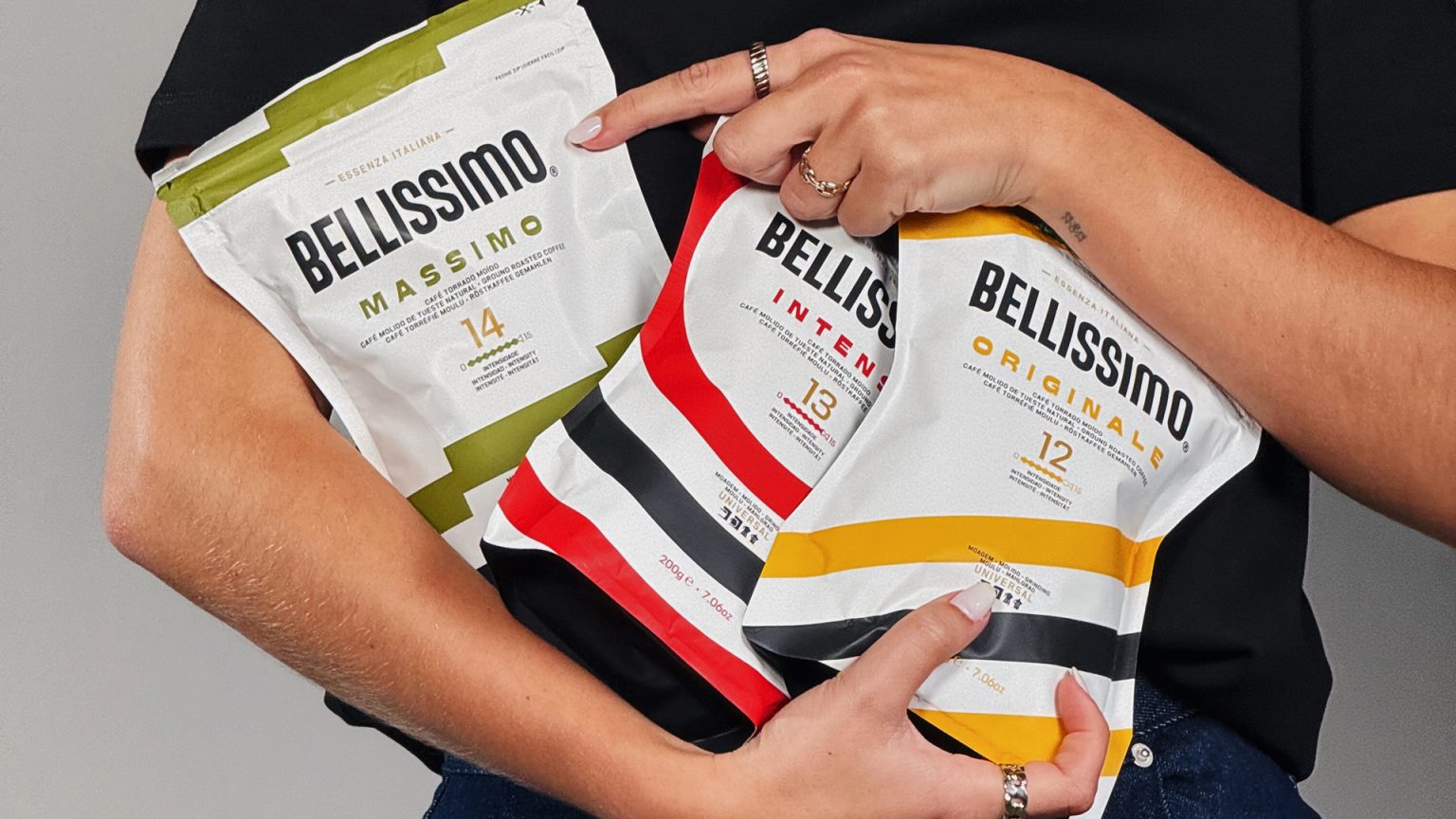

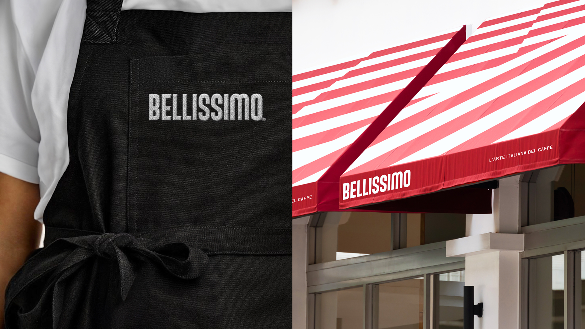
For twenty years, Bellissimo has enriched Portuguese coffee culture with classically Italian roasts. Now, the Peter Schmidt Group has developed a bold new graphic look for the brand. Full of lifestyle appeal and confident ease, from packaging to campaign.
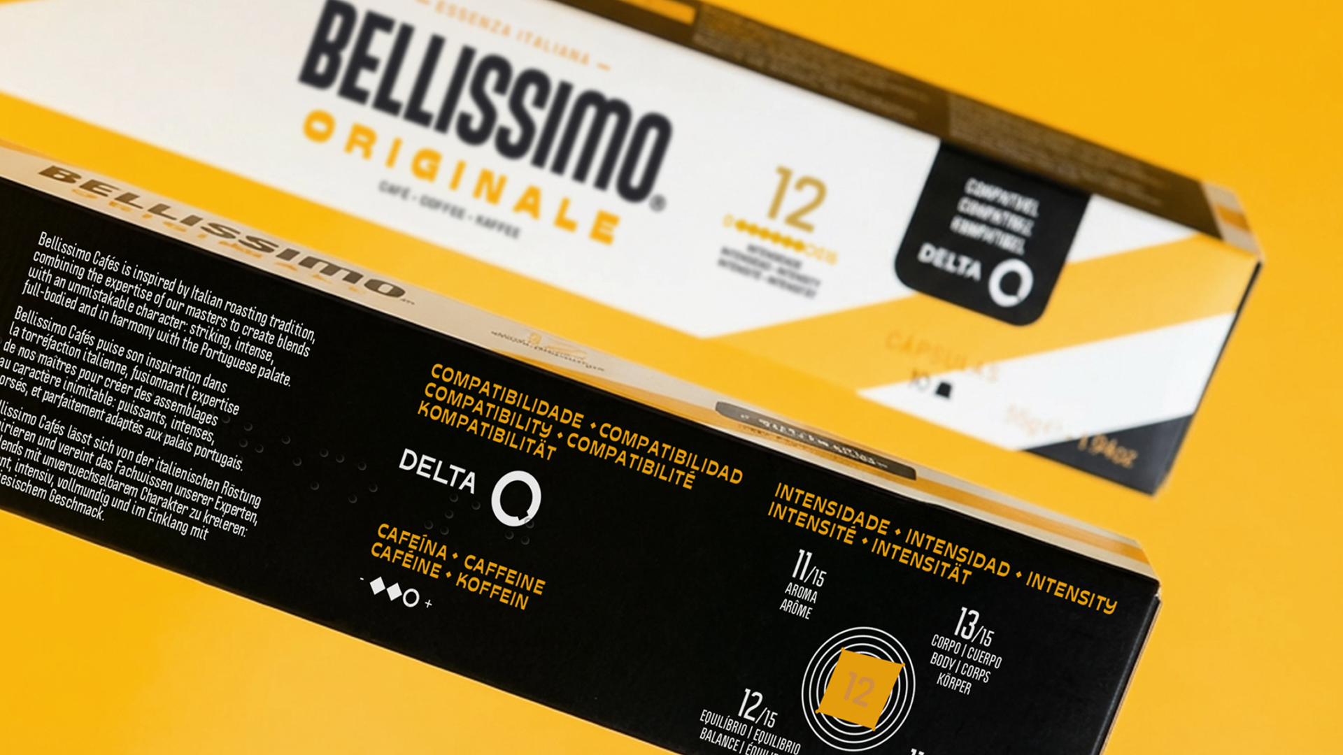
The task for the Peter Schmidt Group: develop a holistic concept for the Bellissimo coffee brand – from visual identity and a restructuring of the portfolio to packaging design for both existing and new products. Bellissimo is a popular Portuguese love brand known for its high-quality Italian blends. Yet the premium taste and craftsmanship behind these blends were not fully expressed through the existing packaging. Our challenge was to translate this rich, Italian‑inspired coffee experience into a visual identity that reflects the brand’s quality and elevates its presence across the entire range.
Portugese Coffee with an Italian Soul
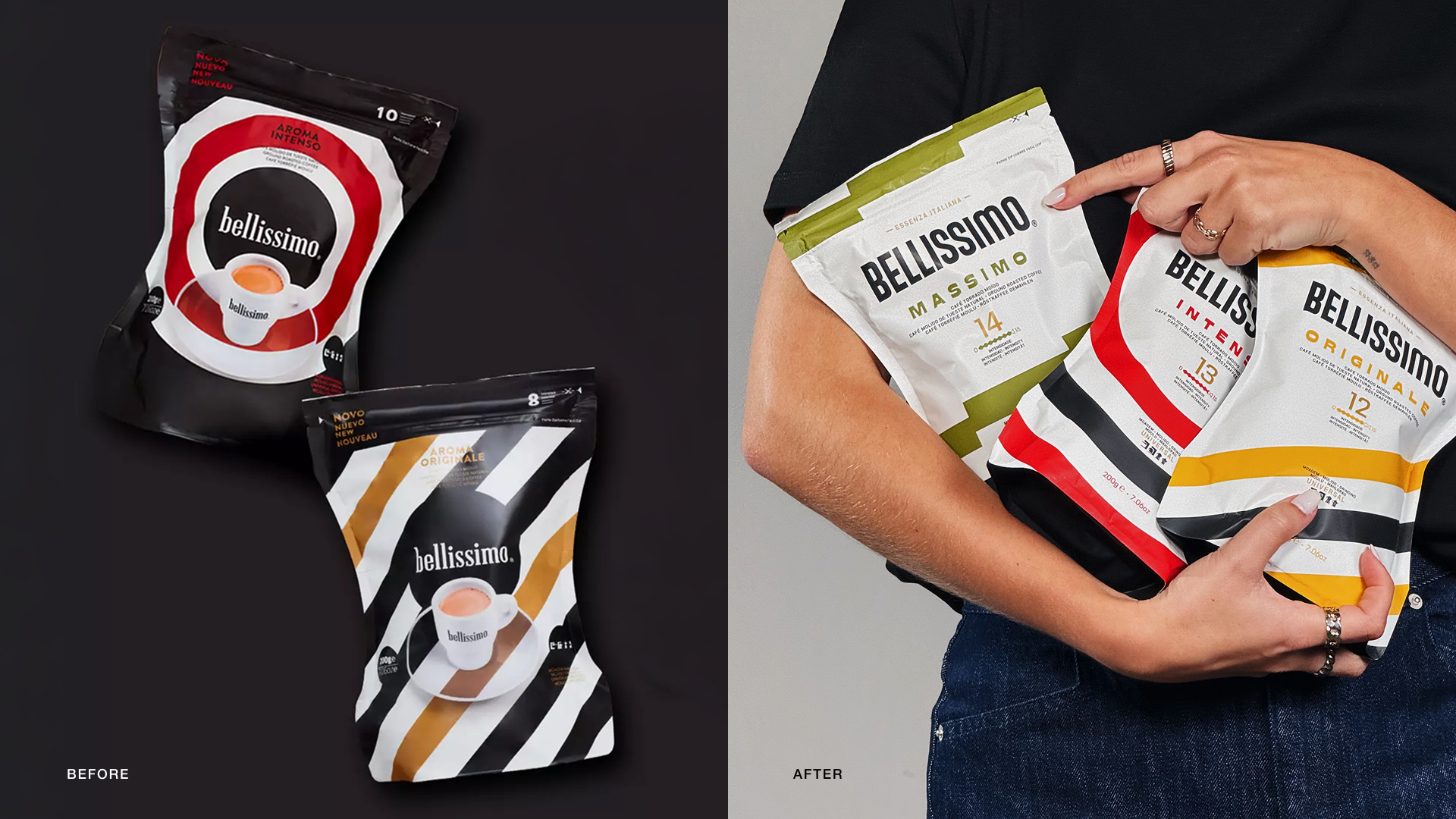
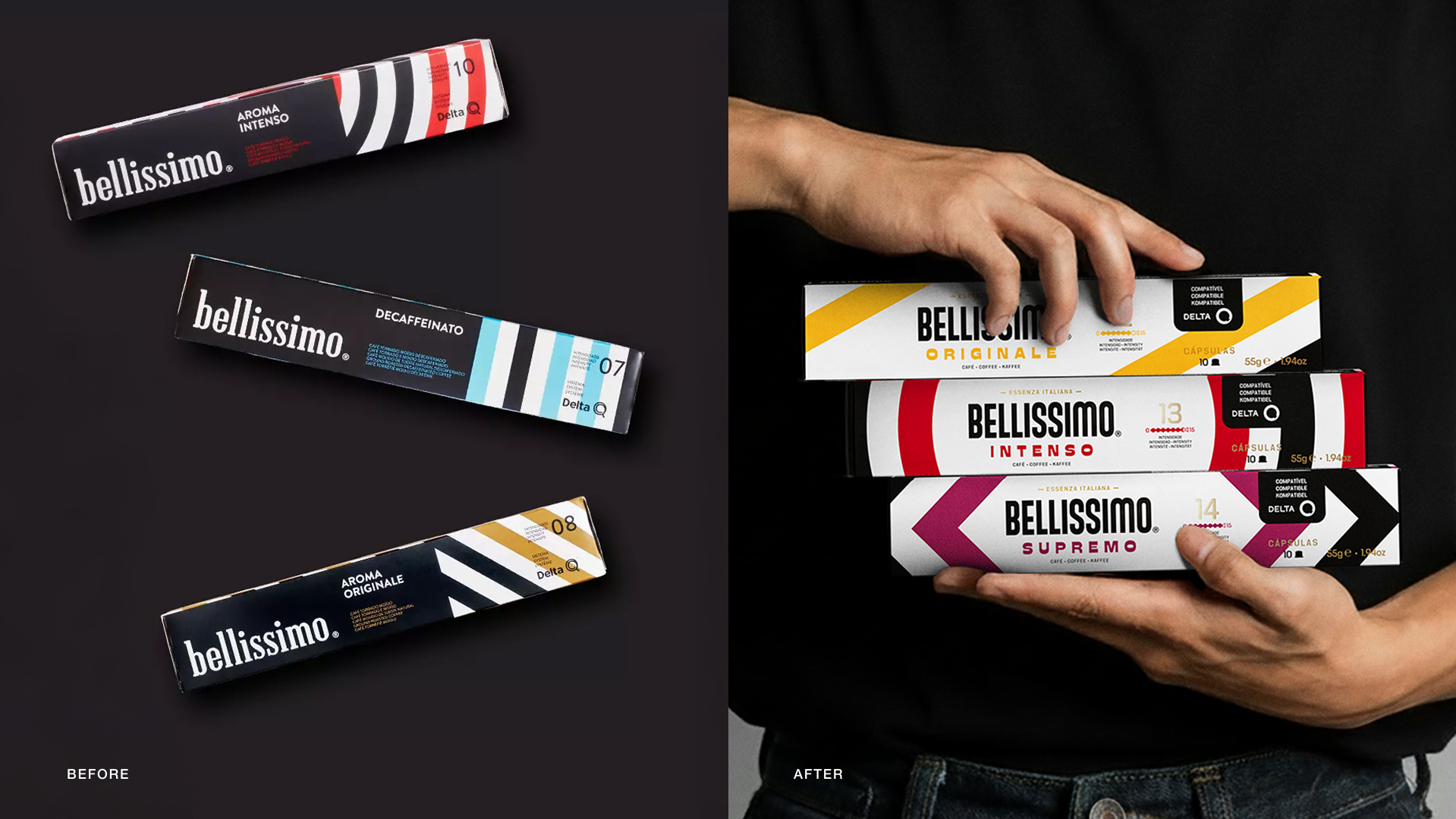
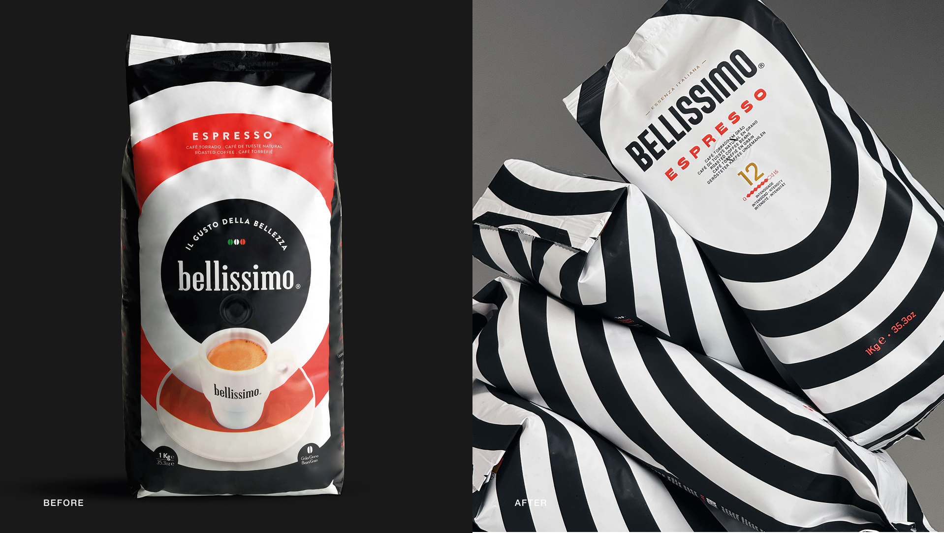
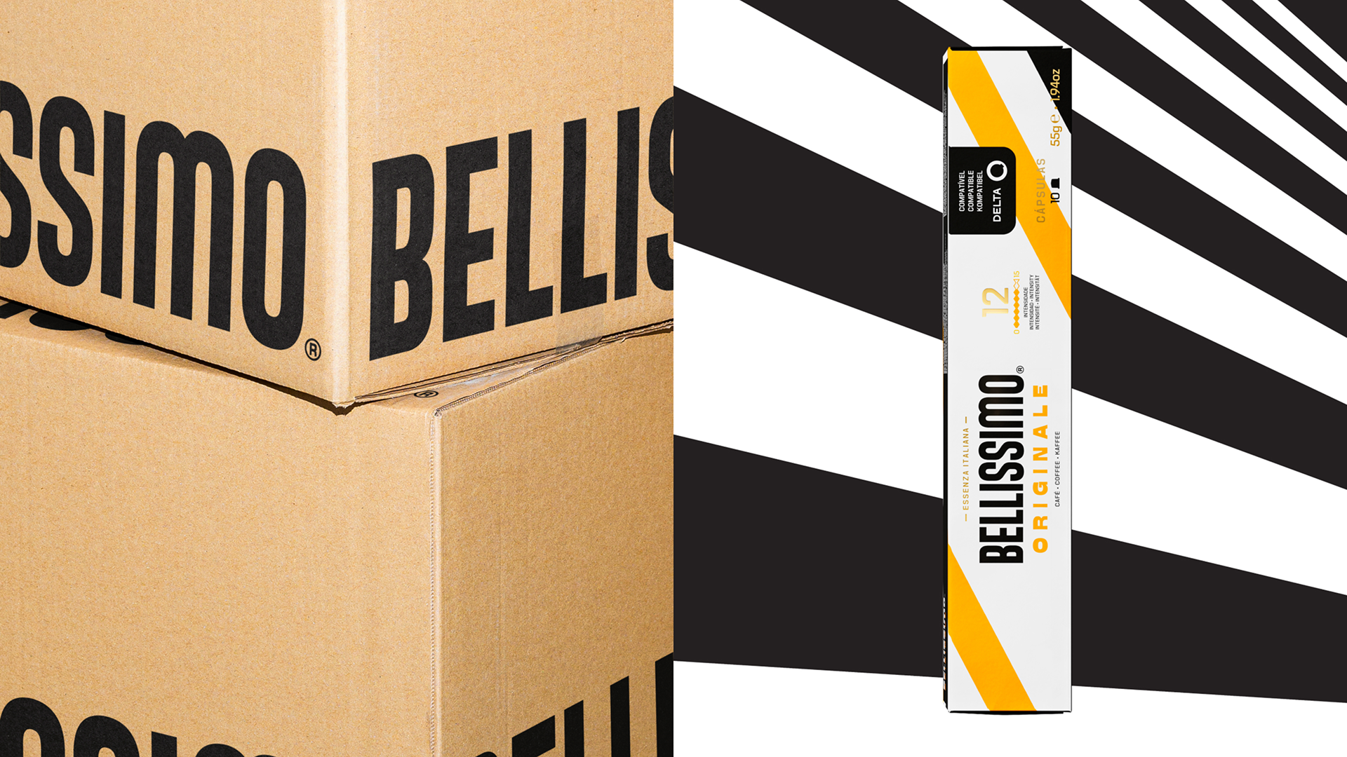
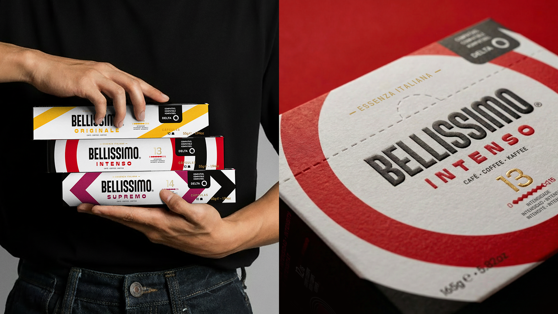
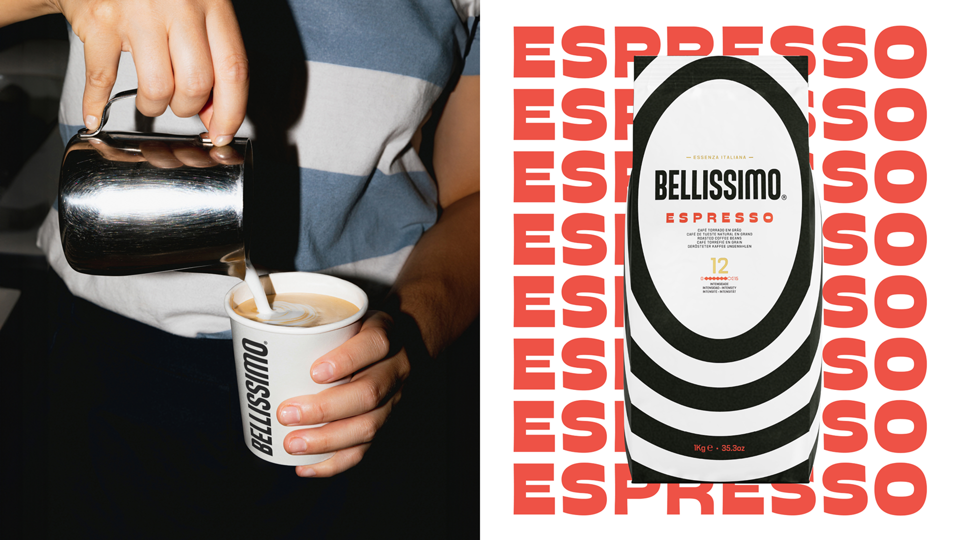
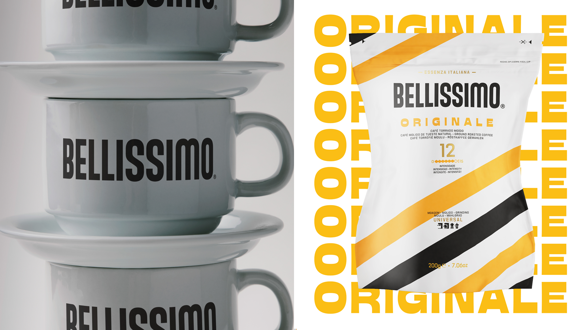
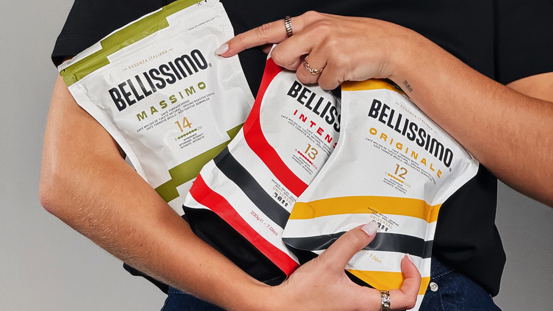
Instead of cliché’s the idea was to express premium quality through a visual language built on consistency, boldness and precision. Each blend was supposed to feel contemporary stylish and full of character, just like the flavors.
The result is a lighter, more premium, and more contemporary expression across the entire range. Variety names and intensity levels now stand out at a glance. A key twist: the use of characterful typography inspired by Italian mid‑century modernism. “We needed to strike the right balance between the brand equity built up over many years and the ambition to make Bellissimo more attractive to new audiences,” says Pedro Vilar, CCO of the Peter Schmidt Group in Lisbon.
According to Mónica Oliveira, Marketing Director Coffee at Grupo Nabeiro, the team achieved exactly that: “The new visual language of Bellissimo aligns with the codes of younger generations while preserving the authenticity and commitment to quality that define us. The brand has become significantly more confident and culturally relevant – standing out in a demanding, highly competitive market.”
A holistic brand approach
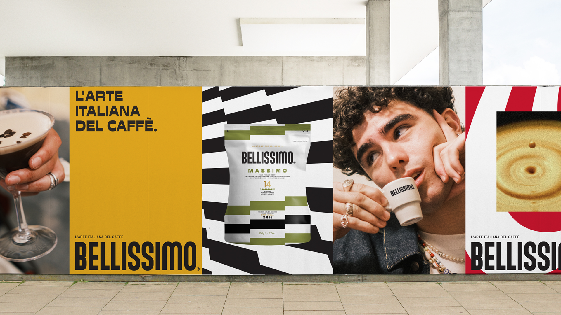
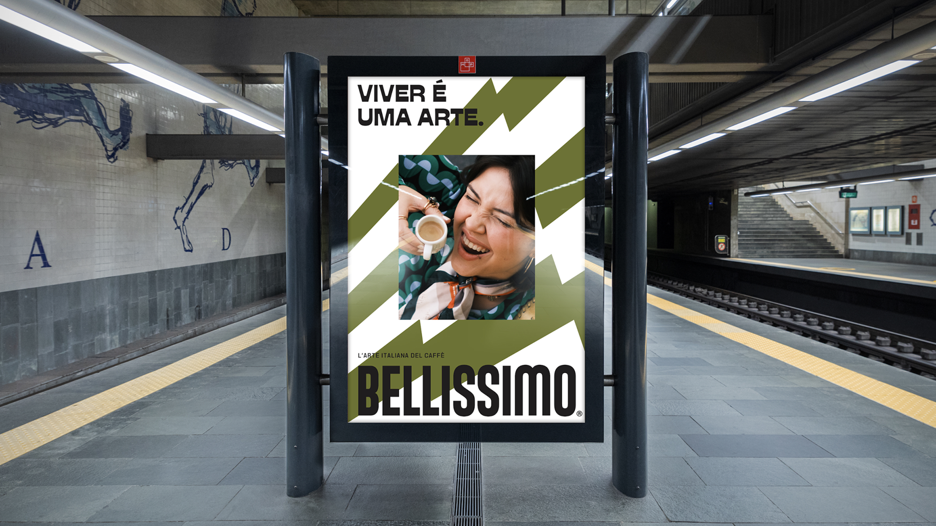
The new look doesn’t just shine on the products – it shapes the brand’s entire communication. The Peter Schmidt Group also developed the multichannel campaign: starting this month, Bellissimo’s graphic patterns are drawing attention on billboards, across social media, in cinemas, and throughout the metro stations of Lisbon and Porto. Dynamic compositions and a visual style rooted in everyday culture give the brand a fresh, youthful energy. The clear message: a brand succeeds when it is conceived holistically – and when packaging is seen as an integral part of its identity.







 lunapanda
 Tridimage
 Analoguecreative
 lettera7
 alchimistestudioParis
 Lana B
 Colossal
 Pivot Studio
 M&A CREATIVE AGENCY
 monther al omari
 Anastasia Cherepanova | xtramez
 Hollóka Grafikai Műhely / Graphic Design Studio
 BOLD branding
 Antonia Skaraki
 Pâmella Lorrany
 Z9BKAdsgn
 Francesco Paternoster
 b1studio.ro
 Chris Creative Works
 Boordon
 Dmitriy Kuzovlev
 Brand Society
 yasharpic