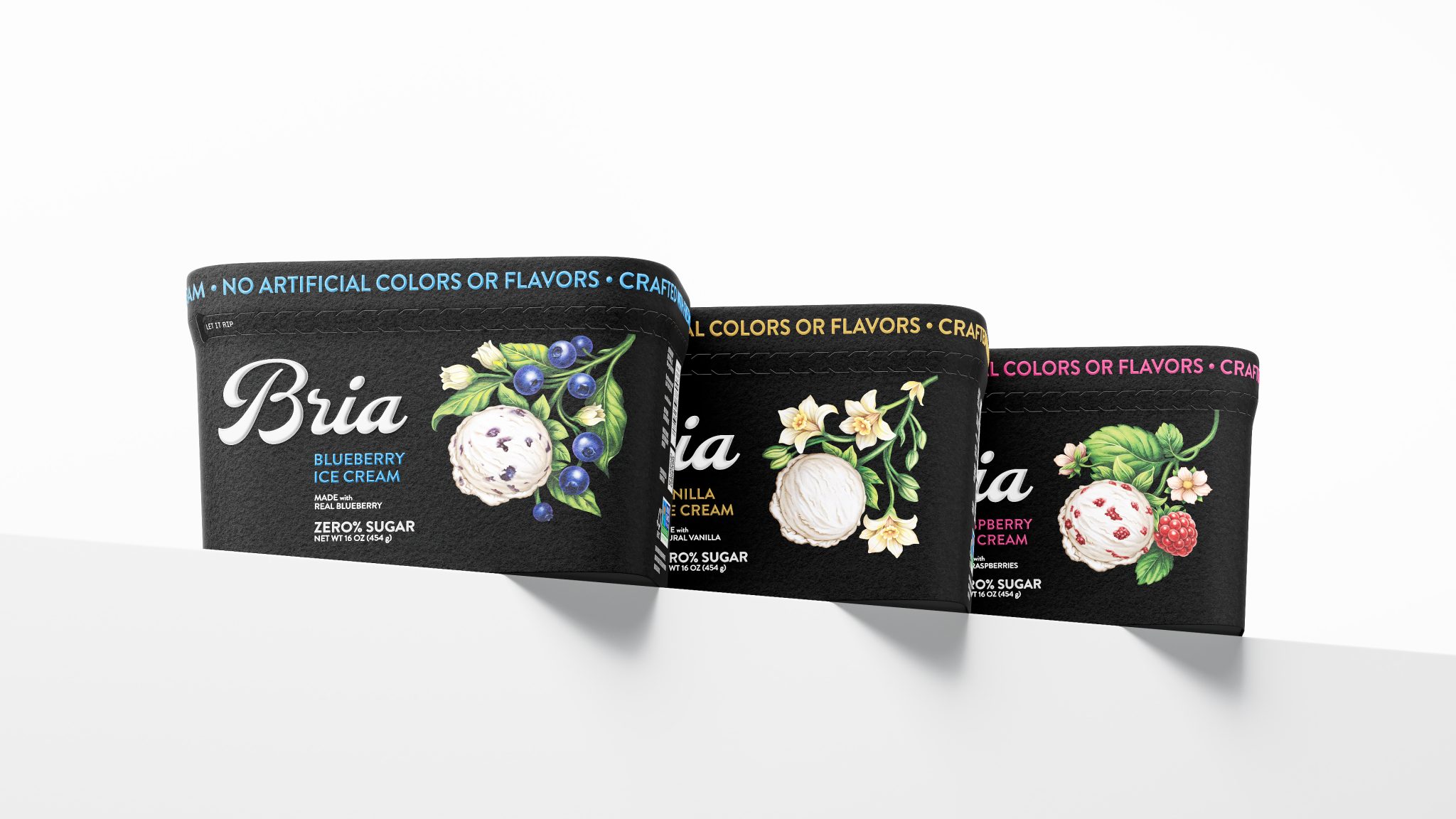

Contrast isn’t a stylistic choice. It’s a strategy.
The ice cream category runs on an unspoken rule: bold colors, rich graphics, maximum
appetite appeal. The shelf is overloaded — every brand is shouting.
Repeating the category’s visual language in that environment doesn’t help you stand out. It makes you disappear. A new product dissolves into the competition and, worse, strengthens the leader: it looks like the original, while everyone else reads as a variation.
That’s why my first question to a client isn’t
“what style?” — it’s “what does the shelf look like?”
The analysis revealed that every player was operating in the same visual register: light, bright, loud. Which meant the point of entry wasn’t amplifying the signal — it was cutting it entirely.
The solution: BLACK PACKAGING.
It’s a risk. Black doesn’t “sell flavor” in any direct sense. But it does something more important — it creates a break. On an overcrowded shelf, it functions like silence in noise. The eye, conditioned to keep scanning, stops. And that moment of pause is exactly where a choice begins.
From there, the packaging has to hold attention: precise ingredient illustration, clean typography, restrained color navigation across flavors.
Not noise — control. Not a promise — confidence.
That shift repositions the product: from mass-market dessert to a considered purchase.
Contrast doesn’t work on its own. It only works within a system: the shelf,
the competition, the buyer’s behavior.
Context isn’t the backdrop. It’s the tool.


 monther al omari
 Ximena Ureta Design Studio.
 vitoramockup
 Up-Brands
 Sophiagdotcom
 Peter said
 ayeidadezigns
 Tancybox
 宏洛图品牌设计HONGLT
 Modern Theory
 Dozen Agency
 Atiq Alam
 Olio Studio
 Ruchi S. Joshi
 mmdesign
 awaiskhadim
 Octasoft
 United Creatives Studio
 Kingdom & Sparrow
 Anastasia Bakhmatskaya
 CreativeWise
 Great and Golden