

Brotherhood emerges as a brand that challenges the dominant logic of performance, speed, and competition within the outdoor space. In a context where exploration is often linked to conquest and individual achievement, it proposes a different narrative: shared experience, personal rhythm, and staying the course.
The core concept is built on a symbolic tension: the hare and the tortoise. This duality is not framed as opposition, but as coexistence. It represents different ways of inhabiting time, where progress is defined not by speed, but by intention. Brotherhood does not celebrate the fastest, but those who endure, accompany, and share.
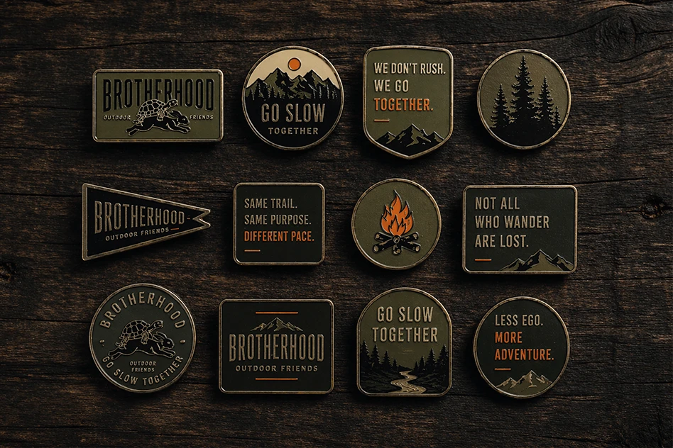
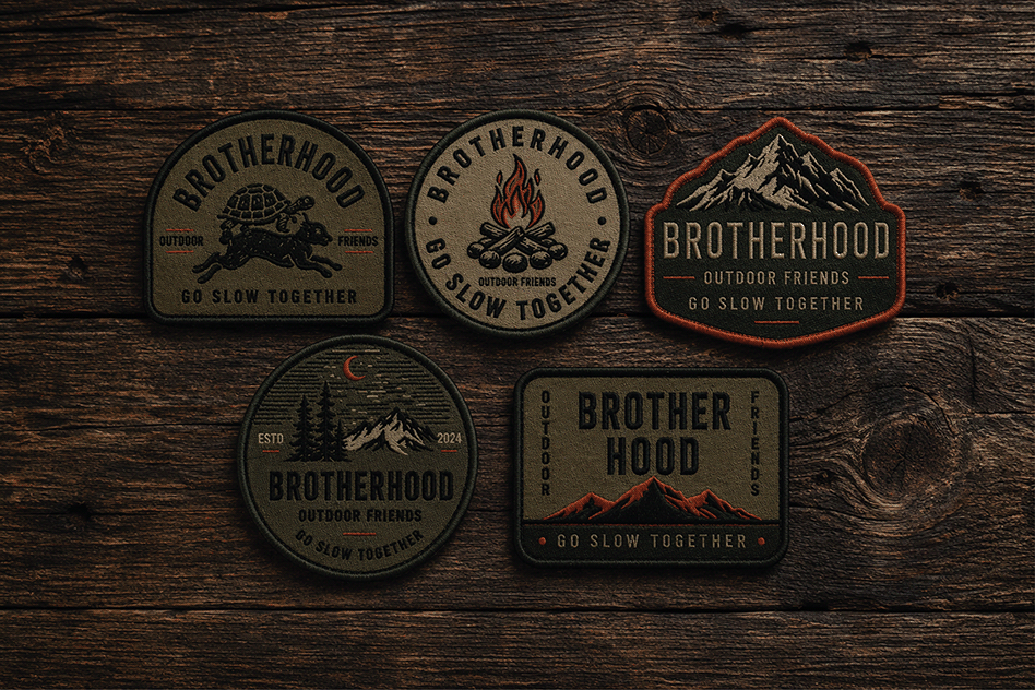
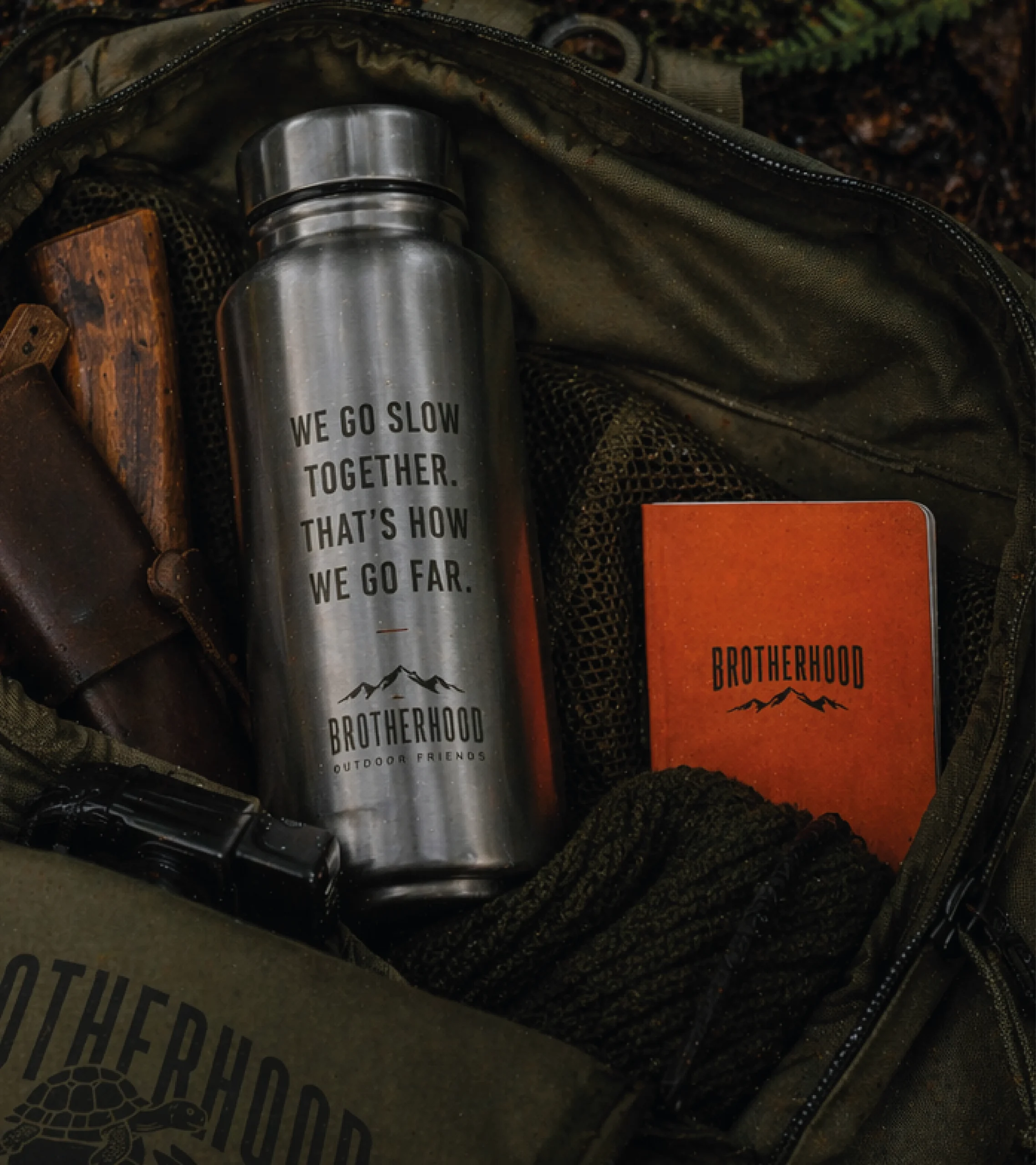
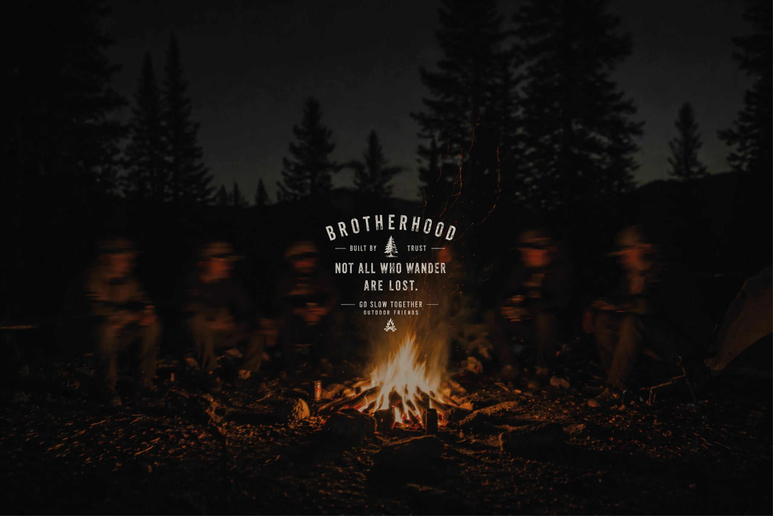
Visually, the brand adopts a sober, tactile, and quiet aesthetic, inspired by traditional outdoor codes and reinterpreted through a contemporary lens. The graphics rely on monochromatic illustration, strong typographic composition, and controlled texture that evokes natural wear, avoiding anything overly decorative or artificially “rustic.”
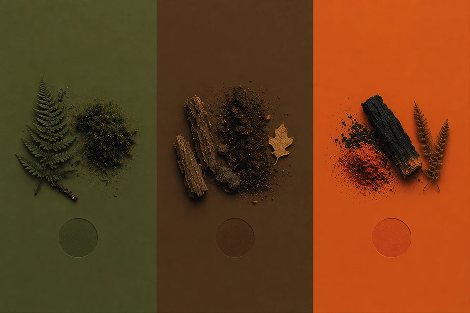
The color palette reinforces this approach: muted greens and earthy tones that connect with the natural environment, contrasted with orange accents, a functional outdoor color that introduces energy within a restrained visual narrative.
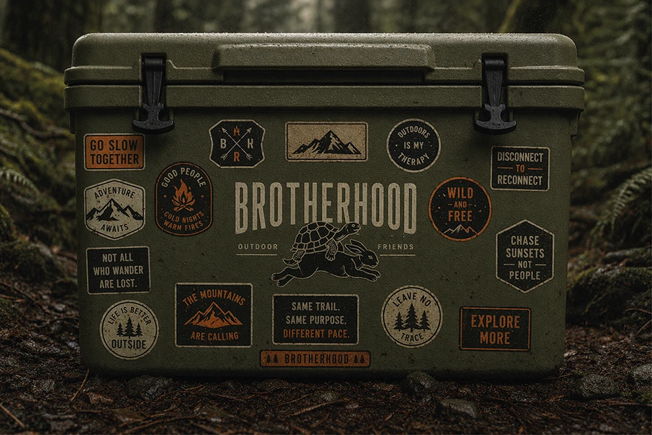
The graphic system expands across multiple applications, patches, pins, apparel, and utilitarian objects, building a cohesive language that reinforces a sense of belonging.
Photography and art direction complete this universe: humid forests, dense landscapes, and diffused light. The brand exists between the intimate and the collective, where the user is not a hero, but a participant.
At its core, Brotherhood is not a traditional outdoor brand. It is a stance: going together matters more than arriving fast.







 Derrick Lin
 Biaa
Biaa Petitmoulin Studio
 White Bear Studio
 Eva Chistyakova
 monther al omari
 Atipus
 alchimistestudioParis
 oneandother
 bloomburo
 helocrene
 Shapers Studio
 Denver Design
 Aidearte
 andrew.huerta
 softmachine
 airobtq
 Buzz & Co.
 Ruby
Ruby themythographer
 IDNB Inc.
 viktorflr
 Zenpack