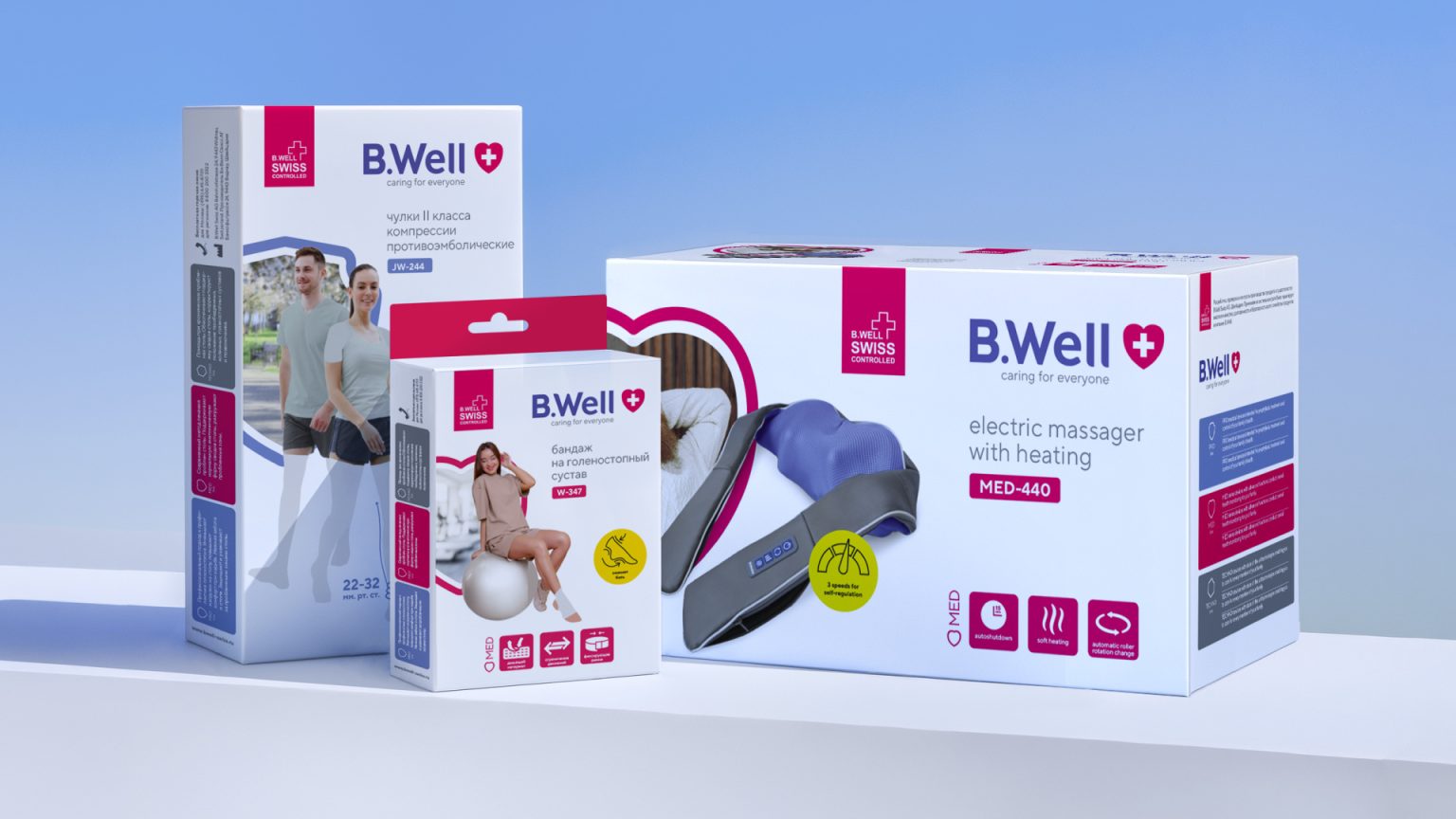

Caring for everyone. B.Well brand packaging update
Client: B.Well Swiss
Task: update the design of the company’s product packaging
The mission of pharmaceutical companies is to care for human health and well-being. But it also strives to care for the pharmacist and the customer when choosing and purchasing the right medication or product. B.Well’s packaging refresh project was driven by precisely this care and support.
B.Well is a brand of medical equipment and orthopedic products. Development, testing, and production control are carried out by the Swiss company B.Well Swiss AG. The company’s Swiss Controlled system guarantees the high quality, durability, and safety of B.Well products.
The brand is widely represented globally, appearing in numerous marketplaces, online stores, and pharmacy chains in Russia and fifty other countries. You probably have some B.Well products at home, from a thermometer or blood pressure monitor to orthopedic insoles.
B.Well Swiss came to us with the goal of further strengthening their position on the pharmacy shelf, solving marketing problems, including with the help of branding and design tools.
The brand has a huge number of products across several product lines. We had to sort it all out, as the work ahead was complex:
- update the design and visually unify the entire product range;
- simplify navigation through product benefits;
- structure the layout and packaging information, and strategically place emphasis to help pharmacists make compelling brand recommendations and to simplify customer selection and purchase;
- strengthen associations with the medical field and the country of origin, Switzerland;
- expand B.Well’s signature photo family by featuring new faces on the packaging.
At the same time, the company had no intention of abandoning the recognizable appearance of its products, and we reworked it with the utmost care.
analysis and recommendations
Before the design stage, we thoroughly analyzed the competitive landscape and visual characteristics of B.Well’s on-shelf counterparts. We identified key approaches and solutions: a predominantly blue and white color scheme, the presence of both monochrome and vibrant, emotional designs, “medical” minimalism, and high-tech.
We also conducted an analysis of the existing B.Well packaging, identifying its main advantages.— a predominantly white palette, but with bright accents;— the use of fairly large and recognizable photographs of the “brand family” inscribed in the signature geometric shapes;— a uniform icon style.
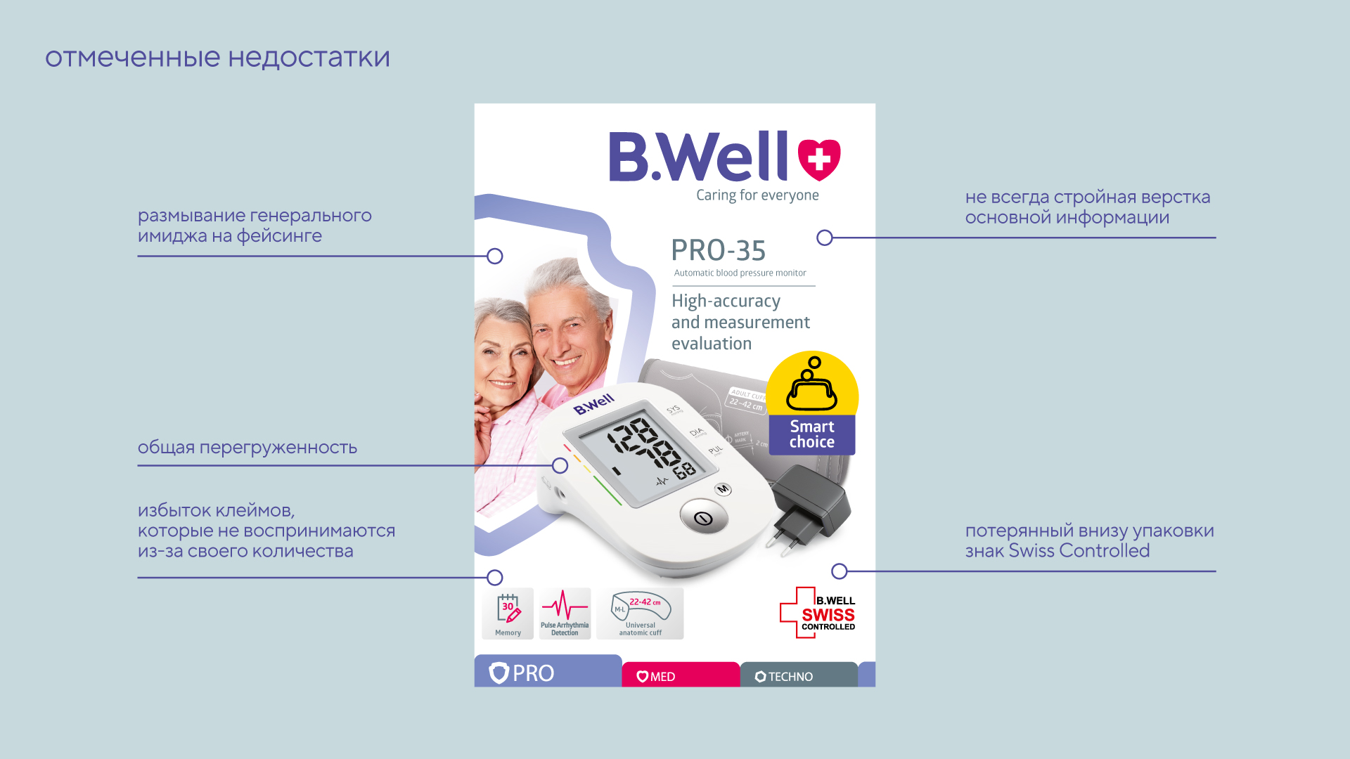
At the same time, we noted a number of points that spoil the impression and could be improved.
As a conclusion, we recommended to the client the main possible changes – the design and placement of stamps, the layout of the side edges and the back of the packaging, the design of the SKU block (product name and model.
All this is done while maintaining maximum design continuity, a consistent brand image – with emotional messages of care, protection, simplicity and accessibility – as well as the overall perception of the design as familiar and recognizable.
development of the design concept
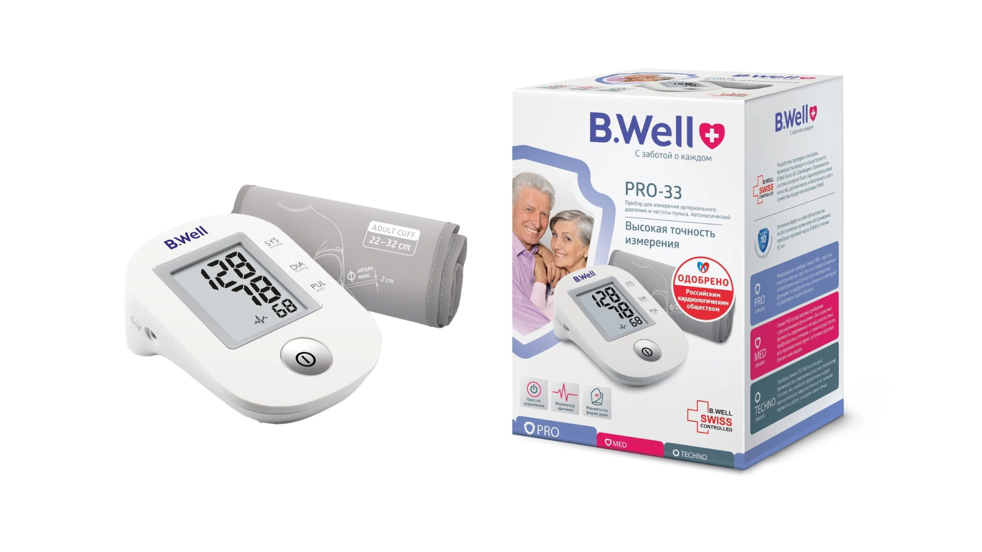
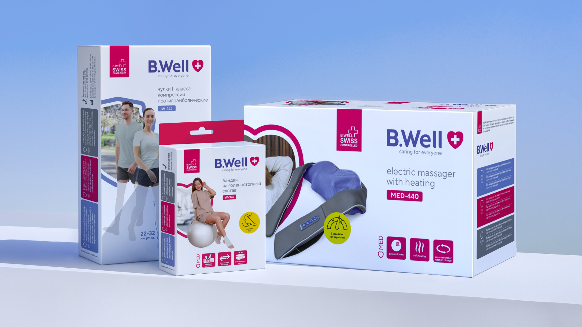
We started by carefully adjusting the brand block: we aligned the tagline to the right edge of the logo, updated its font to make it more consistent with the logo, and increased the heart symbol to the height of the brand block.
The Swiss Controlled seal has been elevated to the top of the packaging, within the overall branding area, drawing attention to it. The contrasting background on which this seal is located makes it a bright, noticeable label—a sign of quality and Swiss manufacturing.
The product name layout has been streamlined (a new font has been chosen, unnecessary lines have been removed, and the model name has been made a separate entity): now customers immediately understand the specific product in front of them, and pharmacists can easily find the right model.
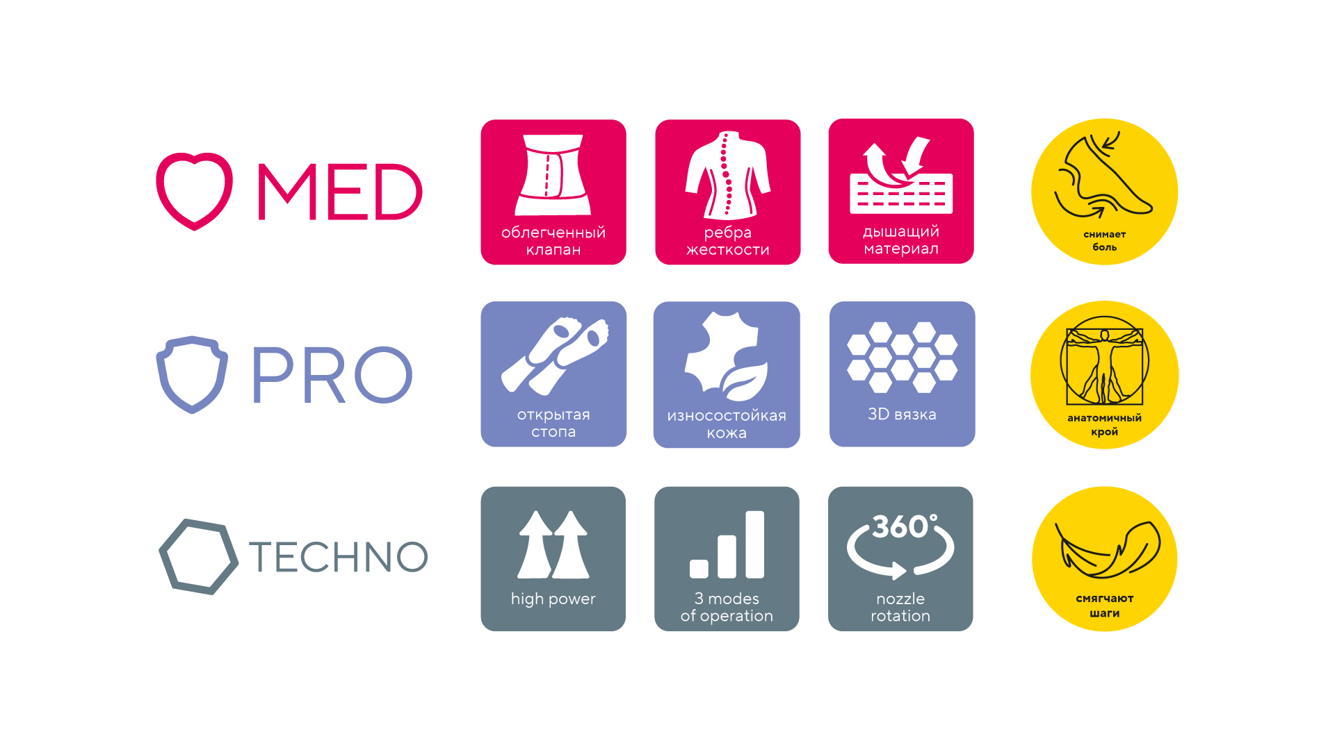
We cleared the bottom area of excessive text and made the product line names (PRO, MED, TECHNO) a sort of header for a row of pictograms illustrating product features, strengthening the informational integrity of the row.
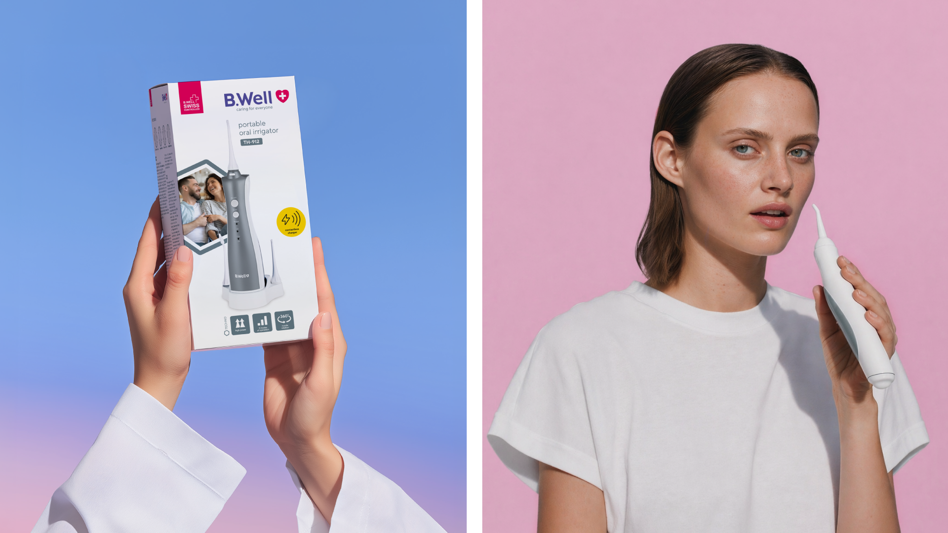
We also created space for a key icon in the brand’s yellow color, highlighting the product’s most important feature: it is now located next to the product image. This way, we draw special attention to both the icon and the product.
We also proposed a refreshed approach to B.Well’s photo style. Instead of static characters looking at the camera, we feature people in a more natural setting, against a simulated but identifiable backdrop, with lively emotions, and from interesting angles. All this refreshes the image, makes the design more modern and dynamic, and emphasizes the company’s values.
The layout of all aspects of the packaging was also reworked. We^
- uniformed the placement of logos and the principle of forming the brand zone in the packaging header;
- placed color and graphic accents on the information blocks;
- removed the duplicate shield symbol in the background, making the entire information space clearer;
- emphasized functions with additional bars.
resume
As a result of painstaking, thorough redesign, the B.Well packaging design has become cleaner, more structured, lighter, and more focused on important information blocks.
This update wasn’t cosmetic, but strategic. It addressed the challenges of attracting and expanding the audience and differentiating itself in the market. B.Well maintained its reputation as a brand of reliable medical products, while becoming perceived as more modern, user-friendly, and focused on the everyday needs of a healthy lifestyle.
The entire project reflected the global trend towards the convergence of medical and consumer technologies (Health & Wellness Tech), where design and user experience support play a key role in customer choice.




 monther al omari
 Alexander Skurihin
 Studio K95
 ARMBRAND
 Richa Rai
 houseoferas by Miti
 Agence des Coteaux
 Kushi Eaknath
 Ann Treasa
 Xiao Ning
 krrrrrllii
 babyage
 Deep
Deep Atiq Alam
 TUERCA Studio
 neo creative studio
 Pinot Agency
 Pixels Studio
 Anastasia Cherepanova | xtramez
 awaiskhadim
 Studio Be Design
 Belova Oksana