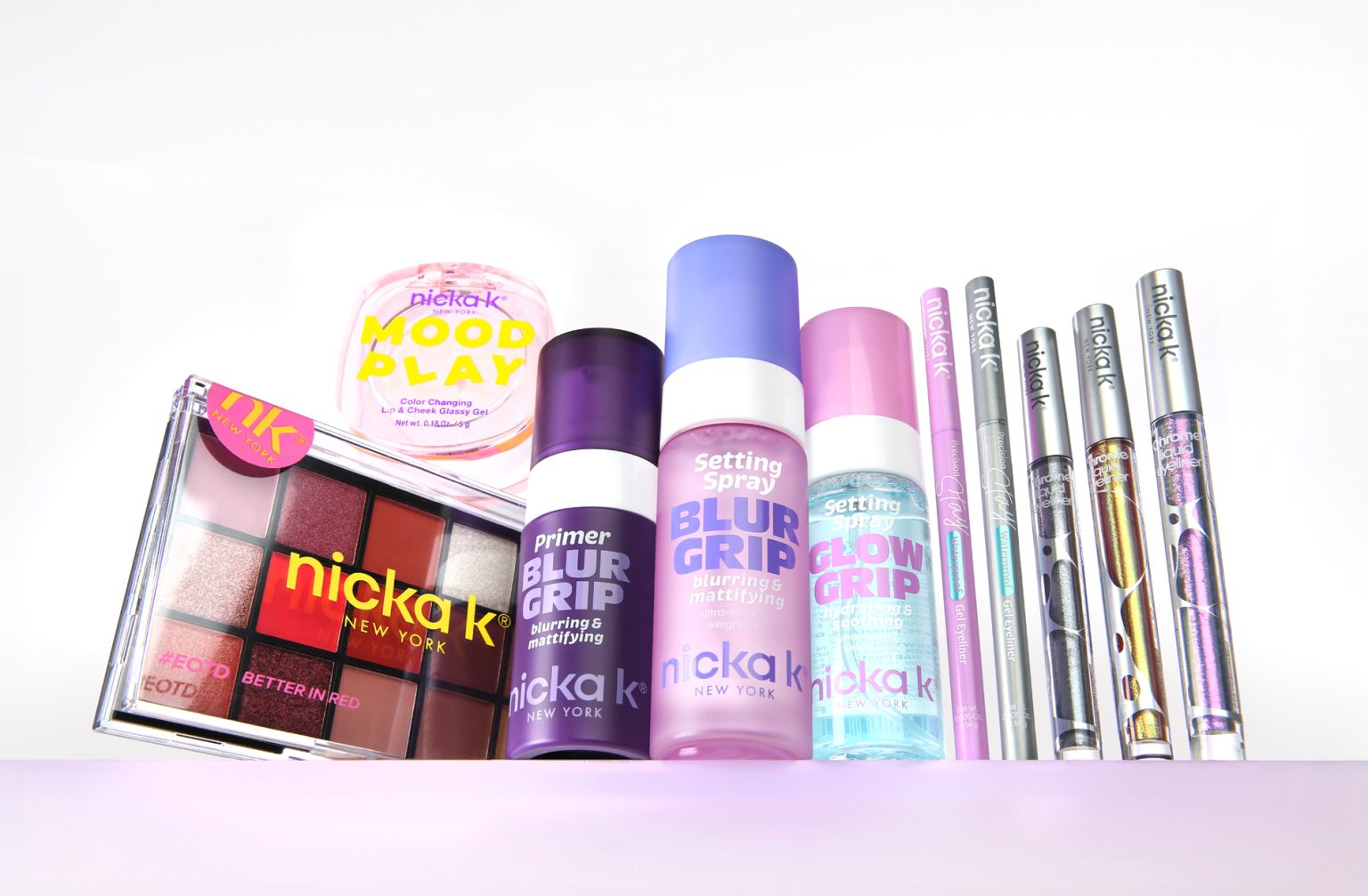

A complete rebranding of a 30-year-old beauty brand, redefining its identity through a unified packaging system.
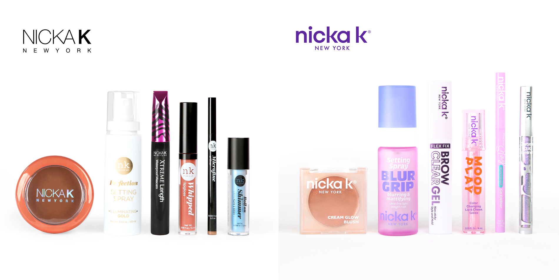
Nicka K New York is a heritage beauty brand rooted in New York’s multicultural beauty supply market. Known for its accessibility and broad product range, the brand had evolved with a fragmented visual identity and limited shelf distinction.
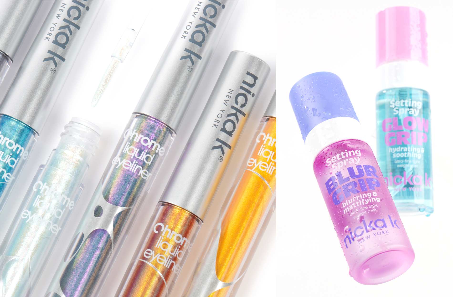
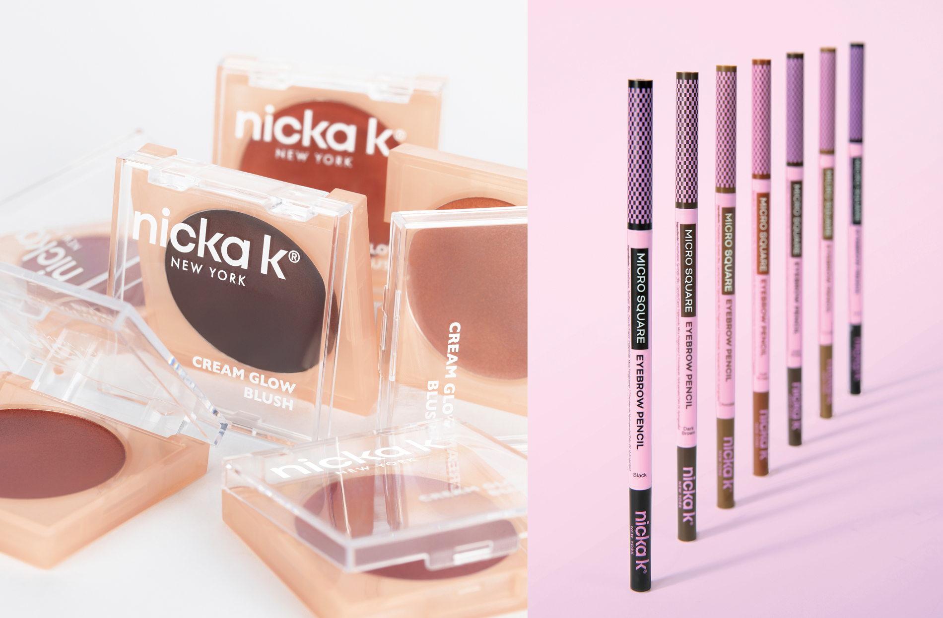
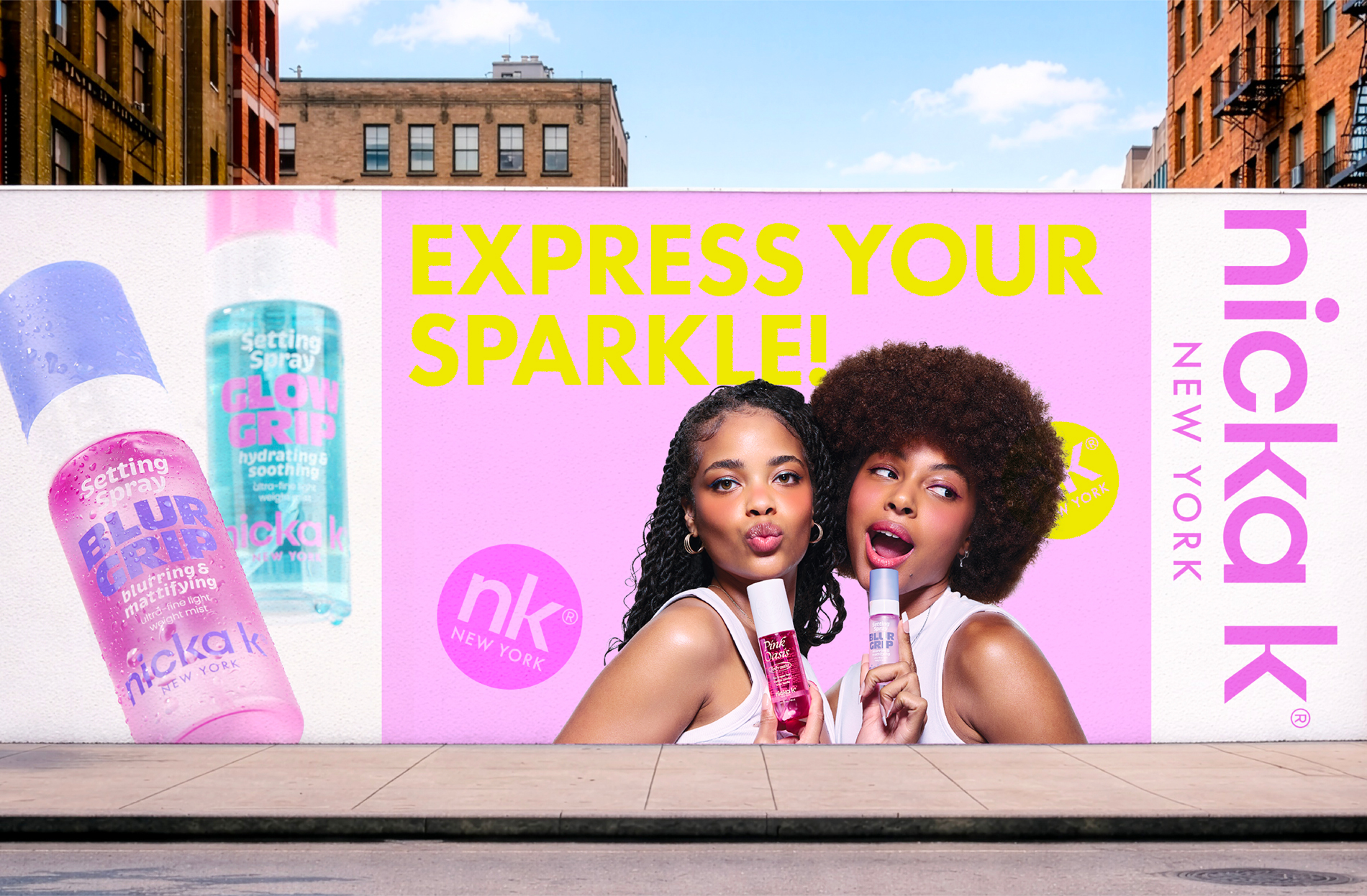
The rebrand introduces a cohesive and modern system designed to unify diverse product categories while strengthening retail presence. A signature purple palette expresses individuality and cultural diversity, paired with silver metallic accents to elevate perception and convey confidence. Transparent elements highlight product clarity and reinforce trust.
Typography was refined to balance product communication and brand identity, allowing each line to maintain its own character within a unified structure. Subtle variations enhance shelf impact and improve navigation across categories.
The result is a flexible packaging system that improves visibility, strengthens brand recognition, and connects with a younger, trend-driven audience repositioning Nicka K as a contemporary and expressive beauty brand.
Creative Direction by Hailey Yoon.
 monther al omari
 Ximena Ureta Design Studio.
 vitoramockup
 Up-Brands
 Sophiagdotcom
 Peter said
 ayeidadezigns
 Tancybox
 宏洛图品牌设计HONGLT
 Modern Theory
 Dozen Agency
 Atiq Alam
 Olio Studio
 Ruchi S. Joshi
 mmdesign
 awaiskhadim
 Octasoft
 United Creatives Studio
 Kingdom & Sparrow
 Anastasia Bakhmatskaya
 CreativeWise
 Great and Golden