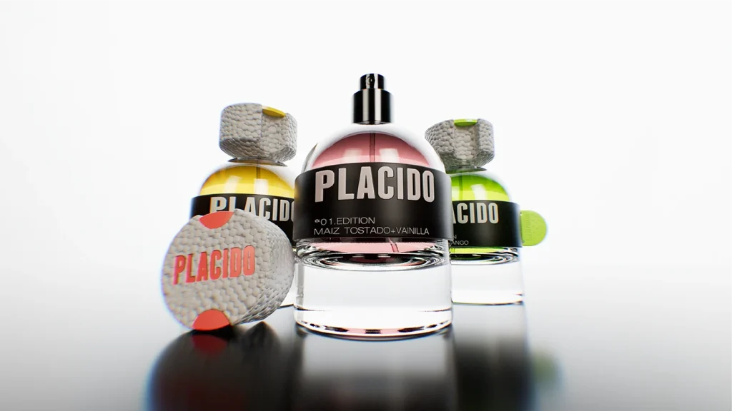

We designed PLÁCIDO as a graphic system. A brand built through composition, where scents guided the visual direction.
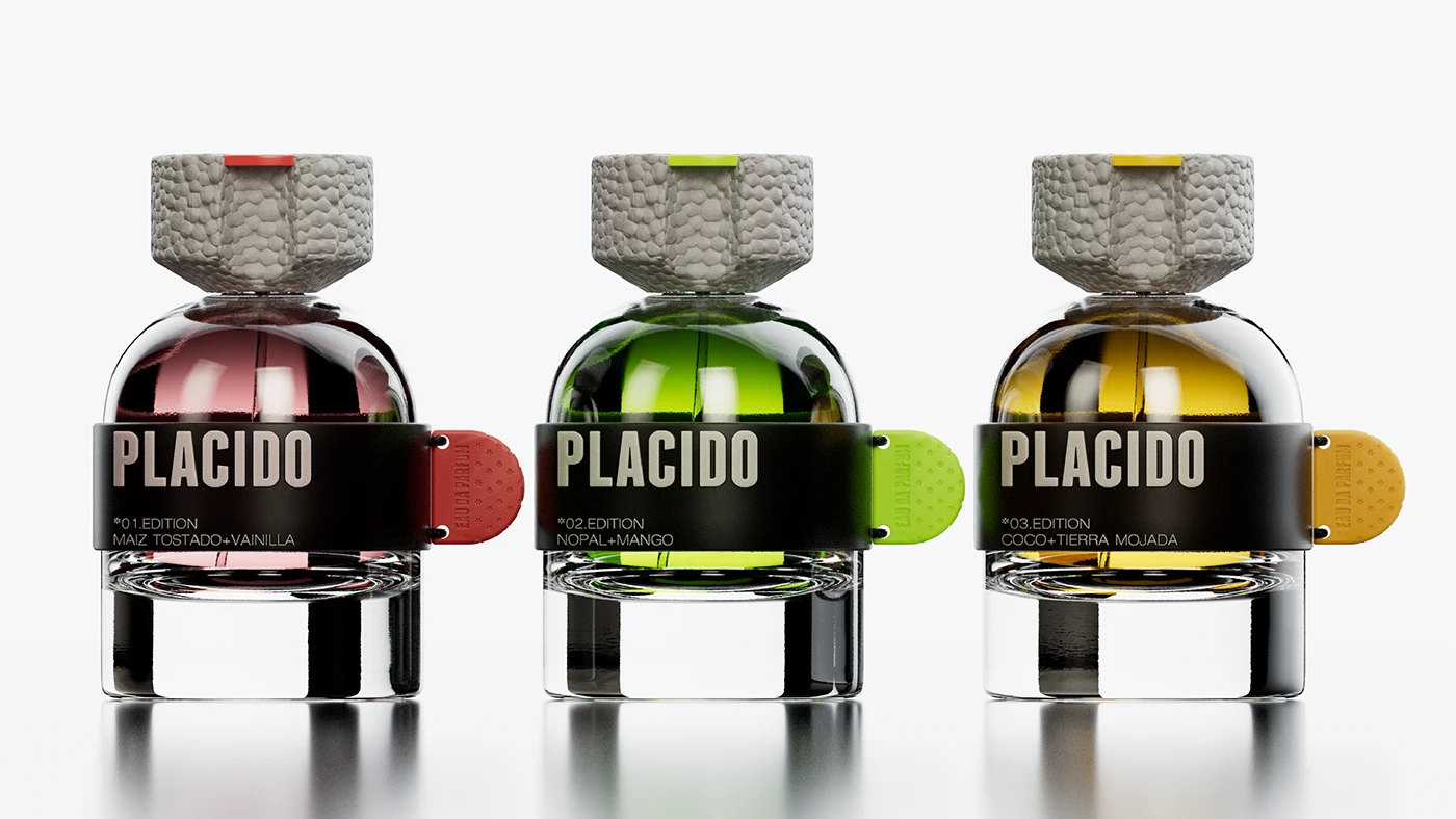
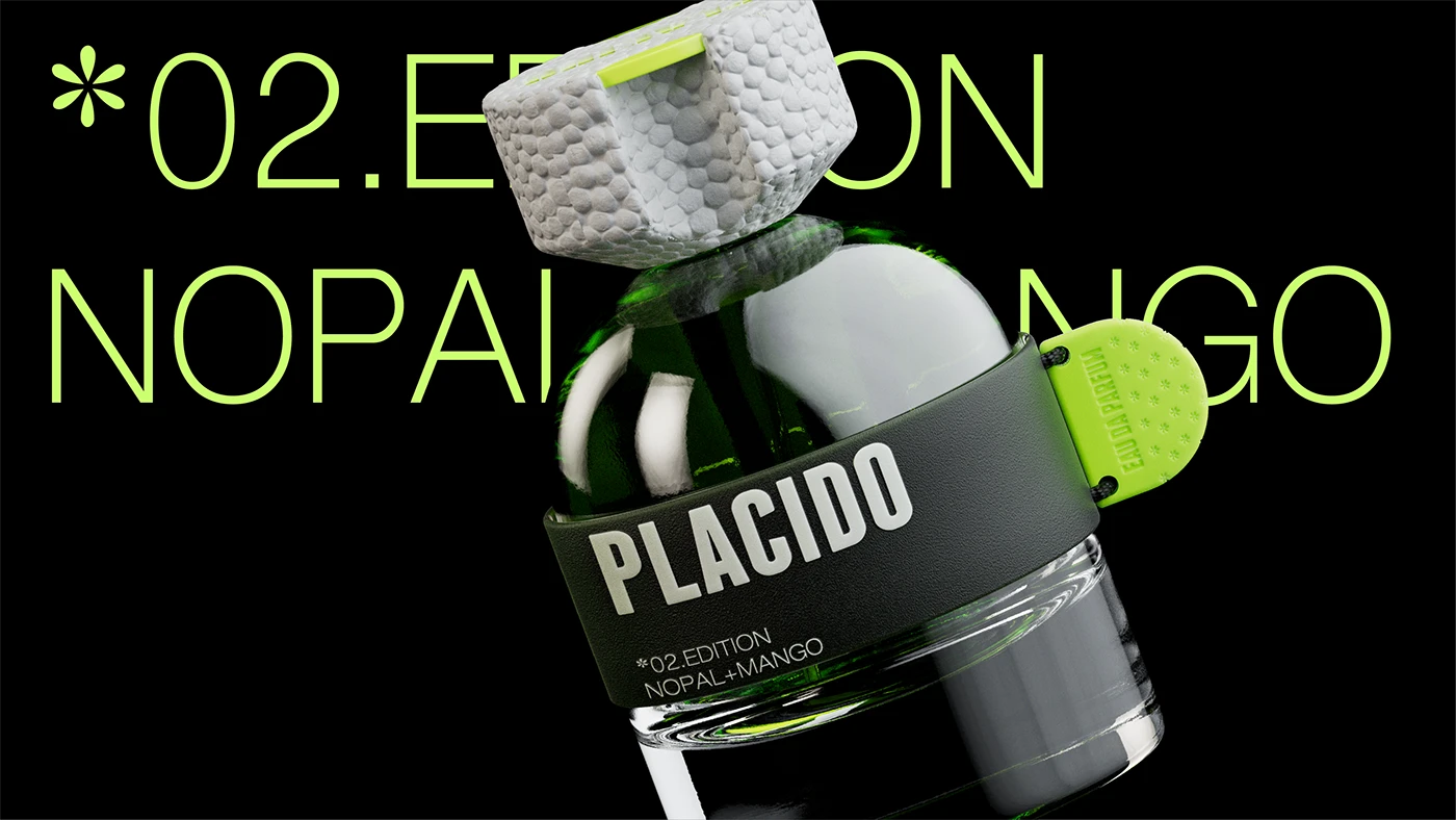
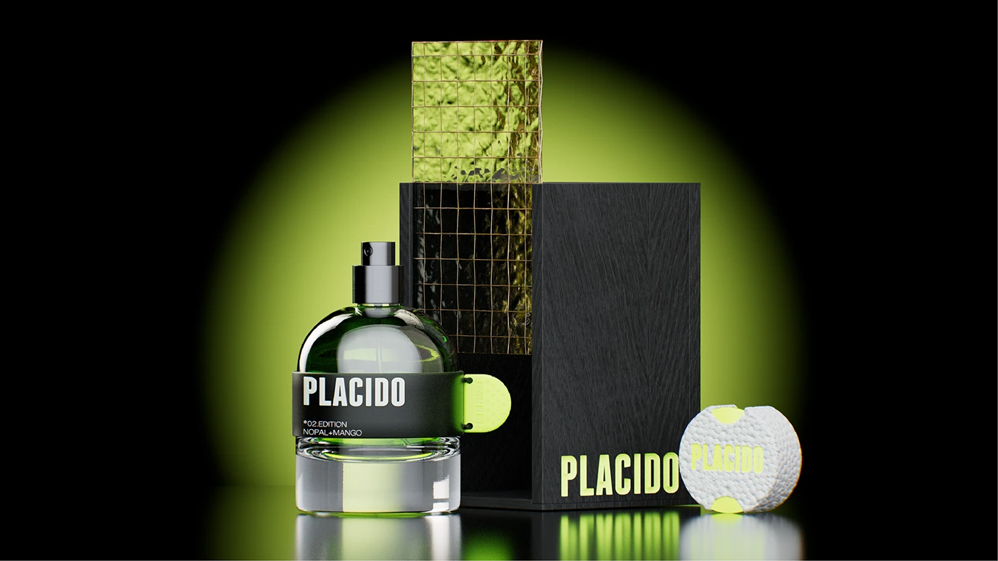
Each edition is a controlled variation: color, scent, and packaging respond to the same graphic and logical structure.
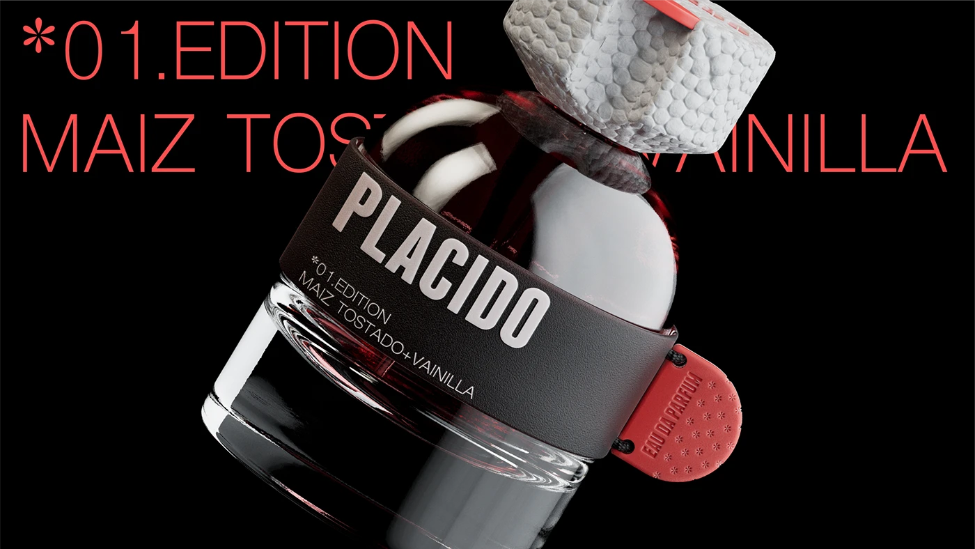
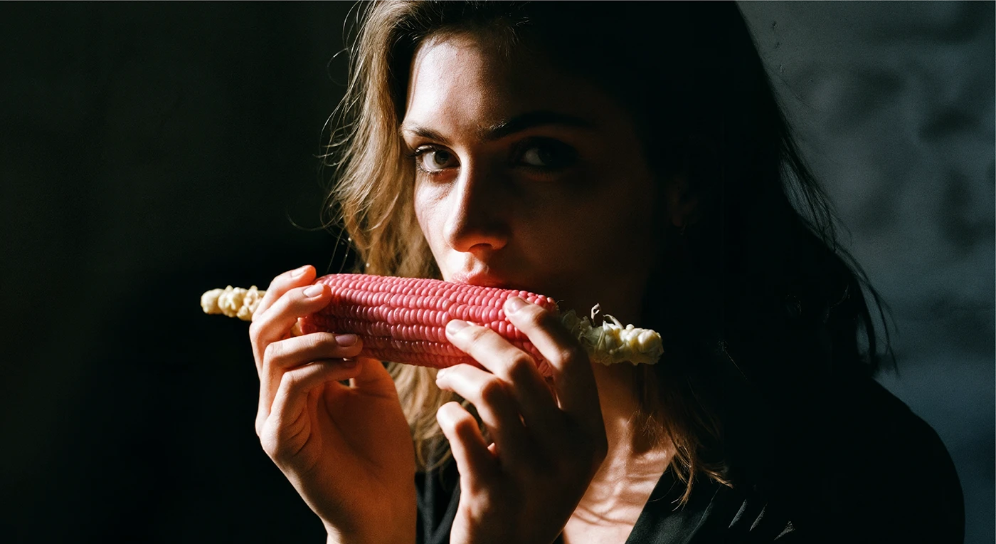
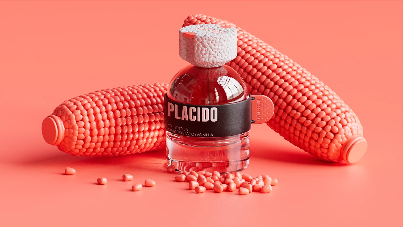
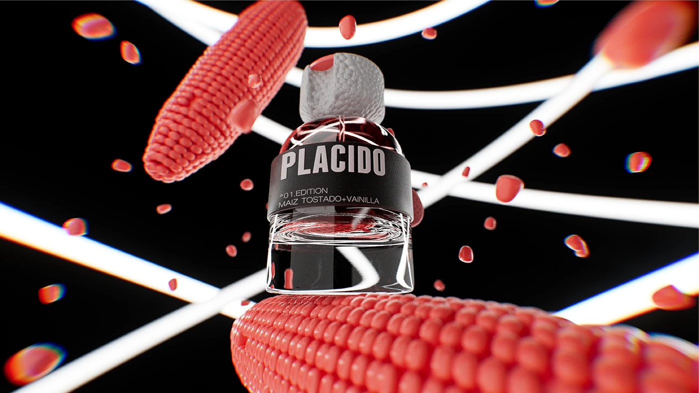
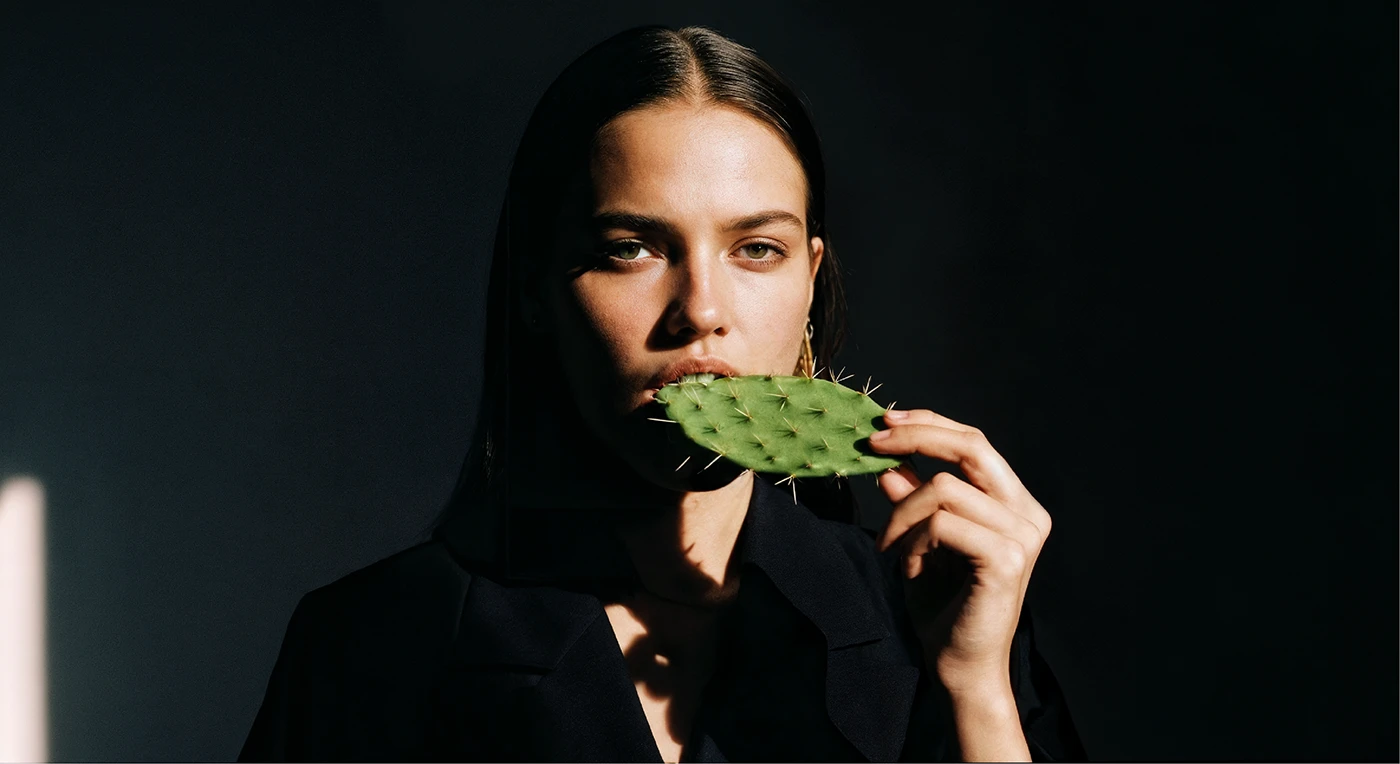
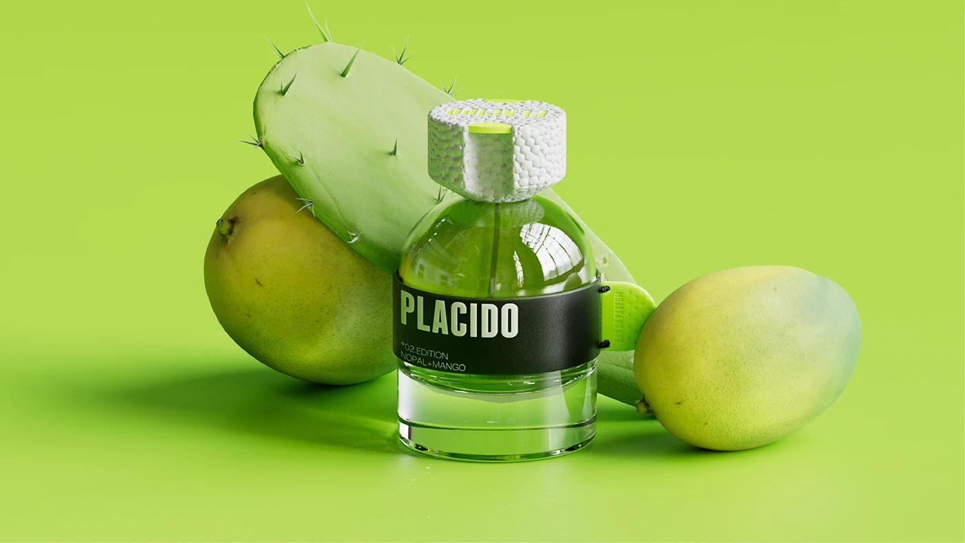
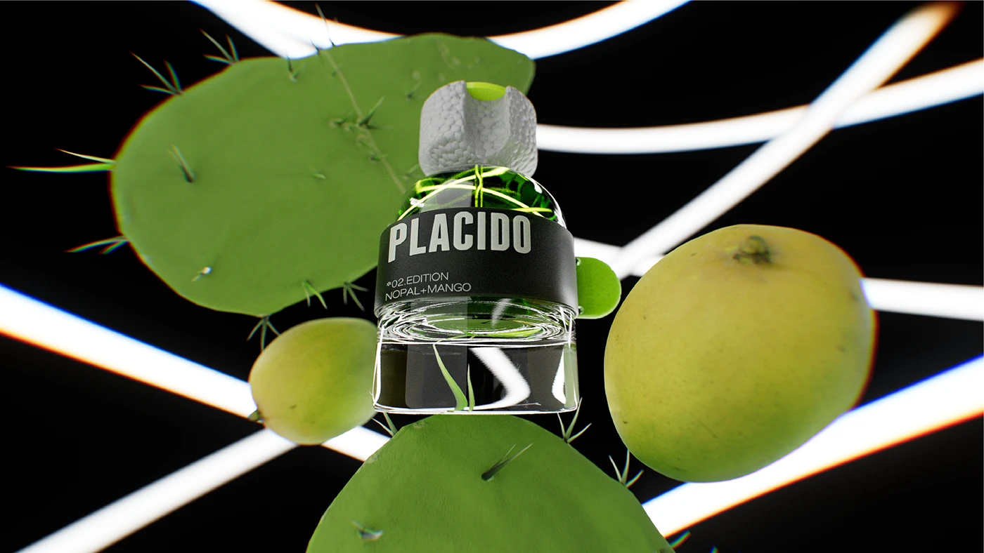
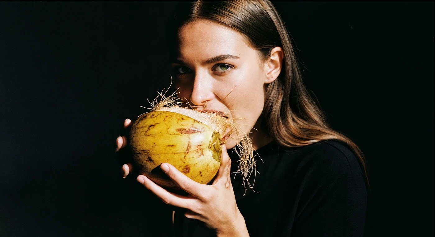
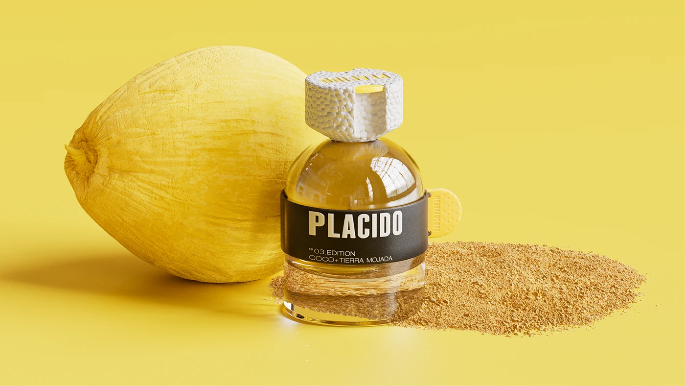
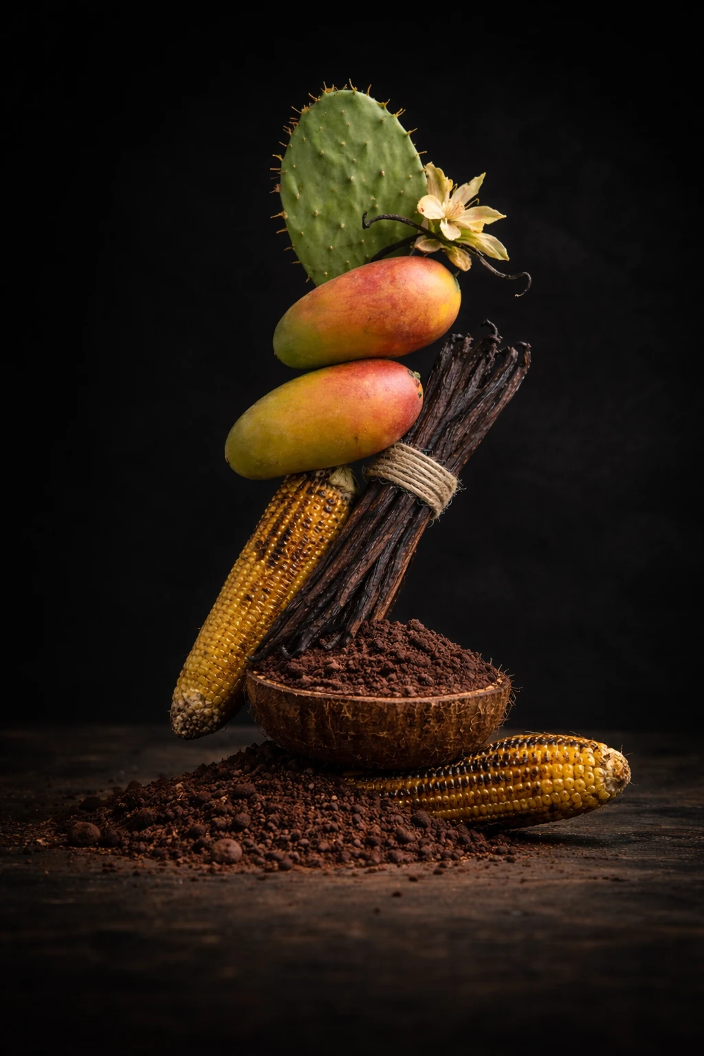
PLÁCIDO is a conceptual perfume that plays with contrast: mango with cactus, coconut with wet earth, toasted corn with vanilla. Scents that wouldn’t normally coexist, yet find balance together.
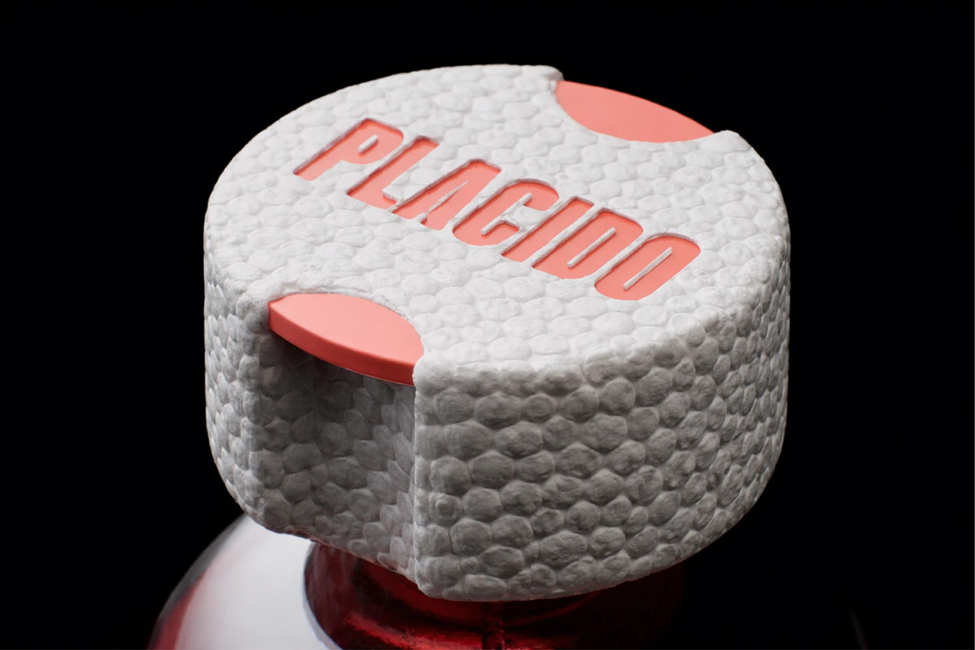
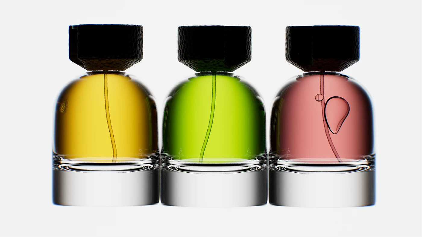
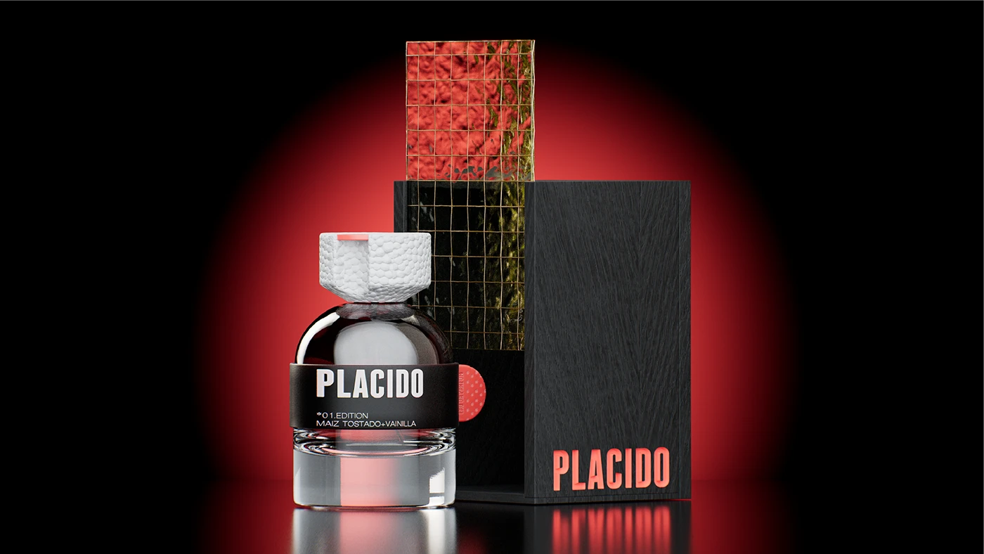
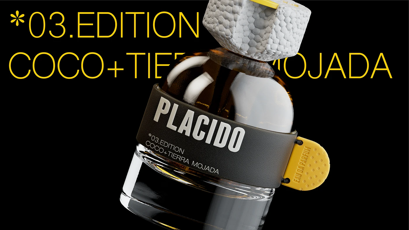
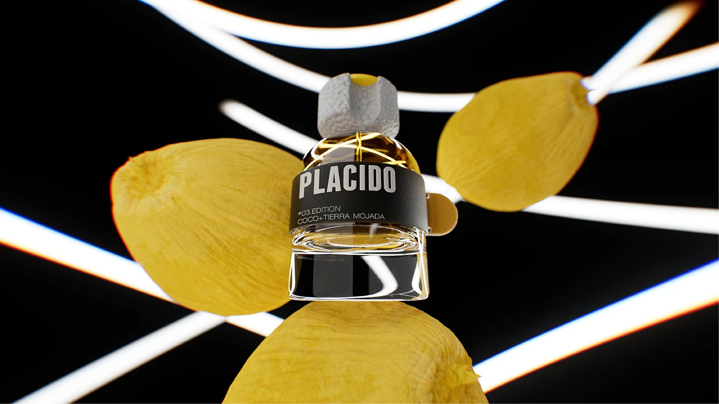
The bottle starts from a classic, clean, and restrained base, contrasted by a more industrial and tactile cap.
This material and visual tension reinforces the core idea of the brand: the extrapolation of concepts that, when combined, create something new.
Curator’s Insight – Contrast as a design system.
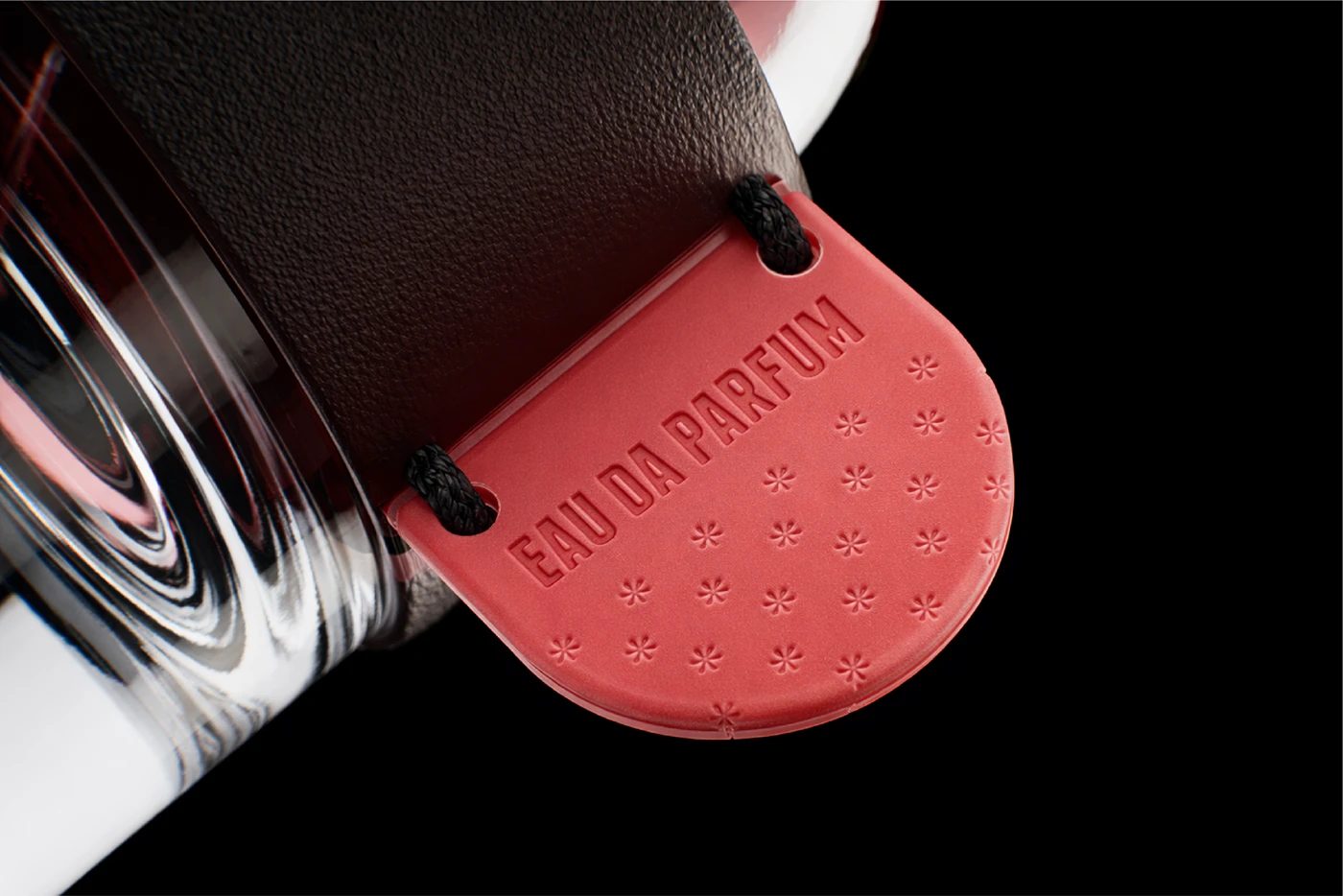
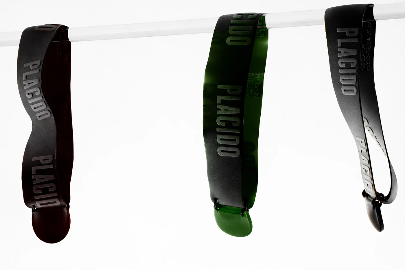
Plácido is built on the tension between opposites: mango with cactus, coconut with wet earth, toasted corn with vanilla. That same logic runs through the packaging. A clean, dome-shaped glass base meets a chunky industrial cap with a raw, tactile surface, and a colour-coded leather tab is the only thing differentiating each of the three editions. The bottle doesn’t describe the scent so much as embody its logic: two things that shouldn’t work together, held in careful balance.
 krrrrrllii
 babyage
 Deep
Deep monther al omari
 Atiq Alam
 TUERCA Studio
 neo creative studio
 Pinot Agency
 Pixels Studio
 Anastasia Cherepanova | xtramez
 awaiskhadim
 Studio Be Design
 Belova Oksana
 We Craft Studio
 ArtDesignByDIna
 Ananya Taran
 Nadezhda Gorelikova
 orhanirmaktasarim
 WillBe
 43oz
43oz Rosario Lo Iacono
 alchimistestudioParis
 Ebbi
Ebbi