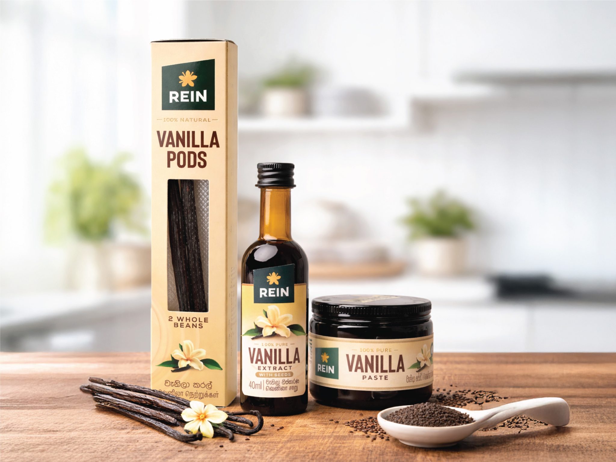

The packaging design development for Rein Vanilla focuses on bridging the gap between raw botanical origins and a premium culinary experience. The primary objective was to establish a visual identity that feels both artisanally authentic and scientifically pure, targeting a consumer who values the integrity of 100% natural ingredients.
Visual Identity and Colour Palette
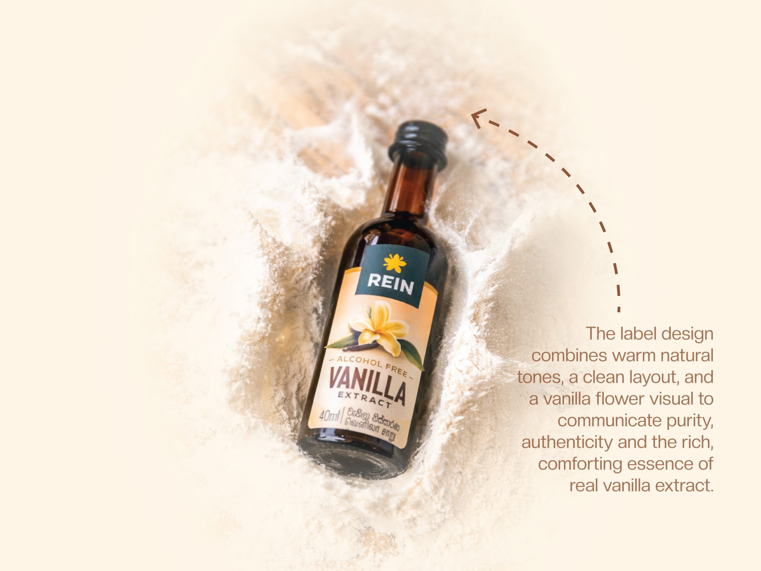
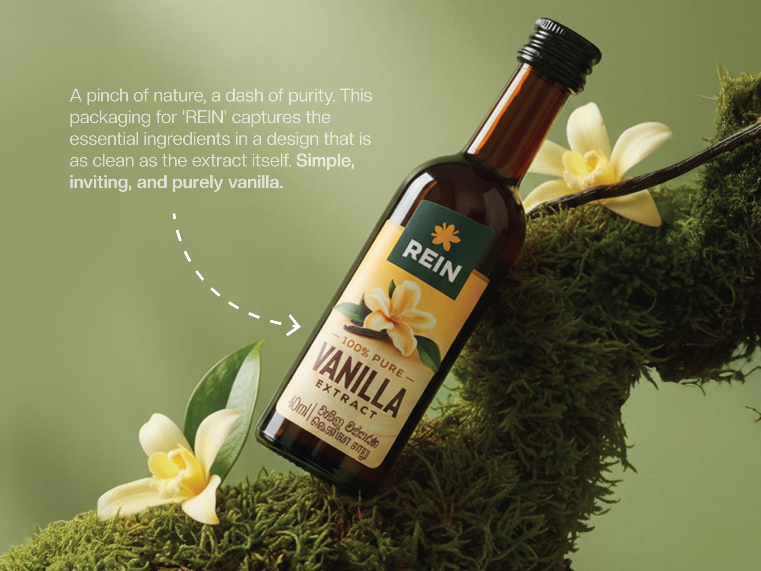
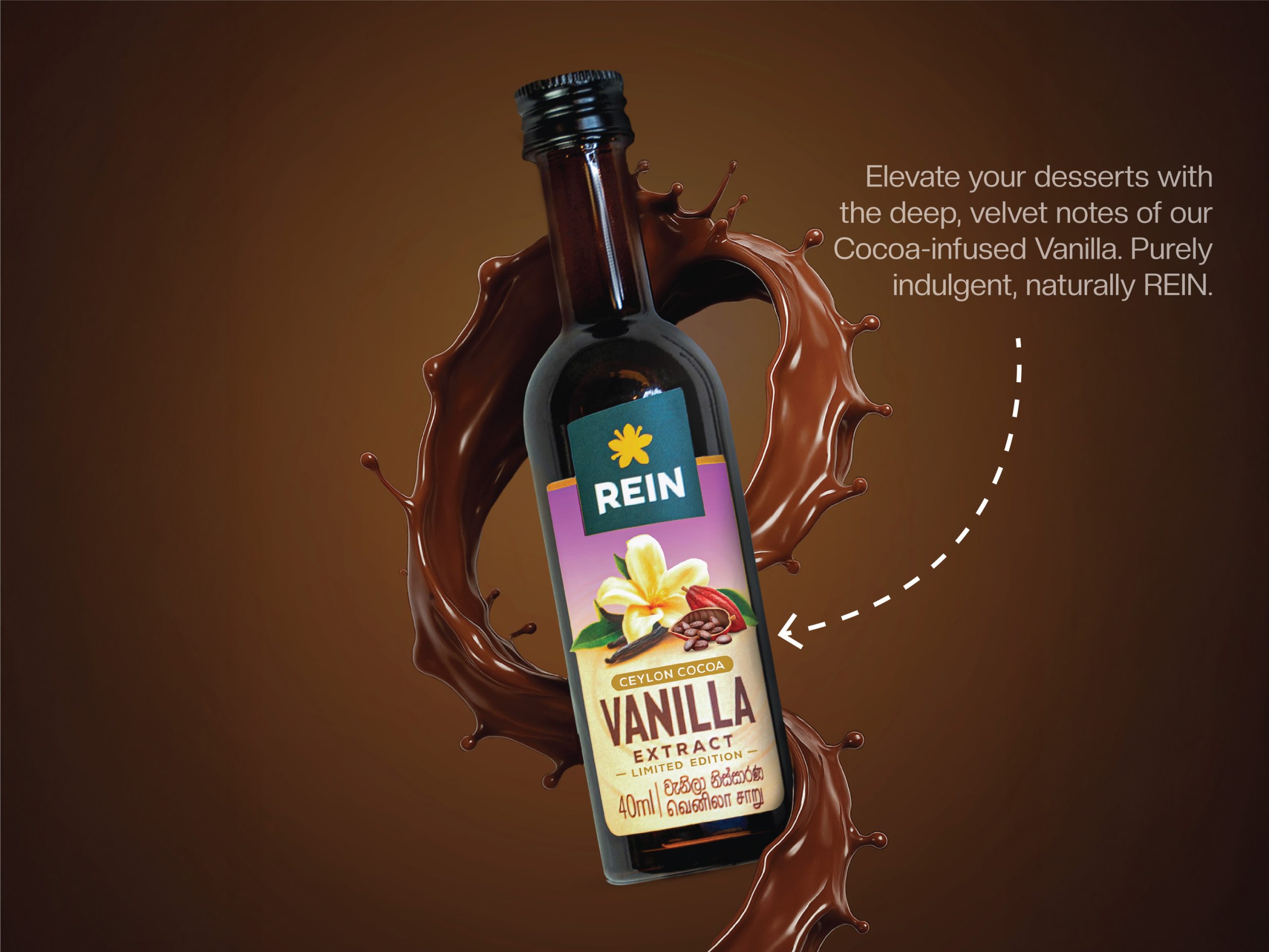
The development began with a farm to pantry philosophy. A warm cream toned background was used for the primary labels to evoke the natural colour of the vanilla orchid’s petals, intentionally moving away from the stark white often seen in industrial products. This is contrasted with a deep forest green in the logo block, symbolizing the lush tropical vines where vanilla pods are harvested. This earthy palette reinforces the brand’s commitment to nature while providing a strong and legible foundation for typography. To differentiate variants, a subtle gradient is introduced at the top of the pack. The original variant carries a soft yellow tone while the chocolate variant introduces a rich purple, allowing for clear distinction while maintaining overall brand harmony.
Structural Design and Typography
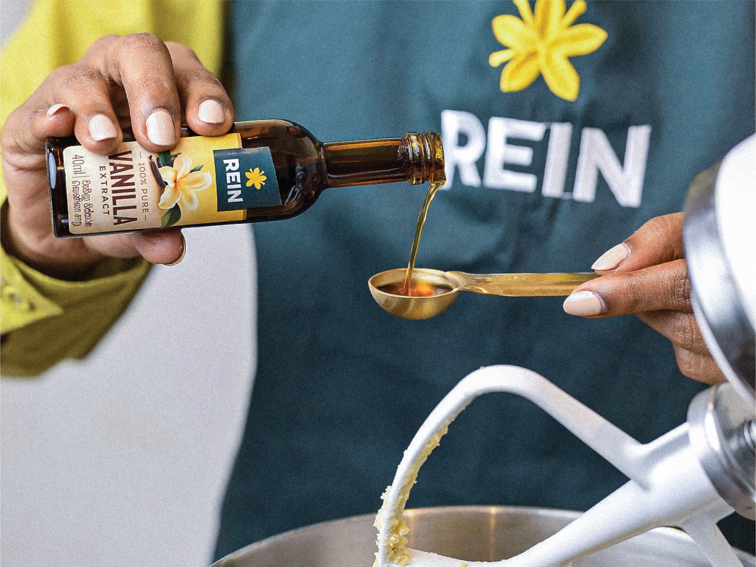
The packaging hierarchy utilizes a refined mix of bold serif typography for product titles and clean sans serif fonts for technical details such as volume and bean count, creating a balanced and timeless visual language. The bottle labels are designed with a distinctive cut out derived from the logo shape, enhanced with flowing vanilla flower elements extending from the sides. This unique structural detail not only adds shelf standout but also brings strong visual prominence to the brand identity.
For the physical packaging, the vanilla pods are presented in a tall slender box with a die cut window, allowing the natural quality of the beans including their oily sheen and length to serve as a key visual feature. For extracts and pastes, amber glass bottles and dark jars were selected. This decision is both functional and aesthetic, protecting delicate vanillin compounds from light degradation while also referencing traditional apothecary styling.
Overall, the Rein Vanilla design communicates a narrative of transparency and understated luxury, ensuring that whether presented as whole beans or concentrated paste, the packaging reflects the premium black gold status of high quality vanilla.
 Derrick Lin
 Biaa
Biaa Petitmoulin Studio
 White Bear Studio
 Eva Chistyakova
 monther al omari
 Atipus
 alchimistestudioParis
 oneandother
 bloomburo
 helocrene
 Shapers Studio
 Denver Design
 Aidearte
 andrew.huerta
 softmachine
 airobtq
 Buzz & Co.
 Ruby
Ruby themythographer
 IDNB Inc.
 viktorflr
 Zenpack