

The June Moon is a body care brand centered on slow rituals, sensory comfort, and everyday indulgence. In a crowded wellness space often defined by either clinical minimalism or overly ornate natural aesthetics, the challenge was to create an identity that felt intimate, elevated, and quietly distinctive—balancing warmth with restraint.
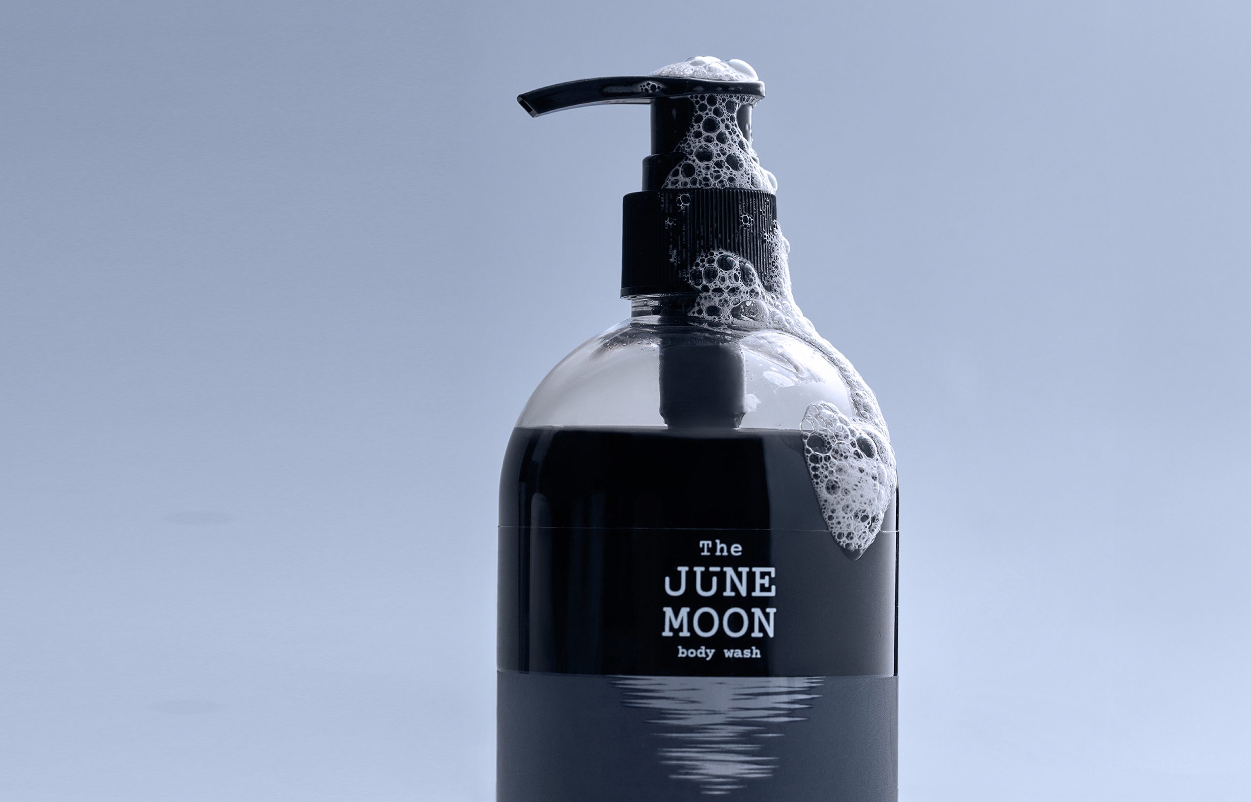
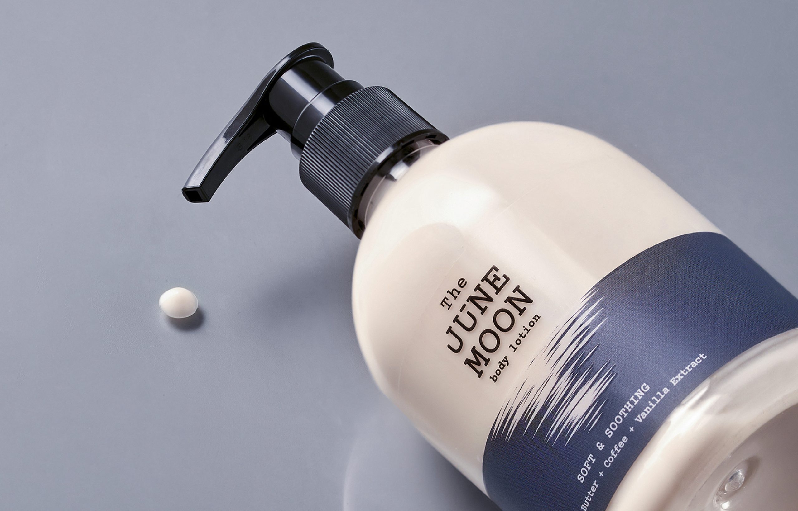
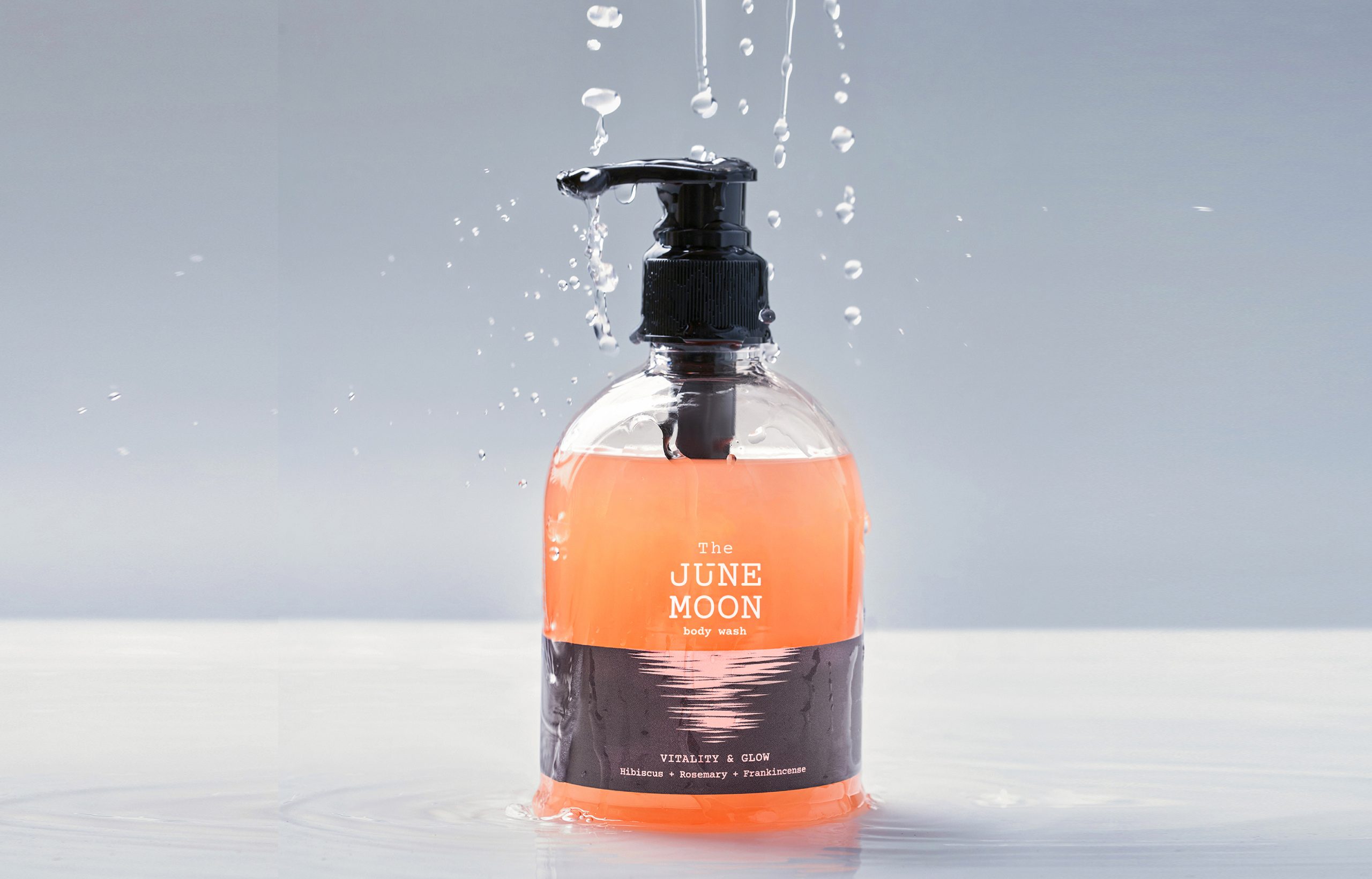
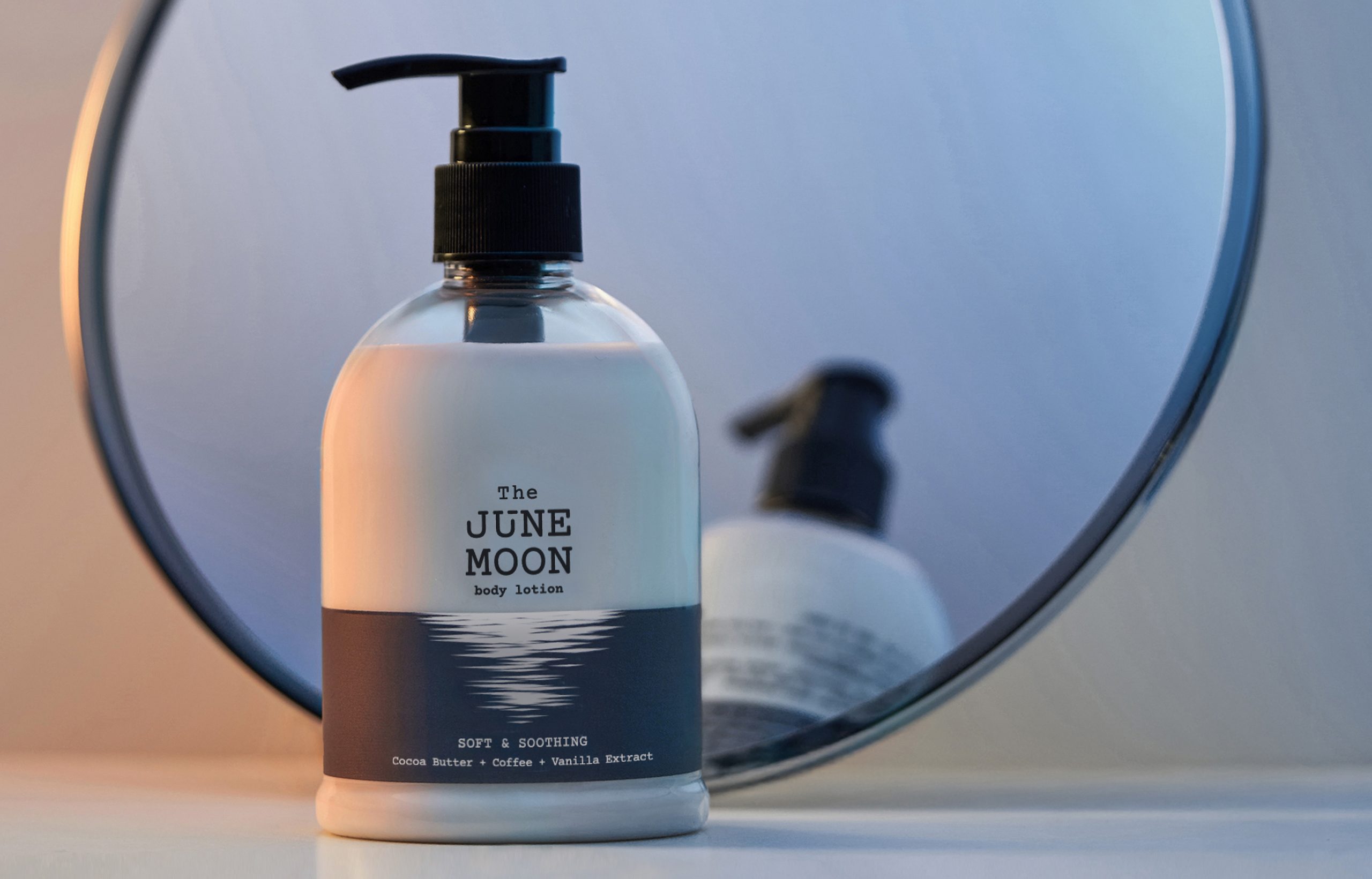
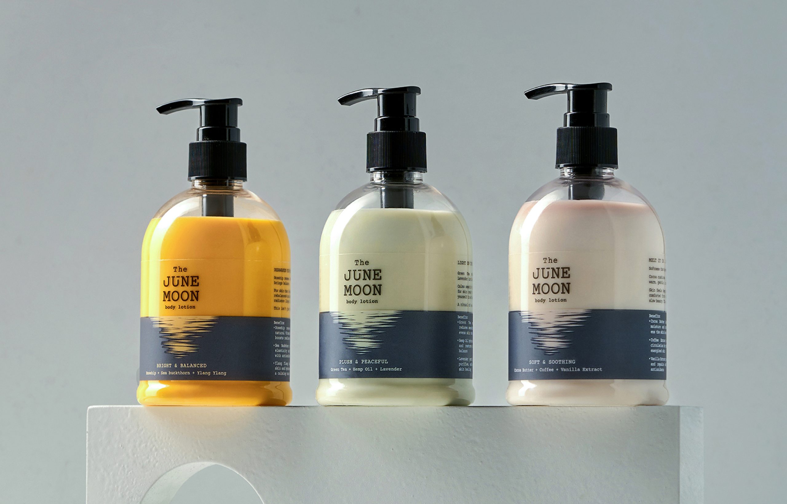
The visual language draws inspiration from the reflection of the moon on water, expressing calm and stillness through mood rather than literal representation. Muted tones, minimalist graphics, and generous negative space establish a sense of pause, while typography and layouts lean poetic rather than prescriptive.
Packaging colours are designed to complement the natural hues of the products, allowing them to take centre stage. Across digital touchpoints, slow-motion video and calming visuals extend this unhurried rhythm, while the photoshoot subtly reinforces the brand’s name and concept through light, texture, and atmosphere.
The result is a cohesive identity that frames self-care as a quiet, personal ritual inviting users to slow down, soften, and engage with the experience more intentionally.





 Aparna Badgandi
 NEV
NEV Stefano Bracci
 Alina
Alina monther al omari
 Lizakjx
 JOAOMARCOSDESIGN
 alchimistestudioParis
 Harriet Neild
 octavio rojo
 宏洛图品牌设计HONGLT
 DESIGN CONCEPTS
 Alexander Skurihin
 Studio K95
 ARMBRAND
 Richa Rai
 houseoferas by Miti
 Agence des Coteaux
 Kushi Eaknath
 Ann Treasa
 Xiao Ning
 krrrrrllii
 babyage
 Deep
Deep