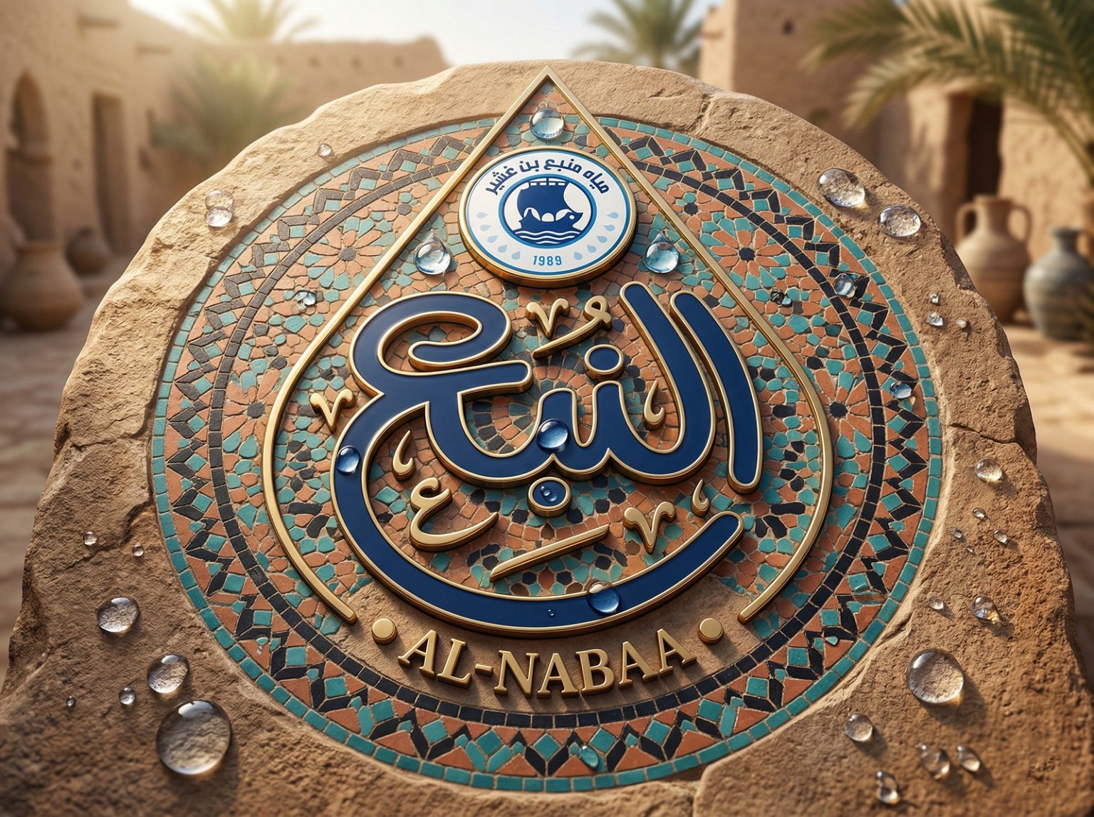

ALNABAA WATER
Visual Identity Redesign: Al-Nabaa Water (A Legacy Reimagined)
Project Overview
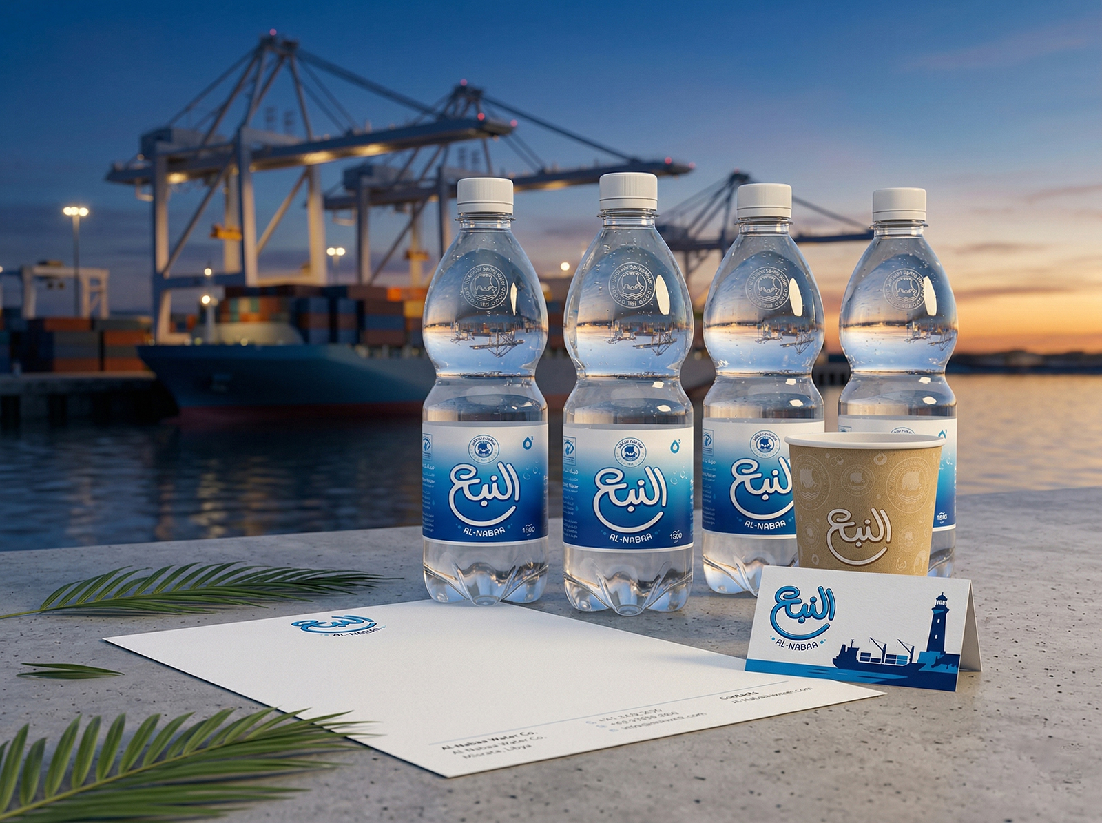
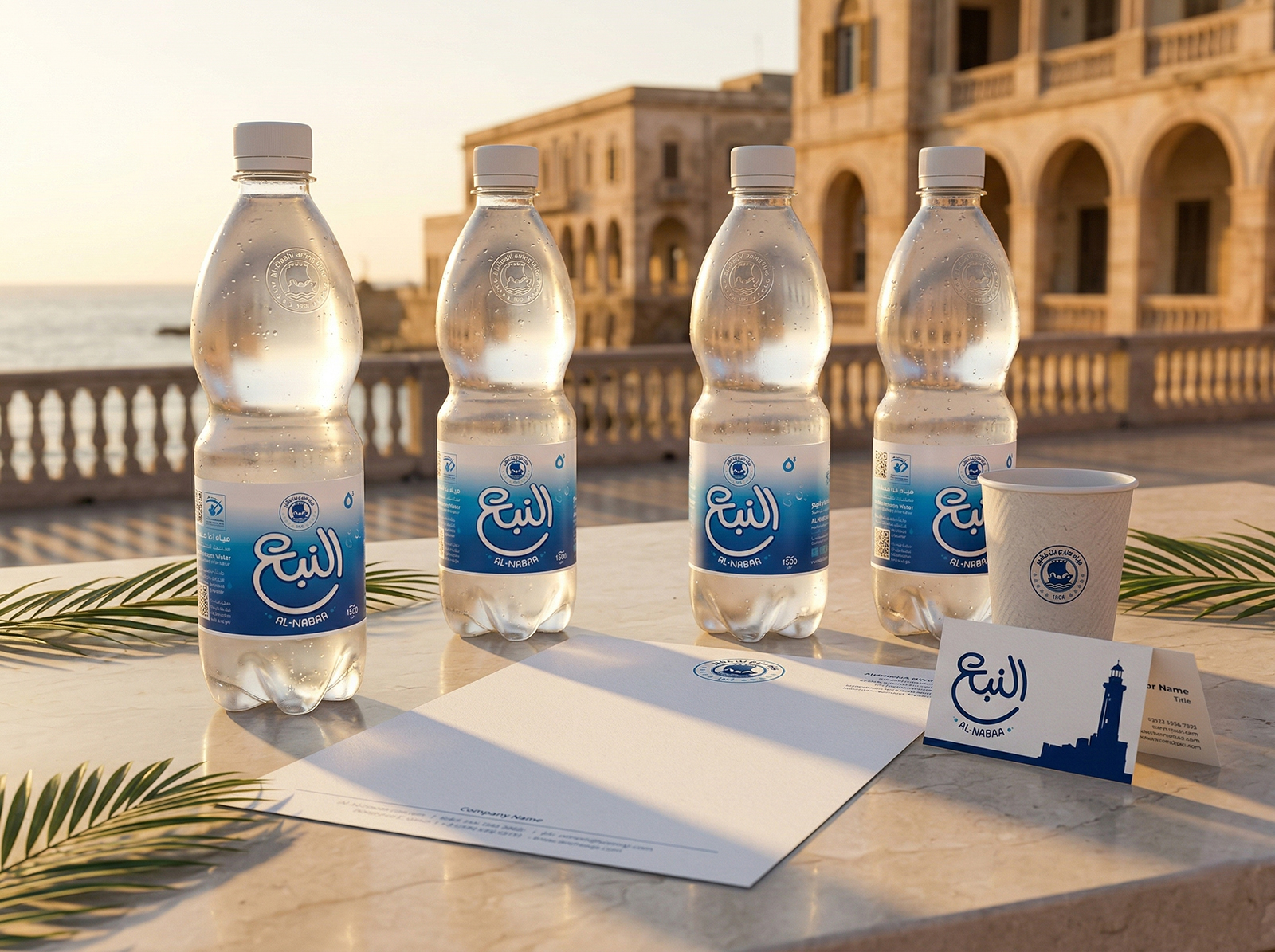
The Al-Nabaa Water rebranding project is a strategic initiative aimed at elevating one of Libya’s most historic bottled water brands. The goal was to transition the visual identity from its traditional, classic roots into a premium, modern brand capable of competing in today’s sophisticated market, all while preserving the “brand soul” that has resonated with Libyan consumers for decades.
Design Philosophy
The new identity is built upon two core pillars:
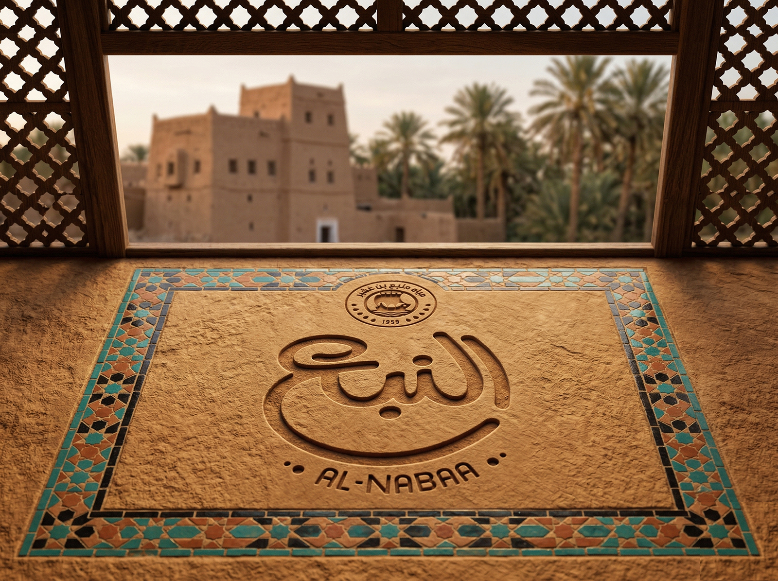
- Authenticity: We maintained the iconic name “النبع” (Al-Nabaa) but redesigned the Arabic calligraphy to be more fluid and legible, symbolizing the purity of the source and the depth of the brand’s heritage.
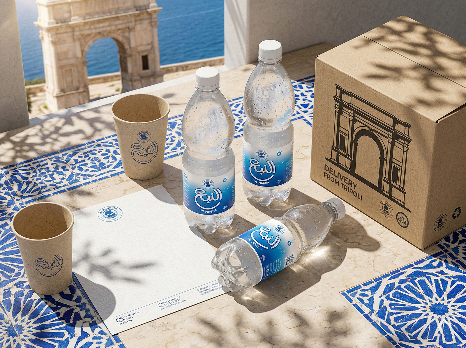
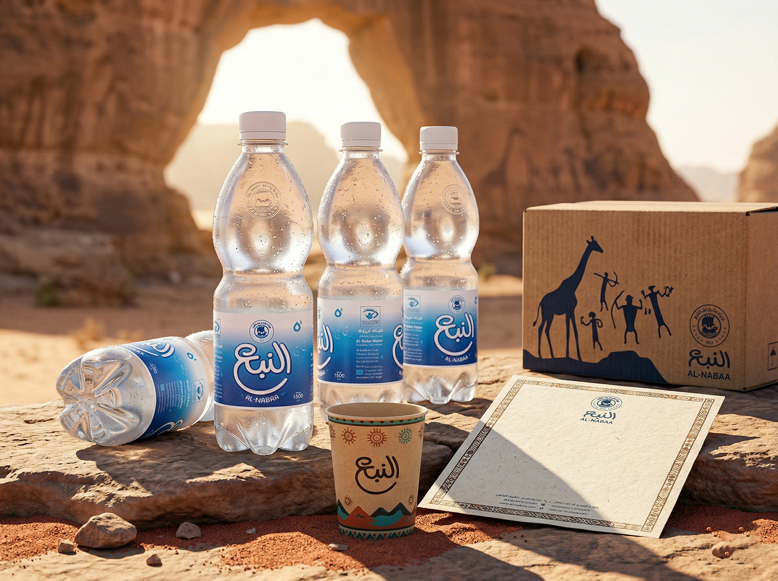
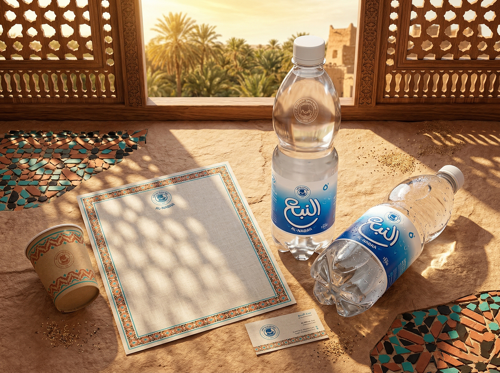
- Modernity: A refined color palette was introduced, blending Mediterranean Deep Blue (representing purity and refreshment) with Desert Gold (symbolizing premium quality and luxury). This contrast creates a striking visual hierarchy that evokes a sense of “Premium Quality.”
Key Design Elements
Logo Evolution: The logo was transformed from a traditional badge into a sophisticated typographic mark. It pairs handcrafted Arabic calligraphy with a clean, modern English serif typeface, integrated with subtle cultural icons—such as a stylized palm or ancient Libyan symbols for water—to ground the brand in its local roots.
 Derrick Lin
 Biaa
Biaa Petitmoulin Studio
 White Bear Studio
 Eva Chistyakova
 monther al omari
 Atipus
 alchimistestudioParis
 oneandother
 bloomburo
 helocrene
 Shapers Studio
 Denver Design
 Aidearte
 andrew.huerta
 softmachine
 airobtq
 Buzz & Co.
 Ruby
Ruby themythographer
 IDNB Inc.
 viktorflr
 Zenpack