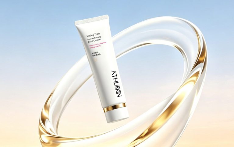

ATHURKIN “Setting Time” Anti-Aging Skincare Series
Brand: ATHURKIN
Design Studio: HONGLT Brand Design
Category: Premium Anti-Aging Skincare (Cleanser, Serum, Essence Lotion, Cream)
Project Background
ATHURKIN is dedicated to high-end anti-aging skincare, with the core promise of “freezing time, keeping skin forever young.” In a market saturated with heavy, cold-looking anti-aging visuals, the brand sought a new visual language that balances cutting-edge technology with natural rejuvenation. The goal was to create a distinct aesthetic that speaks to modern consumers who value both results and refined design.
Design Concept
The theme “Setting Time, Forever Young” guided every element of the visual system. We built a cohesive aesthetic around the concept of “time,” unifying color, form, graphics, light, and typography to deliver a premium yet approachable look.
Color Palette
Pure white + matte gold form the core palette. White symbolizes skin’s natural clarity and the brand’s pure skincare philosophy. Matte gold adds a touch of luxury, representing the elegance of aging gracefully. This classic pairing exudes understated sophistication, perfectly aligning with the premium positioning of the line.
Form & Silhouette
Smooth, rounded lines define every product shape, with no sharp edges. The soft, curvy forms mirror the gentle, nourishing experience of skincare while humanizing the “clinical” feel of anti-aging tech. Consistent silhouettes across the family reinforce brand identity and visual harmony.
Visual Elements
Abstract representations of key benefits were developed to communicate product value at a glance:
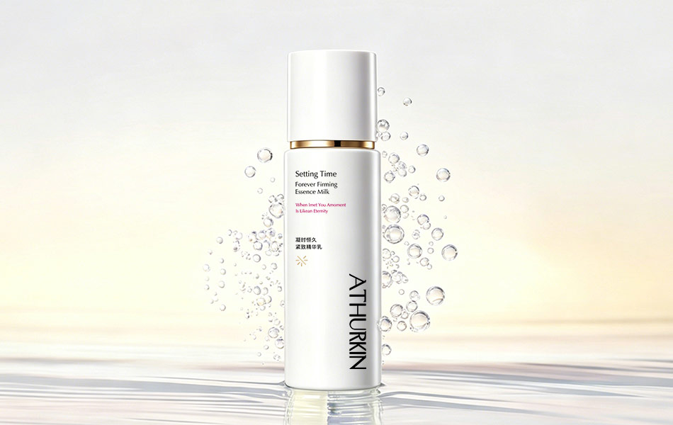
Water bubbles & flowing textures: Evoke hydration, penetration, and plump skin. Silky fabric curves: Convey skin firmness, elasticity, and the lifting effect of the formulas. Golden circular motifs: Symbolize the cycle of time and the brand’s vision of defying aging, while adding a modern, high-tech touch.
Light & Atmosphere
Soft gradient lighting mimics skin’s journey from dull to radiant, creating a calm, therapeutic mood. Carefully controlled highlights and shadows emphasize the bottles’ texture and premium finish, ensuring the products look luxurious even in static imagery.
Typography & Messaging
The poetic tagline “When I meet You, A Moment Is Like an Eternity” adds emotional depth, framing youthful skin as a timeless treasure. Minimalist, balanced typography keeps focus on the products while ensuring clear brand recognition.
Series Cohesion
All products share the same white-and-gold color scheme, logo system, and core visual framework for a unified brand presence. At the same time, subtle variations in supporting elements differentiate each product, ensuring the line feels cohesive yet distinct.
Design Impact
Differentiated brand identity: A minimalist luxury aesthetic stands out in a crowded market. Easier consumer understanding: Visual metaphors make anti-aging benefits instantly clear. Multi-scenario adaptability: The system works seamlessly for e-commerce, retail displays, print materials, and social media. Long-term brand equity: Unique visual elements (gold circles, water textures) build strong, recognizable brand assets over time.


 Lisa Pokrovskaya
 Simple Studio
 Studio Unbound
 David Byerlee
 M&A CREATIVE AGENCY
 alchimistestudioParis
 monther al omari
 Studio Be Design
 LogoSayLove
 agenciabud
 Shustova p
 mutta
mutta @Allenarts13
 Sirka Agency
 Atiq Alam
 Dozen Agency
 j.substance
 SCD
SCD Cristian Lepore | crilep Copia
 Chris Creative Works