
Honglu Brand Design Creates Packaging Design for ChoiDo Qingyan Meike in the Beauty & Wellness Sector
Client: ChoiDo Qingyan Meike
Project Category: Acne Care Skincare / Functional Skincare Series
Services Provided: Brand guidelines, full product line packaging design, bottle visual optimization, functional information layout design
Design Style: Extremely clean and transparent, minimalist and professional, acne-control and oil-balancing, pure and translucent, no heavy cosmetic feel
Agency: Honglu Brand Design
The complete project case study and more brand packaging design works have also been published on the official Honglu Brand Design website. Visitors are welcome to explore more original design projects.
Combining Honglu Brand Design’s professional DNA with Qingyantang’s brand positioning, this packaging design represents a deep integration of vertical expertise in the beauty and wellness sector, local brand strategy, and young consumer insight. Below is a complete breakdown of Honglu’s design methodology and the customized strategy behind the Qingyantang project.
I. Honglu’s Design DNA: Building the Professional Foundation for Qingyantang
As one of Guangzhou’s leading design agencies specializing in beauty and wellness for over a decade, Honglu brought three core strengths into the Qingyantang project:
Vertical Industry Expertise
Deep understanding of cosmetic regulations such as GB 4806 and EU REACH, as well as consumer scenarios and retail display logic, ensuring the design achieves compliance, practicality, and conversion performance simultaneously.
II. Qingyantang Packaging Design: Honglu’s Customized Strategy in Action
Brand Strategy Layer: Translating Professional Clinic Care into Home Skincare
One clear positioning goal was established through Honglu’s core methodology: transforming Qingyantang’s offline expertise in professional treatments such as spot correction, acne care, and skin rejuvenation into the packaging mindset of “professional clinic skincare for home use,” distinguishing it from ordinary consumer skincare brands.
Precise Audience Positioning
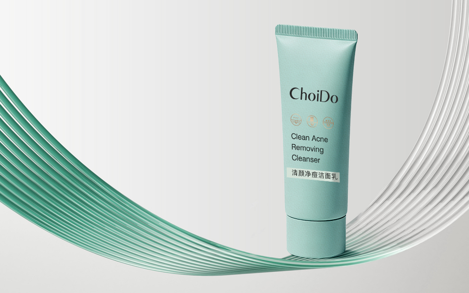
Focused on younger consumers through the use of international-style naming (“ChoiDo Qingyan Meike”), soft macaron-inspired colors, and minimalist layouts that align with modern demands for beauty, effectiveness, and convenience.
Value Communication
Through medical-beauty-inspired elements, frosted finishes, and professional terminology, users immediately perceive the experience of “enjoying Qingyantang professional skincare treatments at home,” solving the pain point of having limited time to visit physical clinics.
Visual System Layer: Honglu’s Dual-Track Design of “Function + Recognition”
(1) Color System: Functional Visualization with Family Consistency
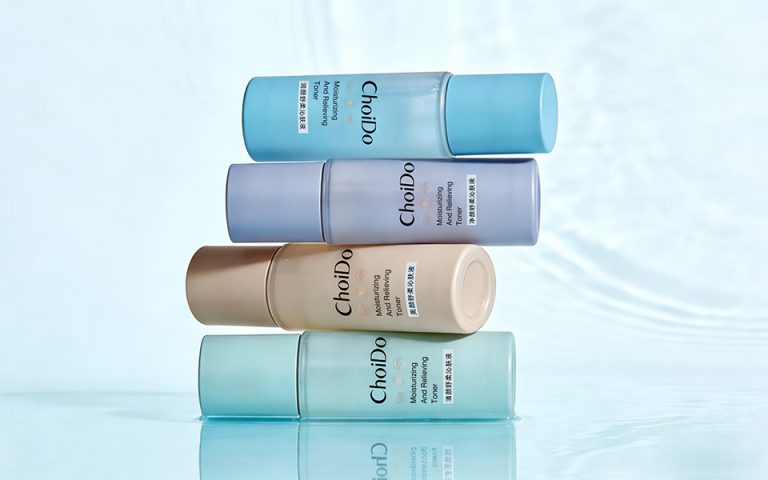
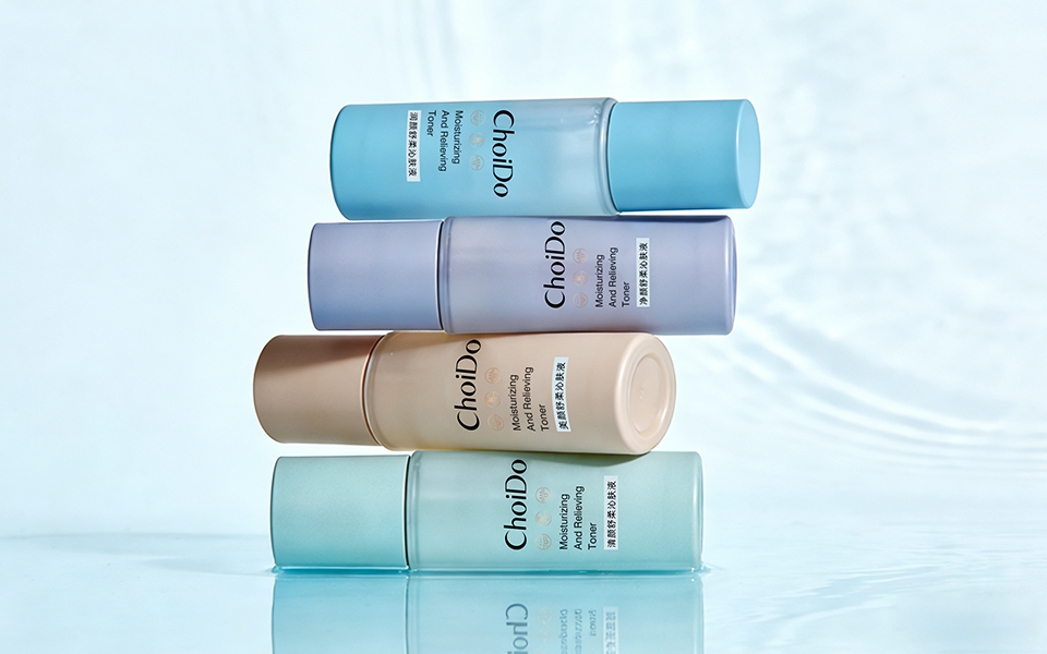
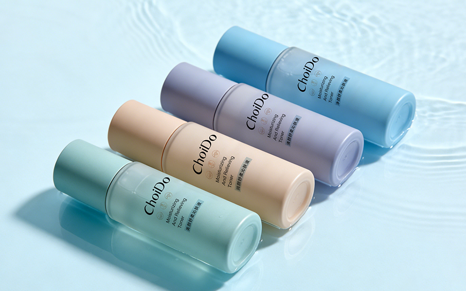
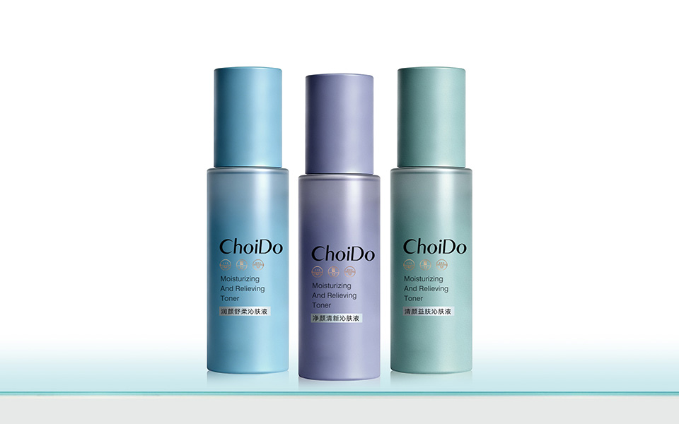
Using Honglu’s signature approach of “unified master branding + color differentiation by function,” the packaging allows users to identify product functions within three seconds, reducing decision fatigue.
| Product Series | Primary Color | Function | Honglu Color Psychology Logic |
|---|---|---|---|
| Acne Care | Mint Green | Acne control & oil balance | Green symbolizes clarity, cleanliness, and acne treatment |
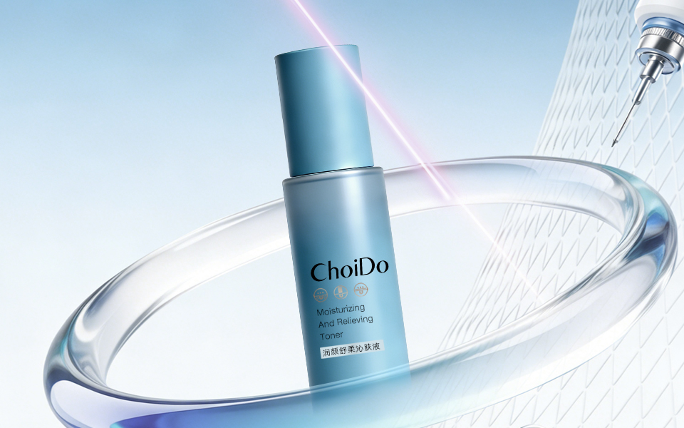
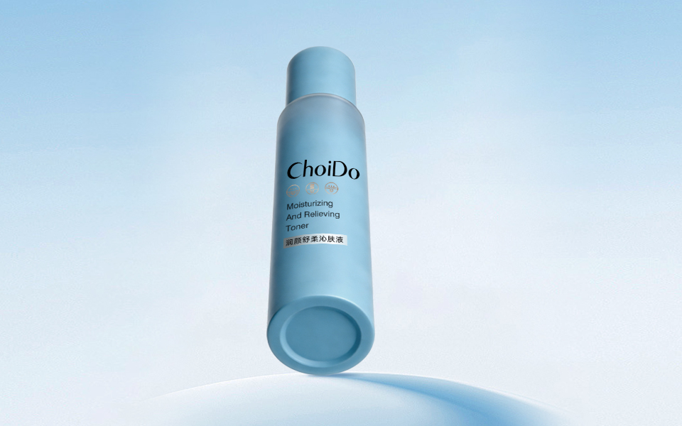
| Sensitive Skin Repair | Light Blue | Soothing & hydration | Blue conveys gentleness, moisture, and reassurance |
| Brightening & Spot Care | Misty Purple | Brightening & skin renewal | Purple reflects radiance, luxury, and antioxidant care |
Unified Brand Feel
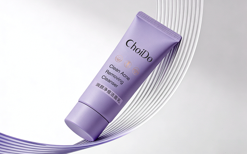
The entire line features frosted bottles with matching tonal caps, strengthening family recognition and enhancing premium perception.
(2) Materials & Finishes: Communicating Professionalism Through Texture
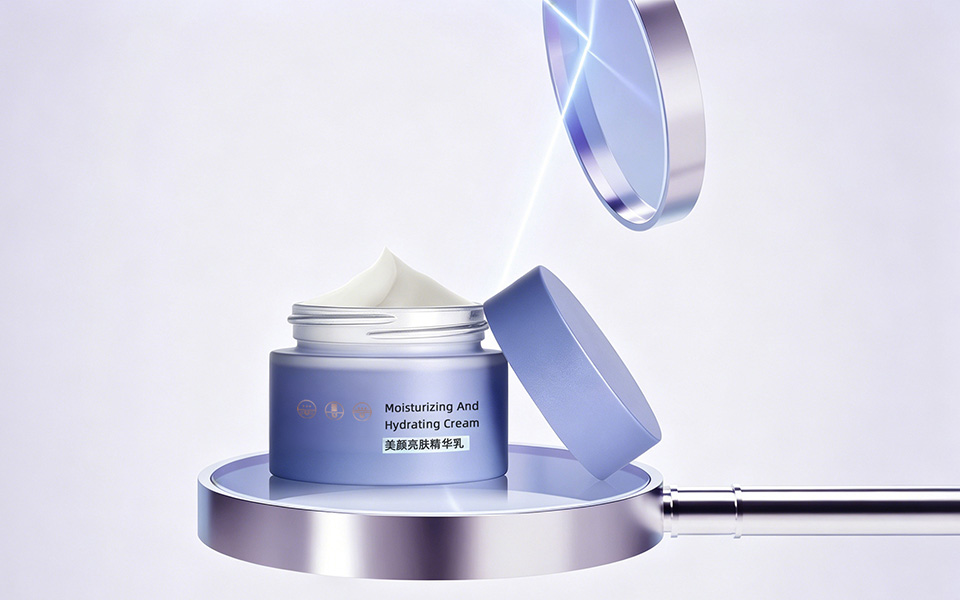
Bottle Material: Frosted glass or matte plastic, differentiating the products from glossy mass-market packaging while naturally conveying a medical-aesthetic and professional skincare image.
Finishing Techniques: Gradient matte processing and layered textures create a sense of movement and technology, aligning with younger consumer aesthetics.
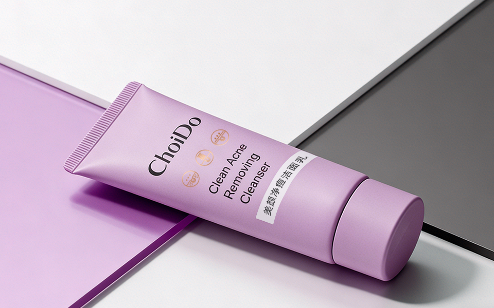
Container Forms: Straight toner bottles, wide-mouth cream jars, and elevated cleanser packaging balance professional appeal with user convenience.
(3) Visual Elements: Medical Beauty Symbols with Minimalist Language
Core Symbol: A unified gold circular icon system builds recognizable visual memory across the product range.
Design Elements: Syringe-inspired graphics, technological lines, and transparent flowing visuals directly communicate “professional clinic-level skin management.”
Typography Structure: “ChoiDo Qingyan Meike” as the primary visual combined with Chinese functional descriptions and product naming creates a balance between international aesthetics and localized communication.
Functional Logic Layer: Refined User Experience Design
Simplified Information Hierarchy
Clear functionality labels and bilingual branding allow users to absorb information quickly and develop fast product-selection habits.
Product Matrix Logic
Product lines are divided into acne care, sensitive skin care, and brightening solutions, with distinct color systems and unified family design encouraging product pairing and repeat purchases.
Compliance & Execution
The packaging strictly follows cosmetic labeling regulations, ensuring both visual innovation and legal compliance.
Consumer Mindset Layer: Precisely Targeting Young Audiences
Professional Trust
Medical-beauty-inspired elements and frosted packaging establish the perception of “professional clinic skincare for home use.”
Social Media Appeal
Soft macaron tones combined with matte finishes create highly photogenic packaging suitable for social media sharing on platforms like Xiaohongshu and Douyin.
Functional Intuition
Strong color-to-function associations reduce cognitive load and solve the common problem of product confusion during purchase decisions.
III. The Core Highlights & Value of Honglu’s Design
Professional Empowerment
Honglu transformed Qingyantang’s offline professional expertise into packaging that is visual, approachable, and shareable, enabling a trust transfer from offline services to online products.
Aesthetic Upgrade
Using INS-inspired minimalist aesthetics and soft low-saturation tones, the packaging becomes a visual asset that elevates brand image and social media communication value.
Commercial Effectiveness
Functional visualization, family-style design systems, and compliance-focused execution help Qingyantang rapidly stand out in the young skincare market while improving conversion and repurchase rates.
Local Industry Advantage
Rooted in Guangzhou’s beauty manufacturing ecosystem, Honglu efficiently connects with high-quality factories to ensure smooth transitions from design to prototyping to mass production while maintaining cost control.
IV. Conclusion
The Qingyantang packaging project stands as a classic example of Honglu’s expertise in the beauty and wellness sector. Built upon vertical industry specialization, guided by brand strategy, and centered around young consumer insight, the project successfully integrates color, material, visual elements, and functional systems to fulfill the brand vision of “professional clinic skincare + youthful aesthetics + convenient home use.”
It represents a benchmark example of how local design agencies can empower local skincare brands through thoughtful, commercially effective packaging design.
 宏洛图品牌设计HONGLUOTU
 MID-AIR STUDIO
 Heramb Arora
 monther al omari
 Tríona O'Donoghue • Design
 Cocoon Prague
 alchimistestudioParis
 hugo zapata
 Bonsanco Creative Studio
 parawaradesign
 UPRISE
 Brand Society
 Que Cálido Studio®
 Richest Branding Pvt. Ltd.
 STRATEDGY
 Shapers Studio
 Platon Ivantsov
 WPA Pinfold
 giselepereiradesign
 ShalaSketches
 05Creation
 Voit Studio
 SSTO
SSTO