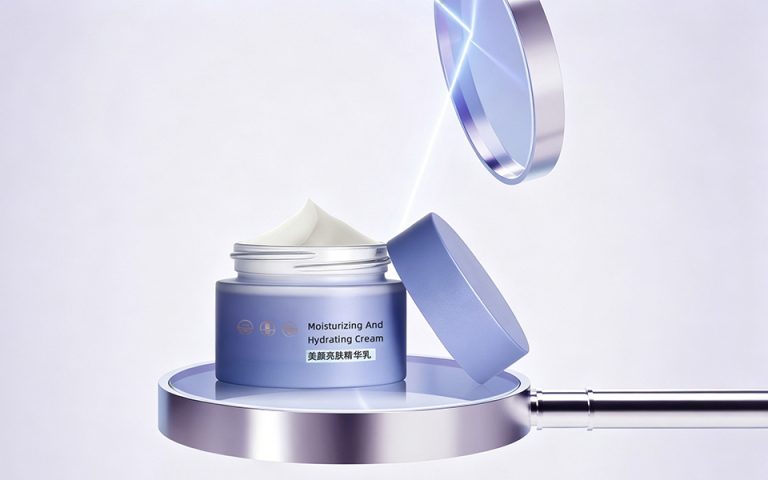

ChoiDo Skincare Packaging Design | Medical-Grade Daily Skincare Series
Client: ChoiDo 清颜美科
Category: Acne & Functional Skincare Packaging
Scope: Brand visual system, full-series packaging design, bottle shape optimization, functional information layout
Style: Minimalist, clean, transparent, professional, medical-level aesthetic
Design Agency: Honglt(宏洛图品牌设计) Brand Design
This packaging project is a customized design solution for ChoiDo, a local professional facial care brand with offline medical beauty salon advantages. Centering on the core positioning of “salon-grade at-home skincare”, we combine vertical beauty & health design experience, Gen Z aesthetic insight and standardized commercial landing logic, transforming the brand’s offline professional salon credibility into visualized, youthful and market-oriented product packaging.
Design Foundation: Vertical Professional Capabilities
With over a decade of experience in the beauty and health industry, our team supports the project with systematic and professional design capabilities to balance aesthetics, compliance and commerciality:
Industry Compliance & Commercial Logic: Strictly follow GB 4806 and EU REACH cosmetic regulations, matching retail display and consumer decision-making scenarios to ensure full realizability from design to mass production. Full-link Design Thinking: Cover brand strategy, visual specification, packaging structure, material & craft selection, sample testing and final production landing. Youth Aesthetic Control: Adopt low-saturation minimalist style and visualized functional design to fit the aesthetic preferences of young skincare consumers. Core Design Strategy: Salon Professionalism Transferred To Home Use
Most daily skincare products on the market adopt ordinary daily chemical styling. We differentiate ChoiDo via medical-grade minimalism, converting offline salon professional service advantages into at-home skincare product value, solving users’ pain points of insufficient time for offline salon care.
With international brand naming and low-saturation color matching, the packaging delivers three core brand values: professional efficacy, convenient home care and advanced texture.
Visual System: Dual Design of Efficacy Identification & Brand Unity
3.1 Color System | Visualized Efficacy + Family Series Recognition
We adopt the strategy of unified brand tone + differentiated color by efficacy, enabling users to quickly identify product functions and reduce selection costs:
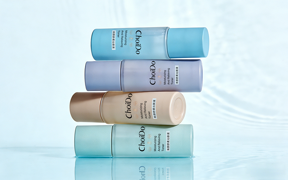
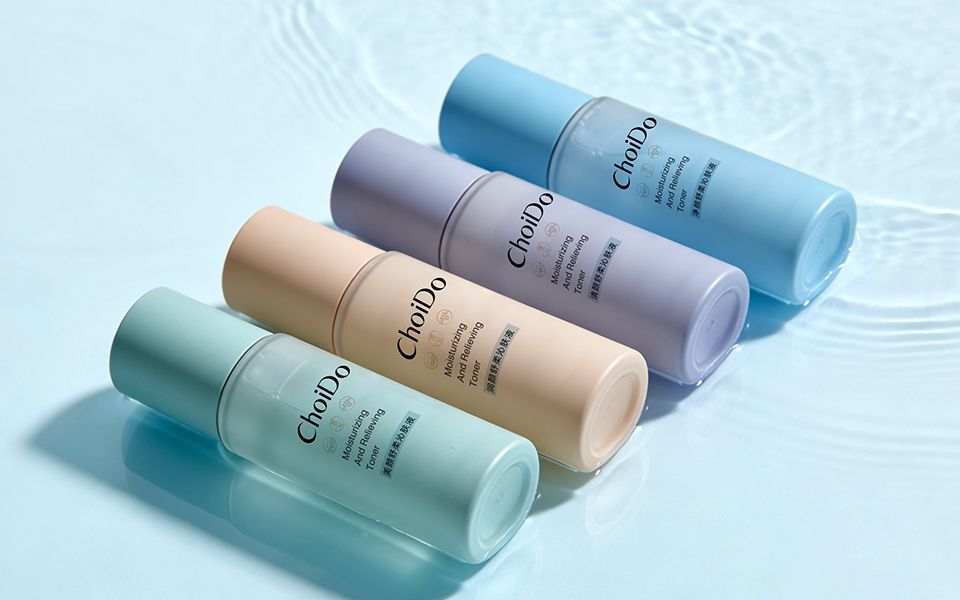
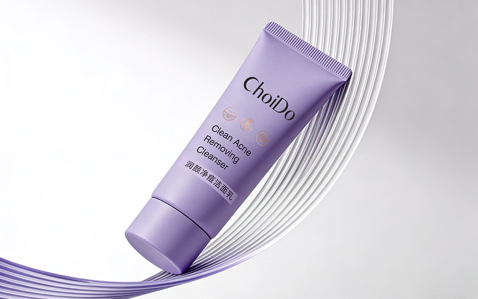
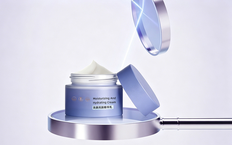
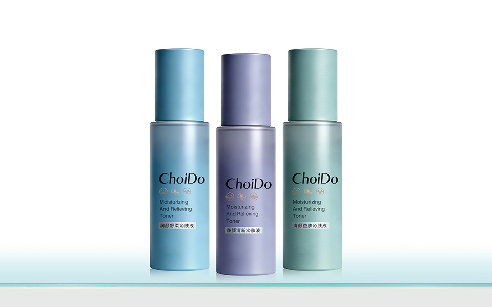
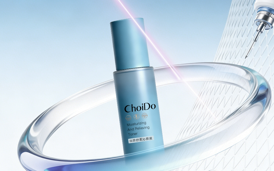
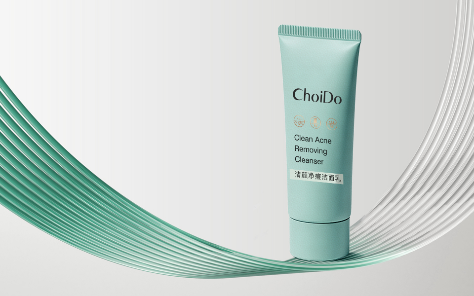
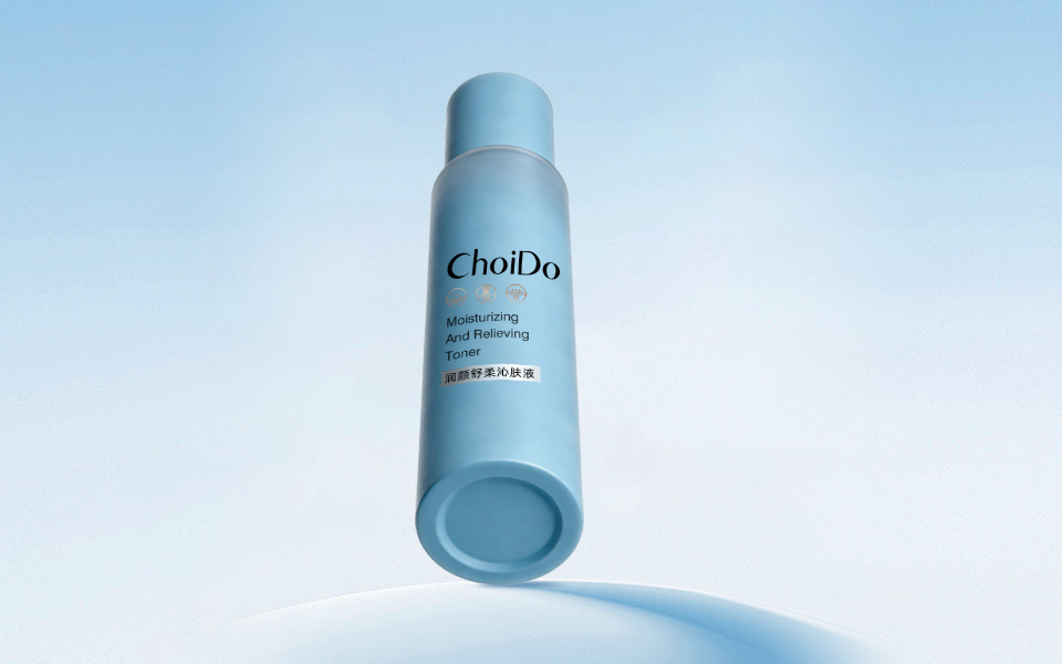
Acne & Oil Control Series | Mint Green: Delivers a fresh, pure and clean visual perception, directly echoing skin purification and oil-control efficacy for acne-prone skin. Sensitive Skin Relief Series | Light Blue: Conveys mildness, hydration and safety, fitting the soothing and repairing positioning for sensitive skin. Brightening & Freckle-Removing Series | Misty Purple: Presents high-end and antioxidant texture, matching skin brightening and rejuvenating efficacy.
The whole series adopts gradient frosted bottle bodies with matched color caps, forming a highly recognizable brand family visual system and improving product premium sense.
3.2 Material & Craft | Tactile Presentation of Professional Medical Aesthetics
Abandon the common glossy bottle design in daily skincare, and create exclusive professional texture through material and craft upgrading:
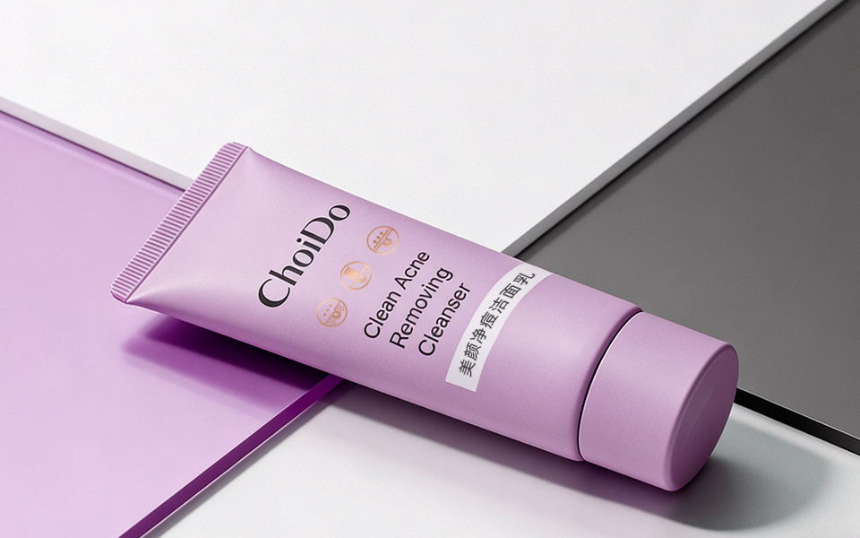
Main Material: Frosted glass & matte plastic, presenting low-key medical-grade professionalism and advanced hand feel. Surface Craft: Gradient spraying + full matte finishing, integrating fluid sense and technological texture to fit young aesthetics. Container Design: Reasonable bottle type matching (straight bottle for toner, wide-mouth jar for cream, hose for cleanser), balancing professional presentation and daily use convenience.
3.3 Visual Elements & Layout | Minimalist & Internationalized Presentation
We build exclusive brand super symbols with unified golden circular icons, and integrate subtle technological lines and transparent fluid elements to imply professional salon-level skin management.
The layout adopts a clear hierarchical logic ofbrand logo + English efficacy label + Chinese product name, balancing international minimalist sense and local reading habits, with no redundant decorative elements, highlighting the core efficacy attributes of functional skincare.
User Experience & Commercial Value Optimization Efficient Information Transmission: Pre-set core efficacy information with bilingual marking to adapt to users’ fast product selection habits. Clear Product Matrix: Classified design by skin problems (acne, sensitivity, dullness), convenient for users to match sets and repurchase. Standard Compliance Landing: Optimize information layout based on cosmetic label specifications, realizing perfect integration of visual innovation and regulatory compliance. Social Communication Attributes: Low-saturation misty tone + frosted advanced texture, suitable for social platform display and spread, empowering product market competitiveness. Project Summary
The ChoiDo skincare packaging design breaks the stereotype of traditional functional skincare packaging. Relying on vertical beauty industry design experience and precise youth user insight, we complete the visual transformation from offline salon professional service to at-home skincare products.
With minimalist medical aesthetic styling, visualized efficacy identification and high-realization commercial design, this project builds a professional, youthful and high-value brand image, creating a benchmark for local professional skincare brand upgrading and packaging iteration.
More original packaging design cases are available on our official website.
 Lisa Pokrovskaya
 Simple Studio
 Studio Unbound
 David Byerlee
 M&A CREATIVE AGENCY
 alchimistestudioParis
 monther al omari
 Studio Be Design
 LogoSayLove
 agenciabud
 Shustova p
 mutta
 @Allenarts13
 Sirka Agency
 Atiq Alam
 Dozen Agency
 j.substance
 SCD
 Cristian Lepore | crilep Copia
 Chris Creative Works