

Crunch was designed as more than just a snack brand the goal was to create an identity that feels bold, playful, energetic, and instantly memorable while still maintaining a clean modern structure that works across packaging and digital platforms. From the beginning, the focus was on building a brand personality that visually communicates texture, flavor, movement, and excitement through every touchpoint. The logo design was created with a strong typographic approach to make the brand instantly recognizable and impactful on shelves. The bold letterforms, dynamic spacing, and playful visual balance help create a sense of crunch, movement, and confidence while keeping the identity approachable and modern. The custom details within the typography were intentionally designed to give the logo its own unique personality rather than relying on generic snack branding aesthetics.
For the color palette were chosen to reflect flavor, fun, and youthful energy while still feeling premium and cohesive. The contrast between bold colors and clean neutral spaces allows the packaging to stand out visually without becoming overwhelming. Every color decision was made strategically to enhance visibility, appetite appeal, and brand recall.
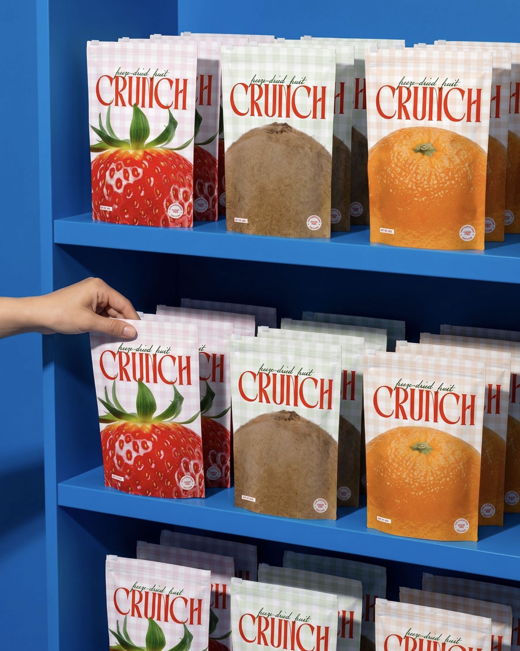
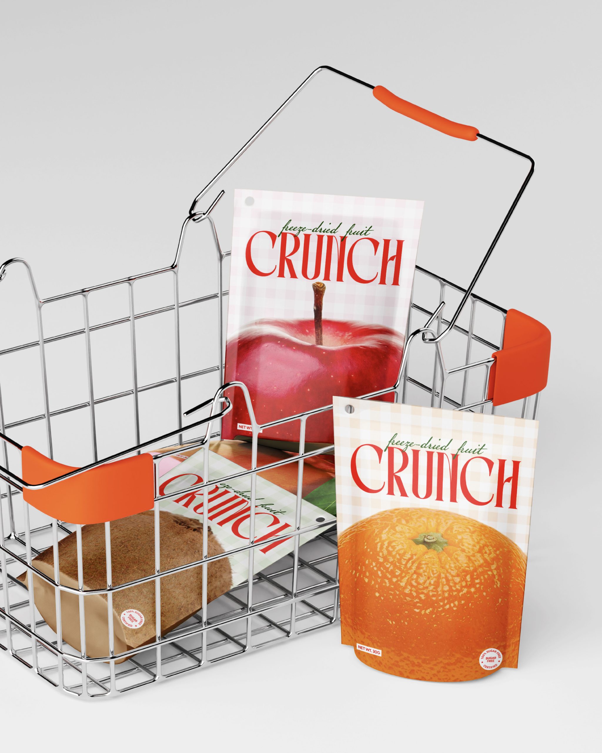
The packaging system was designed to feel expressive and highly shelf-friendly. Large typography, playful compositions, strong hierarchy, and minimal clutter help the products feel modern, eye-catching, and easy to recognize instantly. The layouts balance bold visuals with clean spacing to maintain readability while keeping the brand visually exciting.
Graphic elements and imagery were approached in a way that adds personality without distracting from the core branding. The overall visual language combines modern minimalism with expressive brand energy to create a system that feels flexible across social media, print, packaging, and future brand extensions.
As Inchgraphica, my approach was to build a brand that not only looks visually strong but also creates an emotional and memorable customer experience through thoughtful typography, packaging structure, color psychology, and cohesive visual storytelling.




 monther al omari
 Ximena Ureta Design Studio.
 vitoramockup
 Up-Brands
 Sophiagdotcom
 Peter said
 ayeidadezigns
 Tancybox
 宏洛图品牌设计HONGLT
 Modern Theory
 Dozen Agency
 Atiq Alam
 Olio Studio
 Ruchi S. Joshi
 mmdesign
 awaiskhadim
 Octasoft
 United Creatives Studio
 Kingdom & Sparrow
 Anastasia Bakhmatskaya
 CreativeWise
 Great and Golden