

ABOUT
DODO & CO. is a contemporary coffee concept built around routine, time, and small daily rituals. The brand captures that specific moment, a pause in the day where coffee becomes both habit and escape.
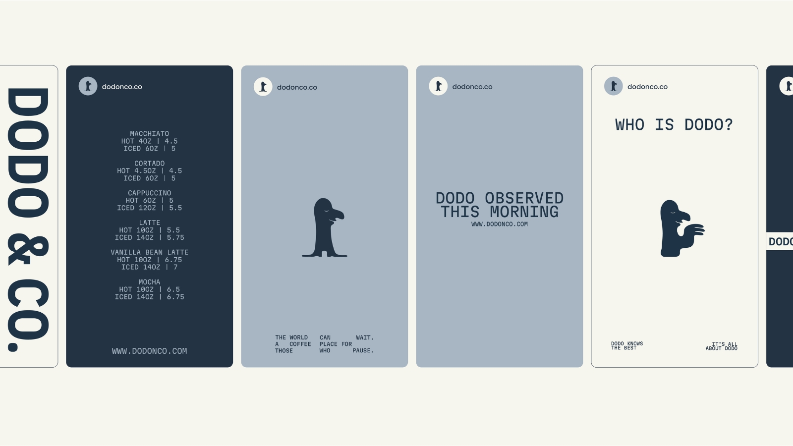
The identity combines minimal structure with a distinctive character, introducing a subtle sense of humor and unpredictability. Simple forms and a muted palette create a calm foundation, while the mascot adds a memorable and slightly surreal presence.
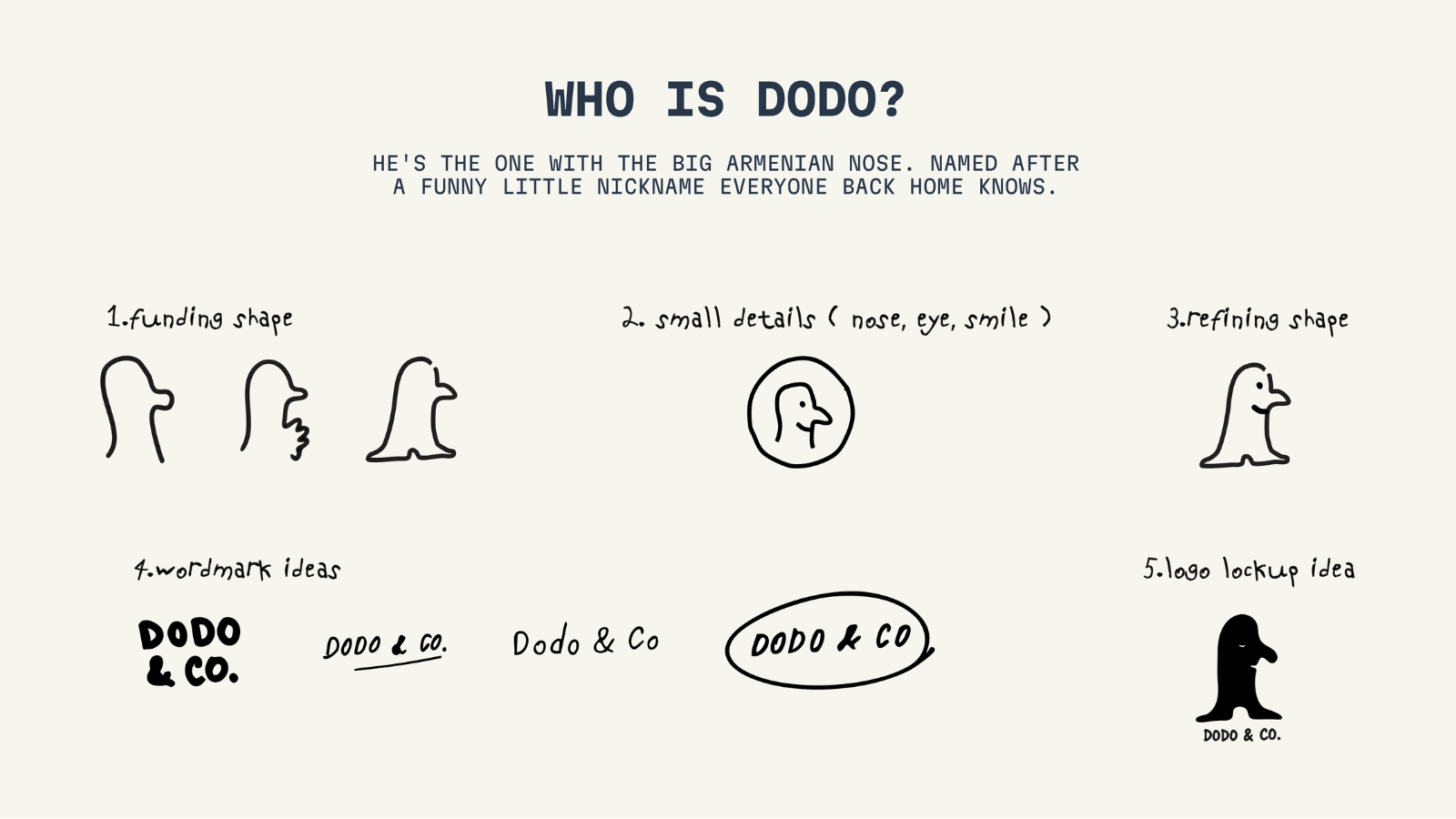
By mascot we mean Dodo itself, a slightly surreal character with a distinctive Armenian large nose. His name comes from a funny little nickname that feels familiar back home, adding a personal and culturally rooted layer to the identity.
CONCEPT
Coffee is usually associated with energy, speed, and productivity, but DODO & CO. looks at it from a different angle: coffee as a slow, personal ritual.
The visual identity is built on this contrast. The system is clean and restrained, while the mascot brings in a playful and slightly unpredictable presence.
SOLUTION
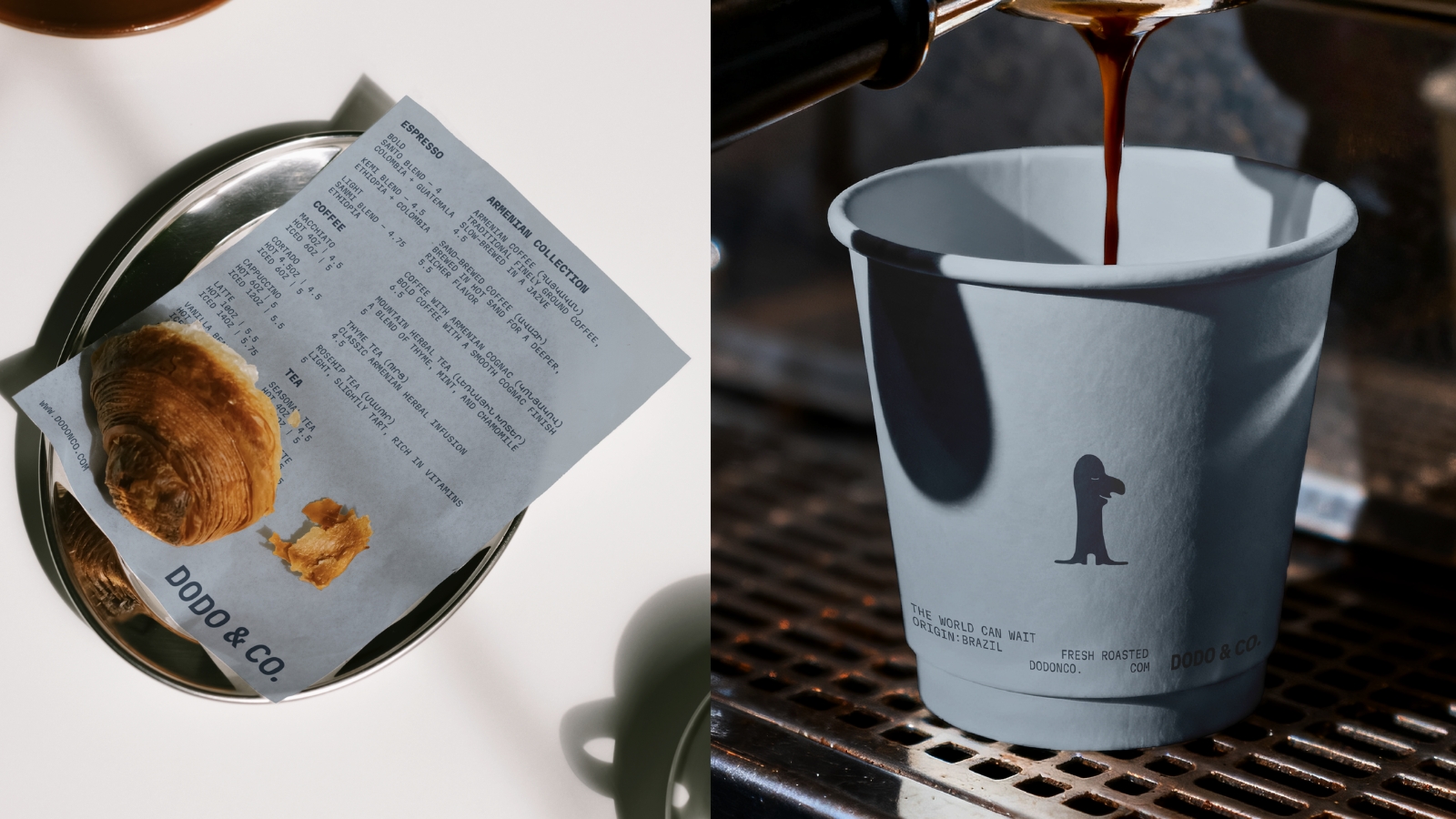
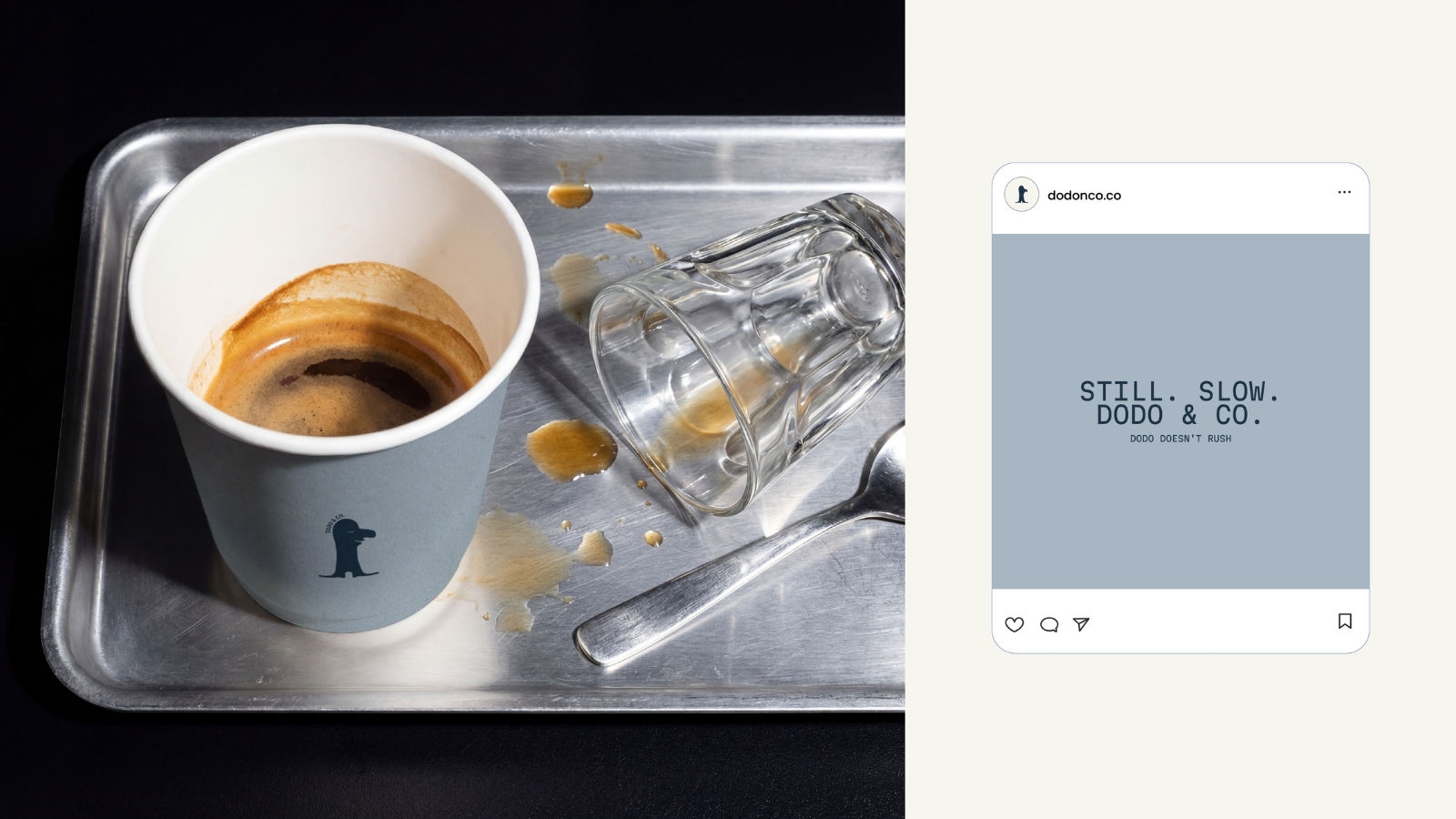
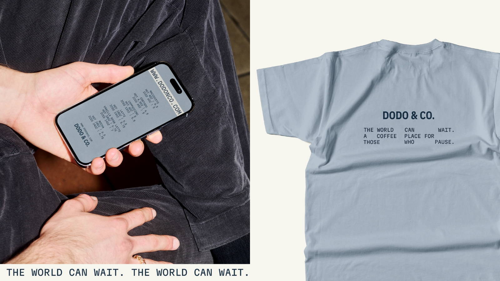
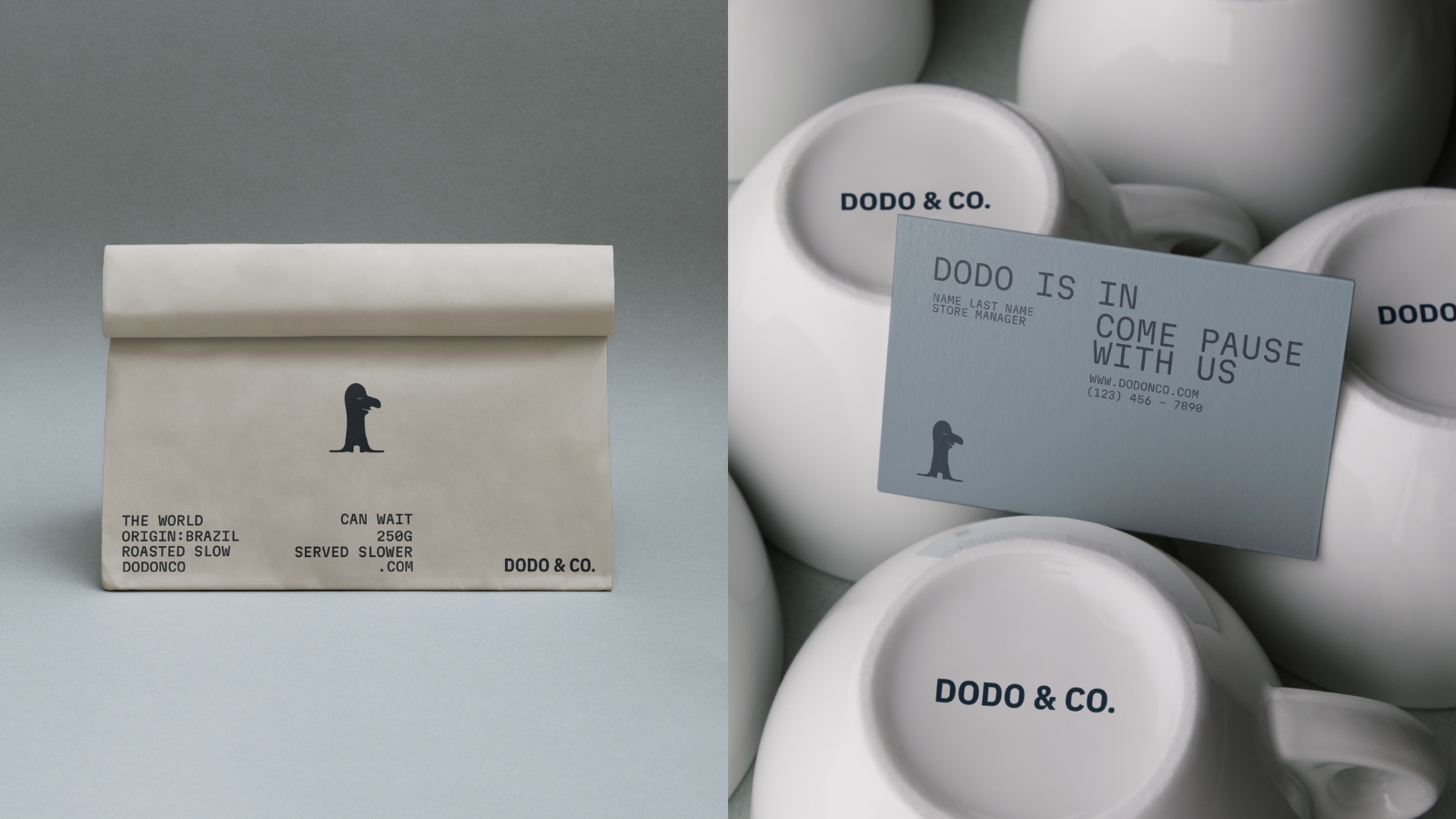
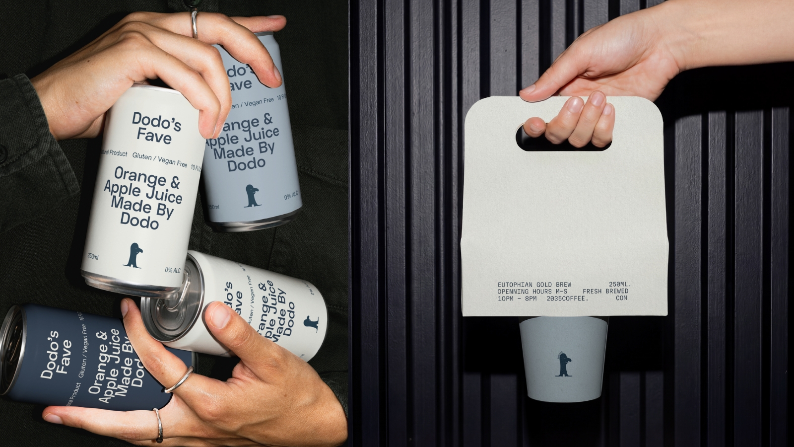
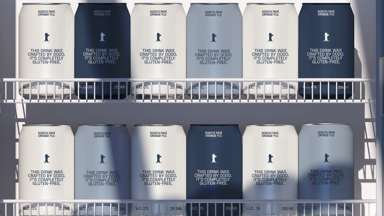
The packaging was designed as a balance between structure and personality. The layout stays minimal, allowing the brand name, typography, and mascot to become the main visual elements. The design uses a reduced graphic language to create a more contemporary and memorable experience.
The mascot was developed through a hand-drawn process, starting from basic shapes and gradually refining the silhouette, nose, eye, smile, and posture. This imperfect sketch-like approach became an important part of the identity, giving Dodo a natural and slightly naive charm.
RESULT
This coffee branding identity feels memorable, personal, and slightly surreal. It turns a simple coffee product into a small brand universe — one where routine becomes ritual, and a quiet mascot becomes the face of a daily pause.
DODO & CO. is designed to be simple enough to feel timeless, but distinctive enough to be remembered after the first encounter.





 IDEOLOGO
 Eva Chistyakova
 Open Strategy & Design
 cem kutlu
 monther al omari
 Bonsanco Creative Studio
 Confetti Design Studio
 古戈品牌
古戈品牌 Rare Ideas
 Studio Pistache
 Studio Tumpic/Prenc
 Atiq Alam
 bachir bachchar
 Akshita Agarwal
 Carreto Concepts Design Studio
 Hollóka Grafikai Műhely / Graphic Design Studio
 Arsen Avetisyan
 Derrick Lin
 Axiniya Knyazeva
 Hadi Samir
 Furt Goods