

GIONA is a family of low‑ABV gin liqueurs that channels classic cocktails, Italian aperitivo and neon bar nightlife, using punchy colour blocks and oversized type to express a bright, “Super Delish” personality.
Creative brief / design challenge
Sedina Distillery set out to introduce a lighter‑strength gin liqueur range that feels contemporary and upbeat, yet remains premium and credible for cocktail lovers. The brand needed to stand apart from the cluttered world of flavoured spirits and RTDs, clearly signalling its gin backbone and low‑ABV profile while resonating with design‑savvy drinkers in both retail and bar contexts.
Design solution
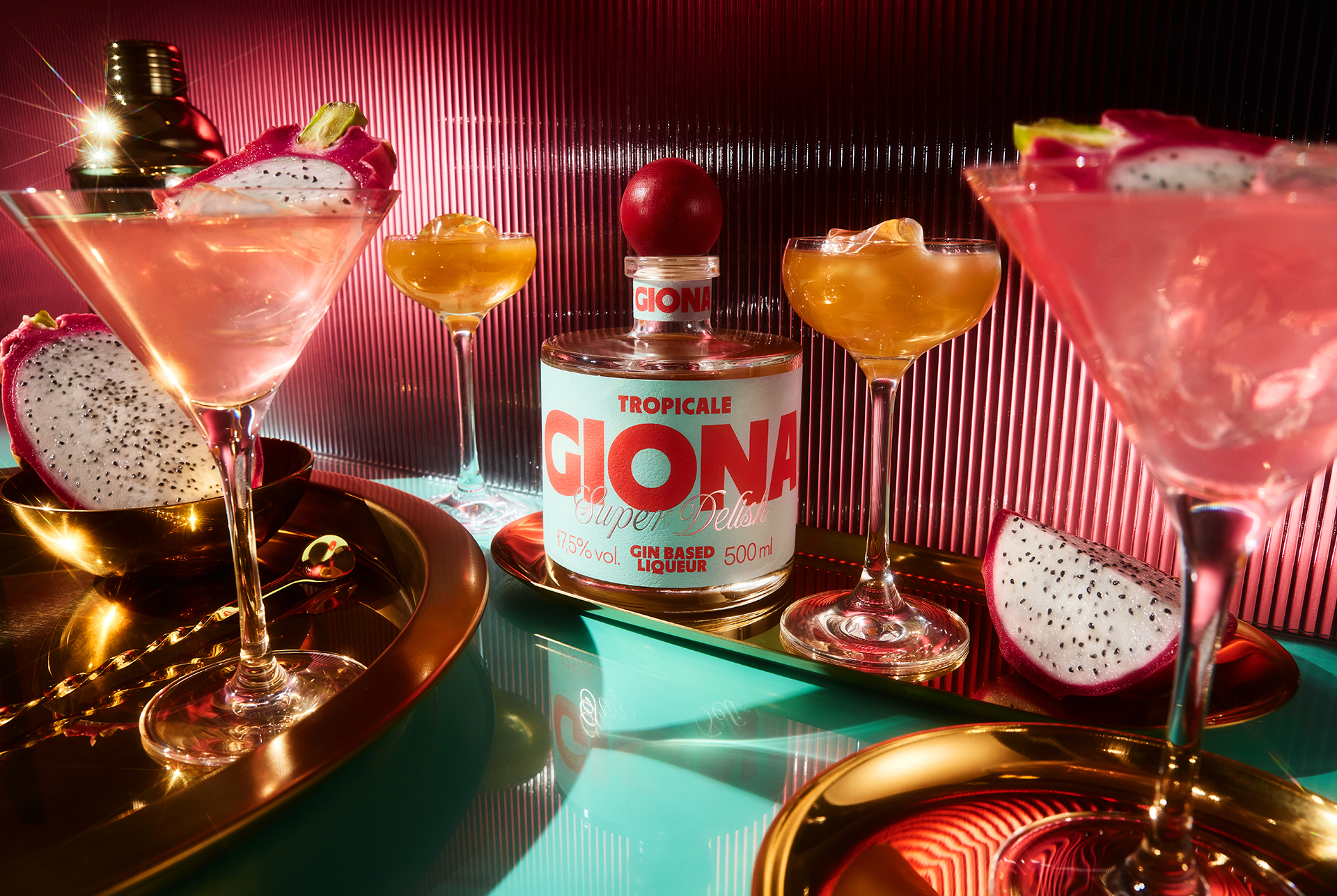
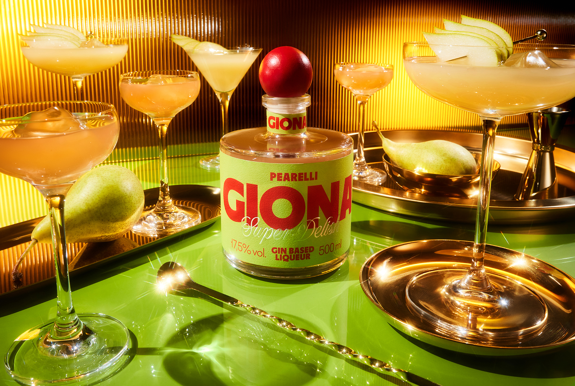
The identity centres on a confident wordmark and a label layout that treats the front of pack as a compact poster. Amplified typography, sharp geometric layouts and a saturated, Italy‑influenced palette reference neon bar signage and aperitivo culture, while transparent glass and reflective accents spotlight the liquid itself. Each variant has its own chromatic universe, tied together by a recurring “Super Delish” device, creating a recognisable family look that translates seamlessly from shelf and back bar to digital channels.
Materials / production
For the main label, we selected Avery Dennison Fasson® rGranite, a stock with a subtle fruity‑peel pattern and stone‑like tactility that enriches the otherwise graphic design. Dense inks and targeted varnishes reinforce the colour blocking and highlight reflections in the glass, helping the pack maintain impact under different lighting conditions, from store aisles to dim bar environments.
Results / recognition
The launch of GIONA has reinforced Sedina’s position in the growing low‑ABV space and earned international acclaim, including a Silver award in the Low Alcohol Beverages category at the NAPA Baltic Packaging Design Awards 2026.
Curator’s Insight:
What GIONA gets right is the refusal to whisper. Where most low-ABV spirits hedge their visual identity to avoid standing out too boldly, this range plants its flag in the opposite direction: maximum typographic weight, no hierarchy anxiety, colour fields pulled straight from neon bar culture rather than the pastels that have become shorthand for “lighter” drinks. The result is a lineup that reads as premium not through restraint, but through conviction.
The red sphere stopper is doing more structural work than it might first appear. It unifies four otherwise distinct chromatic universes at a glance, acting as a visual anchor that makes the family legible across a back bar or a retail shelf at distance. Without it, the individual label palettes risk reading as separate products rather than a coherent range. With it, the system holds.
The substrate choice also rewards closer inspection. Avery Dennison’s rGranite stock introduces a tactile disruption that quietly complicates what might otherwise feel like a purely graphic exercise, grounding the poster-like labels with a material register that signals craft without resorting to kraft. It’s a detail that retail buyers will handle before consumers ever notice it, and that distinction matters in ranging decisions.



 United Creatives Studio
 Kingdom & Sparrow
 Anastasia Bakhmatskaya
 CreativeWise
 Great and Golden
 Ximena Ureta Design Studio.
 Sorted Branding
 Lisa Sirbaugh Creative
 vitoramockup
 YQIAN
YQIAN Navegante
 Anastasia Cherepanova | xtramez
 Polaris Designs
 pavlyai
 Milena Kocharyan
 monther al omari
 Mohamed sherif midoo
 DESIGN CONCEPTS
 mmdesign
 markcreativestudio
 Rosario Lo Iacono