

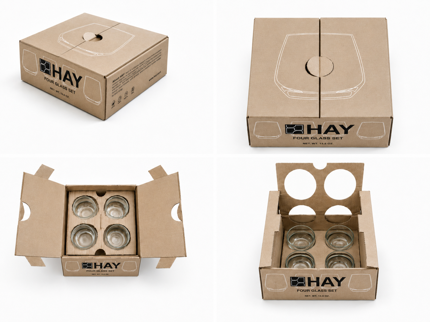
This project is a packaging redesign for HAY’s four-glass set. I wanted the package to feel simple, modern, and practical, while still matching HAY’s clean design style. I used kraft paperboard as the main material, which gives the package a more natural look and also supports the idea of sustainable design.
For the graphic design, I used simple line drawings of the glass shape. This helps people understand the product inside right away, and it also keeps the package from looking too empty. The HAY logo is placed clearly on the front, creating a strong contrast with the simple glass illustrations and making the brand easy to recognize.
The main purpose of the interior structure is to protect the four glasses. Each glass has its own space, and the paperboard insert helps reduce movement and collision during shipping. Instead of using plastic or foam, I wanted to use the paperboard structure itself to provide protection. The top-opening design also makes the unboxing experience more direct, because customers can clearly see how the glasses are arranged inside.
Overall, this design tries to balance protection, sustainable materials, and brand identity. It turns a simple glass package into something that feels more thoughtful, functional, and visually connected to the HAY brand.

 lunapanda
 Tridimage
 Analoguecreative
 lettera7
 alchimistestudioParis
 Lana B
 Colossal
 Pivot Studio
 M&A CREATIVE AGENCY
 monther al omari
 Anastasia Cherepanova | xtramez
 Hollóka Grafikai Műhely / Graphic Design Studio
 BOLD branding
 Antonia Skaraki
 Pâmella Lorrany
 Z9BKAdsgn
 Francesco Paternoster
 b1studio.ro
 Chris Creative Works
 Boordon
 Dmitriy Kuzovlev
 Brand Society
 yasharpic