

ABOUT
Hive Origins is a premium honey brand created to reposition raw honey from a mass-market commodity into a refined ritual and gifting experience rooted in India’s diverse natural landscapes. The project responds to a growing disconnect within the honey industry, where most brands rely on overly commercial packaging systems filled with loud colours, generic bee illustrations, and cluttered “organic” aesthetics that often reduce authenticity into visual noise.
Rather than following stereotypical honey branding cues, the project explores a more restrained and globally relevant design language inspired by material warmth, cultural subtlety, and modern wellness rituals. Designed for a premium, design-conscious audience seeking authenticity, traceability, and quiet luxury, Hive Origins balances Indian heritage with contemporary minimalism through a typography-led identity, earthy tonal palette, and tactile packaging experience.
SOLUTION
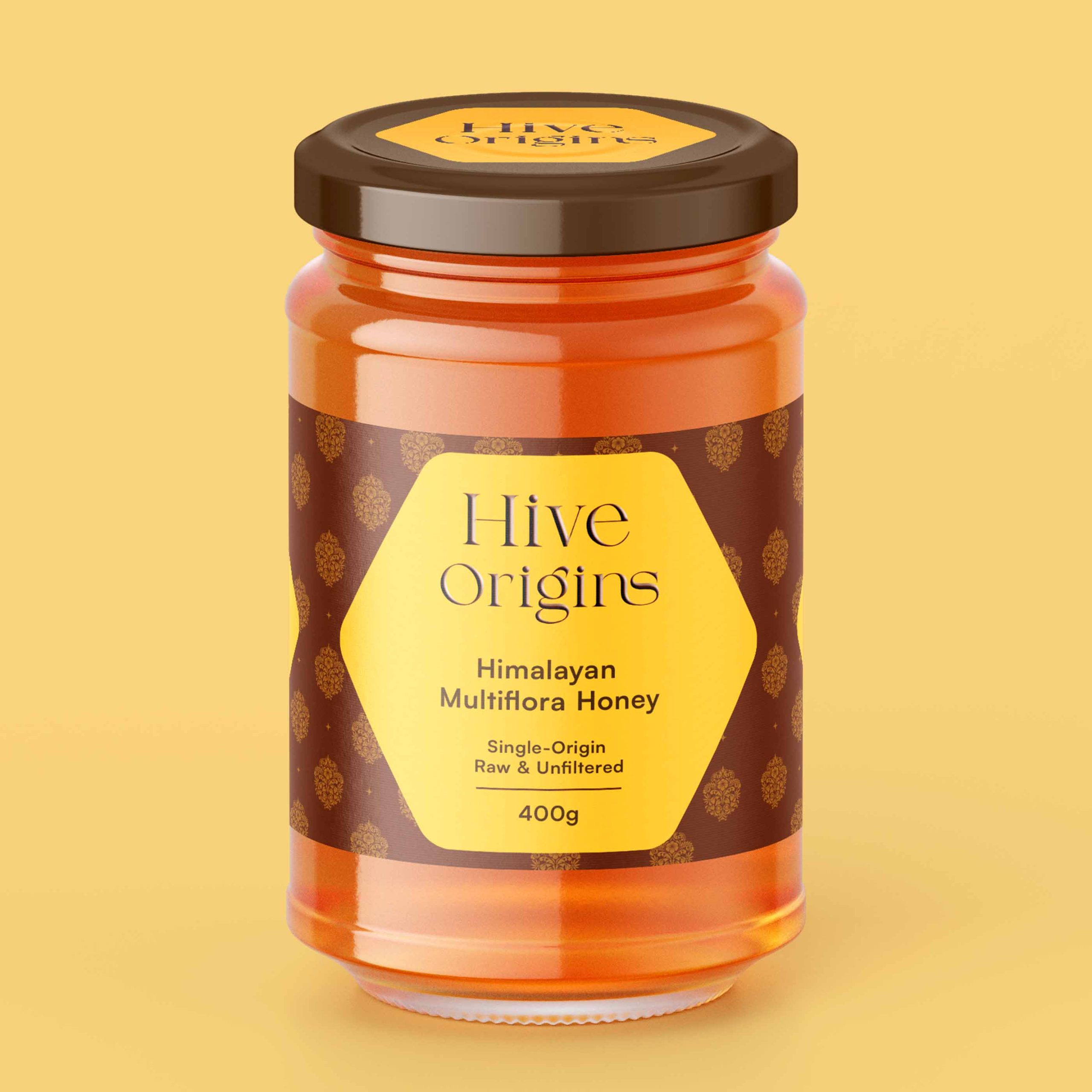
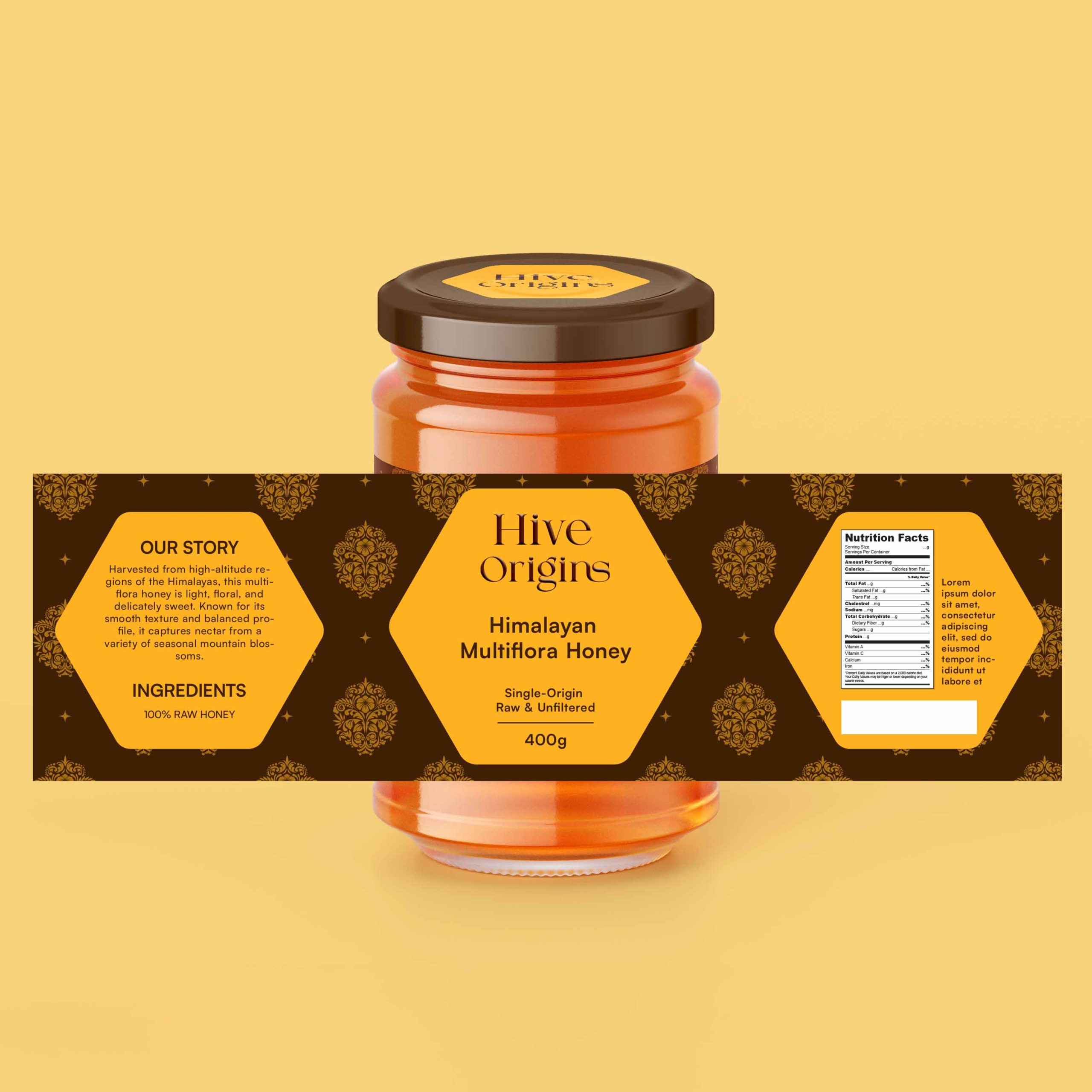
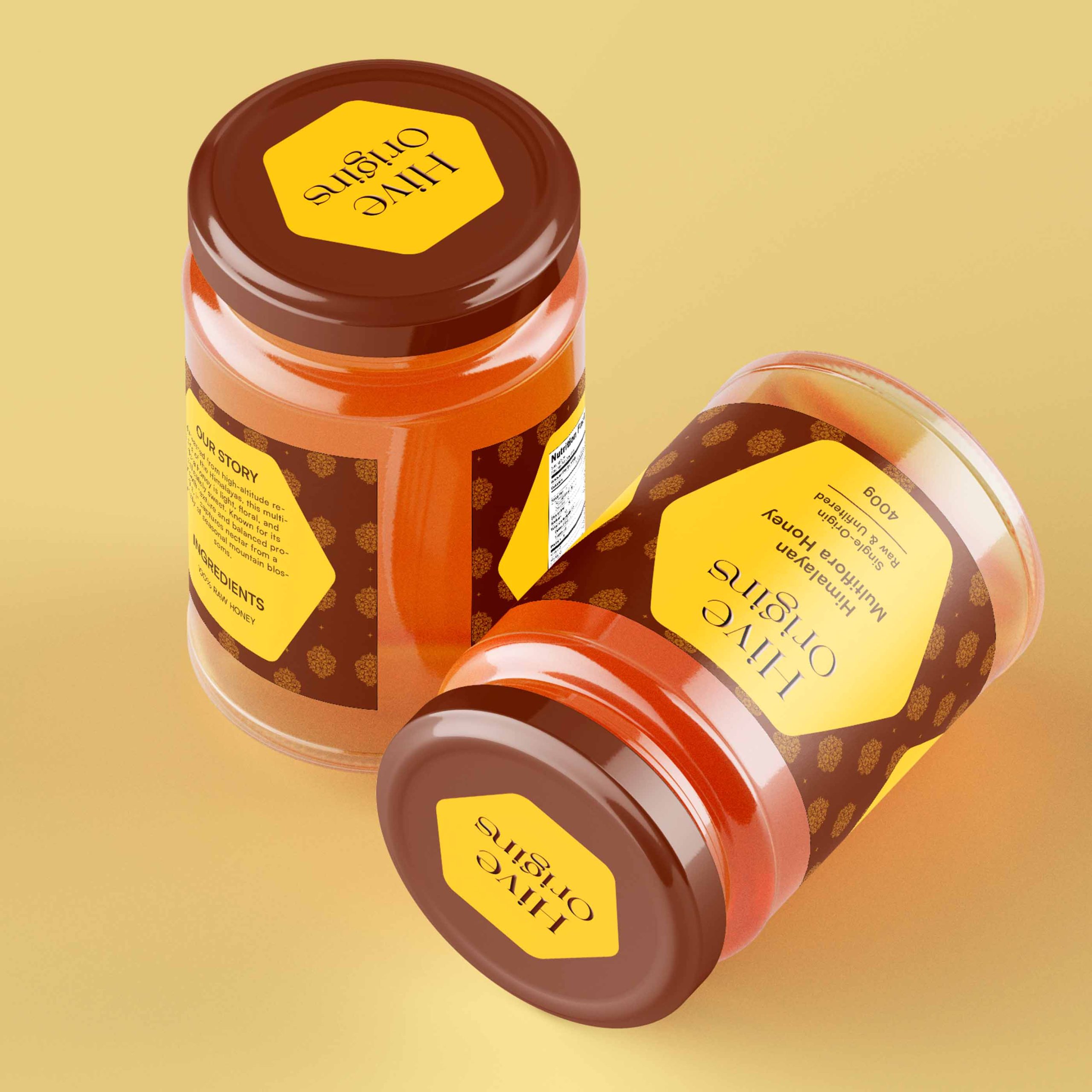
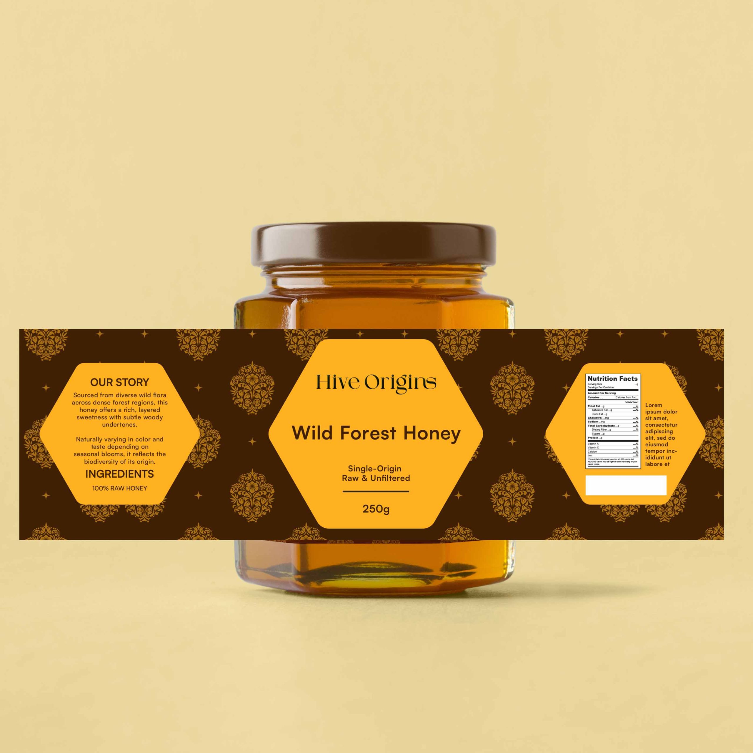
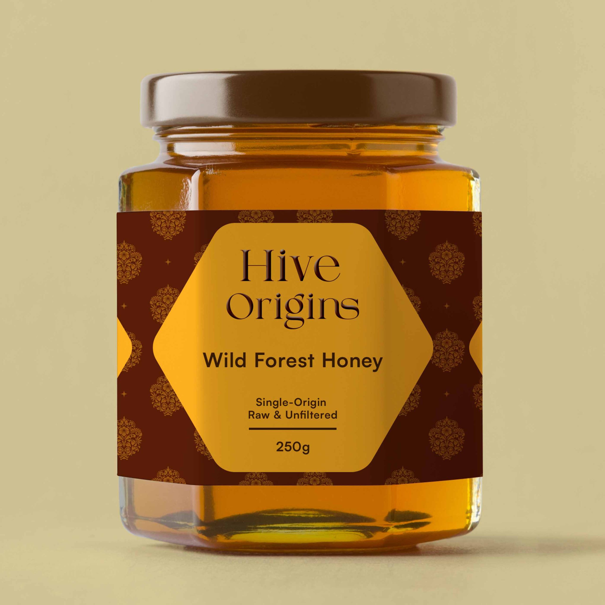
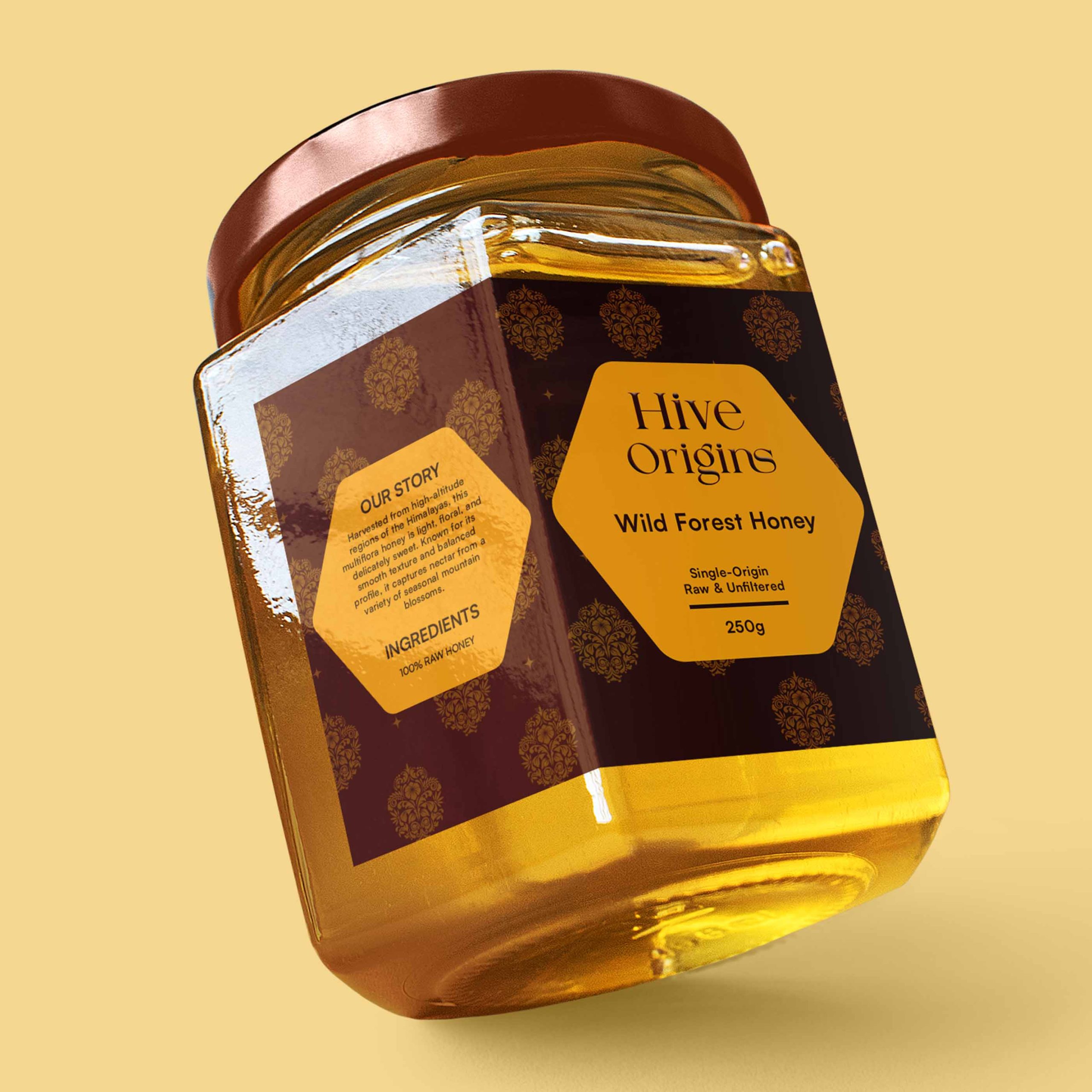
To differentiate Hive Origins from conventional honey packaging, the visual system was built around controlled restraint instead of decorative storytelling. Rather than using illustrative graphics or loud flavour differentiation, the identity relies on a refined serif-led typography system paired with a structured hexagonal label architecture inspired by the geometry of honeycomb forms.
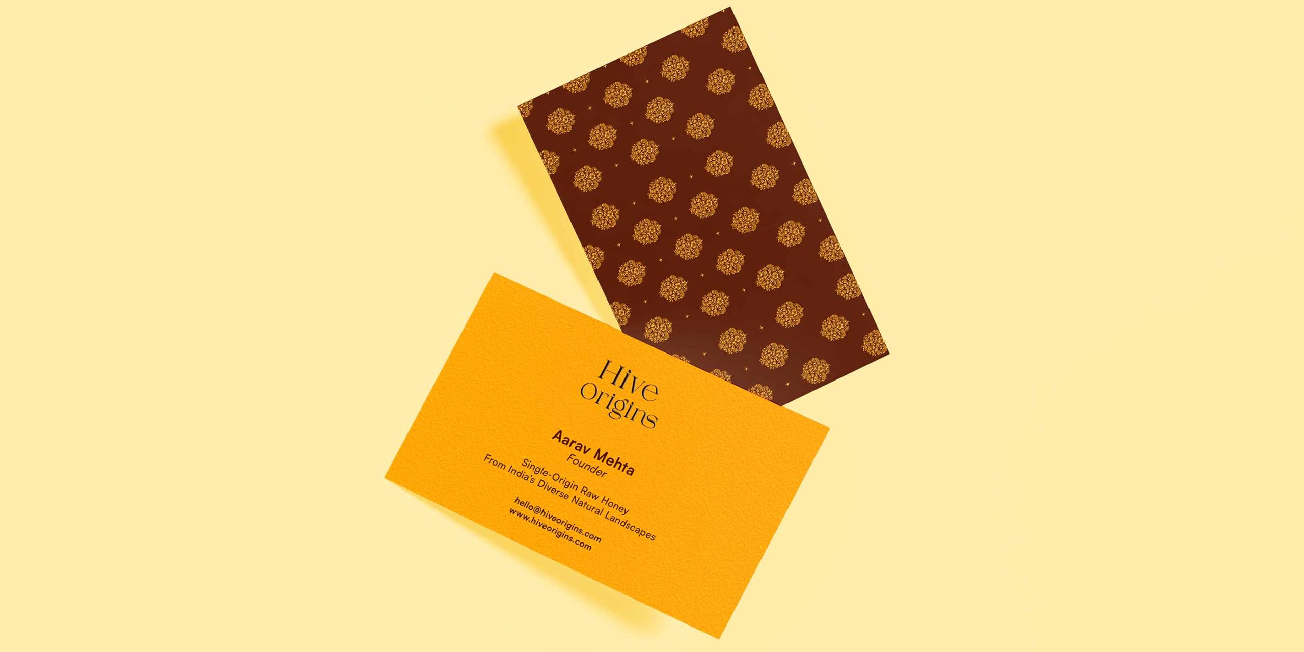
The packaging uses a consistent earthy palette of deep brown and muted honey gold tones to evoke warmth, richness, and natural depth while avoiding the bright commercial yellows commonly associated with mass-market honey brands. Subtle mandala-inspired textures were introduced as a secondary design layer to reference Indian cultural craftsmanship without overpowering the minimalist structure of the packaging.
The gifting experience extends the same philosophy through a rigid presentation box featuring tactile finishes, warm editorial typography, and a welcoming “नमस्ते” message designed to create a calm and emotionally grounded unboxing experience. By combining cultural warmth with contemporary restraint, the system positions Hive Origins as a globally minded premium wellness brand rather than a traditionally “ethnic” product.
RESULT
The outcome transforms Hive Origins into a cohesive premium packaging experience that feels warm, intentional, and globally competitive while remaining deeply connected to its Indian roots. Through restrained typography, a unified colour system, subtle cultural detailing, and sustainable material direction, the brand avoids the visual clichés commonly seen within the honey category and instead creates a calm, modern identity built around authenticity and ritual.
The project successfully elevates raw honey into a premium lifestyle product suitable for modern retail, wellness spaces, and curated gifting environments, while demonstrating how Indian-inspired design can feel sophisticated, contemporary, and internationally relevant without relying on excessive ornamentation or stereotypical visual language.


 NEV
NEV Stefano Bracci
 Alina
Alina monther al omari
 Lizakjx
 JOAOMARCOSDESIGN
 alchimistestudioParis
 Harriet Neild
 octavio rojo
 宏洛图品牌设计HONGLT
 DESIGN CONCEPTS
 Alexander Skurihin
 Studio K95
 ARMBRAND
 Richa Rai
 houseoferas by Miti
 Agence des Coteaux
 Kushi Eaknath
 Ann Treasa
 Xiao Ning
 krrrrrllii
 babyage
 Deep
Deep