

IONT — Diseño de envases cosméticos verdaderamente naturales
Un concepto de marca personal para una marca de cuidado de la piel basado en la transparencia total: sin ingredientes artificiales ni elementos visuales recargados. Cada elemento se creó desde cero: identidad de marca, nombre, dirección artística y diseño de empaque. Un proyecto integral inspirado en la expresión más pura de la naturaleza.
Ilustraciones botánicas, vidrio translúcido, tonos tierra mate y papel kraft texturizado. Nada añadido. Nada oculto.
IONT — Truly Natural Cosmetic Packaging Design
A personal brand concept for a skincare label built on total transparency with no artificial ingredients and no visual noise. Every element was created from scratch: brand identity, naming, art direction, and packaging design. A complete project rooted in the purest expression of nature.
Botanical illustrations, translucent glass, matte earth tones, and textured kraft paper. Nothing added. Nothing hidden.
Curator’s Insight
The decision to strip color entirely is the project’s sharpest move. Most natural skincare brands reach for green, cream, or warm earth tones to signal their botanical credentials. iont refuses that shorthand entirely. Working exclusively in black, white, and unbleached paper, it forces the imagery itself to carry the communication, and the imagery is precise enough to hold that weight.
What makes the system particularly interesting is how it differentiates SKUs without introducing any new visual logic. Each box carries a different botanical subject: cross-sectioned citrus, flat-laid wildflowers, bamboo stalks. The compositional language stays identical across all three, but the specimens change, creating a system that reads as a collection rather than a range. It is the difference between products that sit next to each other and products that belong together.
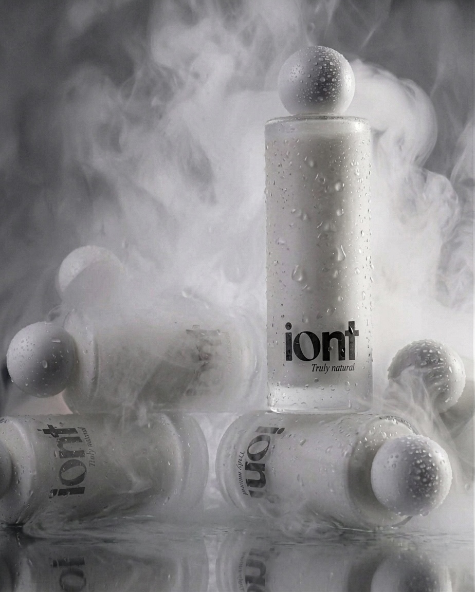
The frosted glass bottles deserve separate attention. The sphere cap is a deliberate departure from the rectilinear discipline of the boxes, and that contrast works well. Where the cartons are graphic and flat, the bottles are tactile and sculptural. Together they create a visual tension that stops just short of inconsistency… which is precisely where interest lives.




 lunapanda
 Tridimage
 Analoguecreative
 lettera7
 alchimistestudioParis
 Lana B
 Colossal
 Pivot Studio
 M&A CREATIVE AGENCY
 monther al omari
 Anastasia Cherepanova | xtramez
 Hollóka Grafikai Műhely / Graphic Design Studio
 BOLD branding
 Antonia Skaraki
 Pâmella Lorrany
 Z9BKAdsgn
 Francesco Paternoster
 b1studio.ro
 Chris Creative Works
 Boordon
 Dmitriy Kuzovlev
 Brand Society
 yasharpic