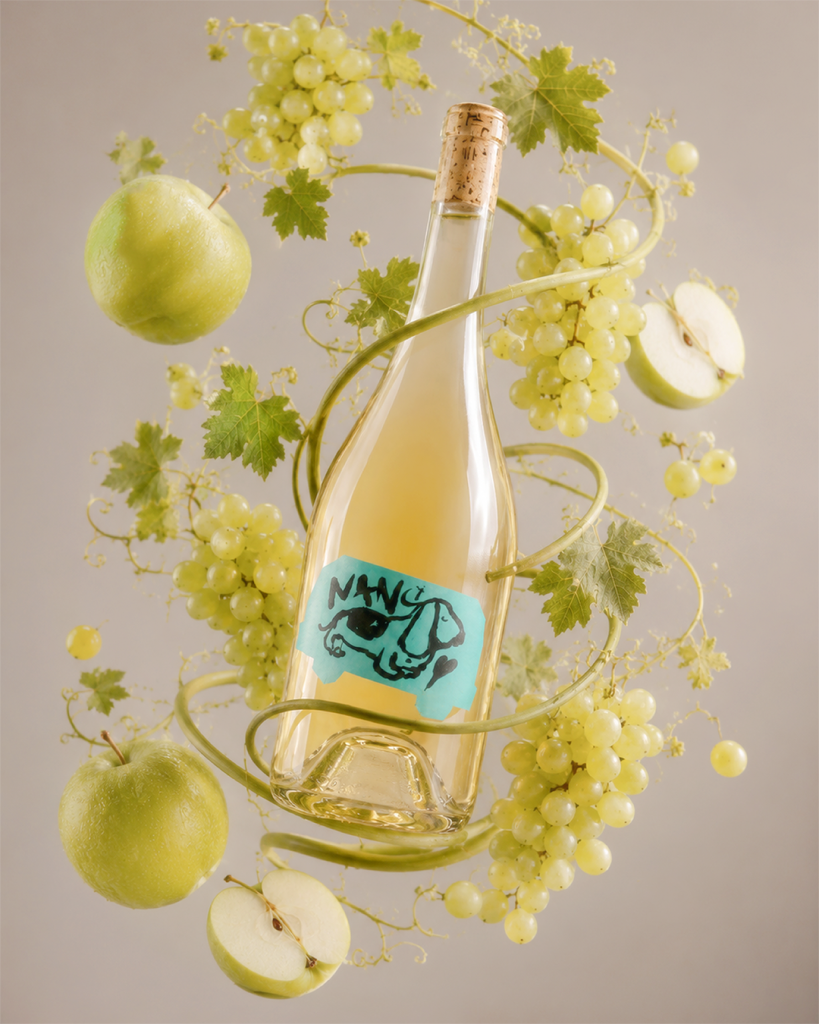

The Van Story.
A journey in every bottle. @kappabetawinery
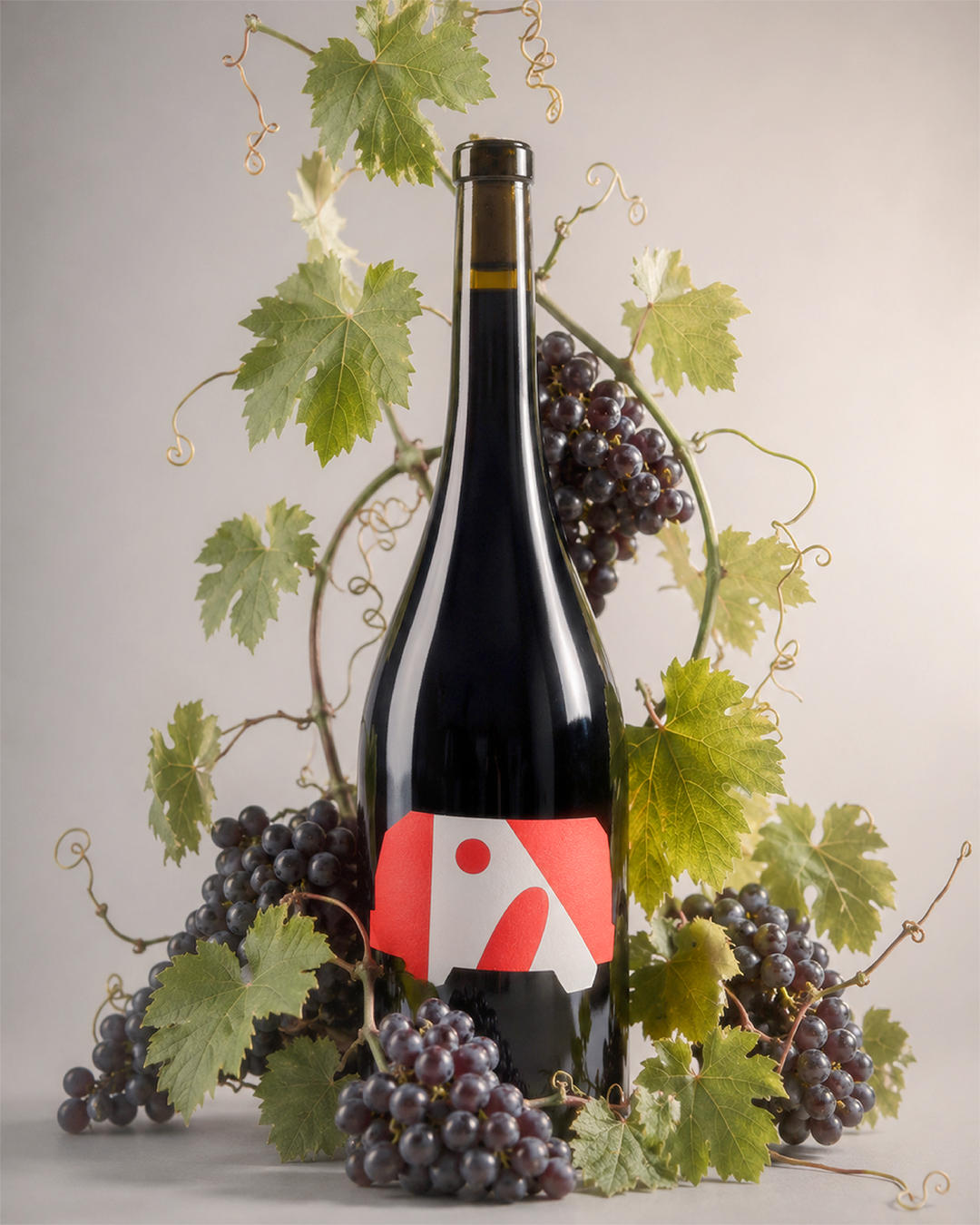
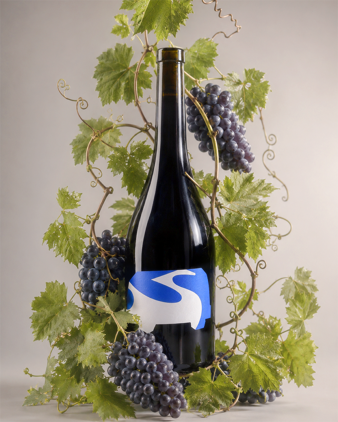
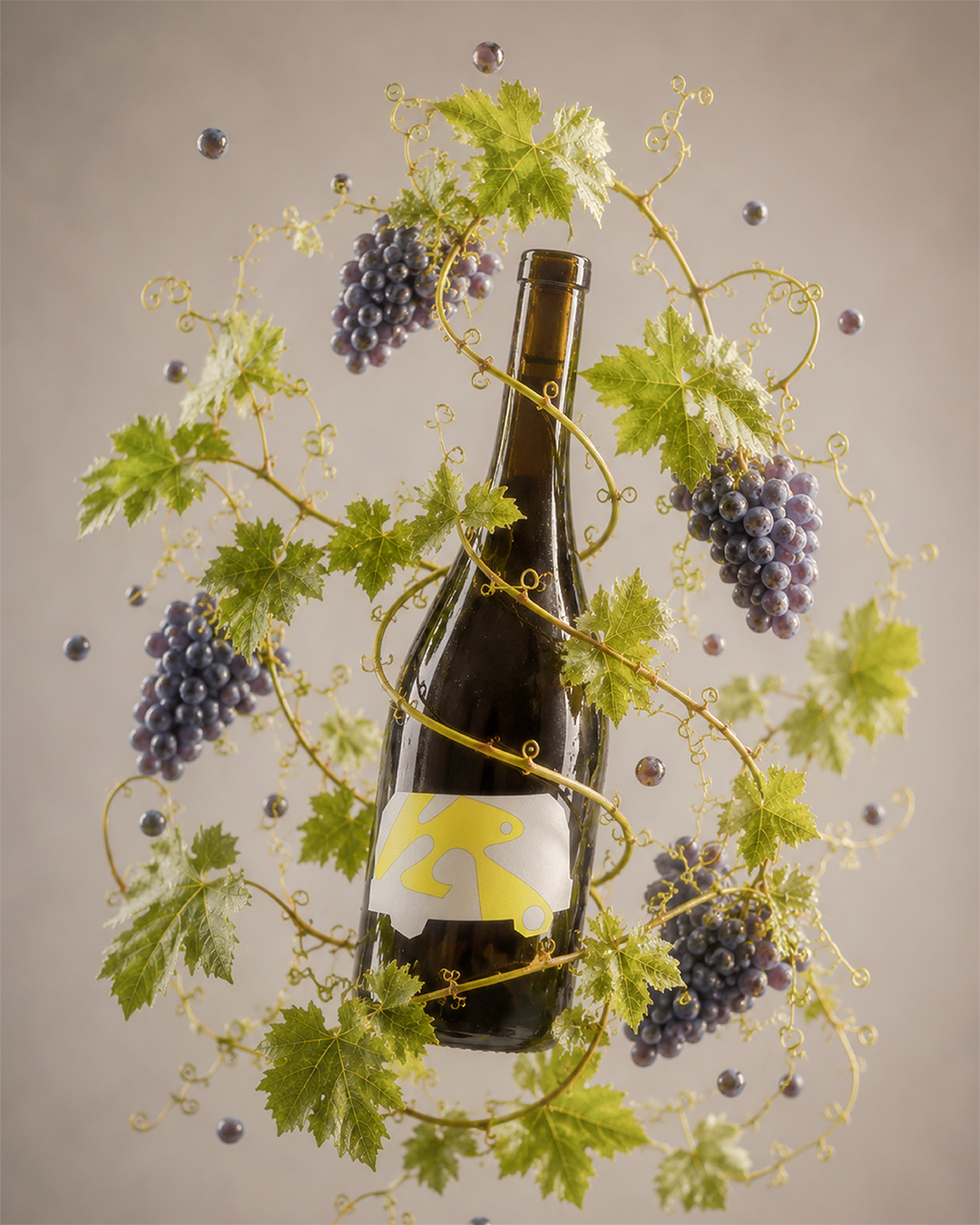
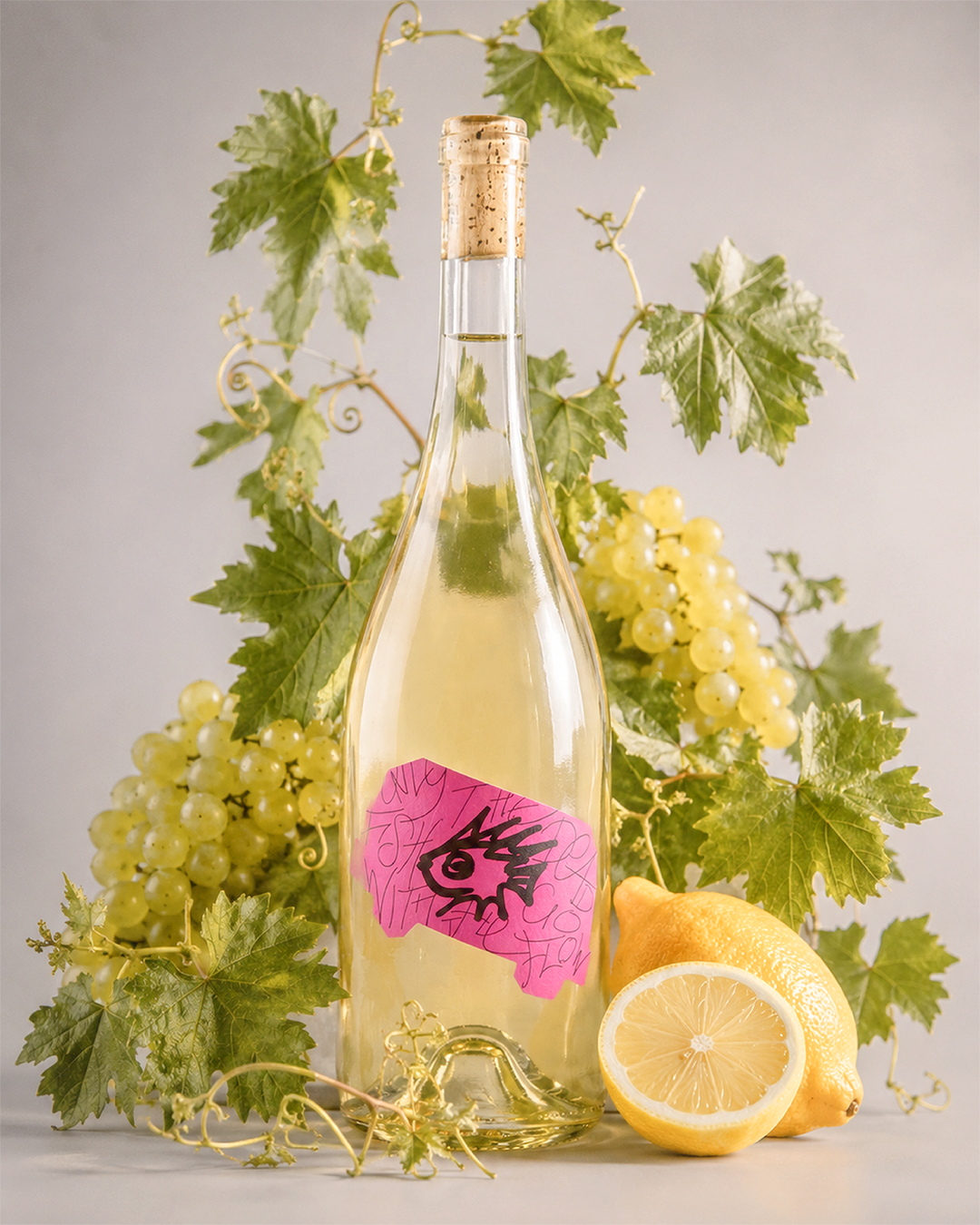
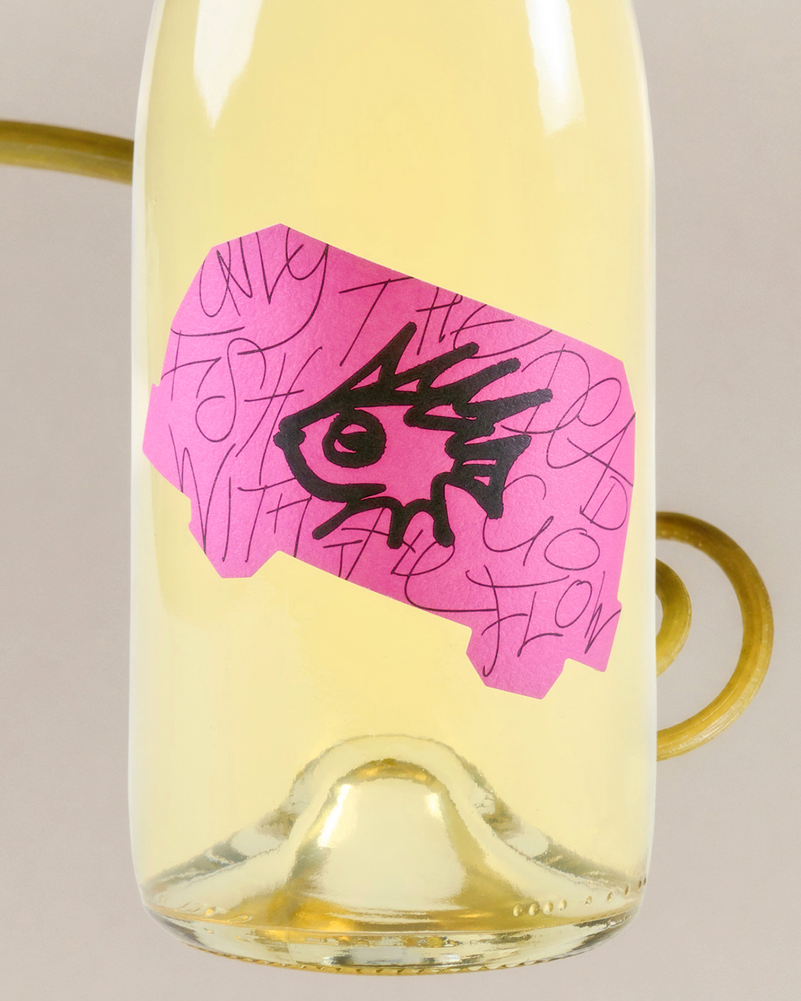
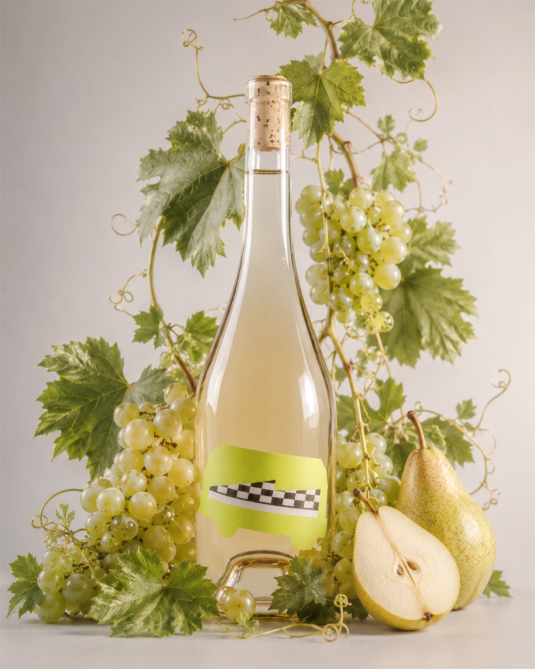
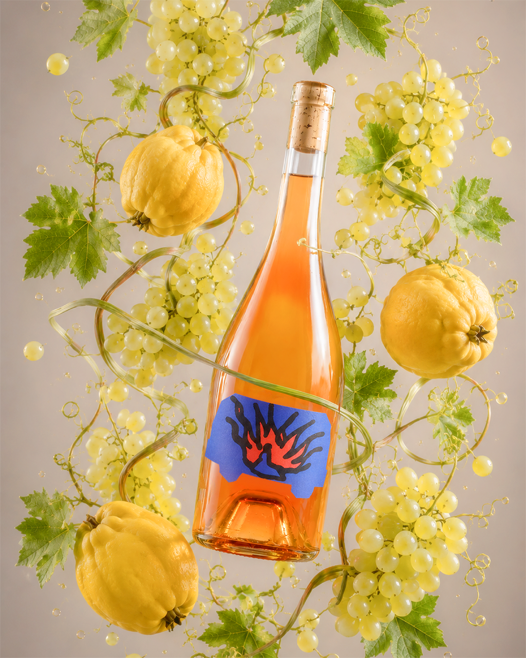
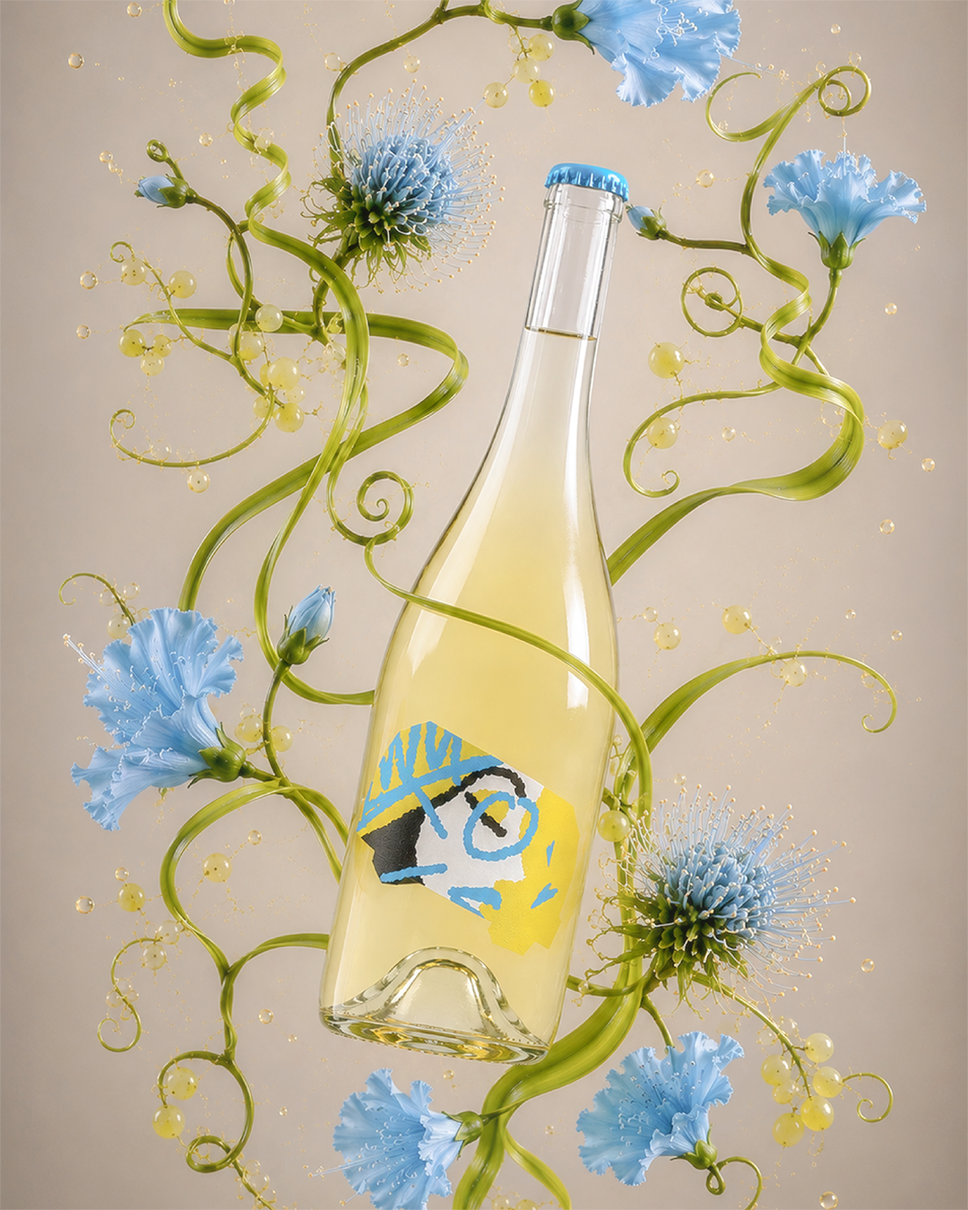
Each label is built on the shape of a van — inspired by the vehicle that carried grapes, tools, people and stories through the journey of KappaBeta.
What began as movement through vineyards became the winery’s visual identity system.
On the front, every bottle tells its own story through a different van-shaped label.
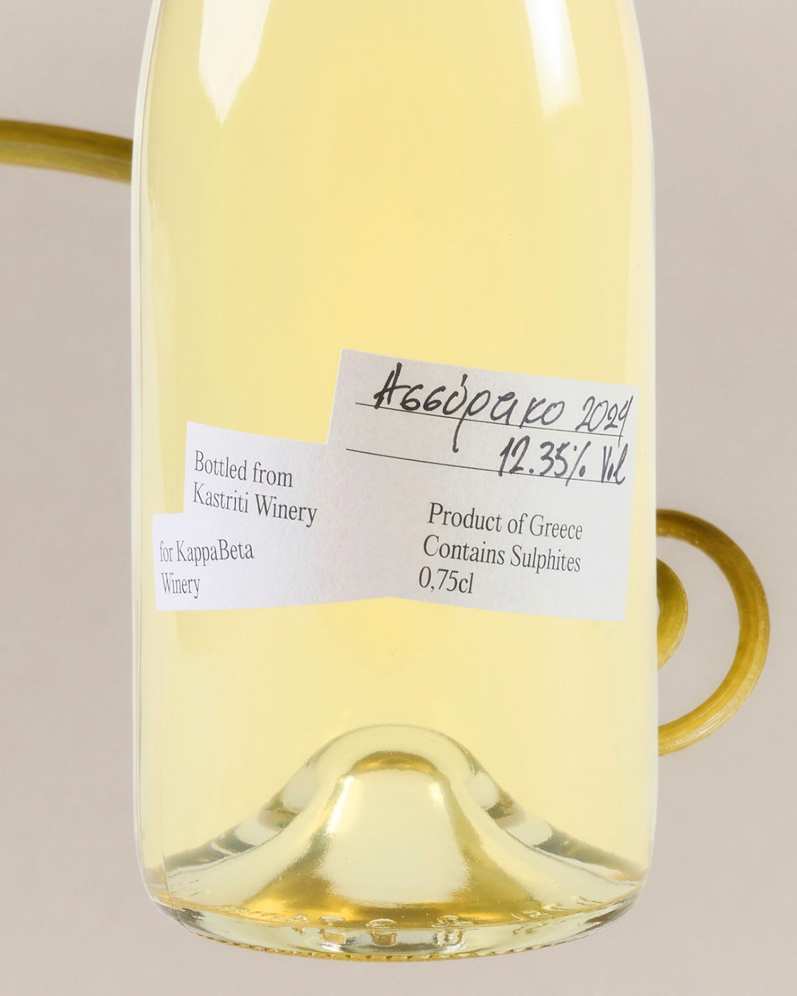
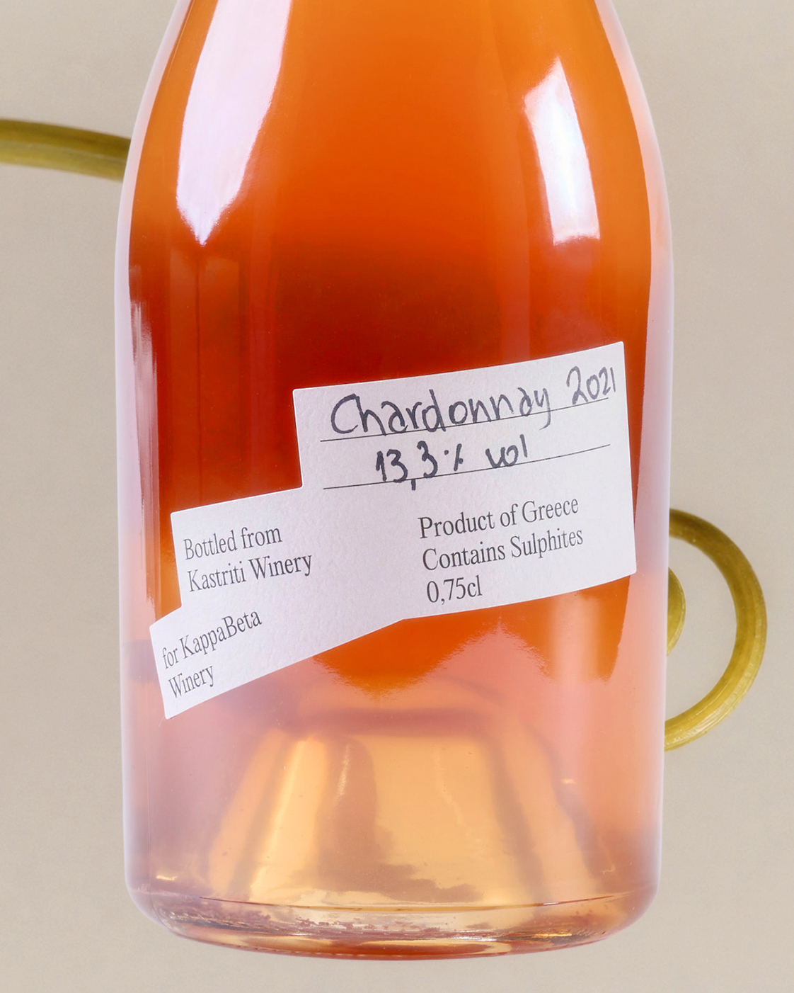
On the back, the system stays constant.
Inspired by the paper tape placed on wine barrels to mark their contents, the back label carries the winery information, while the variety and alcohol volume are handwritten individually on each bottle.
A balance between structure and human touch.
Eight bottles.
Eight stories.
One moving language.
Curator’s Insight
The van motif earns its place here because it operates on two levels simultaneously. As a shape, it gives the label system a consistent silhouette across all eight variants — a structural device that creates instant family recognition on shelf without requiring a uniform illustration style. As a narrative, it grounds the brand in a specific, unglamourised version of winery life: not the estate, not the harvest table, but the workhorse vehicle. That specificity is what separates this from the category-wide trend of “artisanal story” wine labels, where the narrative tends to be vague and interchangeable.
The tension between the front and back labels is also worth noting. The front leans into expressive, almost raw mark-making — the magenta fish-eye label in particular reads closer to zine culture than fine wine. The back resets that energy with something disciplined and archival. This contrast prevents the system from tipping into pure novelty: the handwritten details on each bottle introduce individual variation at scale, giving a production run the feel of a small batch without misrepresenting what it is. Structure and spontaneity held in genuine equilibrium.



 MID-AIR STUDIO
 Heramb Arora
 monther al omari
 Tríona O'Donoghue • Design
 Cocoon Prague
 alchimistestudioParis
 hugo zapata
 Bonsanco Creative Studio
 parawaradesign
 UPRISE
 Brand Society
 Que Cálido Studio®
 Richest Branding Pvt. Ltd.
 STRATEDGY
 Shapers Studio
 Platon Ivantsov
 WPA Pinfold
 giselepereiradesign
 ShalaSketches
 05Creation
 Voit Studio
 SSTO
SSTO