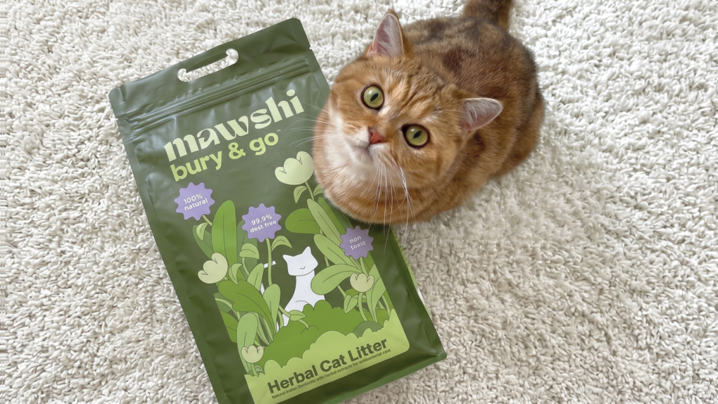

MAWSHI BURY & GO: LITTER PACKAGING FROM A CAT’S POV
mawshi is a cat care brand built on a single observation: a cat stretches fully only when it feels completely safe. Its first product, bury & go, is a litter made from Indian bentonite infused with natural antibacterial extracts.
At Devalok, brand names are not labels. They are the first act of storytelling. mawshi comes from Billi Mausi, a term of affection in India meaning cat aunt. That same logic extended to naming the product: bury & go is what cats actually do, described on their own terms, not ours.
Devalok worked with mawshi across brand naming, tone, visual identity, packaging, website, and marketing assets. The packaging had to carry the brand’s central promise of caring from a cat’s point of view, and do it on a shelf and an Amazon listing where every other litter pack in the category was shouting.
Designed around one specific moment
The packaging is built around the moment a cat is most vulnerable: the moment it uses the litter box. A cat squatting in its litter is exposed, occupied, and unable to move. That single moment shaped how the pack had to feel: calm, considered, and honest enough to be worth the trust the cat is placing in its surroundings.
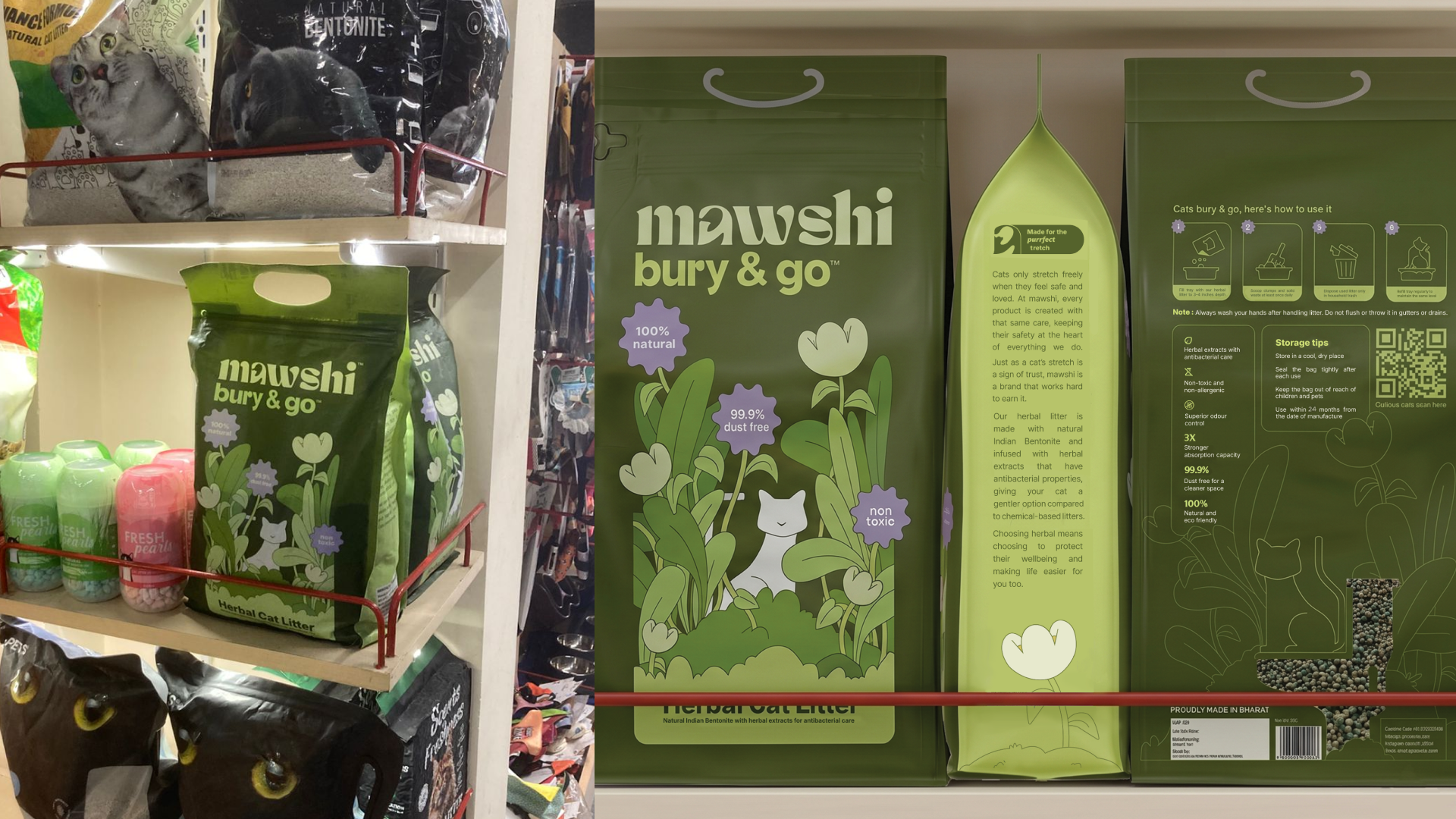
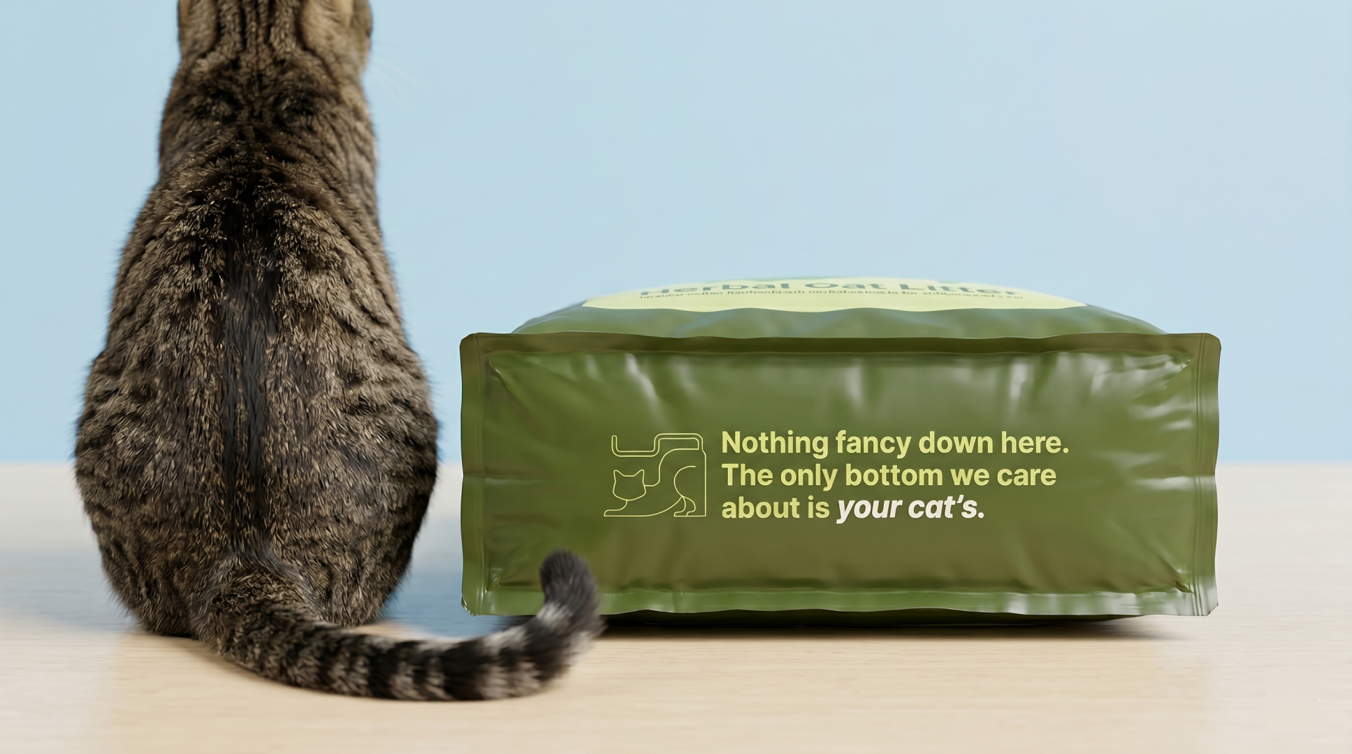
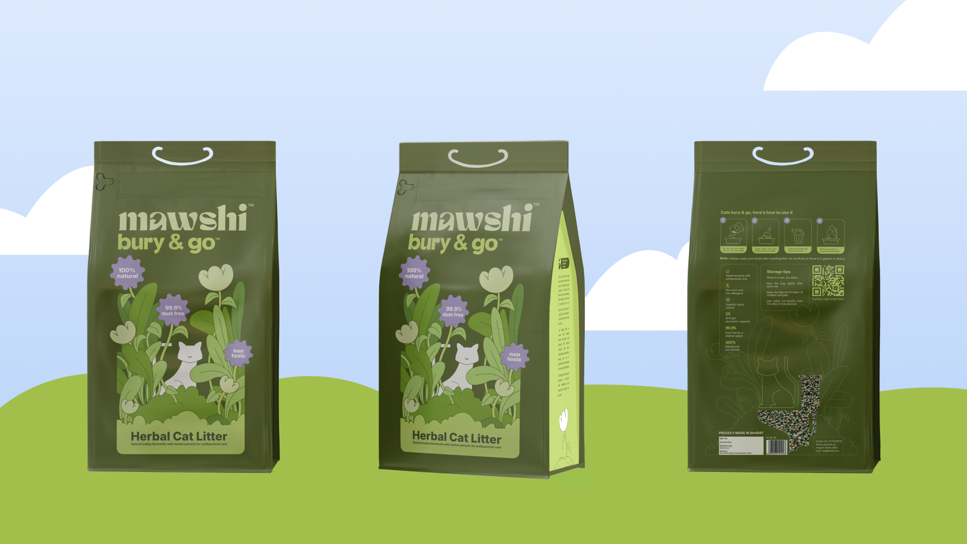
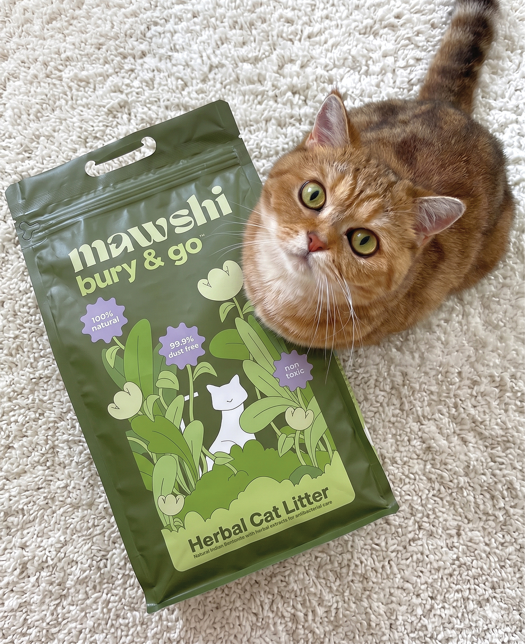
We crafted the front and back of the pack as a single continuous narrative told across two sides. The front shows a cat sitting behind lush green foliage, signalling the herbal quality of the litter. Turn the pack around, and the same cat is now perched on a toilet seat, partially hidden by the same foliage. What the cat was up to behind the leaves reveals itself only when you take a second look. The front face is otherwise kept intentionally minimal. The brand and product name sit at the top, and the product’s most important claim sits below it, with nothing else competing for attention. The back carries a clear how-to, the key features, and a QR code to the website. The sides and the base carry the brand story, the Feline Foundation partnership, and at the very bottom, the line that earns its place exactly where it sits: nothing fancy down here. the only bottom we care about is your cat’s.
The most considered detail on the back panel is a transparent cutout shaped like the toilet seat the cat sits on. Through it, you can see the actual litter inside the pack. For a product that claims to be 99.9% dust-free, showing the litter is more persuasive than printing the number. Functional transparency arrived at through the same playful logic that runs through every other decision on the pack.
A visual language borrowed from cats
The illustrations follow what we call the Soft World: rounded forms, low saturation, warmth chosen over precision. A cat in the Soft World has the proportions of a cat you love, not a cat photographed under studio lighting. The colour palette was drawn from the surfaces cats actually choose to live on. Soft light, worn fabric, warm floors, the green of a plant she has claimed a corner near. The category has oversaturated itself with bright, attention-seeking colour. mawshi went the other way because a cat does not choose a loud space if it can help it.
The packaging was developed through physical sampling alongside the founders. We worked with the manufacturing vendors in person, testing every option: how each material felt in hand, how it read under different light, how the closure held after repeated use. The pack closes with a zip-lock, uncommon in the litter category but something cat parents value for storing and pouring. It carries a handle at the top. The finish is matte, chosen against glossier alternatives because gloss reads as performance and matte reads as honest.
Unique by design
Three things make this packaging specific to bury & go:
The first is the continuity of narrative across the pack. The front and back are not two separate design surfaces. They are two halves of one image, with the cat caught mid-story between them. Most packaging in the category treats the back as a spec sheet. We treated it as the second beat of a jokeThe second is the transparent cutout. It does what most packaging copy tries and fails to do: it lets the product prove itself. Dust-free has to be demonstrated, not declaredThe third is the writing on the pack. The product name comes from watching what a cat actually does at the litter box. Step in, do the business, bury, leave. bury & go names two cat behaviours in sequence, from the cat’s point of view rather than the parent’s. The copy on every panel, including the punchline at the bottom, holds the same fact-first, warmth-second voice.
bury & go is now Amazon’s Choice!
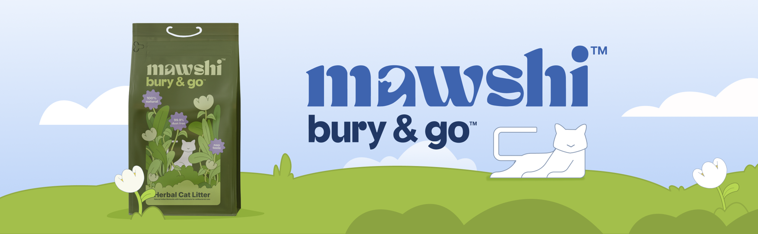
bury & go launched on Amazon rather than through a direct-to-consumer channel, which meant the packaging had to work hand in hand with the listing page. We built the A+ content with the same Soft World illustrations, the same continuous narrative, and the same fact-first voice that shaped the physical pack. The two surfaces, the pack and the page, read as one continuous brand. Paired with SEO writing held to the same standard, bury & go is currently Amazon’s Choice in its category. The packaging earned its place not by competing with the category on volume of claims, but by behaving the way the brand promises a cat should: calm, observed, and completely at home.



 hello ocean
 monther al omari
 the Labelmaker
 alamgirbrands
 kat bres
 Vantablack Studio
 GruppoSaida
 studiorevv
 grafisercreative
 Kate Reichel
 UPRISE
 Modern Theory
 By siddika
 MAISON D'IDÉE Prague
 Kinshuk Bainss
 Palashcc
 www.branding.uz
 Hutton Creative
 DESIGN CONCEPTS
 Tancybox
 habiba hatem
 Up-Brands
 sayadworks
 Kingdom & Sparrow
 furtgoods
 Si me preguntas