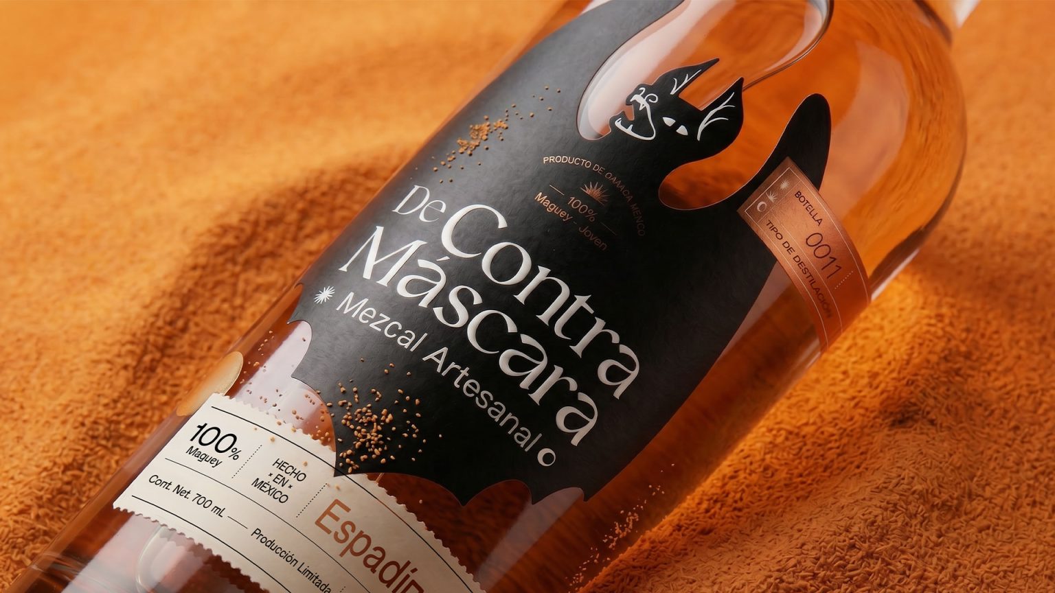

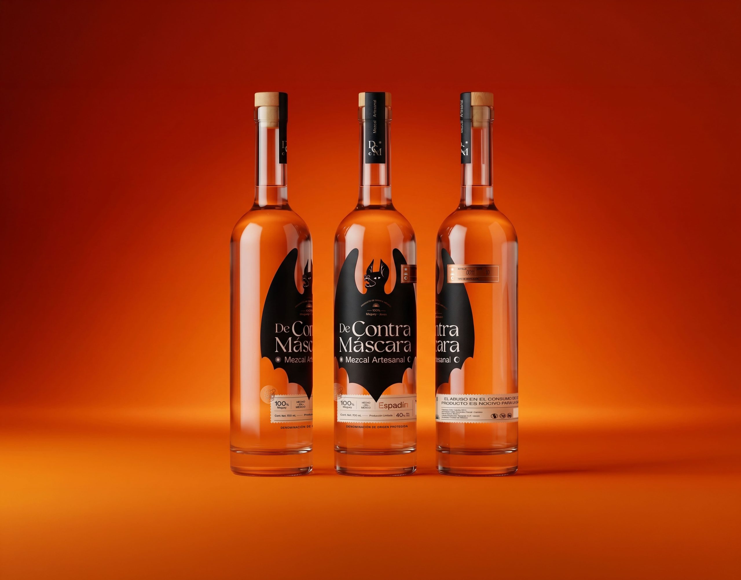
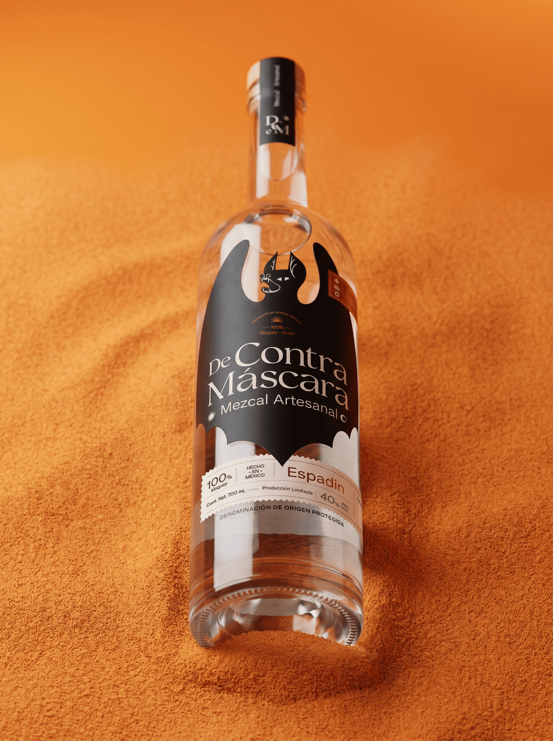
Branding and packaging project created for a small family-owned artisanal mezcal producer in Oaxaca, Mexico. “DeContra Máscara” explores a dark, contemporary, and handcrafted visual identity inspired by the authentic spirit of handmade mezcal.
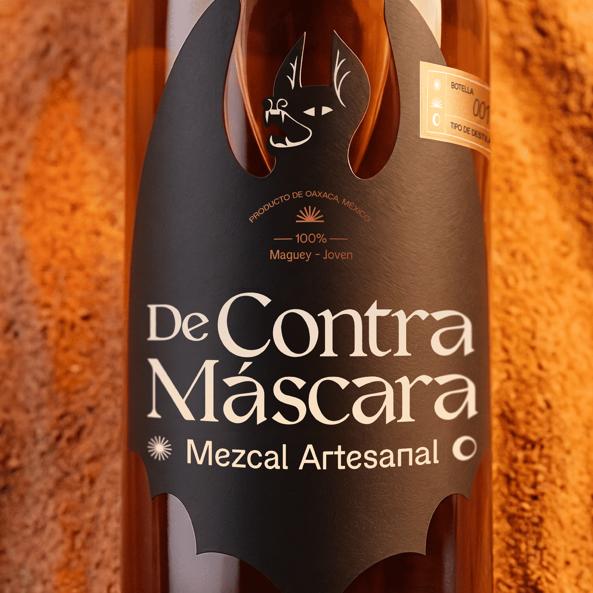
The bat becomes the central symbol of the brand, representing mystery, nightlife, and the natural connection to agave ecosystems. Beyond its visual strength, bats play an essential role in agave pollination, becoming silent guardians of mezcal tradition.
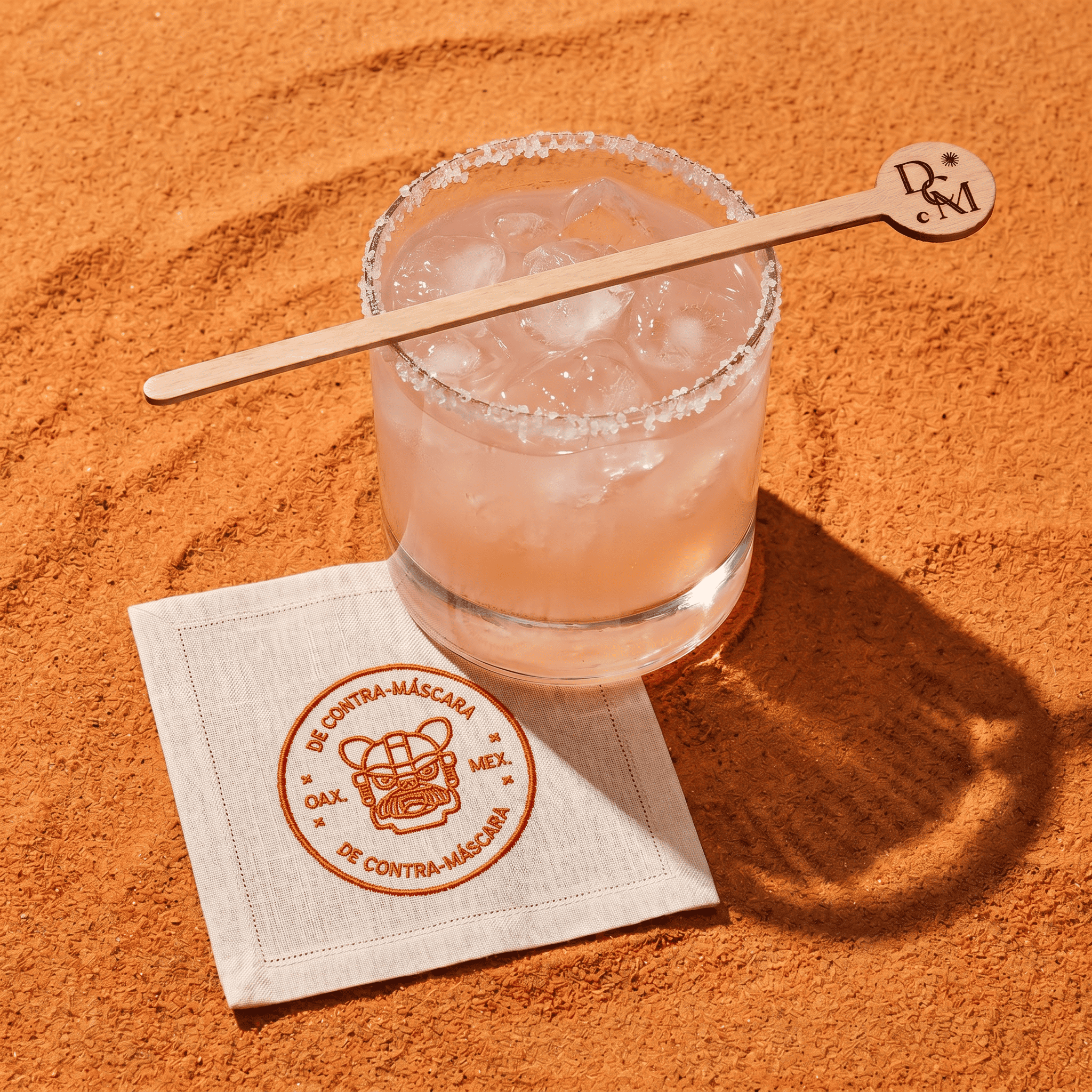
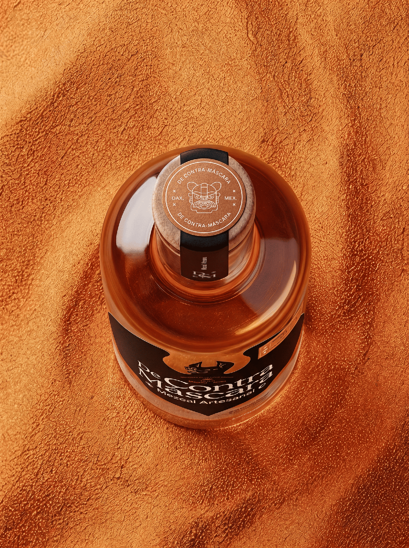
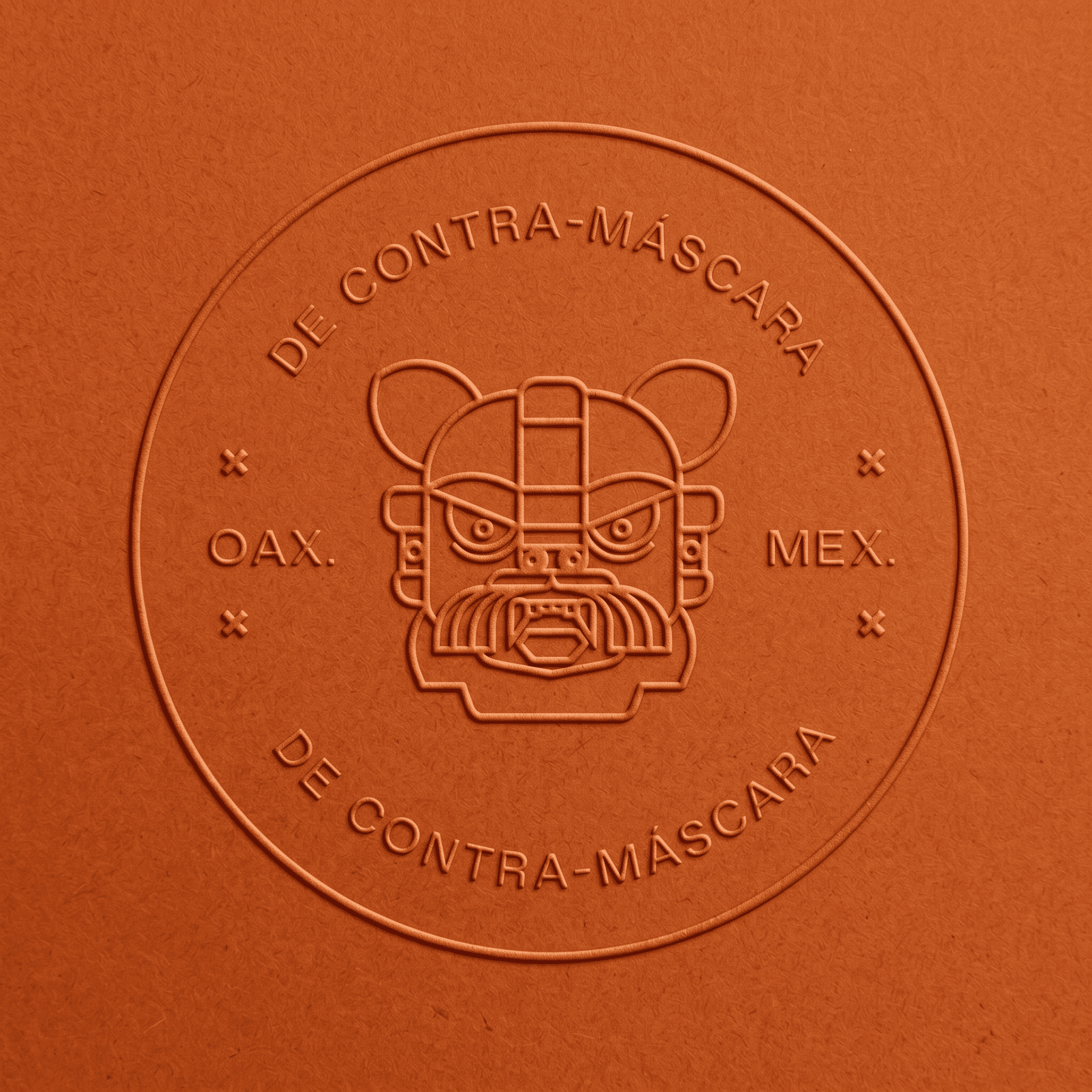
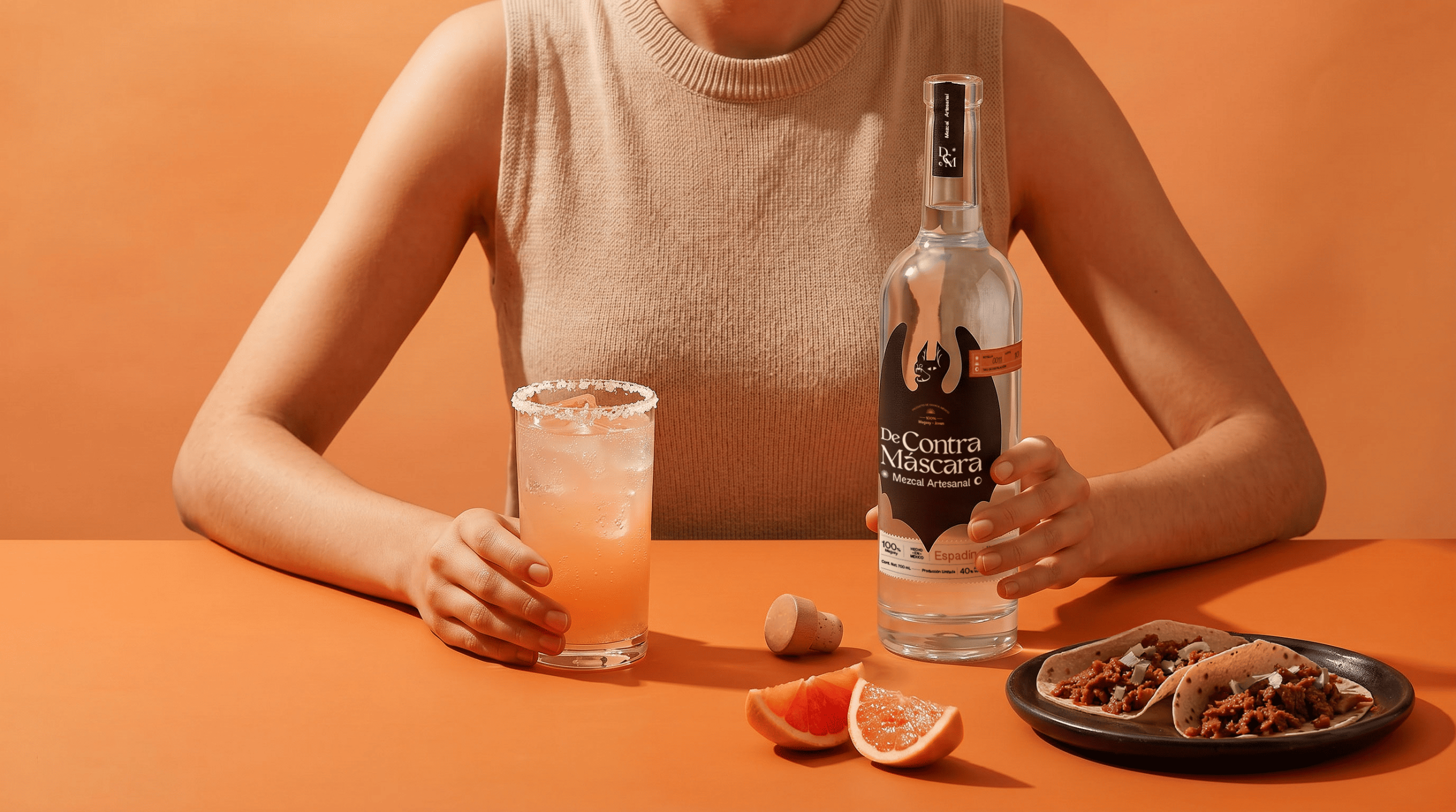
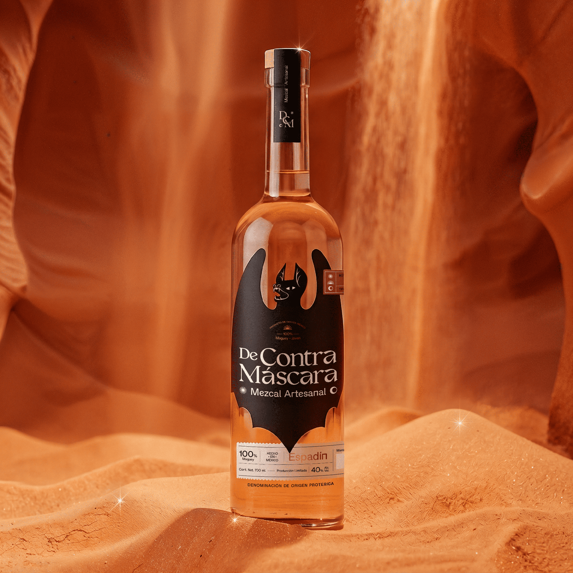
The project included art direction, label design, visual system development, and product visualization, creating a bottle that honors the artisanal process and the human story behind this family business.
Curator’s Insight:
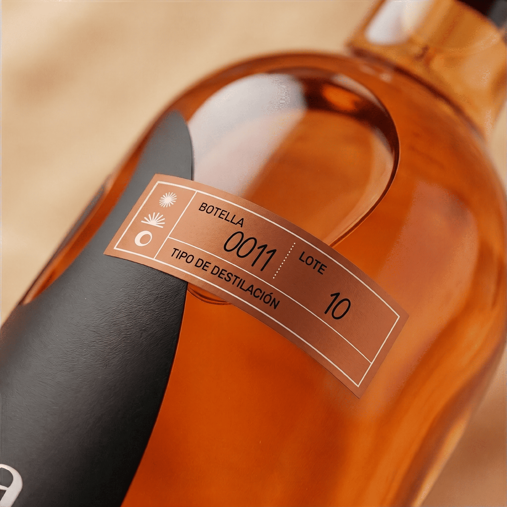
The smartest decision in this project is also the most structural one: the bat isn’t applied to the label, it is the label. The die-cut silhouette means the illustration has no frame to contain it, so the wings extend past the label edge and land directly on the glass. That choice does a lot of work quietly, collapsing the distance between graphic and object in a way most spirits packaging never attempts. The torn paper lower label introduces a second texture register without disrupting the mood, and the individually numbered copper tag on the shoulder adds a tactile proof-of-craft that reinforces the limited-production story. Where many mezcal brands reach for folk art or rustic cues, DeContra Máscara goes dark and contemporary, and it lands because the bat symbol actually has biological legitimacy in the agave ecosystem. The concept isn’t borrowed atmosphere. It’s grounded.


 softmachine
 monther al omari
 alchimistestudioParis
 airobtq
 Buzz & Co.
 Ruby
Ruby themythographer
 IDNB Inc.
 viktorflr
 Zenpack
 Wessam Hussien
 samarabdelmonem
 StudioMordius
 Polaris Designs
 Atiq Alam
 duha mohamed
 HassanEtman22
 agarcia studio
 Wynand88
 Eva Chistyakova
 Maria Bukhtilova