

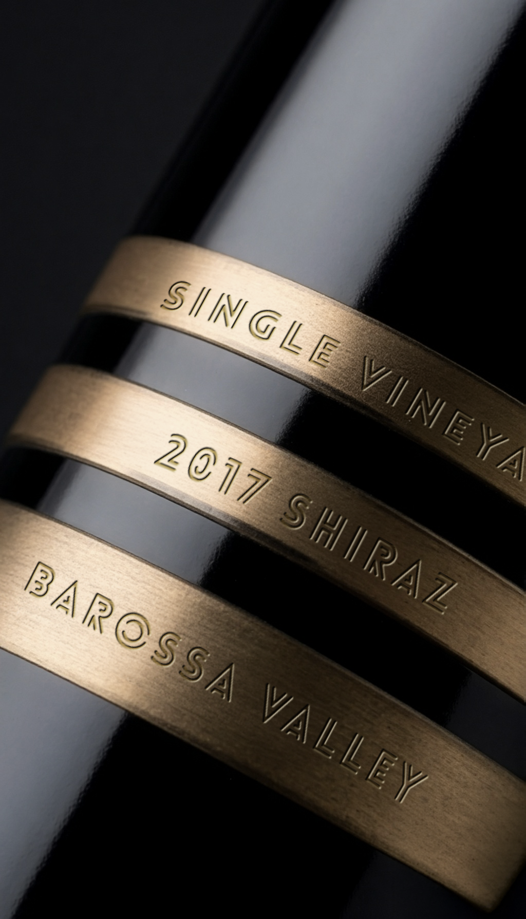
Minimalist storytelling, born from a desire to challenge the traditional visual language of the wine category is where New Oak came about. By stripping away the conventional paper wrap, the packaging honours the wine’s maturation process through a literal yet abstract deconstruction of a traditionally coopered new oak barrel.
The three metallic bands represent the iron hoops of the barrel, while the lined typography within them emulates the organic growth rings of the oak wood itself.
Technical Rigor & Printer Collaboration
The defining challenge of this project was the “invisible” label. To achieve the illusion that the metallic foil strips are applied directly to the glass, we worked in an iterative, high-precision partnership with the printers.
Layered Construction
The label was engineered using a two-layer process. A specialist gloss base was selected to perfectly match the refractive index of the glass bottle.
Achieving Discrepancy
This base layer gives the optical impression that the bottle is naked, allowing the silver MT foil strips to appear as floating, independent elements.
Tactile Embellishments
To elevate the premium feel, we utilised a combination of Matt Varnish on the barrel rings and Gloss Varnish on the base.
Structural Depth
De-bossing between the rings and the specific embossing of the “rivets,” provide a haptic experience that mirrors the physical construction of a barrel.
The Result
The final result is a packaging solution that eschews loud graphics in favour of technical sophistication and material honesty. It is a design that respects the consumer’s intelligence, inviting them to discover the story of the wine through touch and subtle visual cues.

 Lisa Pokrovskaya
 Simple Studio
 Studio Unbound
 David Byerlee
 M&A CREATIVE AGENCY
 alchimistestudioParis
 monther al omari
 Studio Be Design
 LogoSayLove
 agenciabud
 Shustova p
 mutta
mutta @Allenarts13
 Sirka Agency
 Atiq Alam
 Dozen Agency
 j.substance
 SCD
SCD Cristian Lepore | crilep Copia
 Chris Creative Works