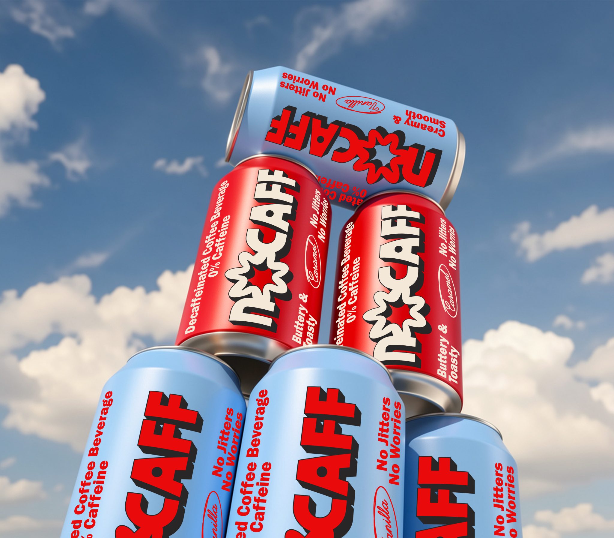

NOCAFF is a zero-caffeine coffee brand that reimagines decaf through a playful and nostalgic visual lens. Inspired by retro beverage packaging, convenience-store graphics, and vintage editorial typography, the concept challenges the idea that decaf needs to feel minimal, clinical, or restrictive. Instead, the brand embraces coffee as an emotional ritual — familiar, indulgent, and culturally comforting without the intensity traditionally associated with caffeine.
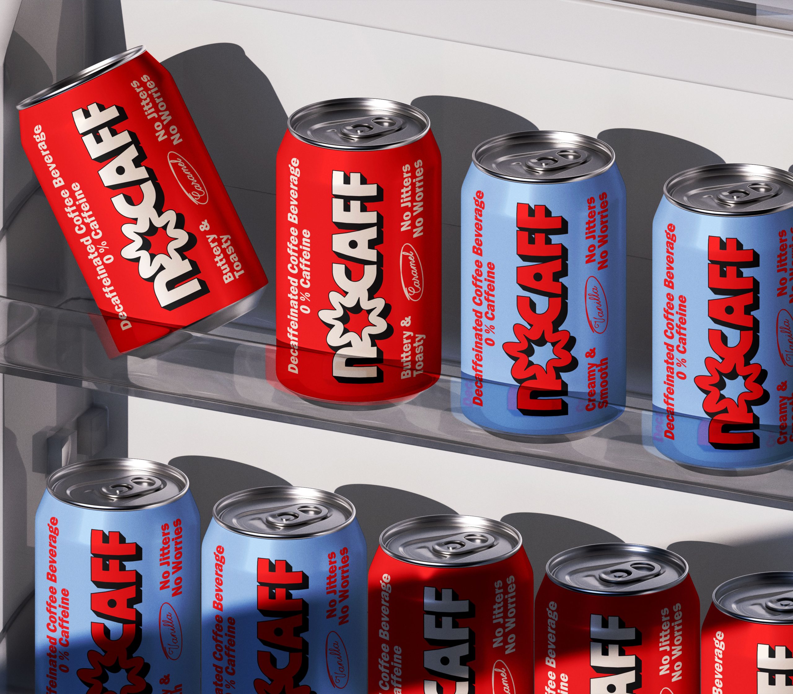
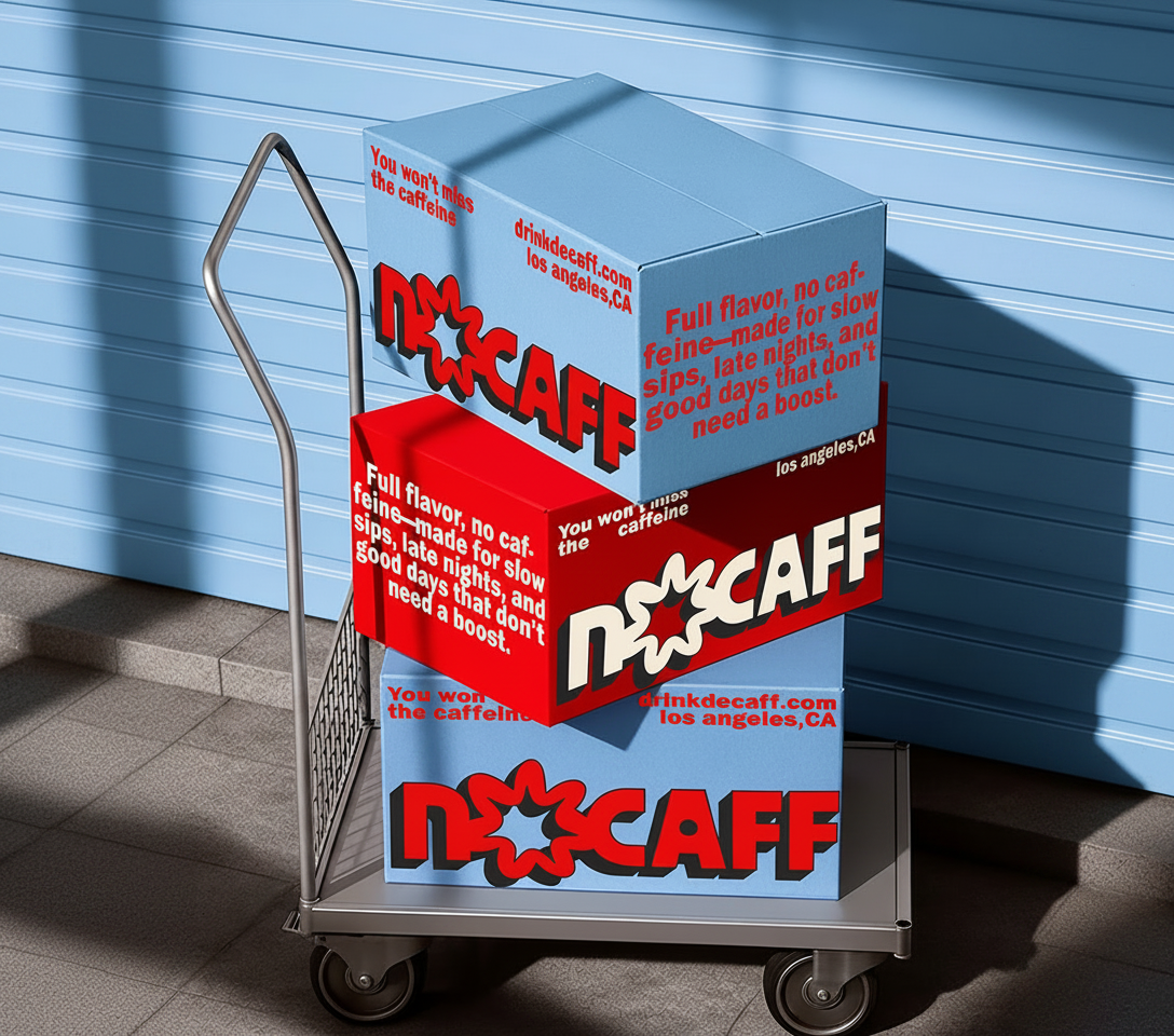
The visual identity combines oversized typography, bold color contrasts, crowded layouts, and playful rotations to create packaging that feels spontaneous and collectible. Repeating phrases function as graphic elements rather than traditional advertising copy, allowing the cans to feel more like found printed objects from another era.
By contrasting visually energetic packaging with the calming nature of a caffeine-free product, NOCAFF creates a distinct tension between loud aesthetics and soft experience. The result is a contemporary coffee concept that feels expressive, nostalgic, and instantly recognizable while still maintaining a clean and design-forward visual system.



 Studio Zak
 Ander Sanchez
 Atipus
 Widarto Impact
 hovski
 Ohmybrand
 CreativeWise
 Rauf Karaev
 Hooperstudio
 La Nube de Ideas
 Modern Theory
 Akim Melnik Design Studio
 preflightcreative
 Seyf El Haq Menouer
 Badraddine Attik
 Samriddhi Ravi
 Alessandro Ammaturo
 Amblr Studio
 vladlenalevit
 Sis Tsarukyan
 monther al omari
 alchimistestudioParis
 designsbysukaina
 About House of Ta
 Amjad Battal