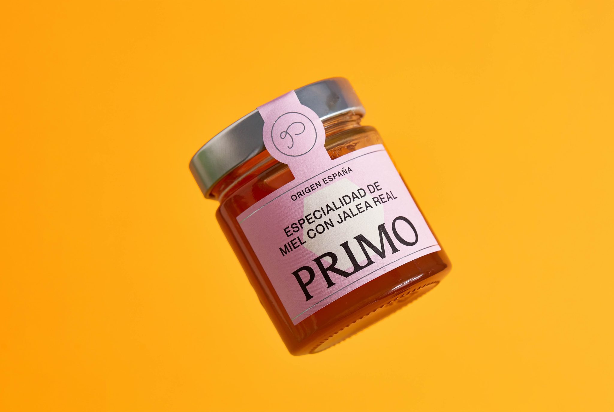

Primo Mendoza SL has been part of the honey industry for more than 100 years. Over time, the company had built a fragmented ecosystem of 8 disconnected brands and more than 150 products, diluting both recognition and brand value on shelf.
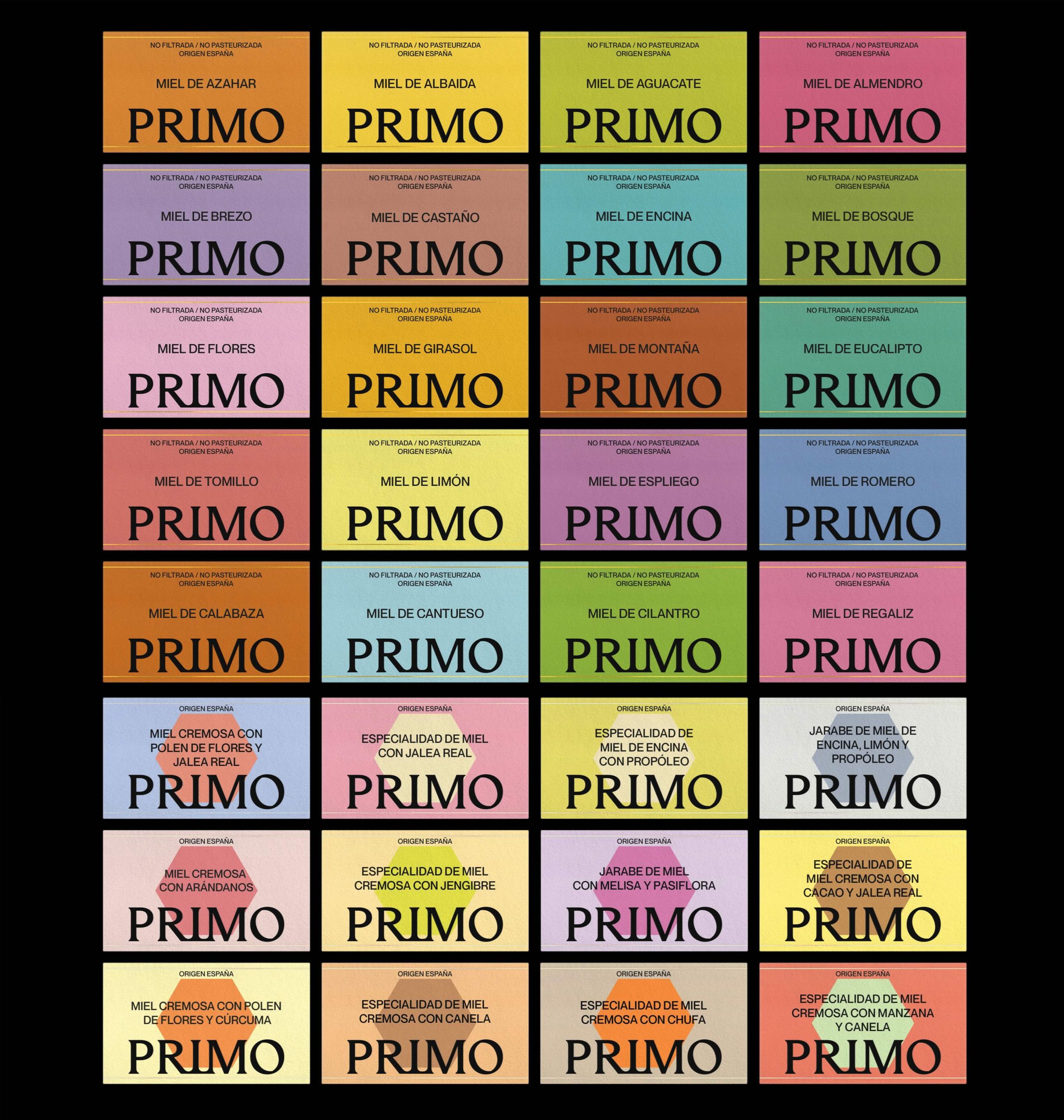
Through a strategic audit involving management, production, commercial, and marketing teams, we identified the real challenge: this was not a packaging problem, but a brand architecture problem. Multiple brands competing without hierarchy, consistency, or a shared voice.
The answer was already there: PRIMO.
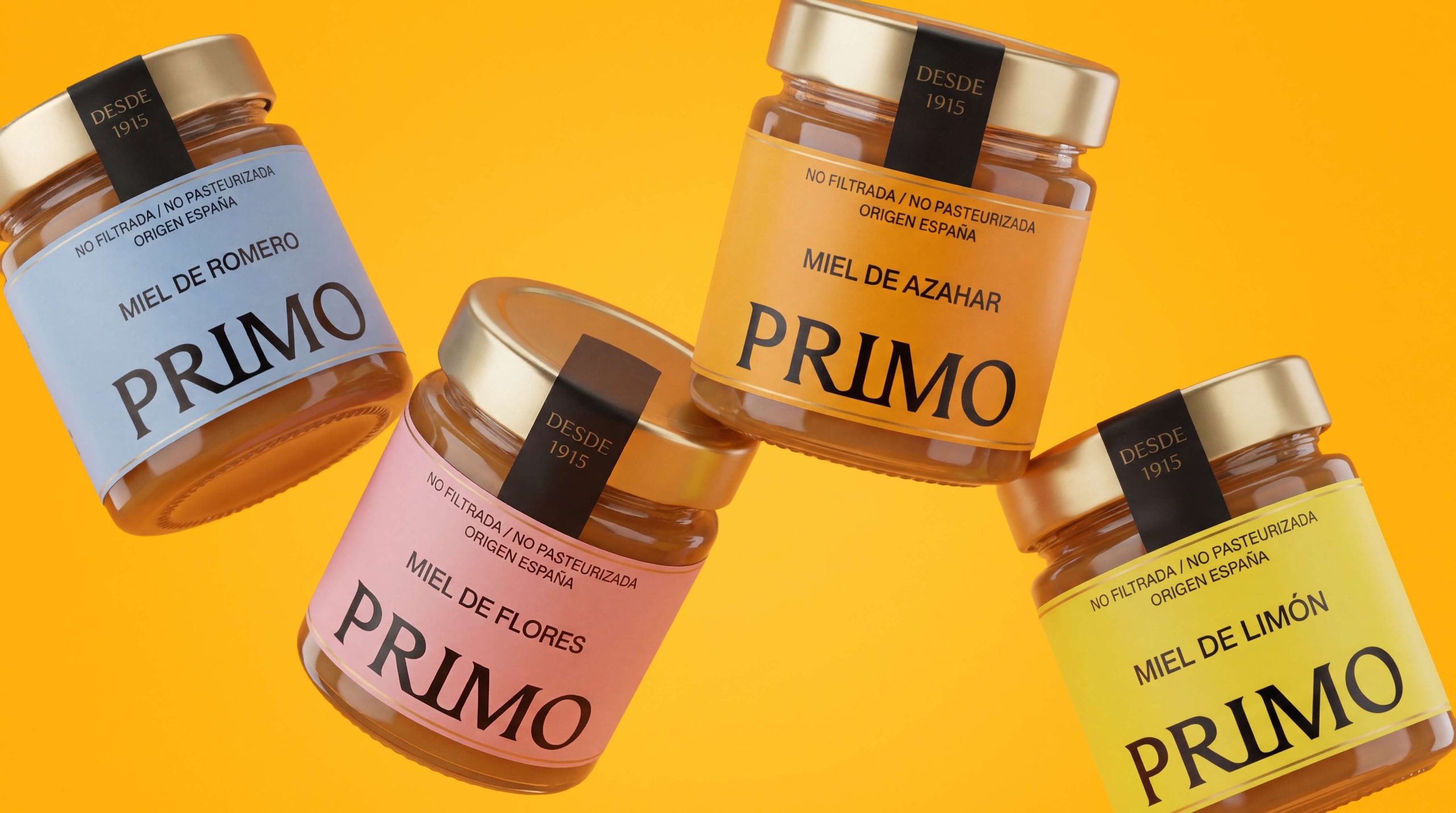
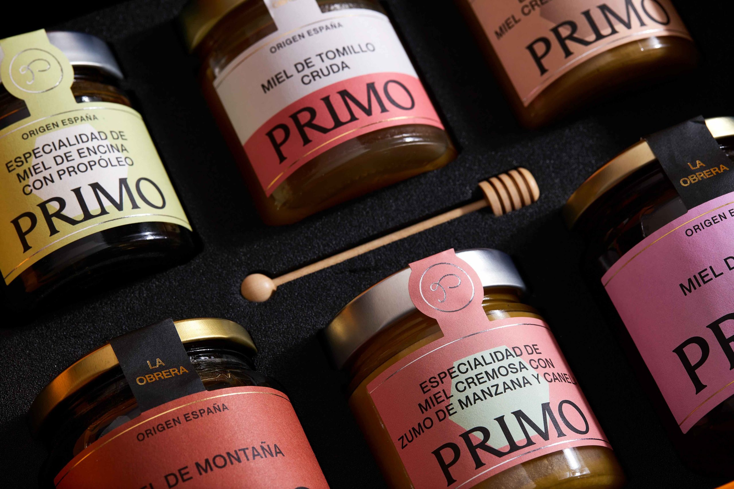
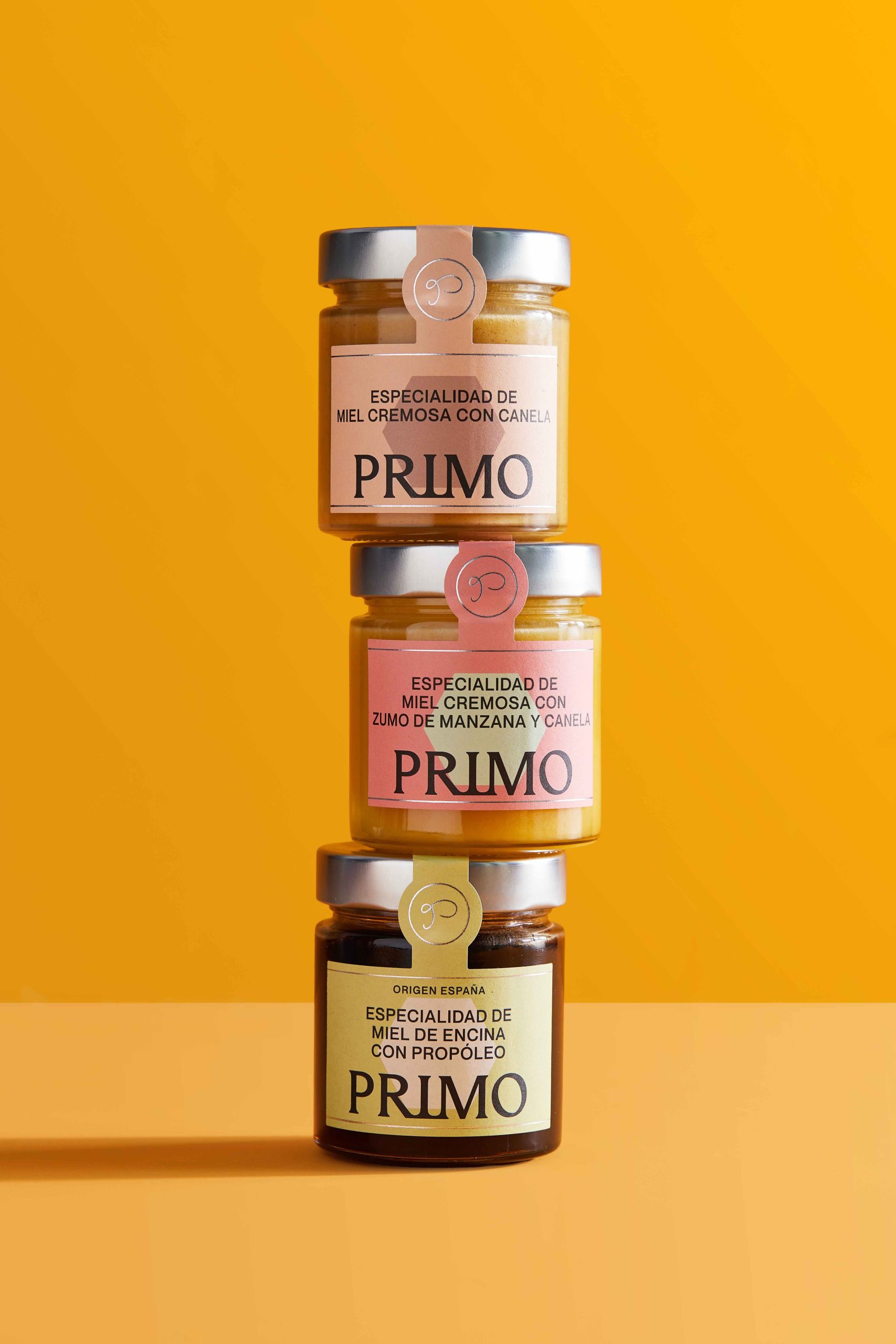
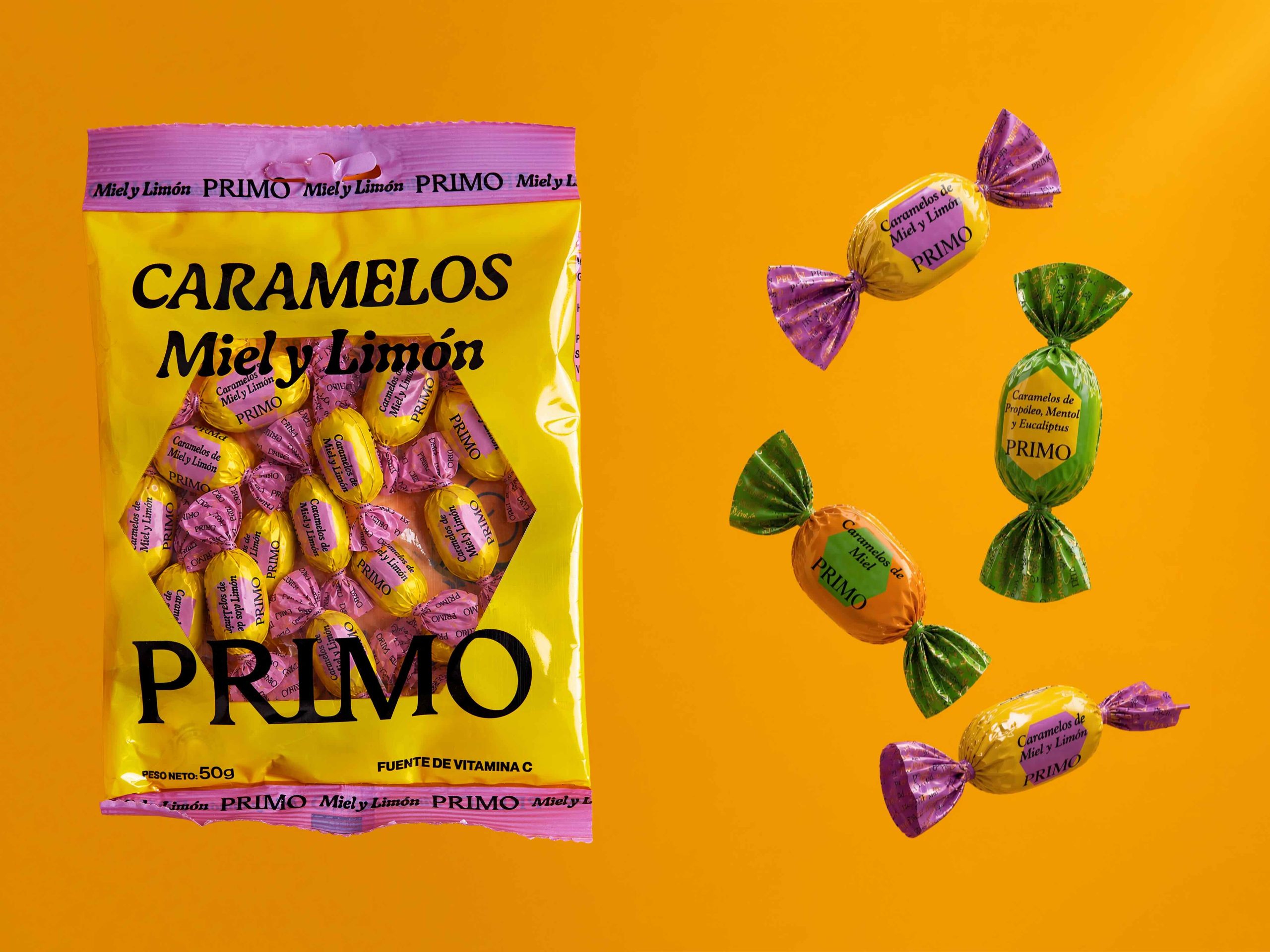
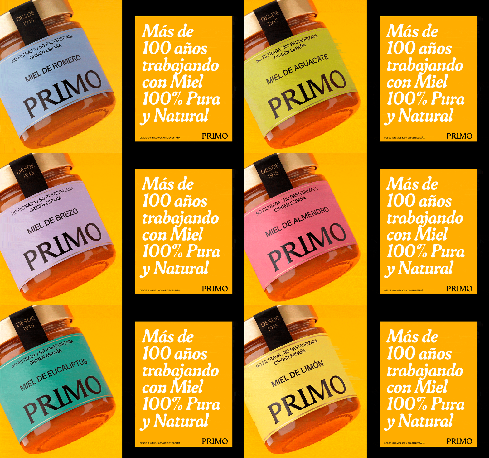
A new umbrella brand designed to unify the entire portfolio under one clear, scalable, and recognizable system.
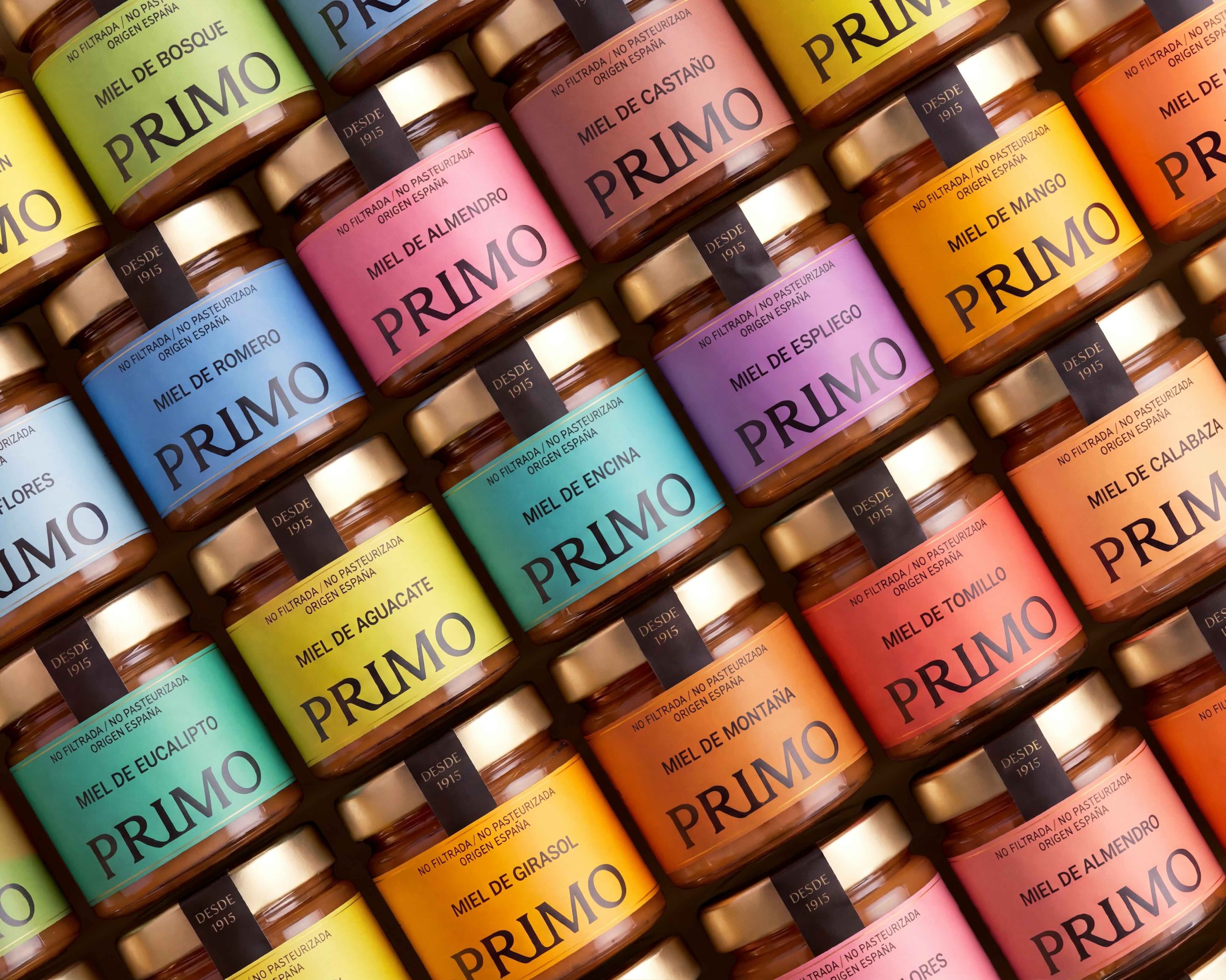
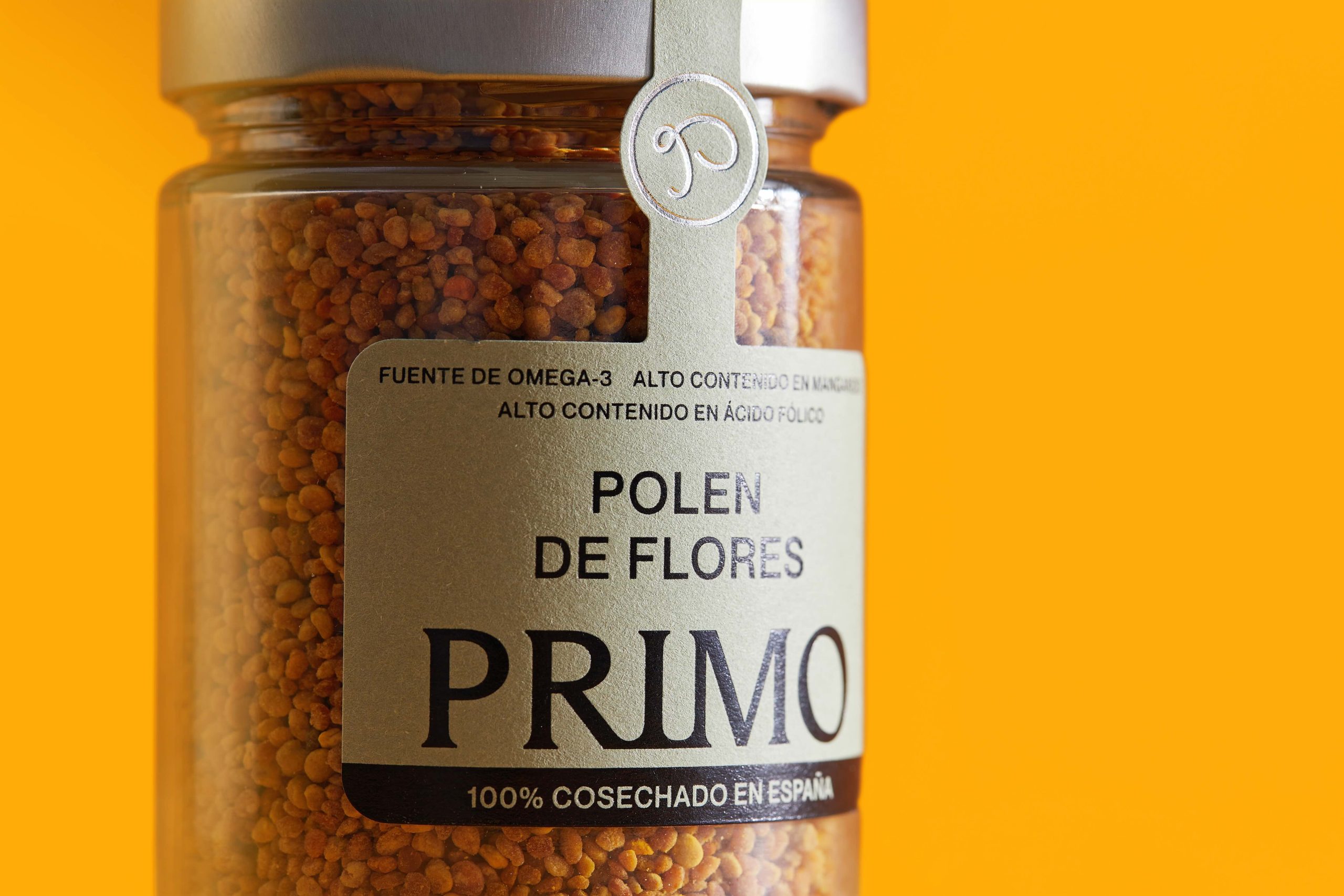
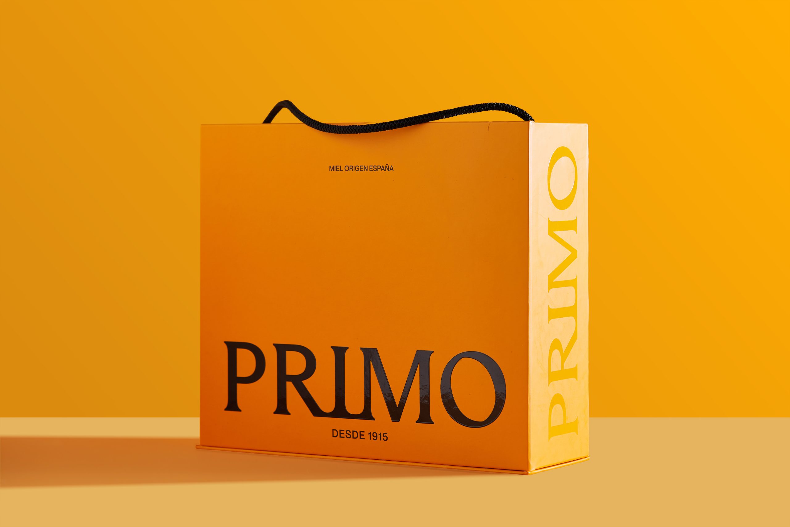
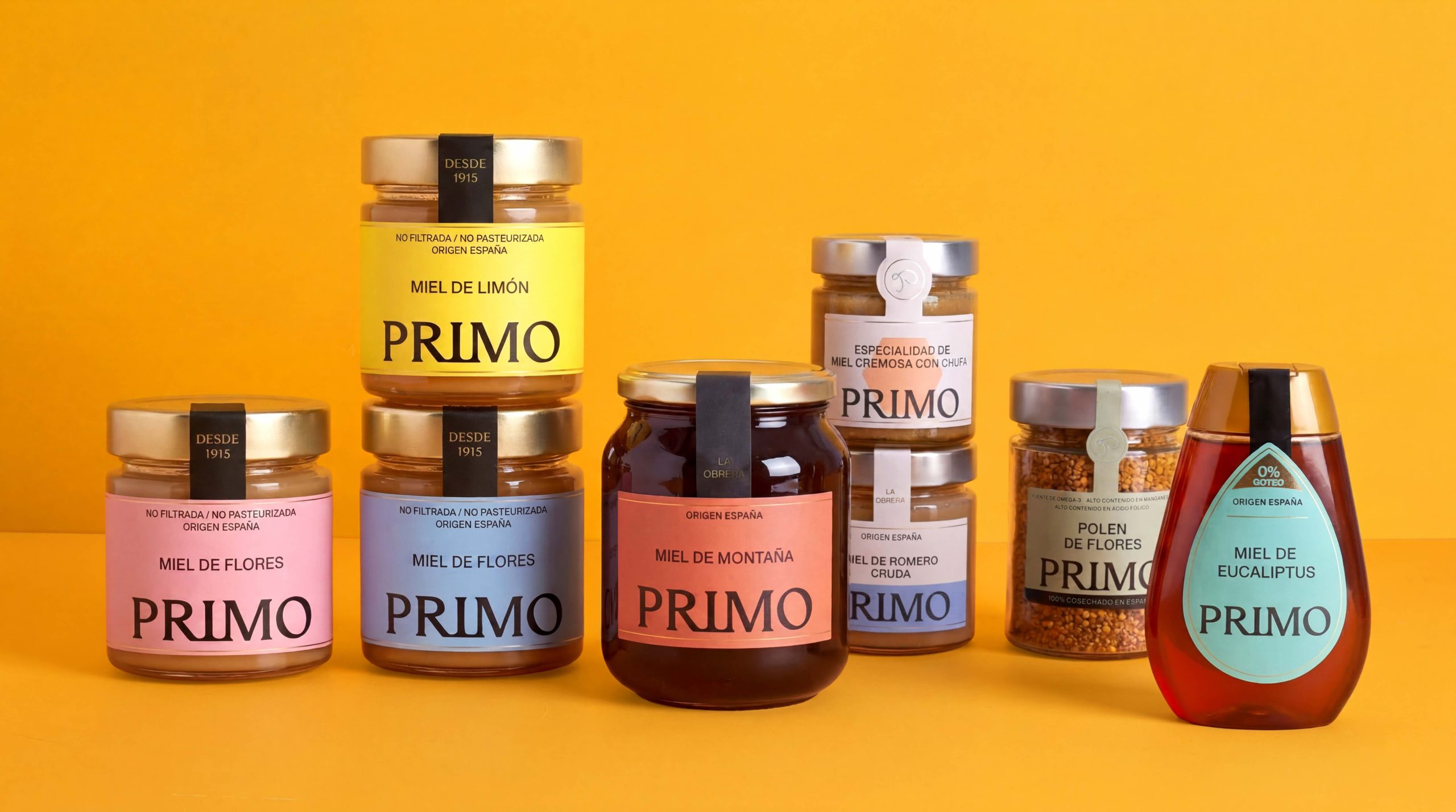
More than a visual redesign, the project redefined the business through a coherent packaging architecture built to organize product families, strengthen shelf presence, and support future growth.
Built around the caregiver archetype, PRIMO positions itself as a close, reliable, and guiding brand. A solid identity created to bring clarity, coherence, and long-term scalability.
From 8 fragmented brands and 150 scattered products to one unified brand with a clear structure and stronger market recognition.
 NEV
NEV Stefano Bracci
 Alina
Alina monther al omari
 Lizakjx
 JOAOMARCOSDESIGN
 alchimistestudioParis
 Harriet Neild
 octavio rojo
 宏洛图品牌设计HONGLT
 DESIGN CONCEPTS
 Alexander Skurihin
 Studio K95
 ARMBRAND
 Richa Rai
 houseoferas by Miti
 Agence des Coteaux
 Kushi Eaknath
 Ann Treasa
 Xiao Ning
 krrrrrllii
 babyage
 Deep
Deep