

We redesigned the entire Santo packaging range to create a modern, cohesive look that appeals to customers. The new bottle design and packaging enhance shelf presence and strengthen brand recognition, delivering a fresh, engaging experience.
From the first pencil stroke to the last polish on the stopper, our work is a story of purpose, craft, and transformation. When Optimo Spirits asked us to rethink their brand and create two new product concepts for the U.S. market, we didn’t just redesign a logo—we rebuilt an entire sensory identity that speaks with confidence on shelf and in hand.
We began with one idea: design must be felt as well as seen. The label uses embossing and debossing to add depth, guide the eye, and invite touch. Those subtle raised and recessed details turn a glance into a small discovery and raise the sense of quality.
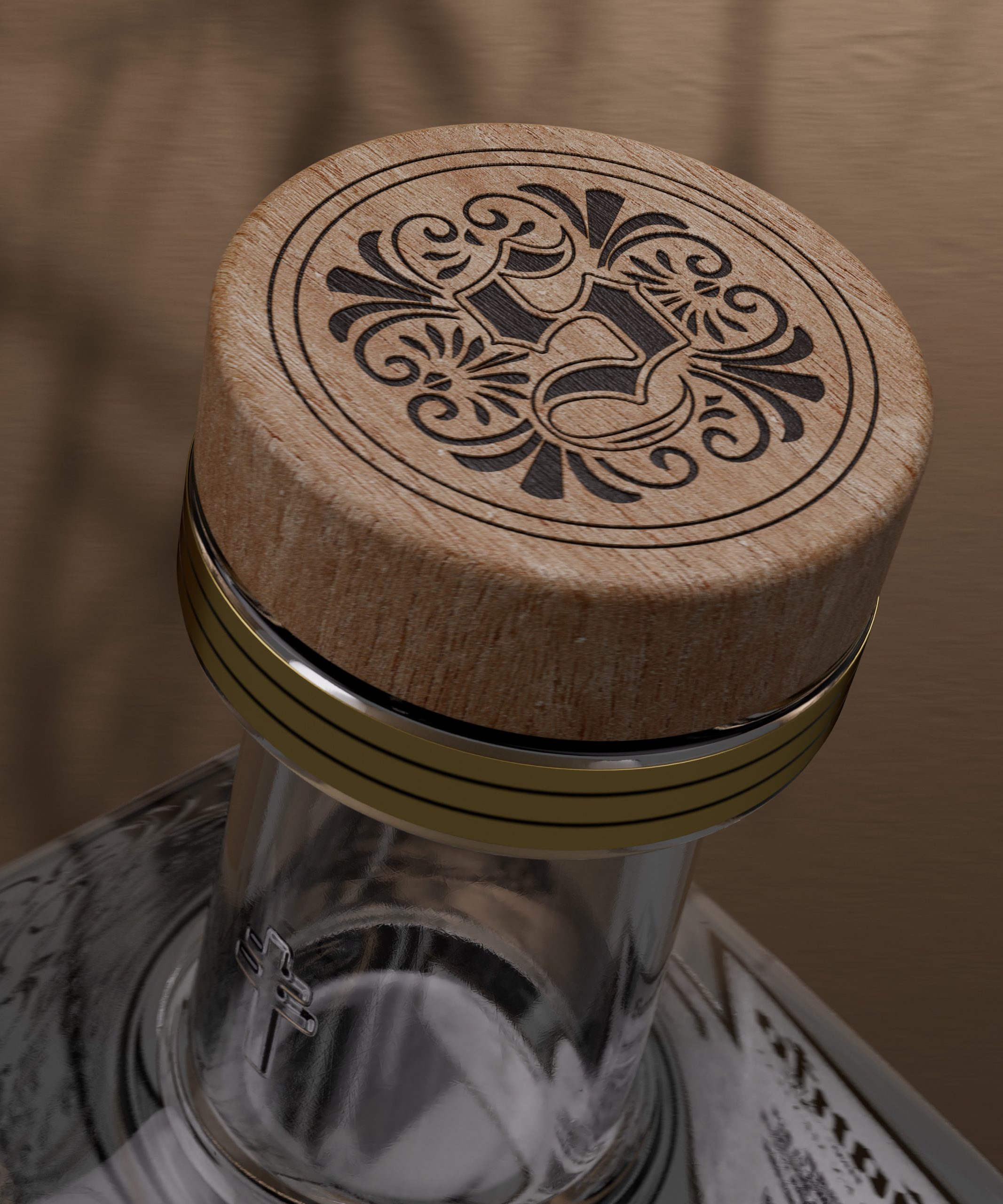
The bottle and stopper were conceived as one thoughtful object. Proportions, materials, and details were balanced so the wooden stopper feels like a natural extension of the glass. Deep engravings and sculpted surfaces play with light, revealing character and hinting at the story inside. The label sits perfectly within the bottle’s geometry, enhancing readability while preserving harmony.
What we offer is more than packaging; it’s a crafted identity that delivers one clear message: refined, intentional, and unmistakably premium. Our brand refreshes do more than look good—they create memorable signatures that elevate perceived value, invite engagement, and make a brand impossible to ignore.



 United Creatives Studio
 Kingdom & Sparrow
 Anastasia Bakhmatskaya
 CreativeWise
 Great and Golden
 Ximena Ureta Design Studio.
 Sorted Branding
 Lisa Sirbaugh Creative
 vitoramockup
 YQIAN
YQIAN Navegante
 Anastasia Cherepanova | xtramez
 Polaris Designs
 pavlyai
 Milena Kocharyan
 monther al omari
 Mohamed sherif midoo
 DESIGN CONCEPTS
 mmdesign
 markcreativestudio
 Rosario Lo Iacono