

Redefining the Canned Food Category: TC Food’s Visual Revolution for Steamed & Grilled-Steamed Fish
In the traditional Vietnamese canned fish market, packaging has long been dominated by purely functional designs – focused on durability and safety but often lacking the visual spark to capture a new generation of shoppers. Recognizing this gap, TC Food, an emerging player in the FMCG sector, decided to pivot. By moving away from conventional aesthetics toward a harmonious blend of professional expertise and modern vibrancy, the brand is carving out its own space. This visual refresh is more than just a change in color; it’s a strategic marketing move to connect with the modern aesthetic standards and stand out in a crowded aisle.
Independent branding strategy for TC Food showcases a masterclass in “Visual Appetizer” thinking. By transforming a traditional commodity into a lifestyle choice, the new packaging design targets the aesthetic standards of Gen Z and Millennials, proving that convenience can indeed be stylish.
The Brand Challenge: Beyond the Familiar
At the heart of this project lies the strategic navigation between two distinct product lines: Steamed Fish and Grilled-Steamed Fish. While sharing a common heritage, each range possesses a unique flavor profile and a different emotional resonance – one focused on freshness and purity, the other on bold, intense “charred” notes.
The primary design objective was to create a visual architecture that allows for instant category recognition on a crowded shelf. However, the ambition went further: the design had to bridge the gap between a mass-market household name and a modern, well-curated brand identity. It was a mission to redefine the familiar – transforming a traditional staple into a more sophisticated, visually articulate choice for the modern consumer.
Design Insight: The “Visual Appetizer” Strategy
The creative strategy centers on a pivotal shift in consumer behavior: modern shoppers are no longer just looking for food – they are seeking inspiration. For Gen Z and Millennials, a product’s aesthetic is a reflection of their personal taste, making every purchase a deliberate choice to feel more sophisticated. To answer this, we adopted the “Visual Appetizer” approach, transforming the packaging into a primary sensory touchpoint. The design is crafted to spark an immediate craving and instill confidence in the product’s quality long before it is even opened.
By implementing Design Thinking, the team focused on a balanced visual system that delivers high energy without being overwhelming. We prioritized a clean, scientific structure that enhances product recognition, moving away from cluttered arrangements to a more professional and contemporary layout that resonates with the lifestyle of the modern consumer.
01. The Steamed Range: Modernity & Precision
For the Steamed fish line, the focus was on clarity and systematic navigation.
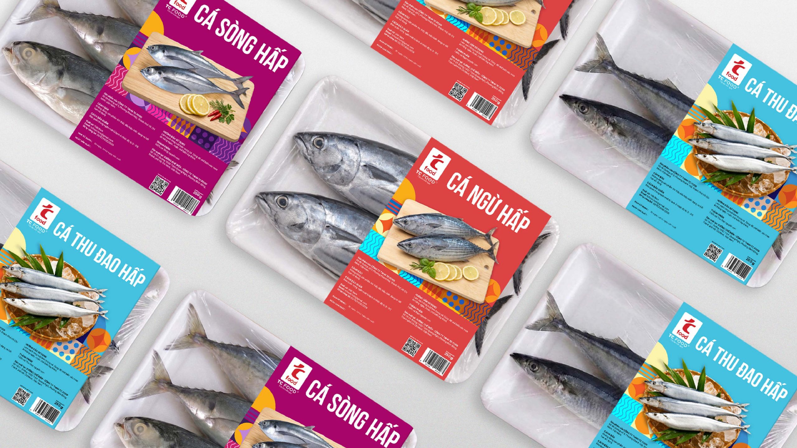
- Color-Coding: Utilizing high-saturation tones (Red, Cyan, Purple) to categorize fish types (Tuna, Saury, Mackerel), allowing for instant recognition.
- Geometric Patterns: Abstracted patterns inspired by ocean waves and fish scales add a playful visual rhythm.
- Typography: Bold, modern Sans-serif fonts ensure maximum legibility in a busy supermarket environment, signaling a professional and transparent brand attitude.
02. The Grilled-Steamed Range: The Art of Fire
To distinguish the “Grilled” line, the design energy shifts toward a more intense and sophisticated expression.
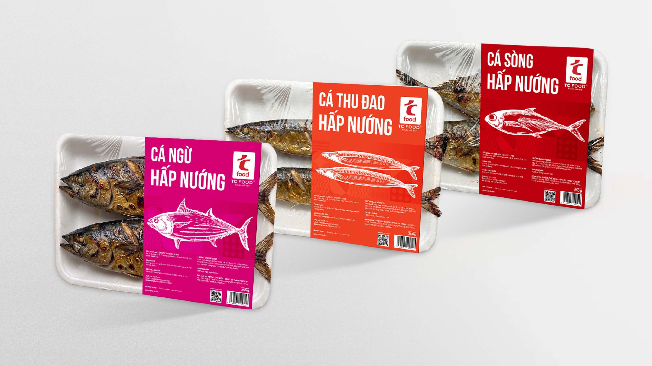
- Modern Line Art: Moving away from conventional stock photography, the fish are reimagined through a sleek, modern Line Art style. These refined, monochromatic strokes bring a vivid and dynamic energy to the product, allowing it to stand out on the shelf through a high-aesthetic graphic language. This approach creates a “poster-like” premium feel that captures the essence of grilled fish in a contemporary way.
- Thermal Palette: The palette transitions to warm, high-saturation tones like Deep Burgundy, Magenta, and Burnt Orange. These colors psychologically evoke heat, spices, and “craveability,” highlighting the bold flavors of the grilled range.
- Subtle Textures: Background patterns subtly mimic the grid of a grill or heat waves, adding a sophisticated layer of depth to the visual storytelling.
Impact: Enhancing Retail Standout & Consumer Connection
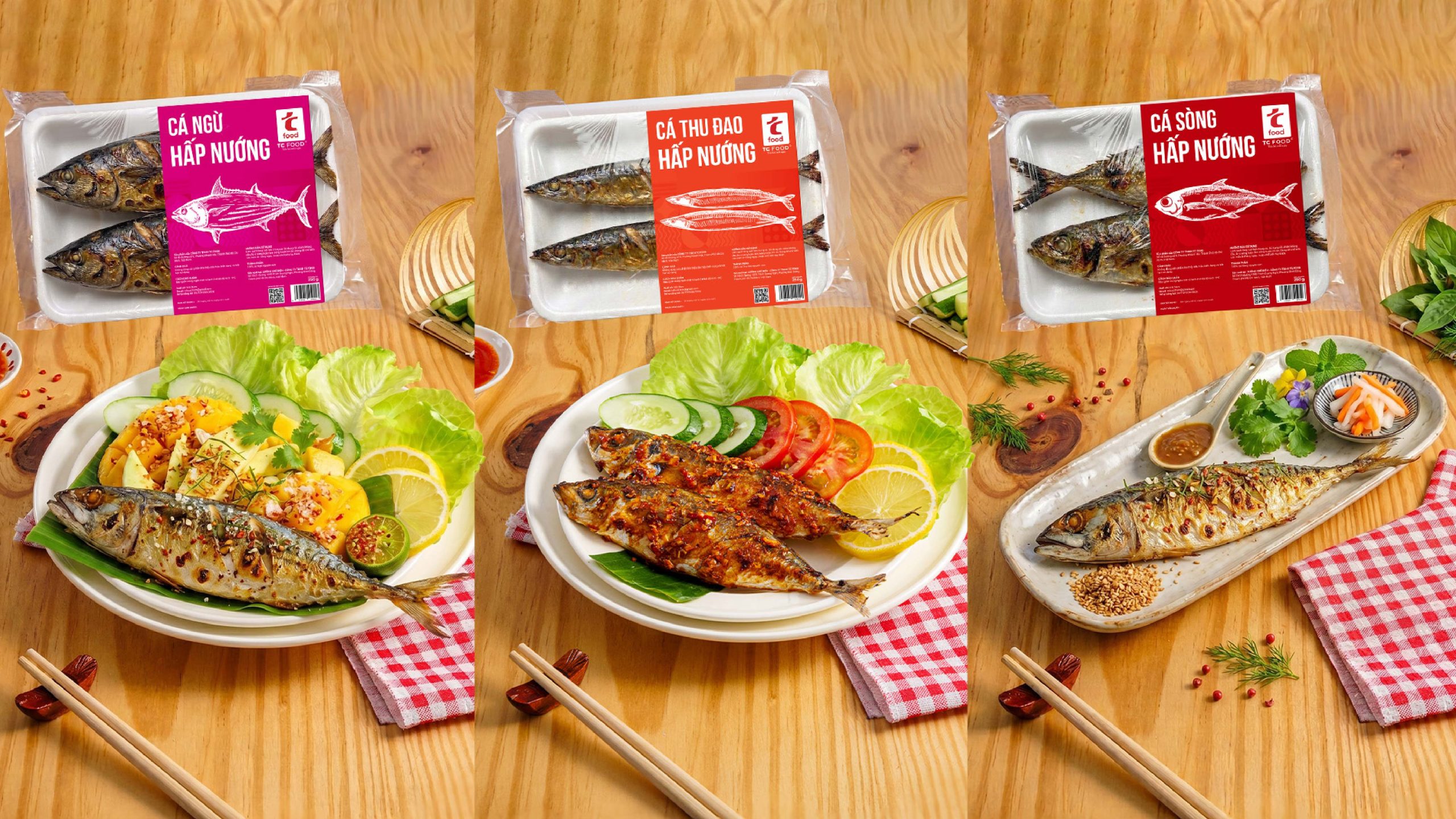
The success of the project lies in its systemic harmony, designed to drive practical efficiency at the point of sale. By establishing a clear visual contrast between the cool tones of the Steamed range and the vibrant energy of the Grilled-Steamed range, the packaging acts as an intuitive guide. This streamlined navigation helps shoppers quickly identify their preferred flavor, significantly reducing decision-making time in a busy retail environment.
Ultimately, this visual refresh allows TC Food to bridge the gap with its target audience more effectively. By becoming more visually arresting and modern, the brand captures vital consumer attention, making the choice of TC Food easier and more spontaneous. It is a strategic step that strengthens the brand’s presence on the shelf while maintaining its approachable, familiar essence.


 Lizaveta Kharitonyuk
 Bonsanco Creative Studio
 DesignRepublic
 GIRAFA STUDIO
 PiotrWisniewski
 Sophiagdotcom
 monther al omari
 CreativeWise
 Modern Theory
 SoreThumbStudio®
 Modern World Studio
 Palashcc
 Valérie Colace
 andreamarinnn
 Chochoi Creative
 Hi estudio
 bachir bachchar
 Aferdini
 AUN BRANDS
 vitoramockup
 InterWish
 ash123456
 Studiotaketwo