

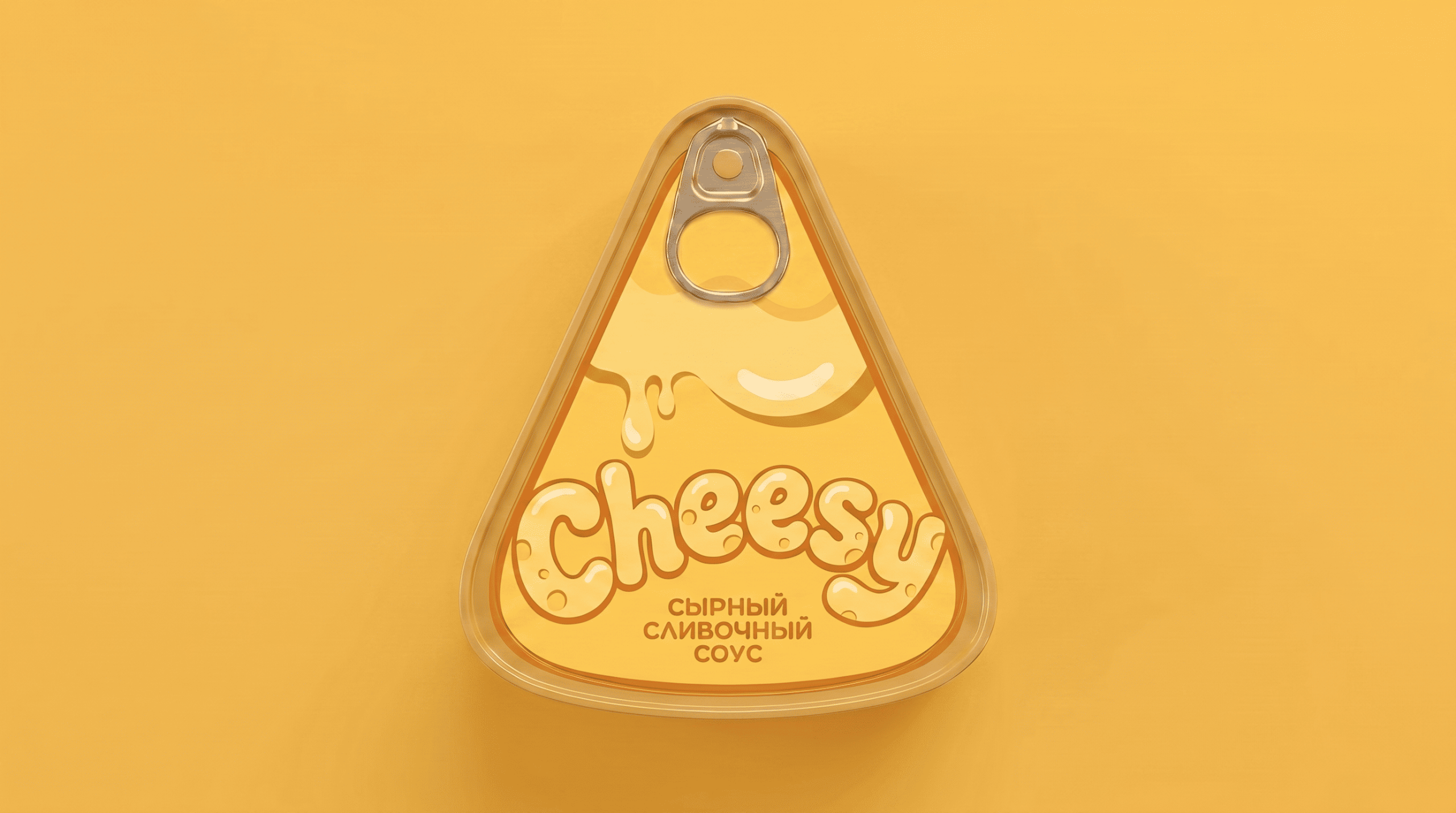
The packaging concept for Cheesy cheese sauces is based on the visual image of the product itself. The design is based on a triangular tin can, the shape of which resembles a piece of cheese, making the product instantly recognizable. The sides are enhanced with distinctive dents, mimicking the holes found on a wheel of cheese and reinforcing the association with natural cheese.
The graphic design of the packaging continues this idea: the cheese sauce appears to flow from the surface of the cheese, highlighting its thick, delicate, and appetizing texture. This technique helps visually convey the product’s properties and makes the packaging more emotional and appealing to consumers.
Two flavors were developed for the line: creamy cheese sauce and cheddar cheese sauce. Each flavor has its own color scheme, allowing for easy differentiation on the shelf while maintaining a consistent brand identity.
As a result, the packaging becomes an extension of the product itself. The can shape, distinctive cheese dents, and graphics work together to create a vibrant and memorable image that highlights the character of the nacho cheese sauce. This approach helps differentiate the product from competitors and increase shelf visibility.


 monther al omari
 Biaa
Biaa Akim Melnik Design Studio
 M&A CREATIVE AGENCY
 Valérie Colace
 Reynolds and Reyner
 bachir bachchar
 Maria Gruzdeva
 Hailey Yoon
 宏洛图品牌设计HONGLT
 Rosario Lo Iacono
 Panagiotis Maravas
 43oz
43oz Thirst
 Carreto Concepts Design Studio
 pastellofactory
 Omar Altayeb
 Cocoon Prague
 古戈品牌
古戈品牌 Pascal Riviere Design