

Cydno is a premium herbal tea brand built around the simple ritual of slowing down at the end of the day. Designed to help people switch off, the brand offers a simple alternative to the overstimulated routines that have become the norm. Working closely with the founder, Deuce Studio developed the strategy, identity and packaging from the ground up, creating a brand built around the ritual of rest.
At the heart of the project sat a clear, considered strategy: helping people make better choices through 100% natural products designed to support restful, restorative sleep. In a world of noise, late screens and restless nights, Cydno offers a genuine alternative, rooted in nature and built around a simple, repeatable evening ritual. This strategy shaped every decision that followed, keeping the brand focused on its purpose: something people can trust, reach for, and feel better for choosing.
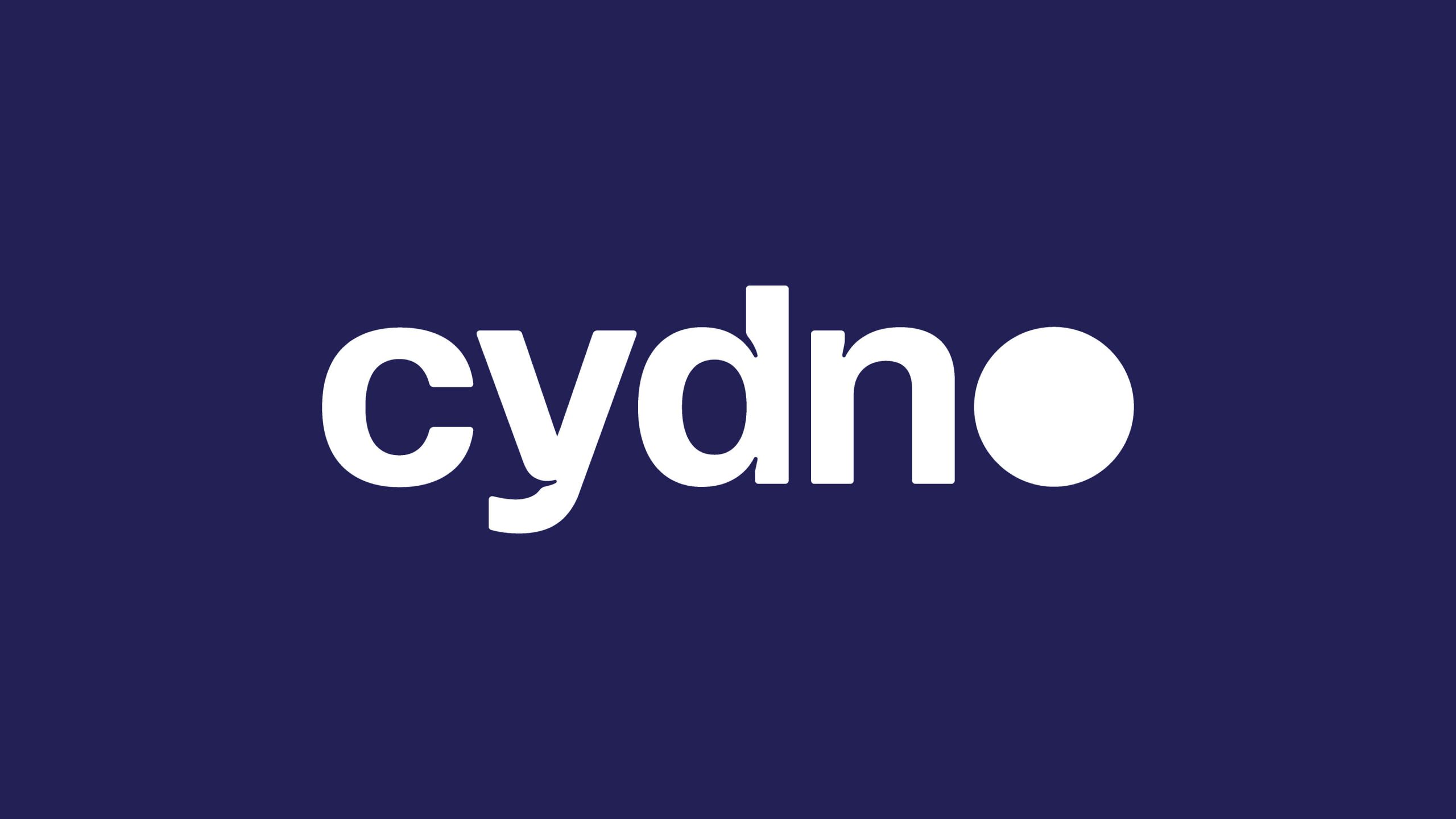
Inspired by the rhythm of the night, the identity captures the gentle transition from day to evening. At its centre is a bespoke wordmark, where the letter O doubles as a full moon, a simple but distinctive symbol of the brand’s connection to sleep and ritual. Subtle ink traps throughout the logo create a soft, pillowy character, with curves that gently hug into the letterforms. Supporting this is a verbal identity that speaks with warmth, clarity and restraint, bringing a calm confidence to every touchpoint.
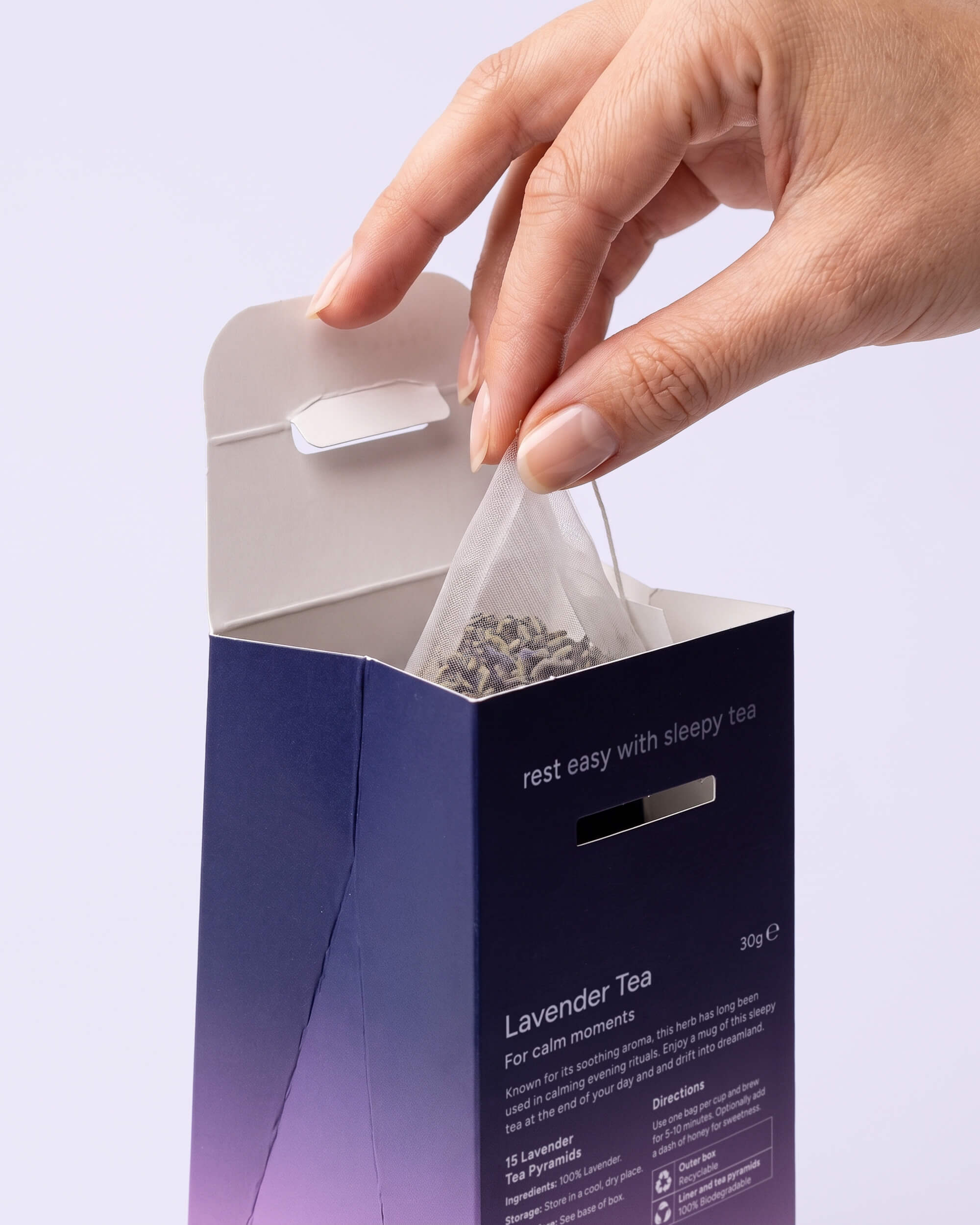
The packaging uses a palette of deep indigo that softly fades into pastel tones, each representing a different tea variety. This creates a distinctive visual world that feels both atmospheric and reassuring. It’s paired with a clean structural design and restrained graphic system, bringing clarity and calm to shelf while remaining highly functional in everyday use. And from a sustainability perspective, every element was considered with the environment in mind — the outer carton is fully recyclable, the inner liner is crafted from biodegradable wood pulp, and the tea bags themselves are compostable.
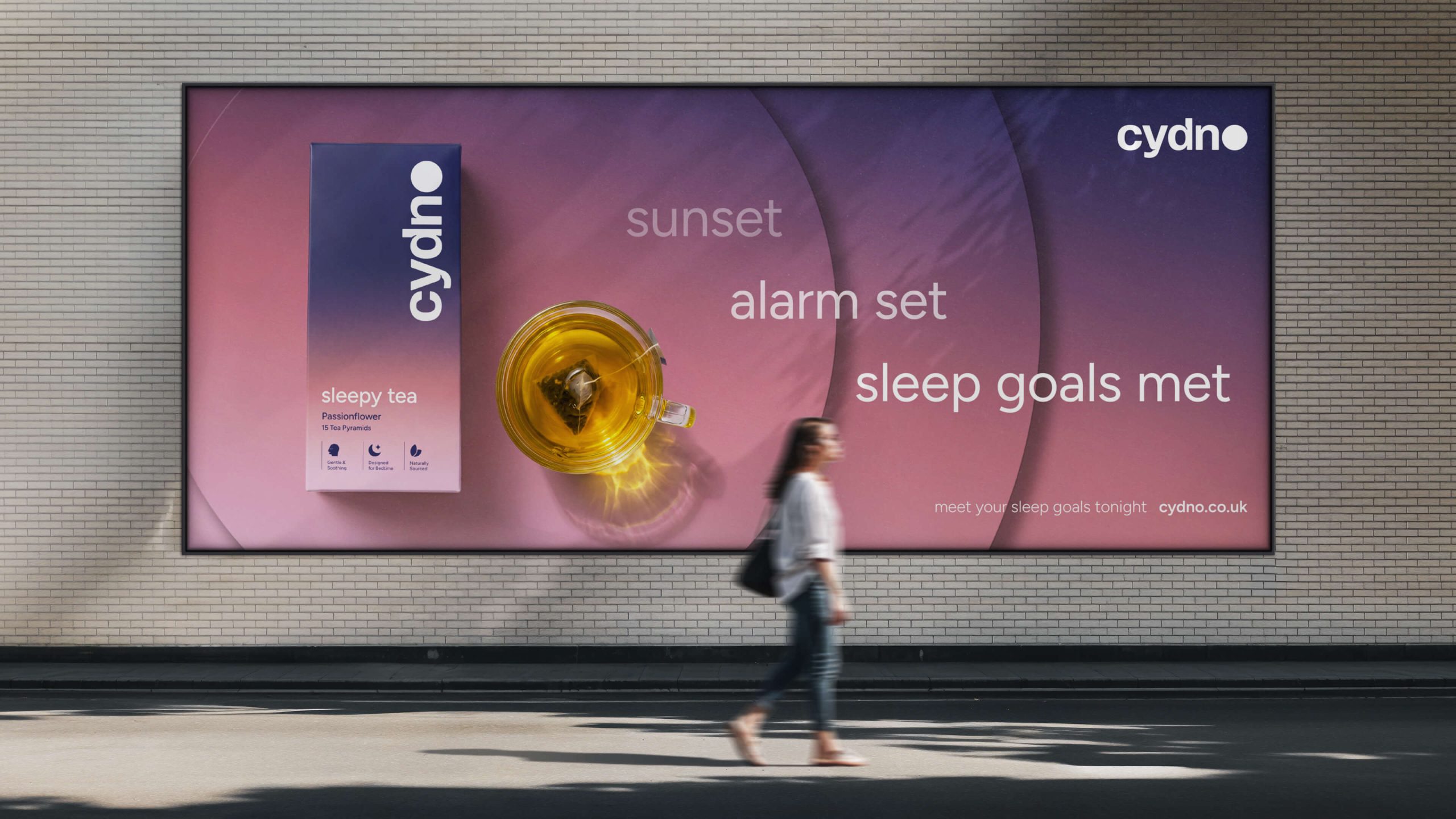
Across digital, print and packaging, the identity is designed to feel effortless. Generous spacing, refined typography and a minimal graphic language create a sense of quiet consistency across every touchpoint. Nothing shouts. Instead, the identity draws you in. A contemporary sleep tea brand designed to make slowing down feel like something worth looking forward to.




 Eclectic M
 Katya Slobodskaia
 Евгения Береснева
 CreativeWise
 宏洛图品牌设计HONGLT
 erandy
 Abbas Sayyed
 Ollie
Ollie Moço Wine Branding
 khadijaaljifri
 Abdulrahman Taha
 Juana Sarabia
 Modern Theory
 Mohammed Nasr Sharfi
 Oksana
 Minim Brand Design
 Asmaa Mohamed
 Aidearte
 Navy Creative
 GIRAFA STUDIO
 Tia Nguyen
 Logoclub99