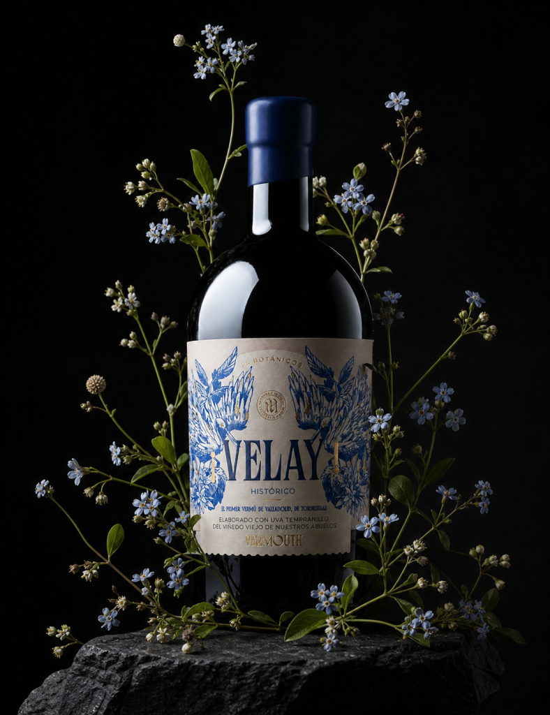

Label design and illustration for Velay Vermouth, the first vermouth produced under the Rueda Designation of Origin by Bodega Muelas, in Tordesillas, Valladolid.
The project was born from the desire to create premium packaging that reflected both the winery’s winemaking heritage and the botanical richness that defines artisanal vermouth. The label combines highly detailed original illustration, handcrafted typography and a distinctive colour palette for each variety —Clásico and Histórico—, building a coherent and recognisable visual identity on the shelf.
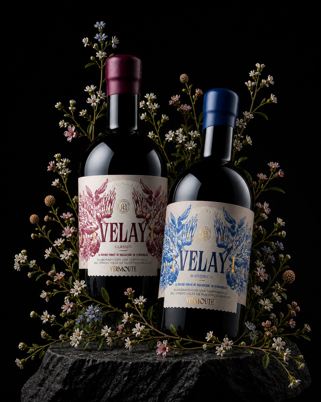
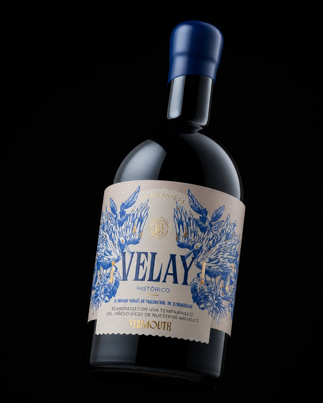
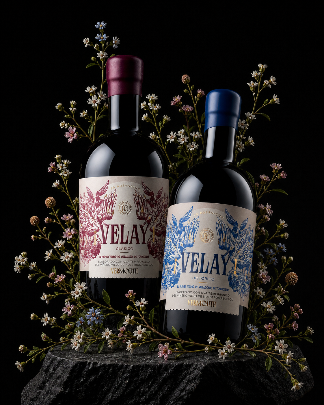
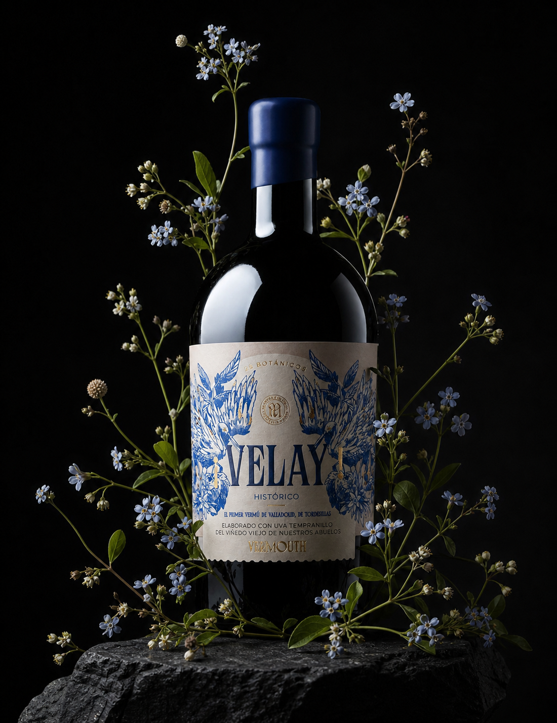
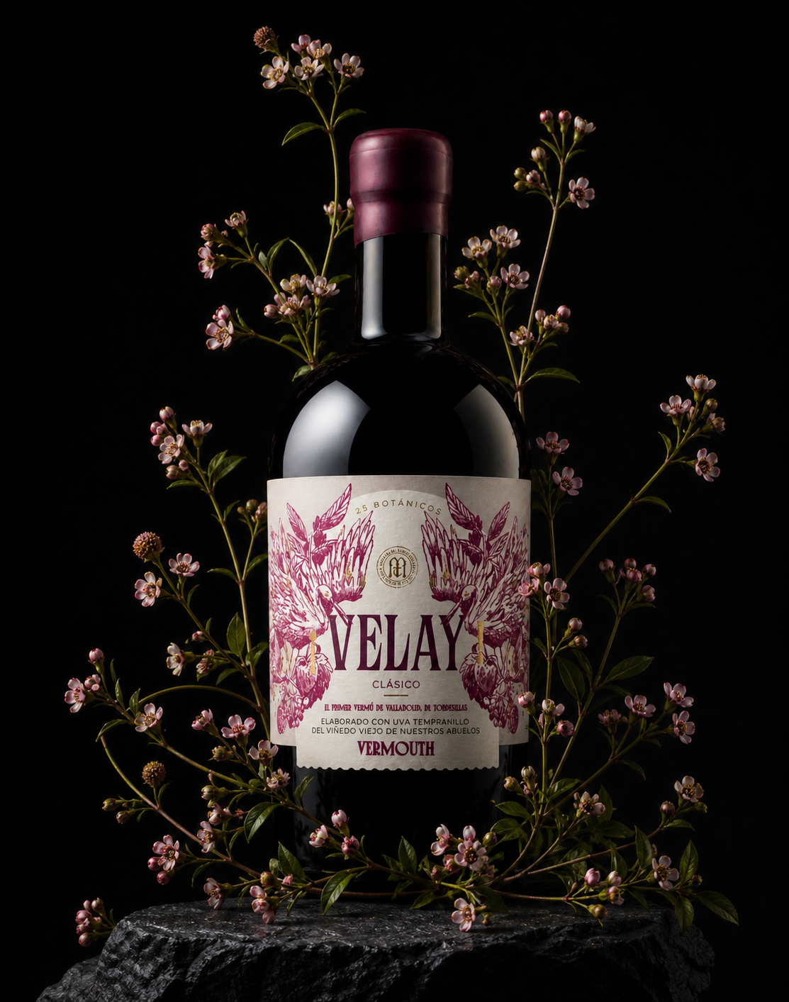
The label design is based on a personalised illustration of the aromas and nuances of the vermouth itself: the 25 botanicals that define it, as well as the surrounding area and its native fauna. Each label uses colour to identify its specific tasting profile —blue for Histórico, pink for Clásico—, creating an immediate and distinctive visual reading.
The printing includes a screen-printed relief on the VELAY brand name, together with gold stamping applied to key elements such as the winery’s logo and the product description. To elevate the overall design to its premium category, small gold details are distributed throughout the illustration.
Beyond the graphic design, the project includes the selection of the bottle model, the type of wax seal, the paper and the die-cut shape, with the aim of creating a vermouth that stands apart from the established category and differentiates itself not only through its image, but through the product as a whole.
Made with Tempranillo grapes from the old vineyard of their grandparents, Velay Vermouth is now one of the most outstanding packaging design projects on the Spanish scene, with a reception that goes beyond the local sphere.
A product branding project that brings together tradition, graphic craftsmanship and territorial identity.

 DinamicaStudio
 MID-AIR STUDIO
 Heramb Arora
 monther al omari
 Tríona O'Donoghue • Design
 Cocoon Prague
 alchimistestudioParis
 hugo zapata
 Bonsanco Creative Studio
 parawaradesign
 UPRISE
 Brand Society
 Que Cálido Studio®
 Richest Branding Pvt. Ltd.
 STRATEDGY
 Shapers Studio
 Platon Ivantsov
 WPA Pinfold
 giselepereiradesign
 ShalaSketches
 05Creation
 Voit Studio
 SSTO
SSTO