

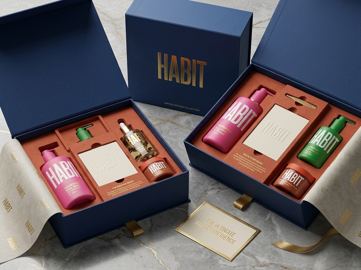
HABIT is a modern personal care brand concept built around the idea that small daily rituals shape how we feel, live, and care for ourselves. The challenge was to create a unified visual identity capable of spanning multiple product categories—including body wash, hand wash, face care, haircare, scrubs, oils, and treatments—while maintaining instant brand recognition and strong shelf presence.
At the heart of the system is a bold typographic approach that transforms the brand name into the primary visual asset. Oversized condensed lettering creates immediate impact, allowing the packaging to communicate confidence and simplicity from a distance. Rather than relying on complex graphics or decorative elements, the identity uses typography, color, and proportion as the core brand-building tools.
A vibrant color architecture differentiates product categories while preserving consistency across the range. Each product receives a distinctive color assignment, creating intuitive navigation for consumers and enabling future product expansion without compromising brand cohesion. Premium gold accents and refined material finishes add a sense of quality and sophistication, balancing accessibility with a premium positioning.
Inspired by contemporary wellness brands, modernist graphic design, and lifestyle-driven beauty packaging, the visual system reflects the growing consumer desire for products that feel both functional and aspirational. The result is a scalable packaging architecture that strengthens shelf visibility, improves product recognition, and establishes a memorable presence in the competitive personal care market.
HABIT demonstrates how a strategically simplified identity can create a distinctive, category-defining brand experience across an entire product ecosystem.




 monther al omari
 Ximena Ureta Design Studio.
 vitoramockup
 Up-Brands
 Sophiagdotcom
 Peter said
 ayeidadezigns
 Tancybox
 宏洛图品牌设计HONGLT
 Modern Theory
 Dozen Agency
 Atiq Alam
 Olio Studio
 Ruchi S. Joshi
 mmdesign
 awaiskhadim
 Octasoft
 United Creatives Studio
 Kingdom & Sparrow
 Anastasia Bakhmatskaya
 CreativeWise
 Great and Golden