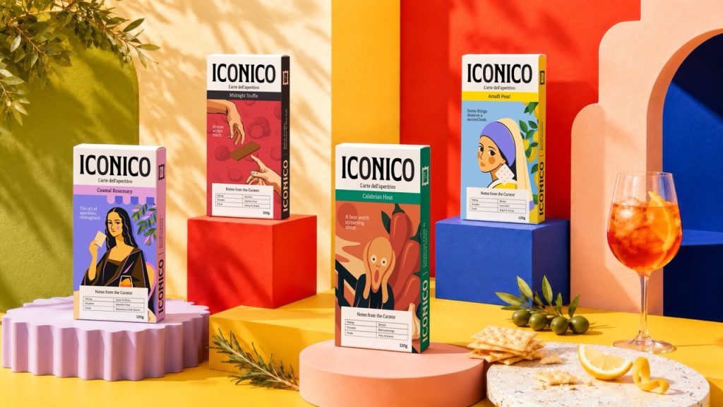

Introducing ICONICO
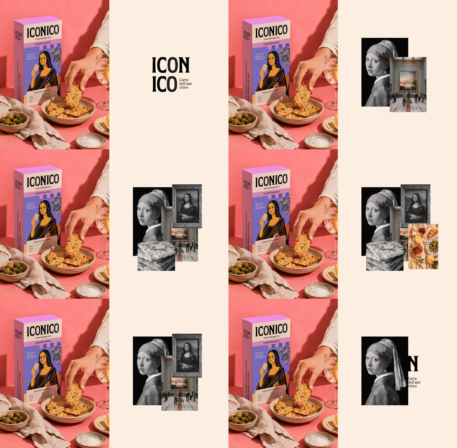
ICONICO is a premium Italian artisan cracker brand. Every element — the illustrations, the packaging architecture, the copywriting, the Notes from the Curator — is built on a single conviction: that eating well is an art form, and the table deserves the same level of craft and attention as the canvas.
The brand lives at the intersection of Italian art history and Italian food culture. It does not treat art as decoration. It treats art as brand philosophy — the belief that the rituals of everyday Italian life are themselves worthy of artistic attention.
The Concept
The greatest art museums in the world charge admission. ICONICO doesn’t.
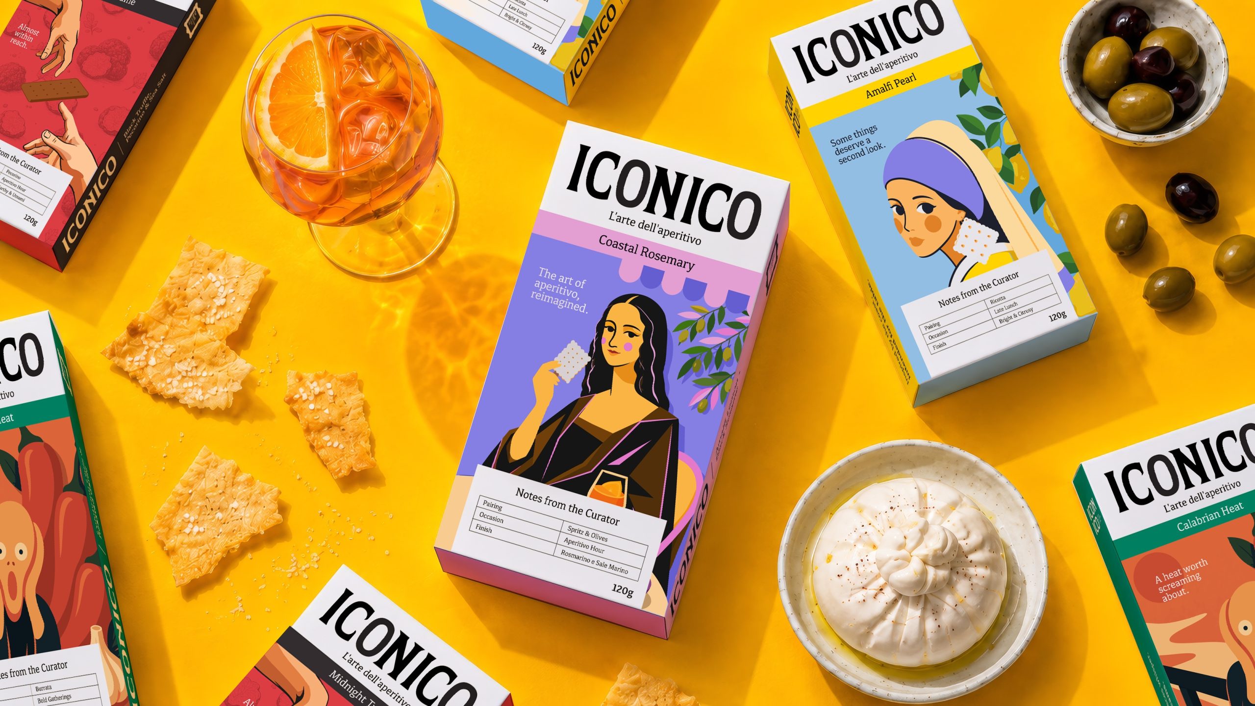
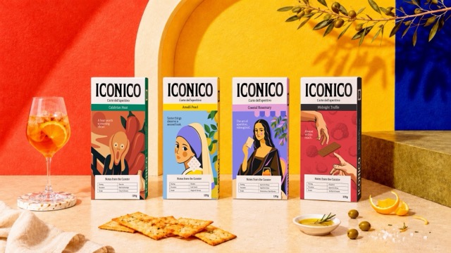
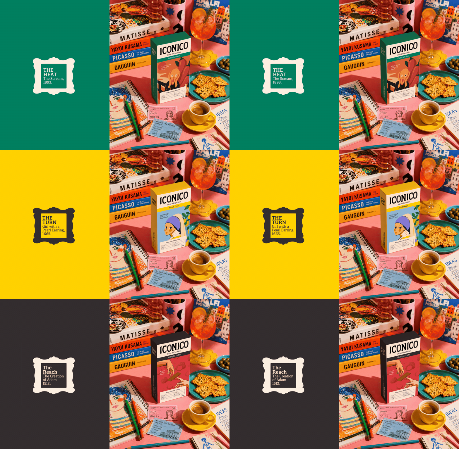
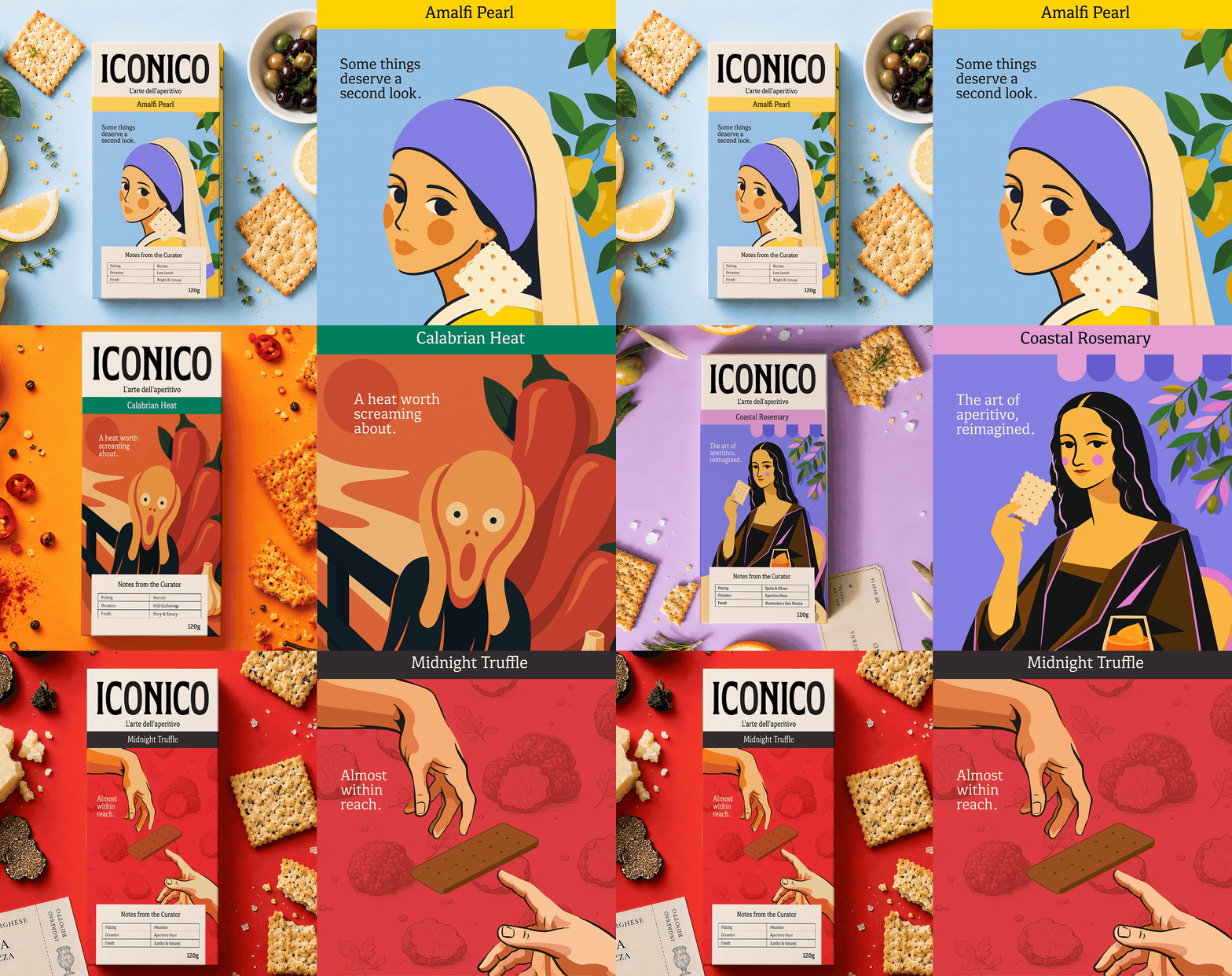
ICONICO reimagines history’s most beloved artworks through the lens of Italian aperitivo culture. Each illustration places a famous painted subject into the aperitivo hour — cracker in hand, glass nearby, in a setting that is unmistakably, specifically Italian.
This is not art as wallpaper. It is art as a strategic and emotional position: the belief that the pleasures of Italian daily life — the golden hour, the cold spritz, the assembled board of things worth eating — are themselves as worthy of reverence as any painting in the Uffizi.
The figures are not copies. They are reinterpretations — each one liberated from their frame and placed, finally, somewhere they actually want to be.
The masterpiece was always on the table. We just gave it the right packaging.
The Challenge
The Italian aperitivo hour is one of the most ritualised, most joyful, most culturally specific moments in daily life. It is not a meal. It is not a drink. It is a pause — a particular kind of Italian pause, unhurried and social, built around the pleasure of small things done beautifully, The cracker has always been at the centre of this ritual. And yet it is chronically underdesigned — treated as a vehicle for cheese rather than an object worthy of craft and consideration in its own right.
The opportunity: build a premium cracker brand that actually belongs at aperitivo. One that earns its place on the board the way a good wine earns its place on the table. One that people reach for because of what it says about them, not just what it tastes like.
The Insight
Italian art and Italian food share the same belief.
That beauty is not a luxury. It is the point.
The greatest paintings in history were made in the same country that invented the spritz, the bruschetta, and the aperitivo hour. The same civilisation that gave the world the Mona Lisa also gave it rosemary sea salt, black truffle, and the Amalfi lemon.
The connection was always there. ICONICO makes it visible.
Curator’s Insight
What makes ICONICO work is the restraint in how the concept is executed. Reinterpreting canonical artworks is a high-risk move… it can easily tip into novelty or pastiche. Here, the illustrations hold their ground because they commit fully to the reframe: these figures are not posing with crackers for effect, they genuinely belong in the scene. The aperitivo setting feels earned, not costume.
The packaging architecture supports this well. The “Notes from the Curator” panel does real functional work — pairing suggestions, occasion, finish… while reinforcing the gallery-as-brand-world conceit without over-explaining it. It trusts the consumer to get it.
What lingers is how naturally Italian food culture and Italian art history sit together once someone actually makes the connection explicit. ICONICO does not invent the link; it just finally puts it on the shelf.
 butterflyhunters
 monther al omari
 Asprey Creative
 About House of Ta
 Up-Brands
 KJS CRAFT
 hello ocean
 PG Branding
 CF Napa Brand Design
 booouuuche
 Hyejung Choi
 Abbydraw Designs Unique Conceptual Branding & Packaging Designing Ideas
 Hollóka Grafikai Műhely / Graphic Design Studio
 Minim Brand Design
 saerom81
 YNL
YNL bilel tkouri
 vitoramockup
 Lampra
 Sanavala
 www.branding.uz
 alchimistestudioParis
 Estudio Argo
 Modern Theory