
ABOUT THE PROJECT
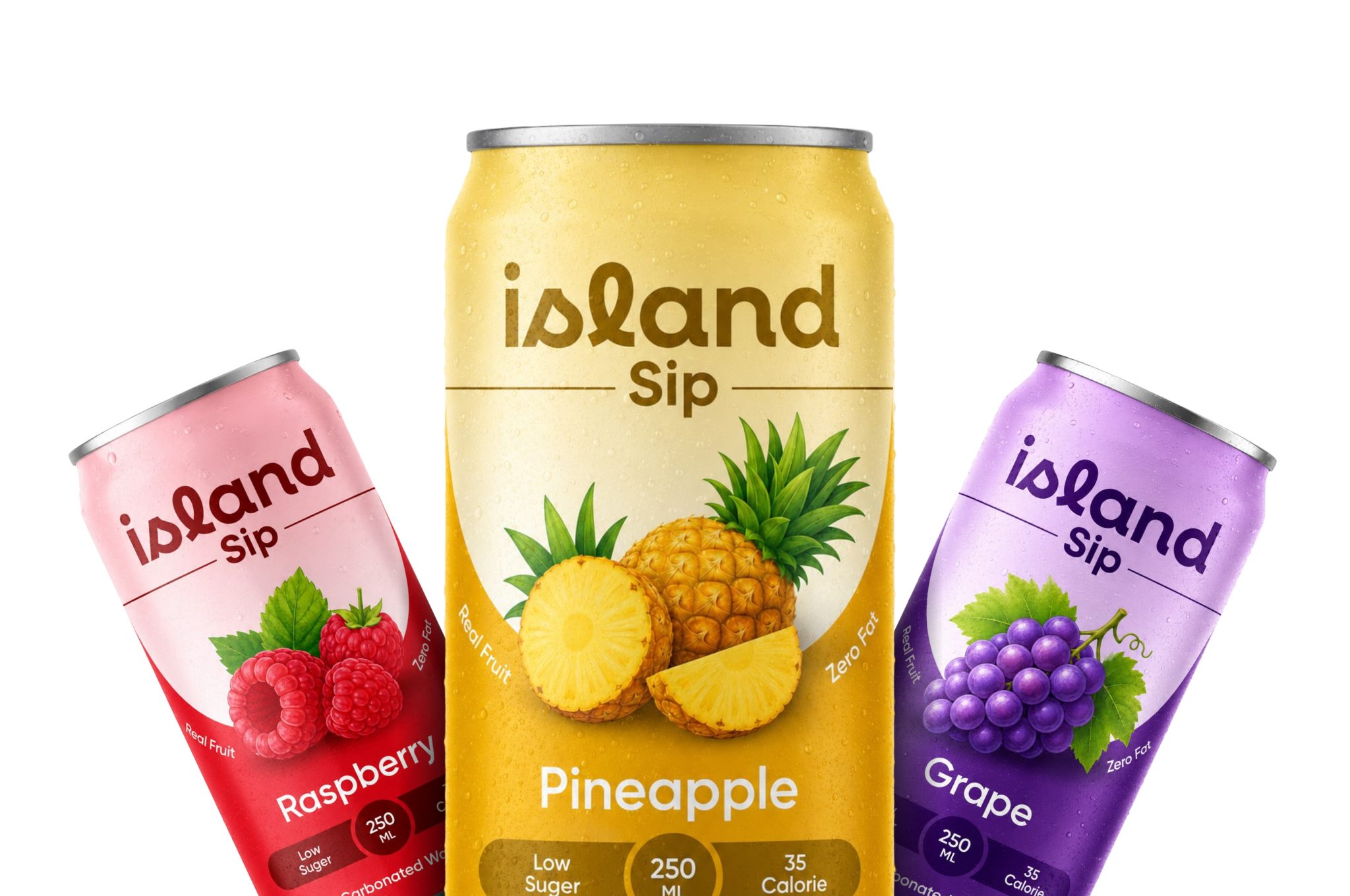
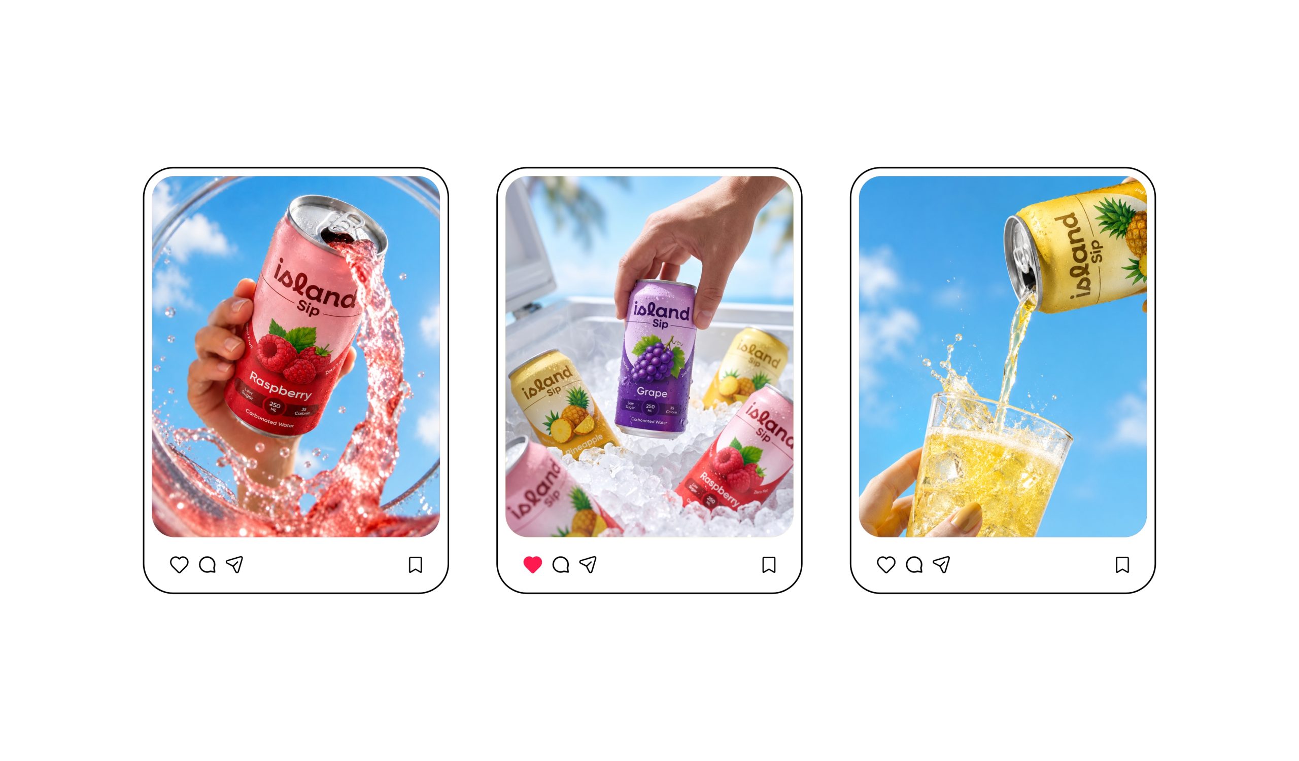
Island Sip is a conceptual carbonated beverage packaging project designed to create a refreshing and modern visual identity for fruit-based sparkling drinks. The project focuses on building a youthful, energetic, and approachable brand language that instantly communicates flavor, freshness, and lightness through vibrant color systems and playful visual elements.
THE SOLUTION
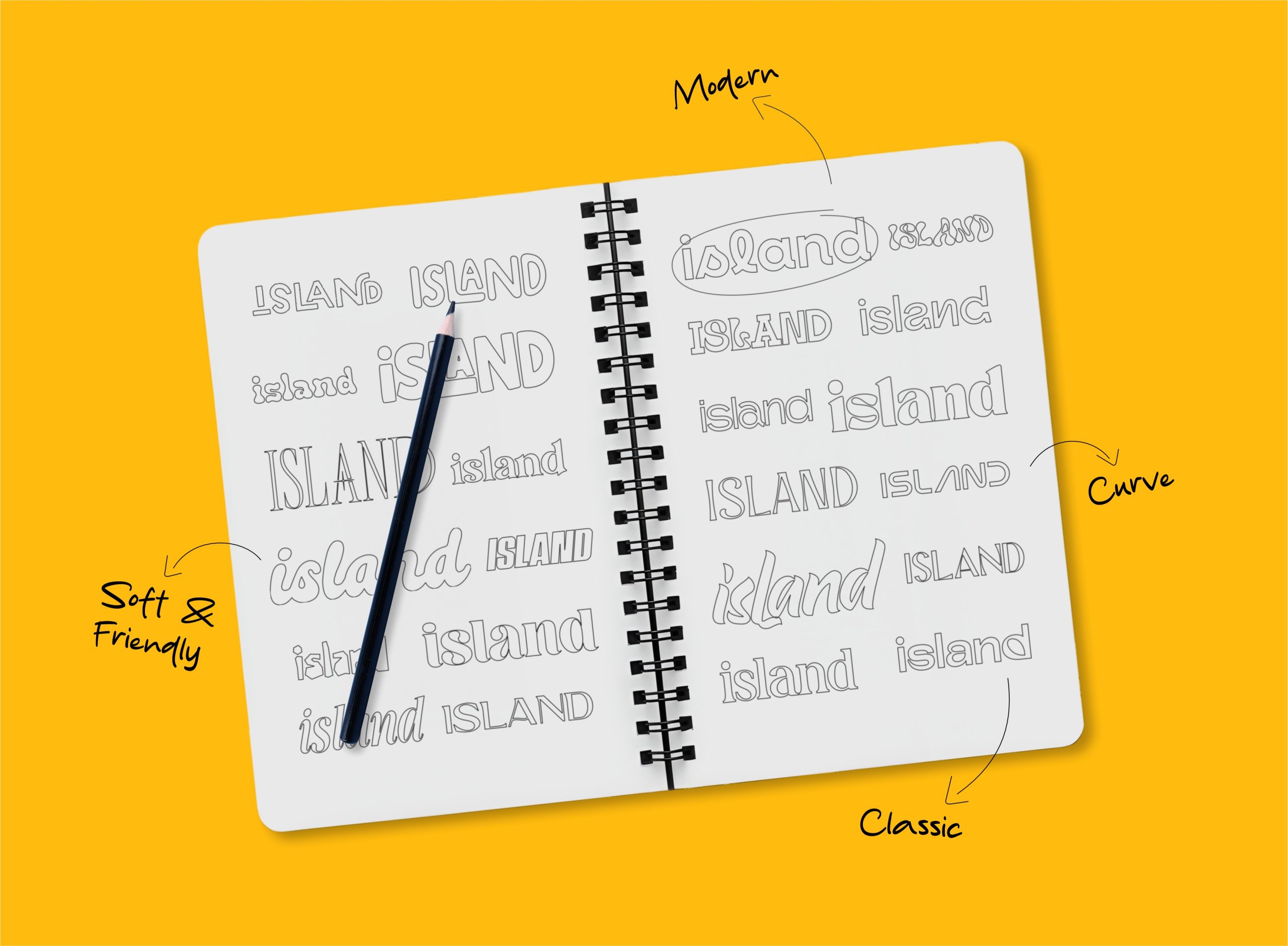
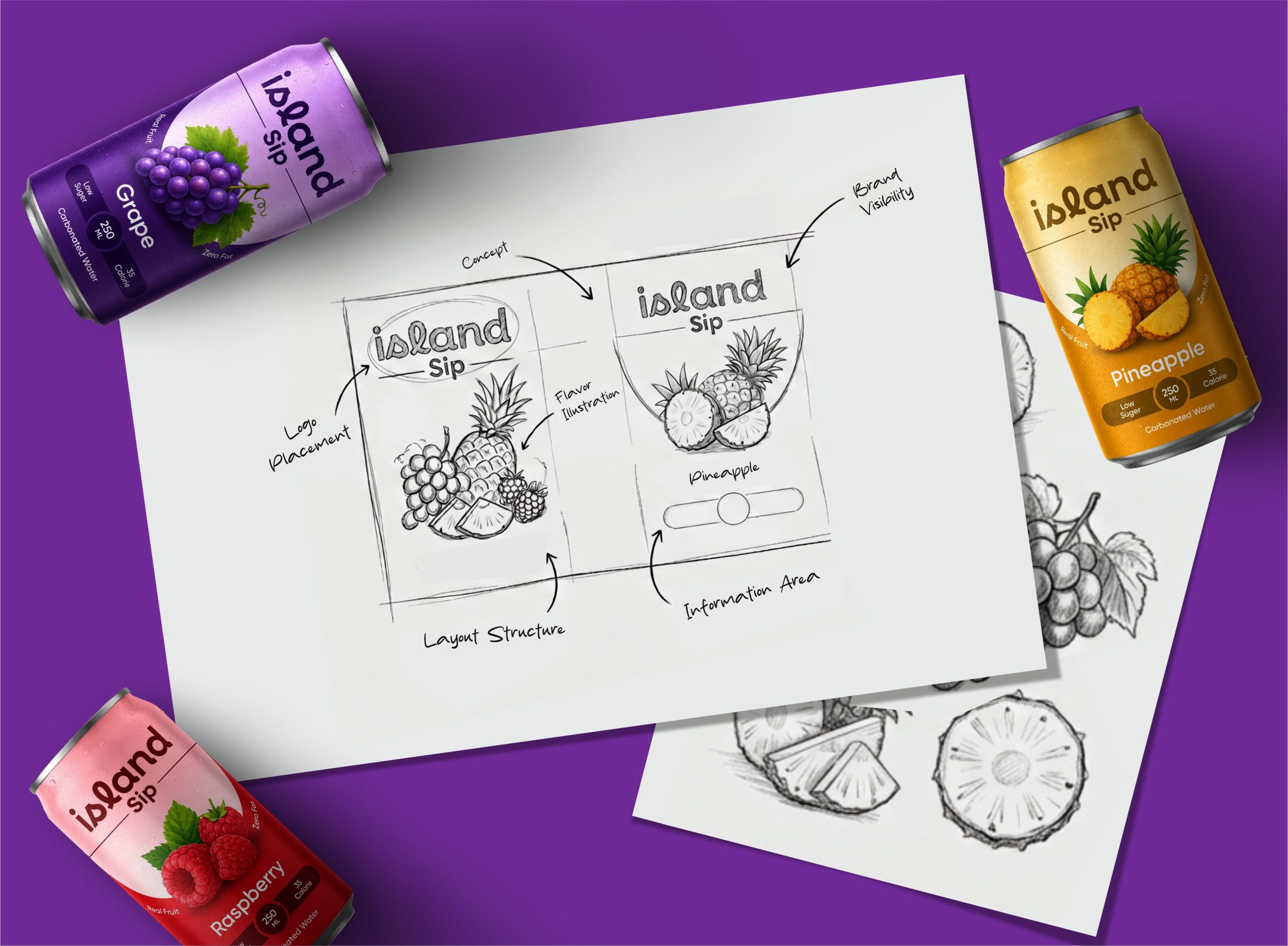
The packaging system uses a flavor-driven color palette combined with bold typography and large fruit illustrations to create strong visual recognition. Each variant receives its own distinct color identity while maintaining a unified layout structure for consistency. Clean spacing, minimal information hierarchy, and prominent product attributes such as low sugar and low calories help improve readability and shelf impact.
THE RESULT
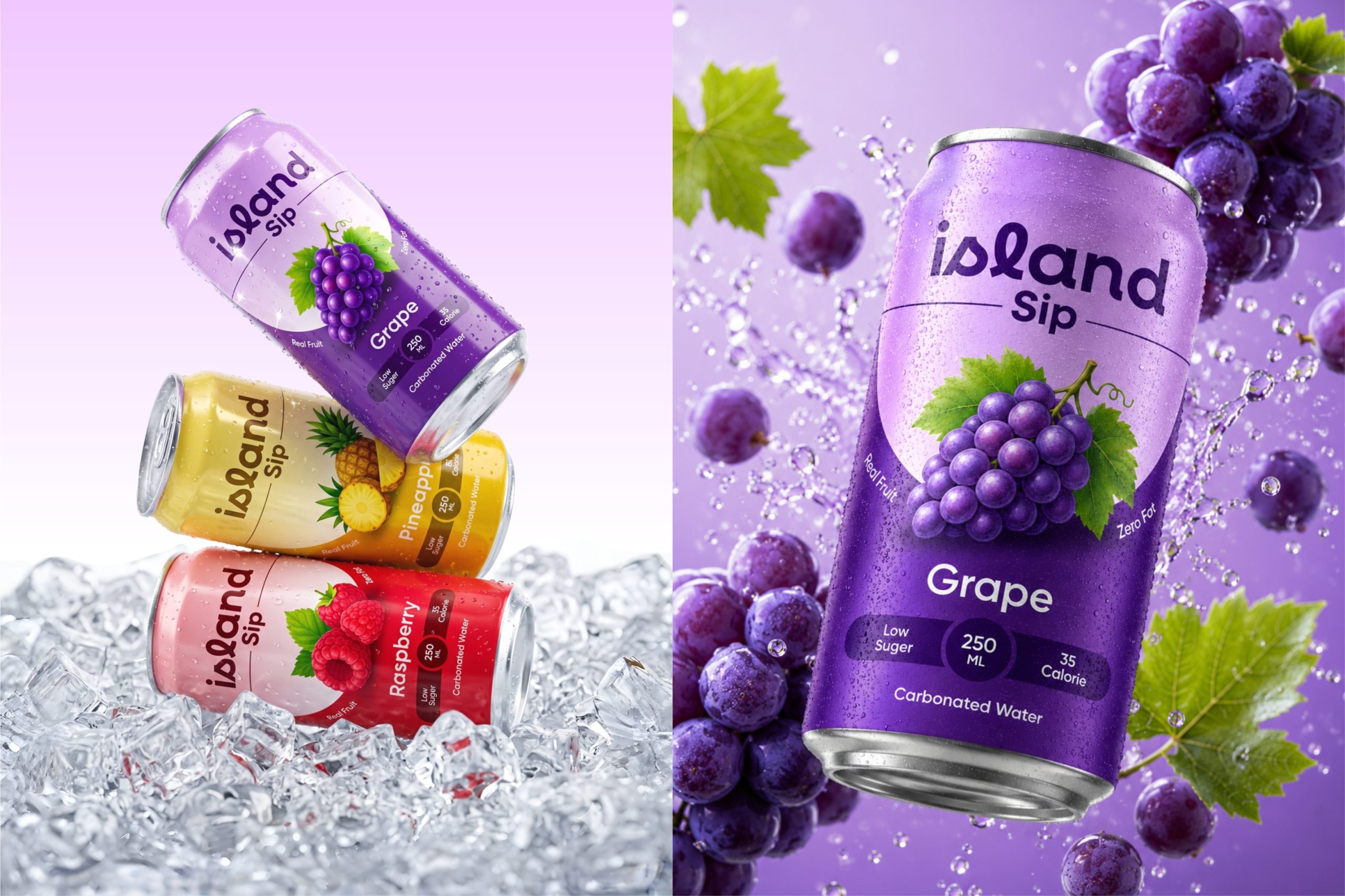
The final outcome is a cohesive beverage packaging system that creates a strong visual presence while reinforcing freshness and flavor association. The colorful packaging, clear hierarchy, and modern aesthetics make the product feel energetic, premium, and highly recognizable across multiple variants, resulting in a scalable packaging system suitable for modern beverage markets.

 monther al omari
 Ximena Ureta Design Studio.
 vitoramockup
 Up-Brands
 Sophiagdotcom
 Peter said
 ayeidadezigns
 Tancybox
 宏洛图品牌设计HONGLT
 Modern Theory
 Dozen Agency
 Atiq Alam
 Olio Studio
 Ruchi S. Joshi
 mmdesign
 awaiskhadim
 Octasoft
 United Creatives Studio
 Kingdom & Sparrow
 Anastasia Bakhmatskaya
 CreativeWise
 Great and Golden