

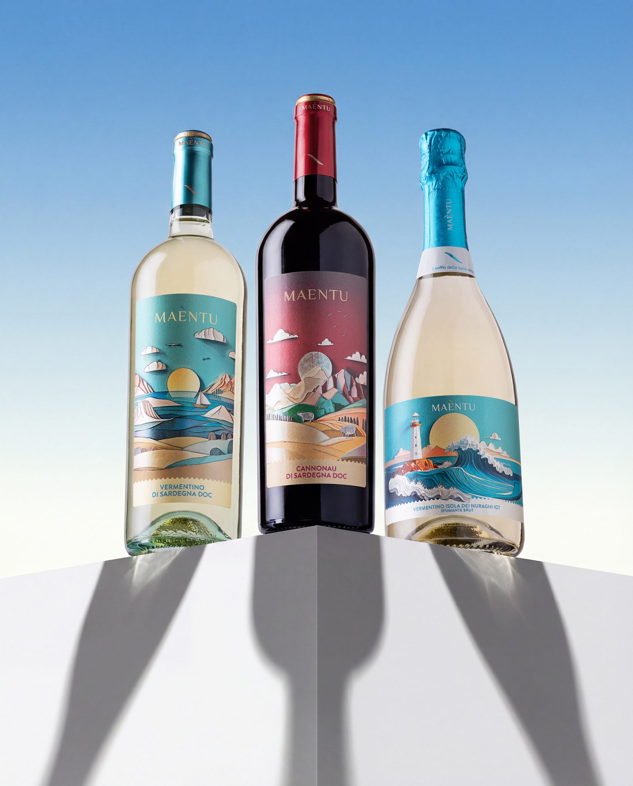
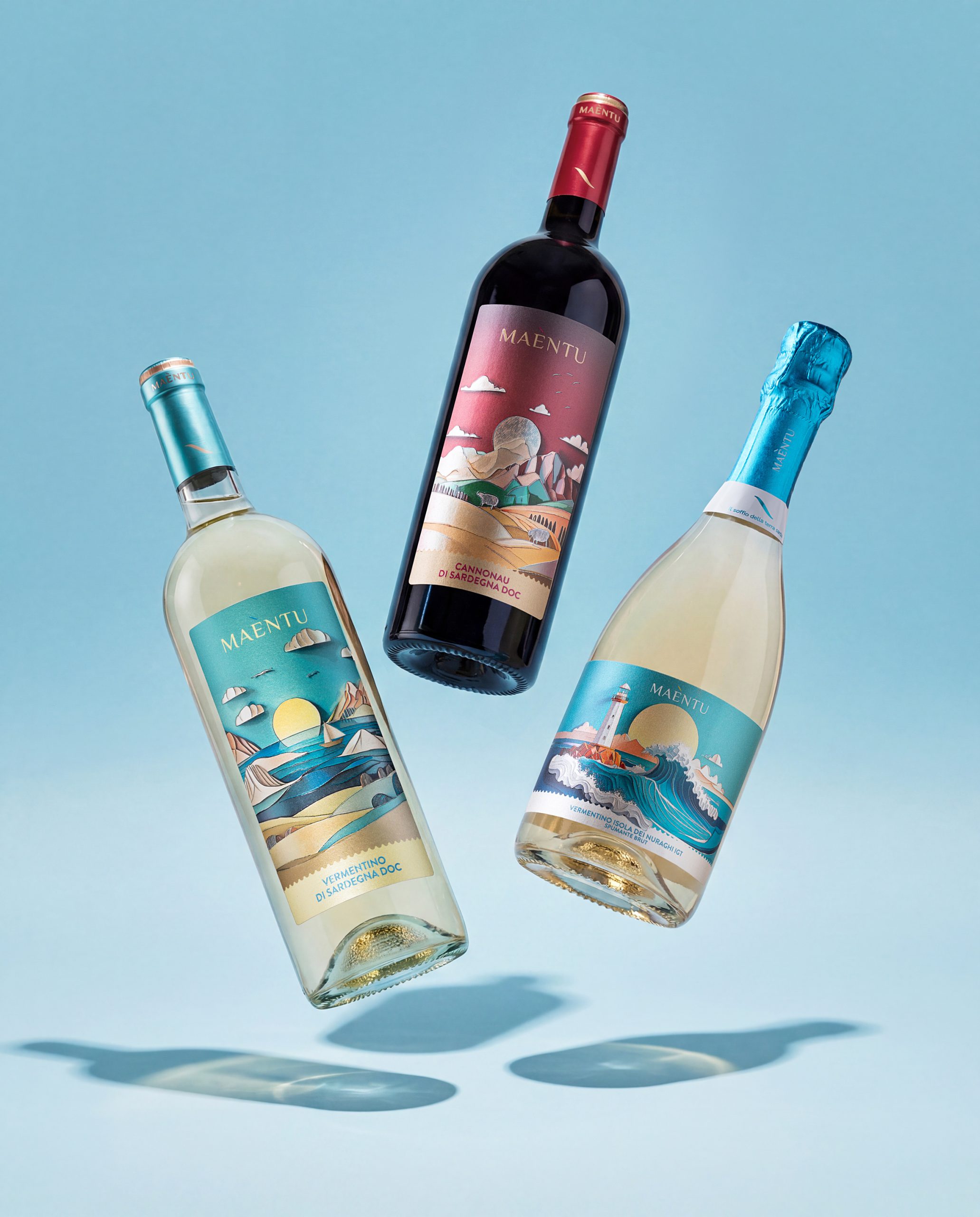
Maèntu is a collection of three Sardinian wines created for the Genevitis project by Mack & Schühle Italia: a Vermentino di Sardegna DOC, a Cannonau di Sardegna DOC and a Vermentino Isola dei Nuraghi IGT Spumante Brut.
The project was born with the aim of creating a contemporary wine identity deeply connected to Sardinia, its landscapes, its light and its winemaking culture. Maèntu is not just a wine name: it is a tribute to the island’s natural soul. The word comes from the union of Maestrale, the north-west wind that shapes Sardinia’s climate and coastline, and entu, the Sardinian word for wind.
The result is a brand that speaks about Sardinia through movement, light, matter and atmosphere.
CONCEPT
The concept is based on the idea of Sardinia as an emotional landscape.
Rather than representing one specific place, the labels create an imaginary geography made of elements that belong to the island’s collective identity: the sea, the wind, the mountains, the sun, the coastline, the countryside, the lighthouse, the sailboat, the rocks and the sheep.
Each label tells a different side of Sardinia.
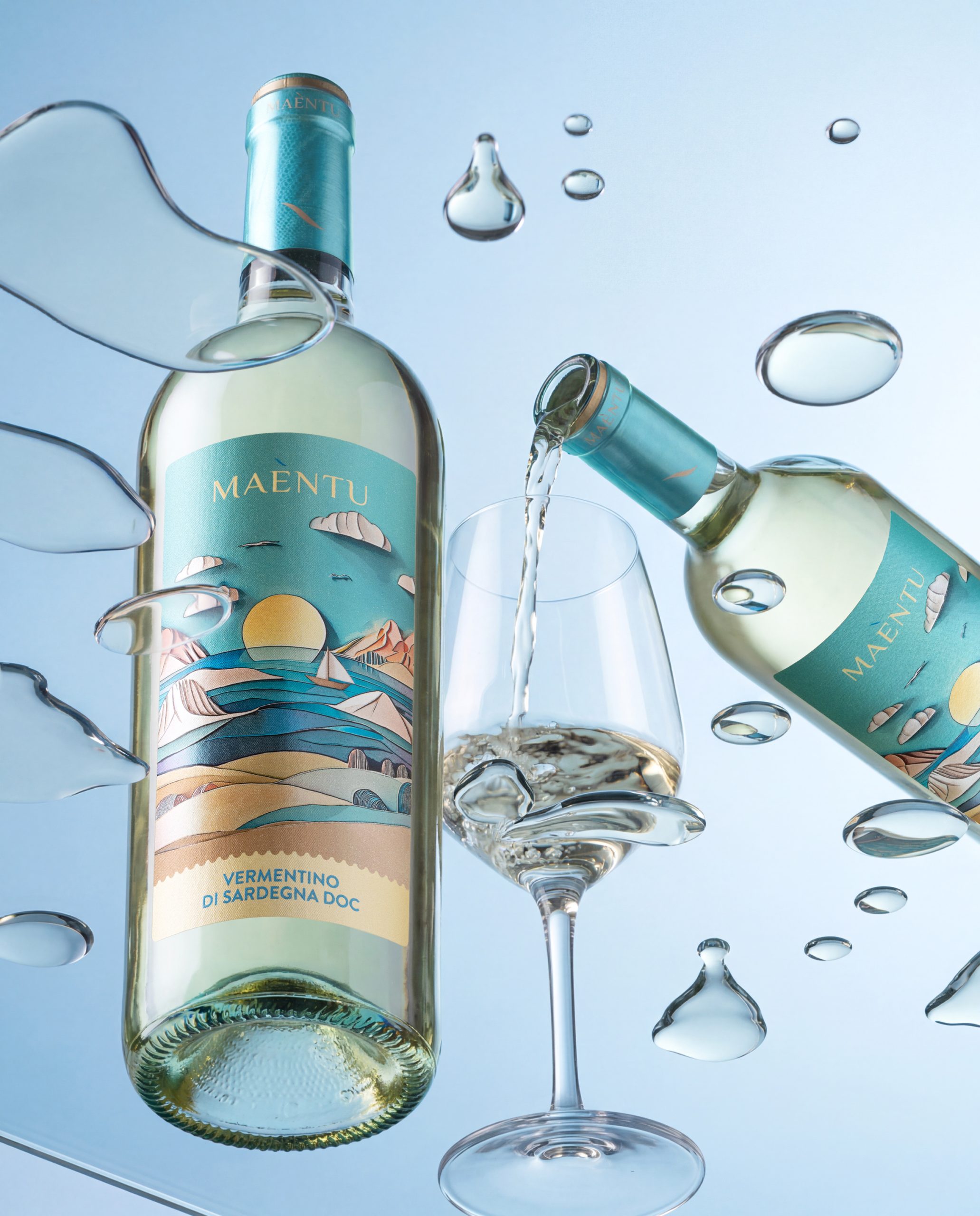
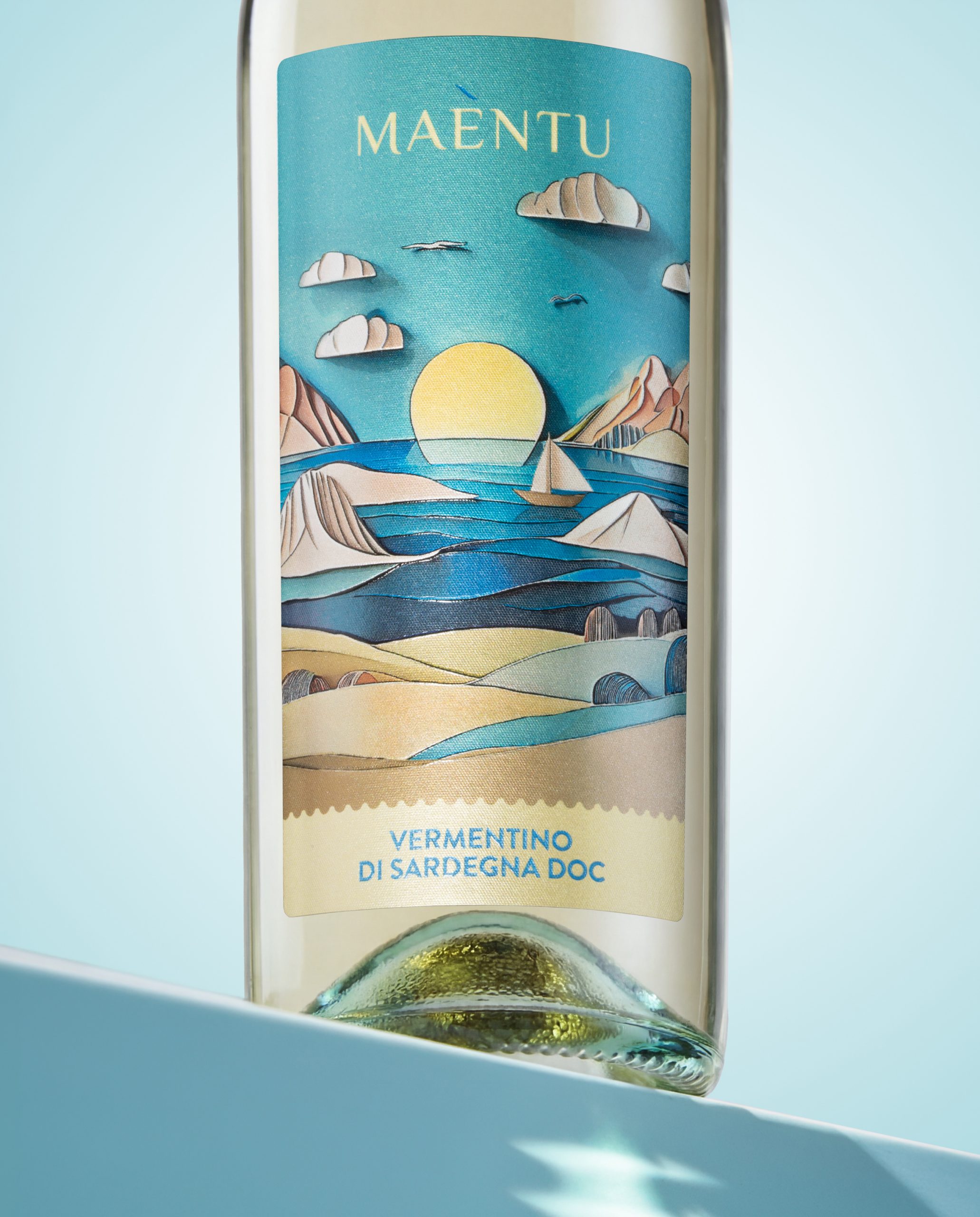
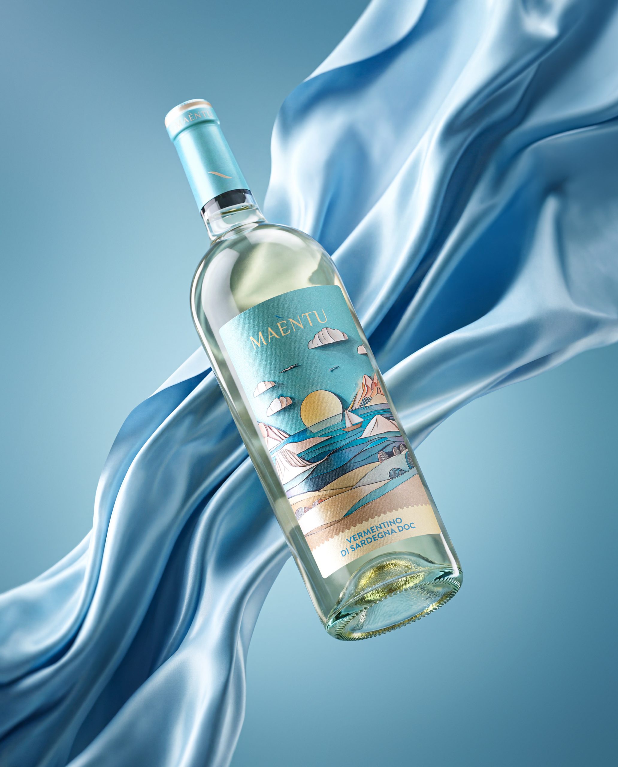
- The Vermentino di Sardegna DOC expresses the fresh, luminous and Mediterranean soul of the island. Its visual world is built around sea, breeze, horizon and sunlight.
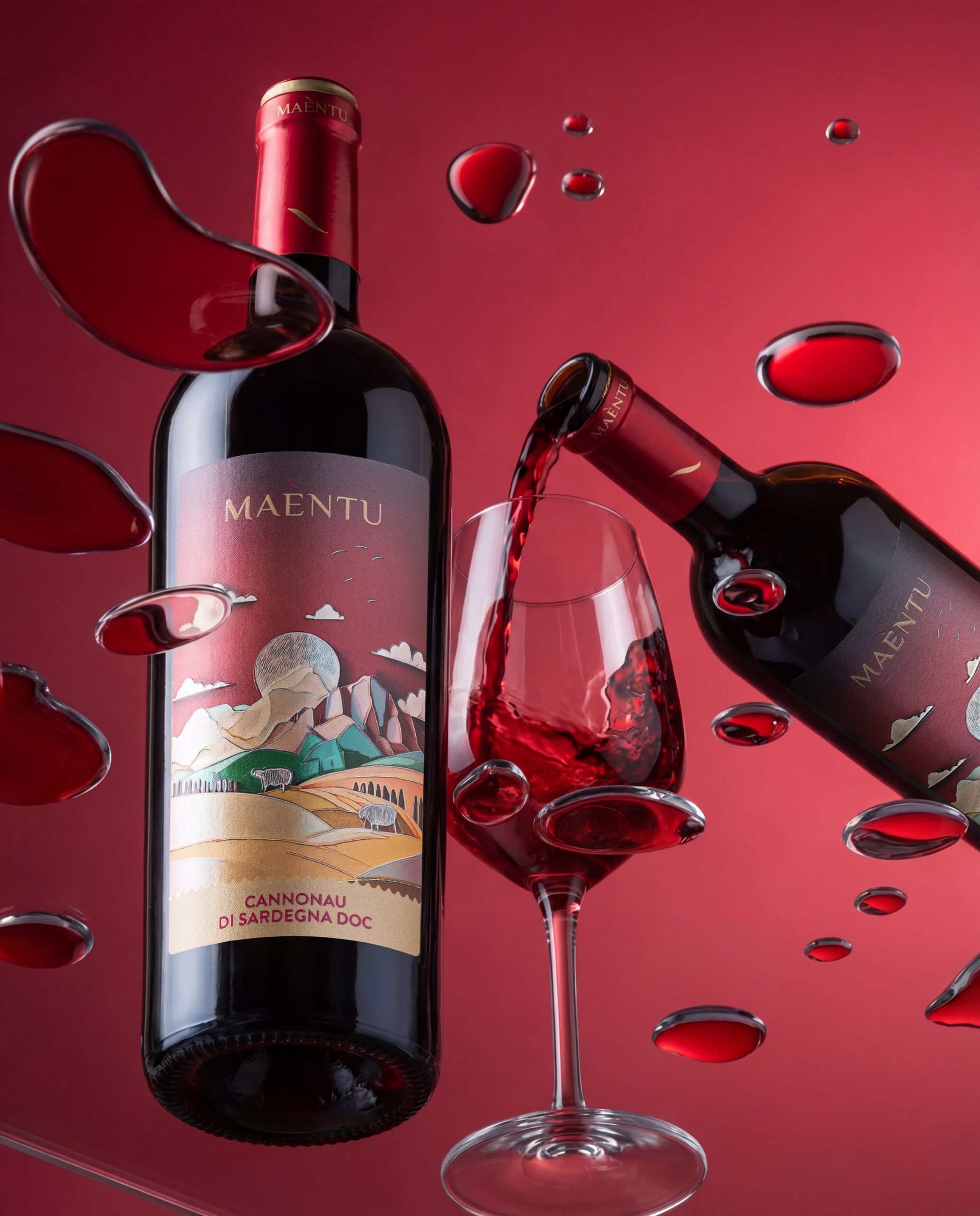
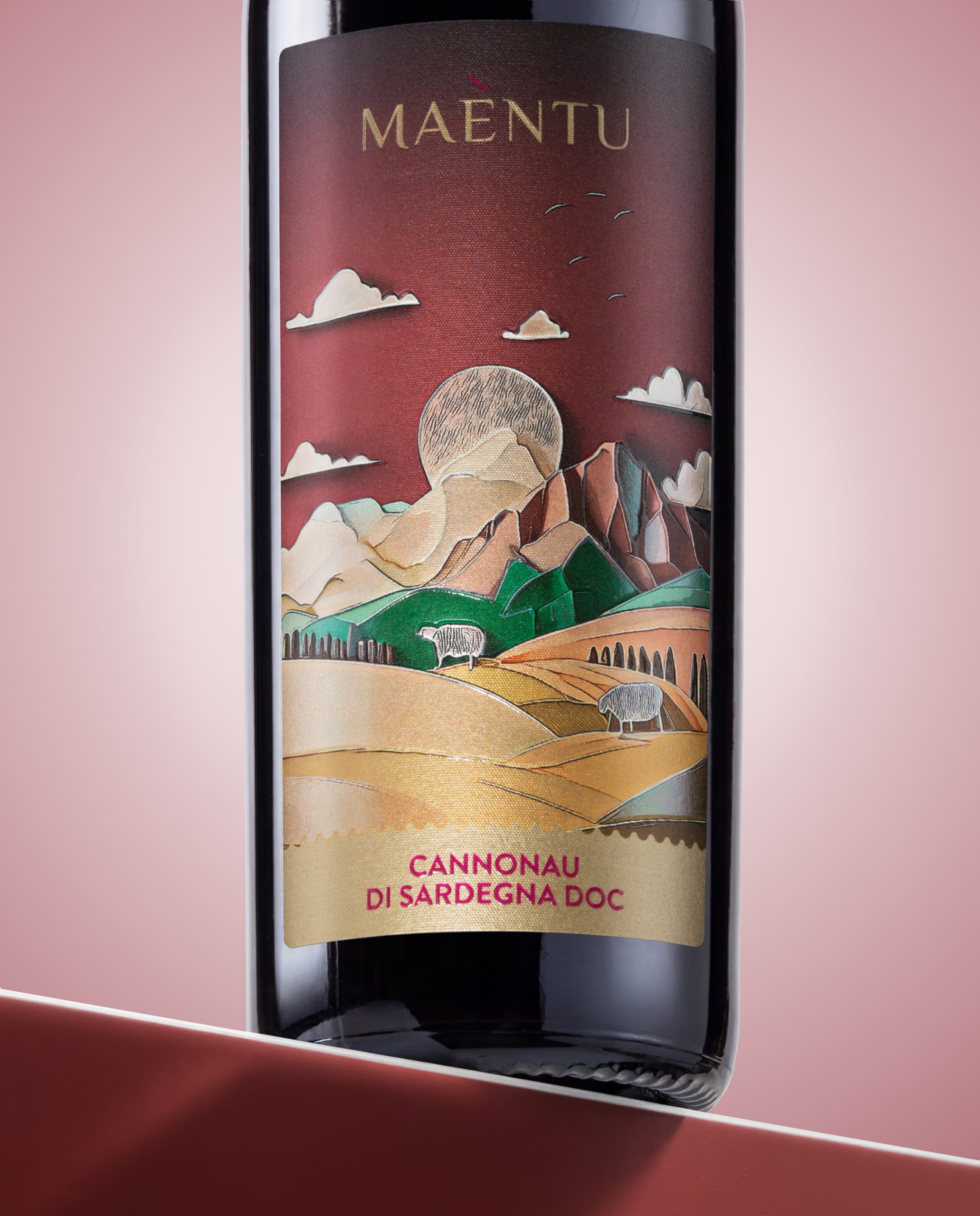
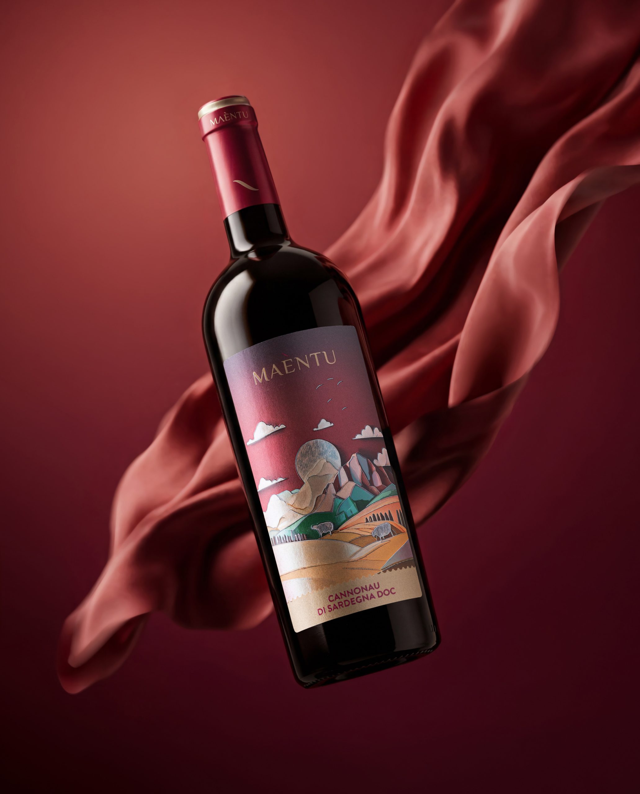
- The Cannonau di Sardegna DOC represents a more ancient, powerful and material Sardinia: hills, mountains, warm colours, rural landscapes and a deeper emotional tone.
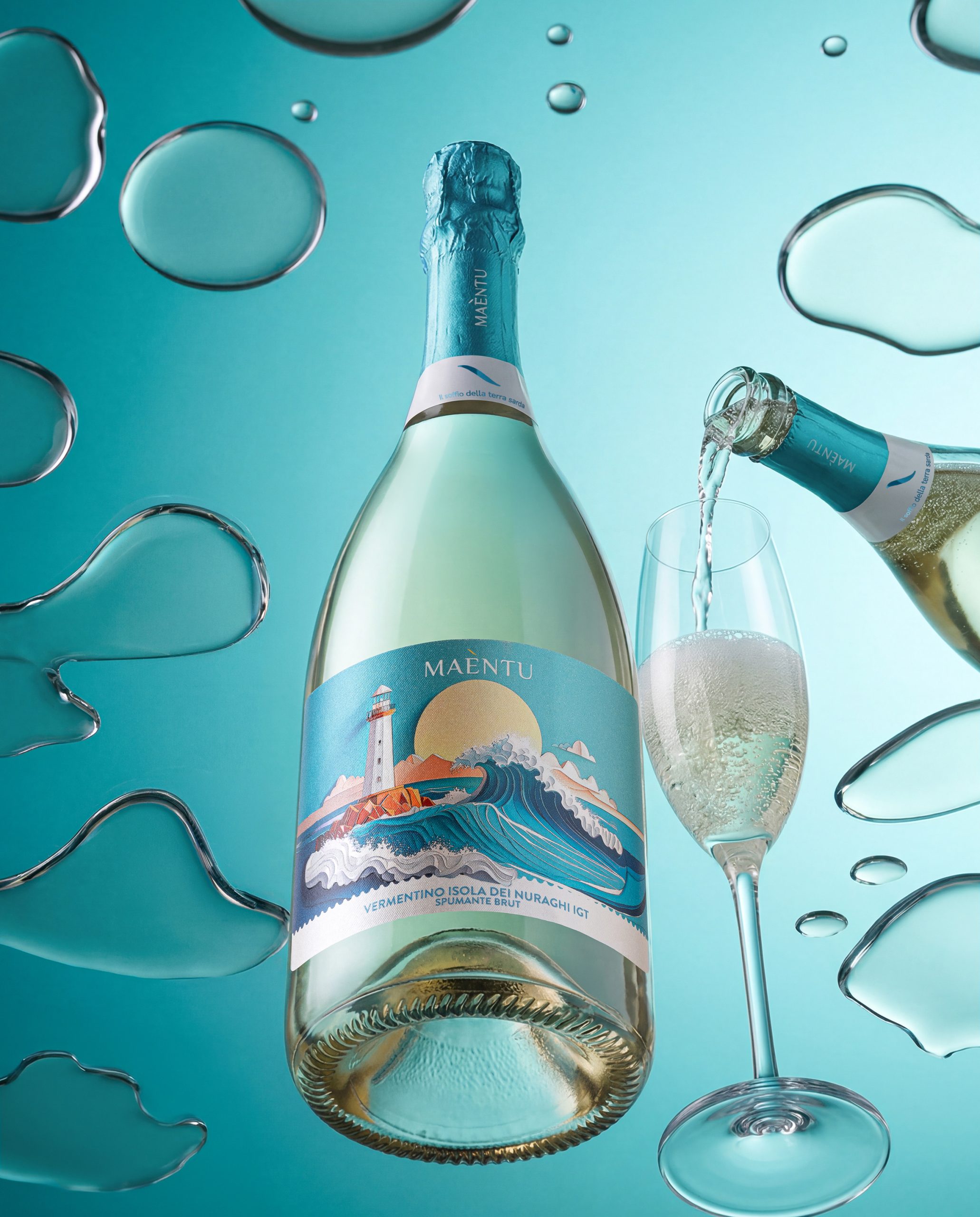
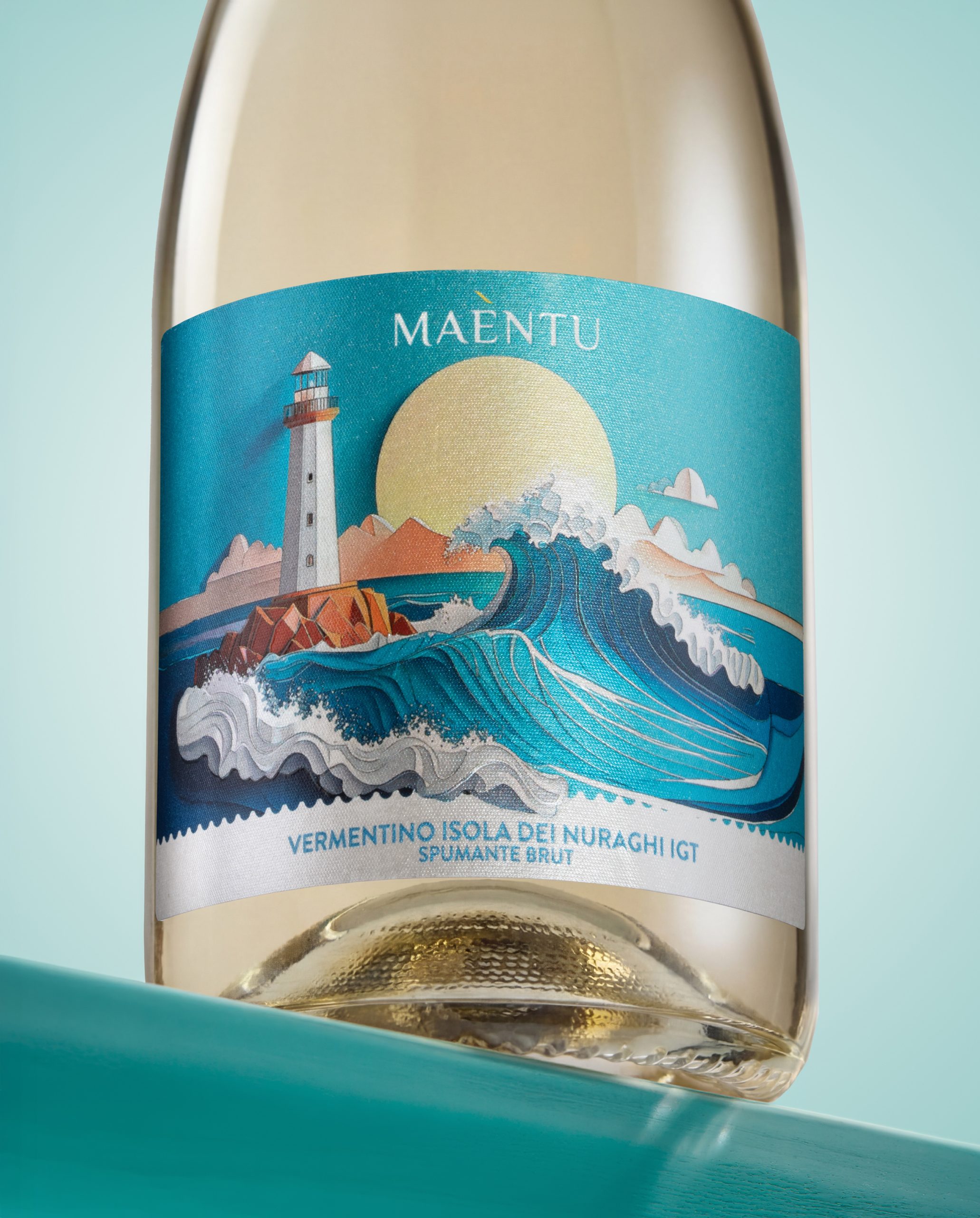
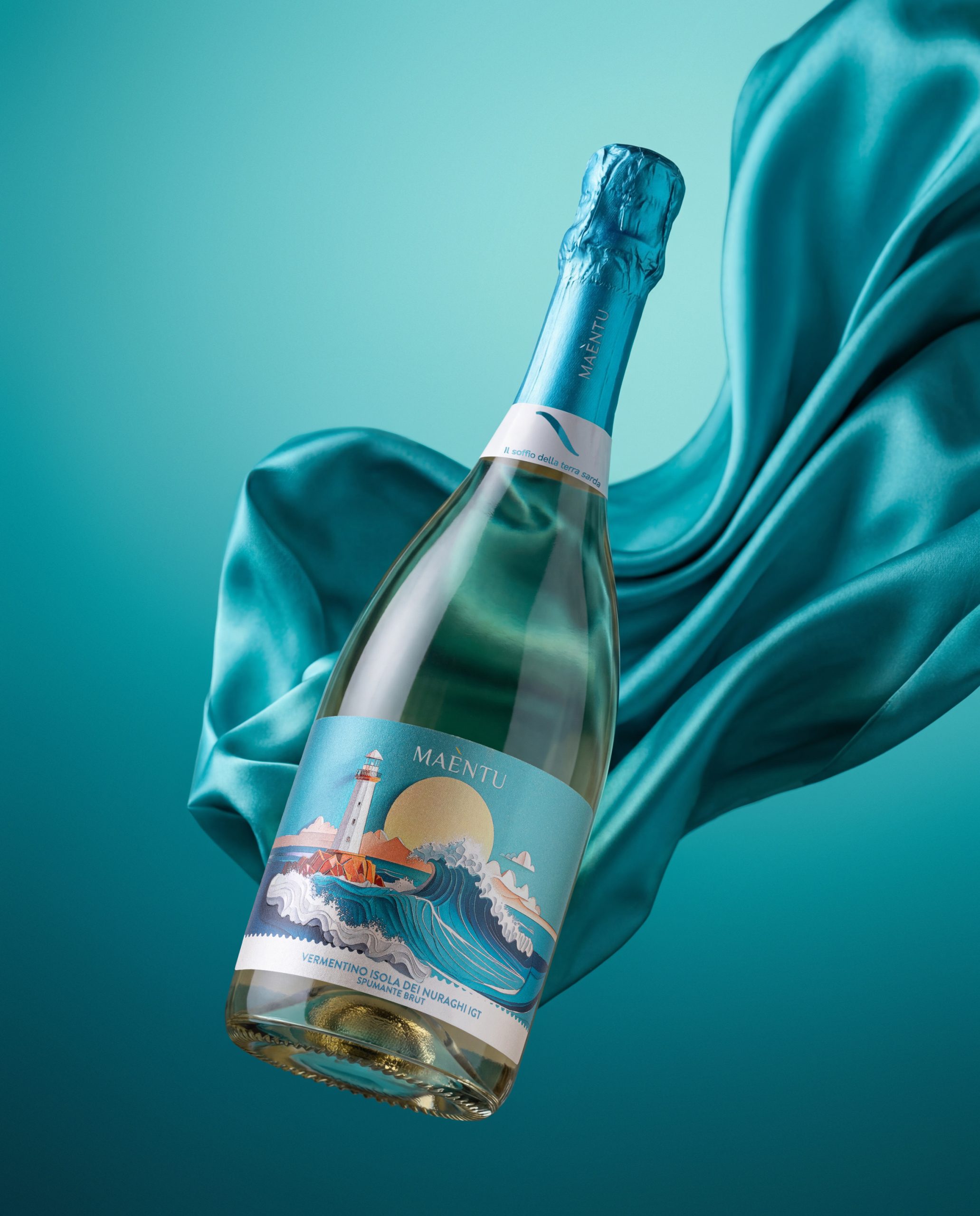
- The Vermentino Isola dei Nuraghi IGT Spumante Brut translates the energy of the sea into a more dynamic and celebratory image, where the wave becomes the main visual gesture.
Together, the three wines become a small visual journey through Sardinia: from the coast to the inland, from freshness to intensity, from stillness to movement.
THE SOLUTION
The packaging solution is based on a coordinated label system with a strong illustrative identity.
The design uses a contemporary, layered visual language, where landscapes are built through overlapping planes, soft volumes and stylised shapes. This gives the labels an almost three-dimensional feeling, while keeping the overall composition elegant, accessible and highly recognisable.
The brand name Maèntu is placed at the top of each label, acting as a quiet but distinctive signature. The central illustration becomes the emotional core of the design, while the denomination is positioned at the bottom with clarity and balance.
The colour palette changes according to the personality of each wine:
- turquoise, pale blue and gold for the Vermentino and the sparkling wine;
- deep red, burgundy and earthy tones for the Cannonau.
This creates a family feeling across the range, while allowing each bottle to express its own character.
THE TECNIQUE
The labels were designed to combine illustration, materiality and tactile perception.
The use of pearlescent paper enhances light reflection and gives depth to the illustrated landscapes. The surface becomes part of the story: it recalls the brightness of the Sardinian sea, the warmth of the sun and the mineral quality of the island’s natural scenery.
Embossing and tactile effects add volume to selected elements of the illustration, creating a physical relationship between the consumer and the label. Details such as clouds, waves, rocks, hills and sun acquire a subtle relief, making the design more immersive and premium.
Glass-like finishing effects and refined metallic details enrich the perception of the packaging without turning it into conventional luxury. The goal was not to create a distant or overly formal wine label, but a sensory object: fresh, contemporary and rooted in place.
UNIQUENESS OF DESIGN
The uniqueness of Maèntu lies in its ability to represent Sardinia without falling into postcard imagery or decorative folklore.
The labels do not show a literal map of the island. They build a visual atmosphere. They translate Sardinia into a set of sensations: the wind on the coast, the light over the sea, the silence of the hills, the strength of the land, the rhythm of the waves.
The project combines a commercial and contemporary wine language with a strong sense of origin. It is designed to be immediately appealing on shelf, but also rich in detail when observed closely.
Maèntu is not simply a range of Sardinian wines.
It is Sardinia seen through the movement of the wind.
RESULTS
The final packaging design includes three coordinated labels:
- Maèntu Vermentino di Sardegna DOC: A fresh and luminous white wine label inspired by sea, wind, horizon and Mediterranean light.
- Maèntu Cannonau di Sardegna DOC: A warm and material red wine label inspired by the inland landscape, hills, mountains and rural Sardinia.
- Maèntu Vermentino Isola dei Nuraghi IGT Spumante Brut: A sparkling wine label inspired by the energy of the sea, with a dynamic wave as the main visual element.
- Design system: coordinated wine range with differentiated colour codes
- Visual language: contemporary layered illustration
- Main inspiration: Sardinian landscapes, wind, sea, countryside and island identity
- Materials: pearlescent premium label paper
- Finishing techniques: embossing, tactile reliefs, refined metallic and glass-like effects
- Brand name origin: Maestrale + entu, the Sardinian word for wind
- Design objective: create a modern Sardinian wine identity able to combine authenticity, freshness, shelf impact and premium perception
The final result is a wine collection with a strong and coherent visual identity: elegant, bright and deeply Mediterranean, designed to make Sardinia feel close before the bottle is even opened.
 Hi estudio
 43oz
43oz monther al omari
 Rosario Lo Iacono
 alchimistestudioParis
 Ebbi
Ebbi Maruf Nishat
 Mind Brand
 宏洛图品牌设计HONGLT
 Iyioluwanbelarami
 sahildoesartt
 Denis Ulianov
 Garry Veda
 arutza
 Lucid mk2
 MaheswariMadhu
 sanjnasnair
 POSH FMCG BRANDING
 Modern Theory
 Shubhashish Roy
 Affogato Brand Design
 Backbar Studios
 hello ocean
 Luciana
 Valérie Colace