

ABOUT THE PRODUCT
GINNASIUM is a premium craft Italian Distilled Gin created for “Ginnasium – Train your Design 2026”, an experimental packaging design project dedicated to exploring the emotional and visual power of gin packaging. The project asked designers to interpret their own region through the design of a premium gin bottle, using paper, glass, closures, printing techniques and finishing processes as creative tools. Our interpretation is dedicated to Sardinia: an island of ancient landscapes, symbolic traditions and rituals that still feel alive, powerful and deeply contemporary.
CONCEPT
The concept is titled “Nothing Is as It Seems.” It is inspired by the Carnival of Ottana, in Barbagia (Sardinia), one of Sardinia’s most ancestral and mysterious traditions. During this ritual, the masks of the Boes — the oxen — and the Merdules — their masters — stage a primordial struggle made of sound, movement, fire, animality and transformation.
In Sardinia, the boundary between sacred and profane is not a line: it is a tribal rhythm. Between ritual fires, cowbells, masks and animal skins, Carnival becomes a rite of transformation.
The packaging translates this world into a system of dualities:
- man / animal
- day / night
- truth / appearance
- visible / hidden
- matter / spirit
The bottle becomes a mask itself: something that reveals only part of the story at first sight, inviting the consumer to look closer.
SOLUTION
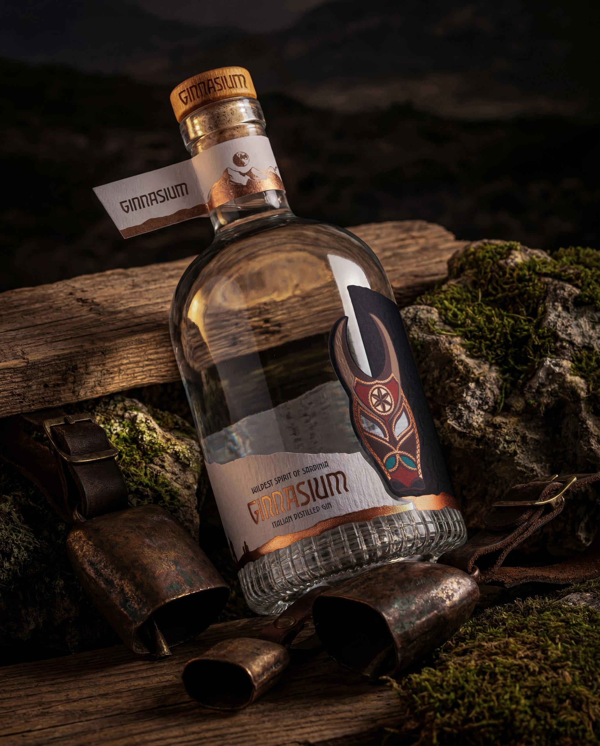
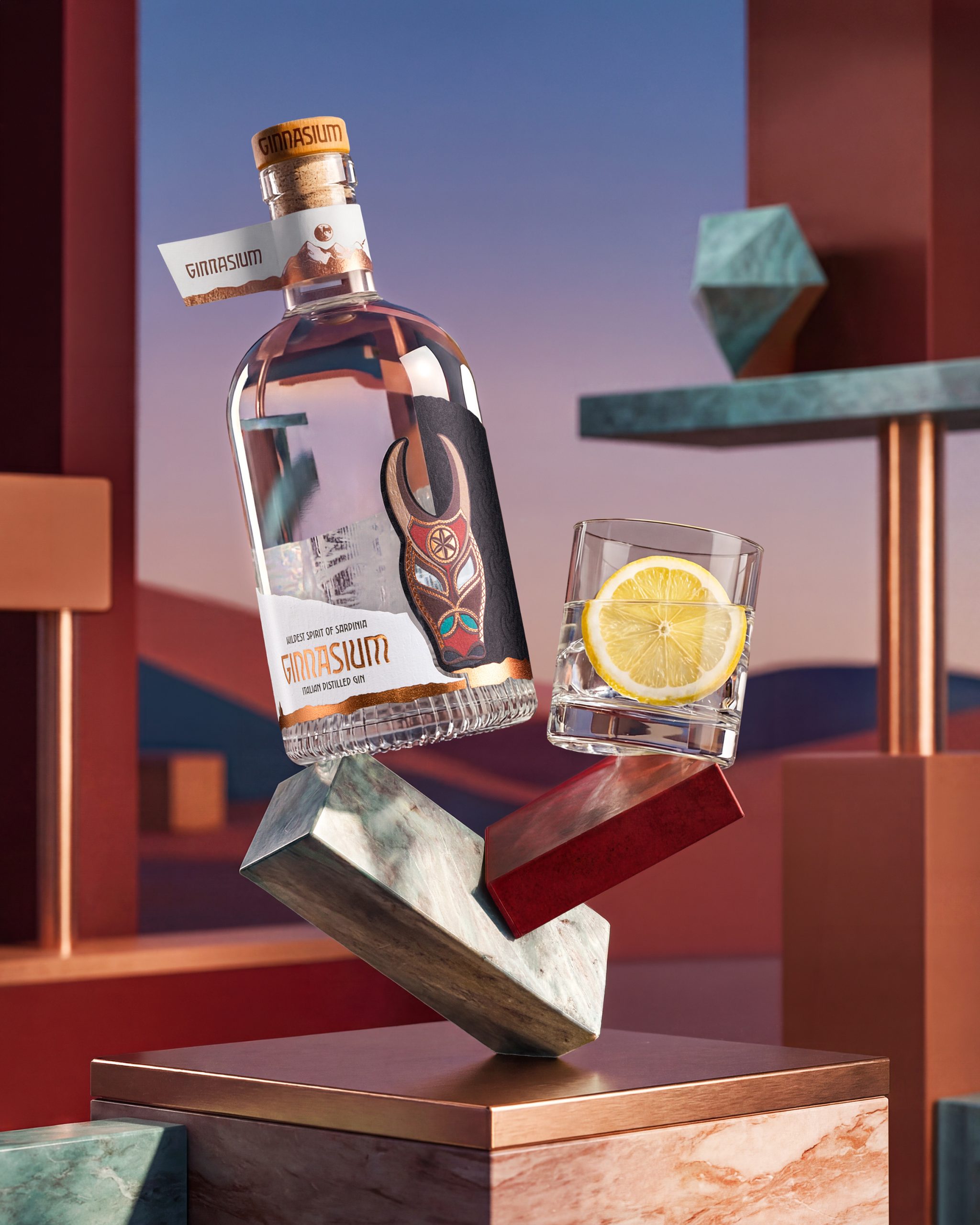
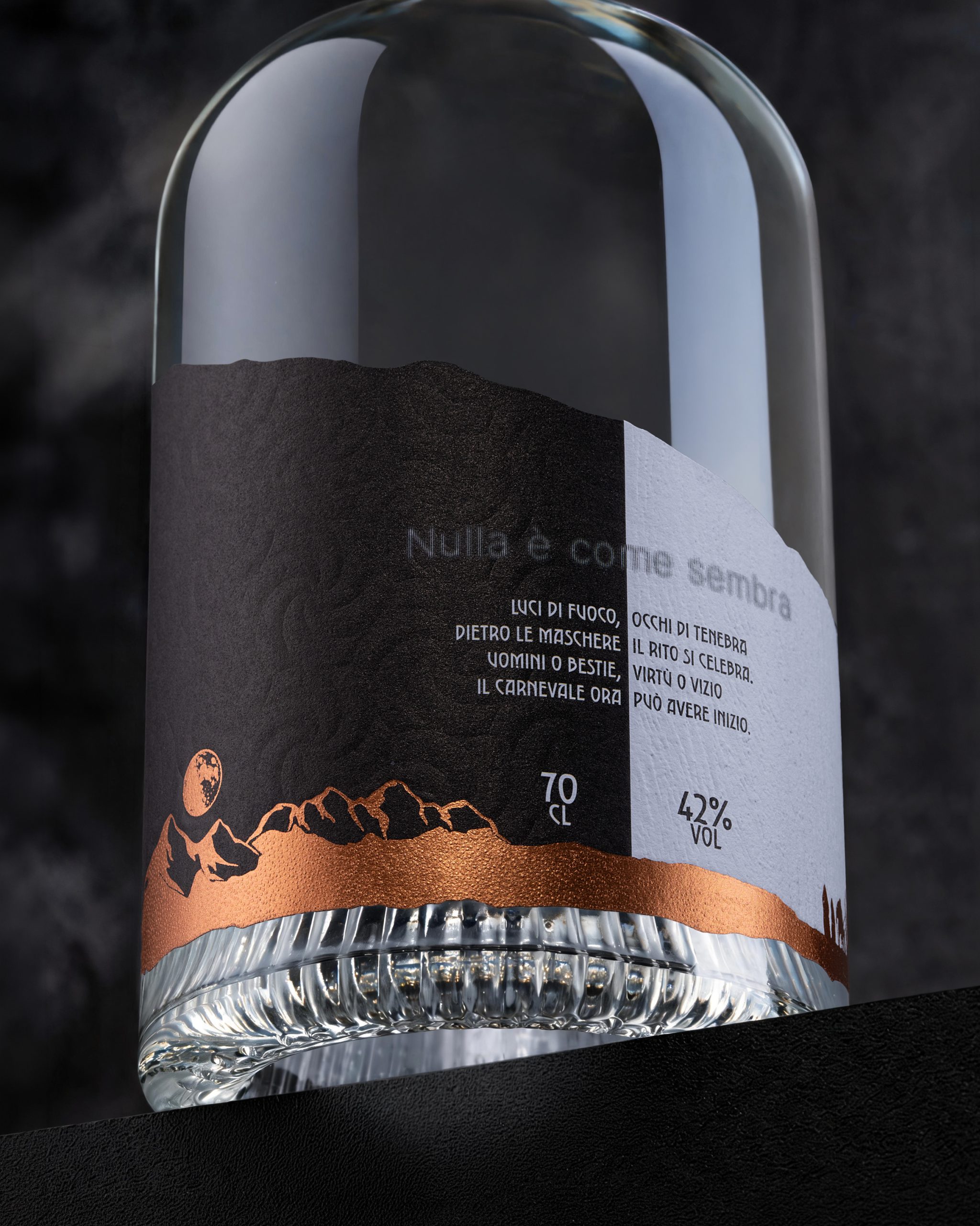
The design solution is based on a wraparound asymmetric label that creates a visual “window”. When the bottle is rotated, the external label reveals a second internal layer, turning the packaging into a small ritual of discovery. On the outside, the design shows the iconic presence of the Boe mask, the mountain landscape, the ritual fire and the moon. Inside, a more ambiguous and hidden scene appears: the Boes and Merdules emerge in a solemn, almost ceremonial pose. The label is not simply applied to the bottle: it performs. It breaks the geometry of the cylindrical surface and invites interaction.
The message “Nothing Is as It Seems” becomes both the creative idea and the user experience: the design asks people not just to look at the bottle, but to rotate it, touch it and discover what lies behind the mask.
PRINTING TECNIQUE
The packaging was designed as a layered visual and tactile system. The main label is printed on UPM Raflatac Sabrage paper, chosen for its premium material quality and its ability to enhance the physical perception of the design. A second transparent layer, applied as a plastic film, creates depth, overlap and a “see-through” effect. The finishing techniques were selected to transform the symbolic elements of the ritual into tactile sensations:
- micro-embossing, embossing and debossing to create depth and physical contrast;
- textural effects to evoke leather, fur, wood and rough natural surfaces;
- foil details to recall bronze cowbells, firelight and precious ritual objects;
- layering and transparency to create the tension between what is visible and what remains hidden.
Every technical choice is functional to the concept. The finishings are not decorative extras: they are narrative tools.
UNIQUENESS OF DESIGN
This packaging is unique because it turns a cultural ritual into a physical experience. It does not use Sardinian tradition as folklore or decoration. Instead, it transforms it into a contemporary premium design language, where every material, texture and cut has a strategic role. The bottle creates curiosity at shelf level, but rewards interaction at close range. The consumer is invited to move the object, discover the hidden layer and decode the story gradually. The result is a packaging system that works on three levels:
- Visual impact — through contrast, asymmetry and iconic imagery.
- Tactile engagement — through paper, reliefs, textures and foil.
- Narrative discovery — through the hidden internal illustration and the rotating experience.
In a market where premium spirits often rely on classic luxury codes, GINNASIUM chooses a different route: it builds desirability through mystery, ritual and transformation.
SPECIFICATION
The final packaging design includes:
- Product: Premium Italian Distilled Gin
- Project title: Nothing Is as It Seems
- Design inspiration: Carnival of Ottana, Sardinia
- Main visual references: Boe mask, Merdules, ritual fire, moon, mountain landscape, animal skins, cowbells
- Label structure: Asymmetric wraparound label with window effect
Main material: UPM Raflatac Sabrage paper - Secondary material: Transparent plastic film layer
- Printing and finishing techniques: embossing, debossing, micro-embossing, texture effects, foil applications
- Design objective: create a premium gin packaging capable of generating curiosity, emotional engagement and physical interaction
- Key feature: a layered design that reveals a hidden visual story when the bottle is rotated
The final result is a bottle that behaves like a ritual object: iconic from a distance, rich in detail up close, and memorable because it asks the consumer to take part in the story.

 monther al omari
 Ximena Ureta Design Studio.
 vitoramockup
 Up-Brands
 Sophiagdotcom
 Peter said
 ayeidadezigns
 Tancybox
 宏洛图品牌设计HONGLT
 Modern Theory
 Dozen Agency
 Atiq Alam
 Olio Studio
 Ruchi S. Joshi
 mmdesign
 awaiskhadim
 Octasoft
 United Creatives Studio
 Kingdom & Sparrow
 Anastasia Bakhmatskaya
 CreativeWise
 Great and Golden