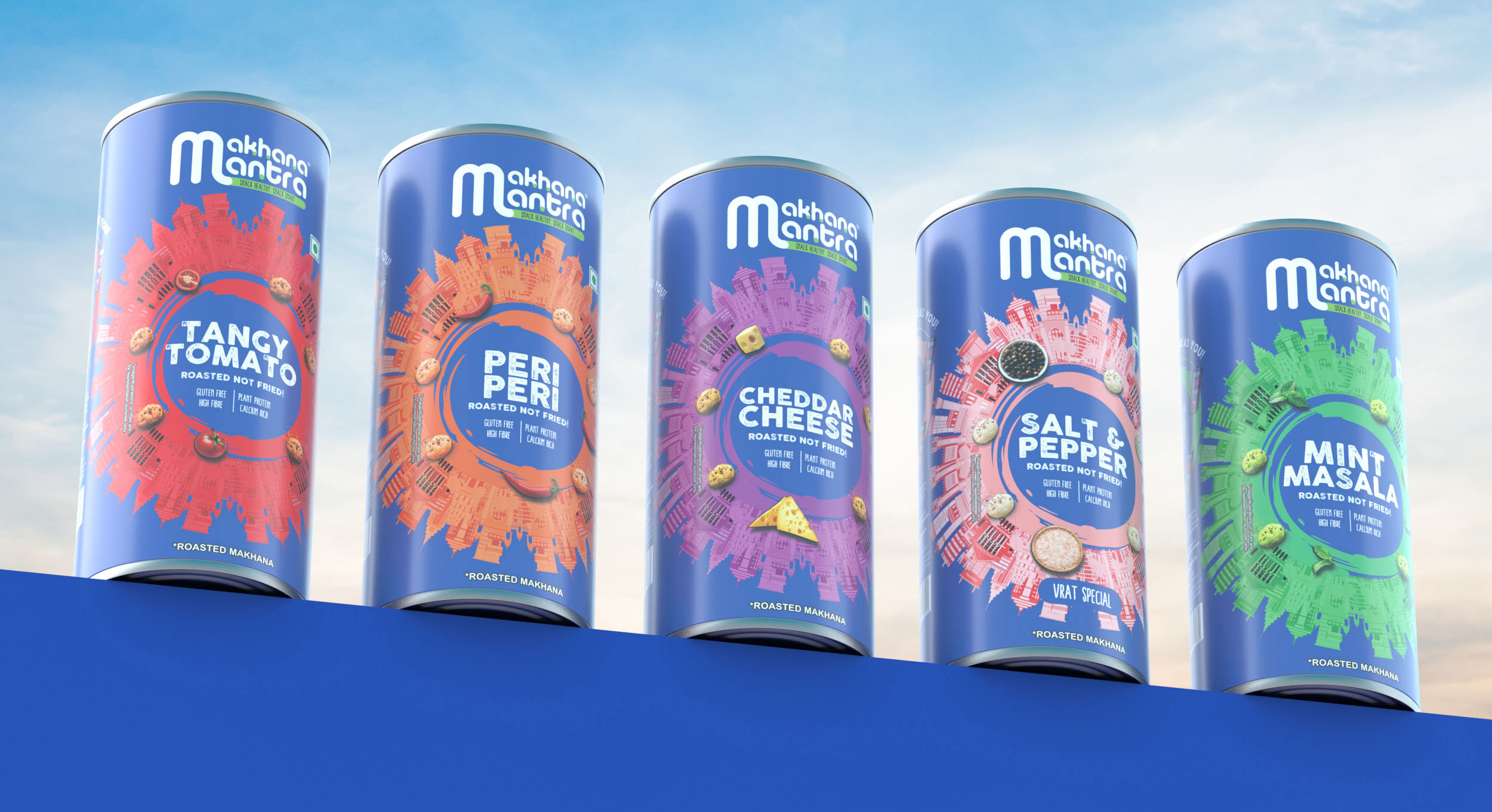

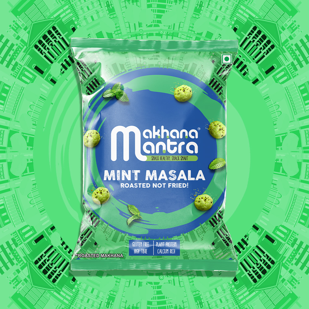
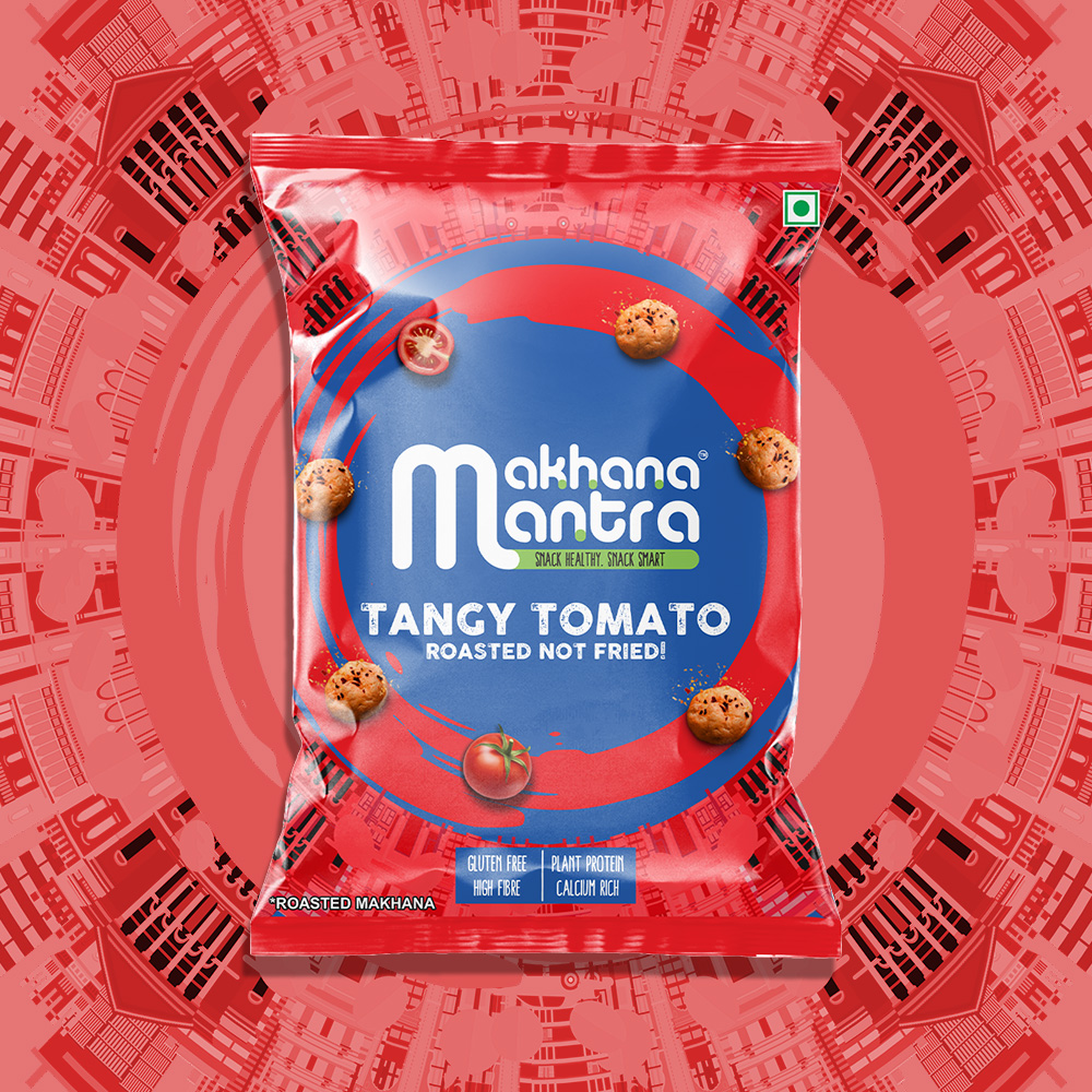
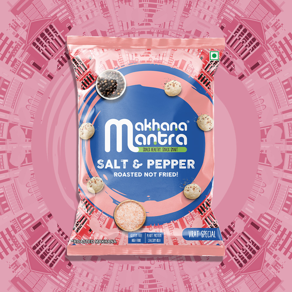
Makhana Mantra is a contemporary roasted makhana brand designed to transform a traditional Indian superfood into a bold, modern snacking experience. The packaging system was created to stand out in an increasingly crowded healthy-snacking category by combining vibrant flavor differentiation, strong shelf impact, and a distinctive visual identity.
The cylindrical can format provides a premium and reusable pack structure while ensuring product protection and enhanced shelf presence. At the heart of the design is a dynamic circular cityscape illustration that radiates around the flavor name, symbolizing the energy, movement, and modern lifestyle of today’s conscious consumers. The visual system creates a sense of momentum while drawing immediate attention to the product variant.
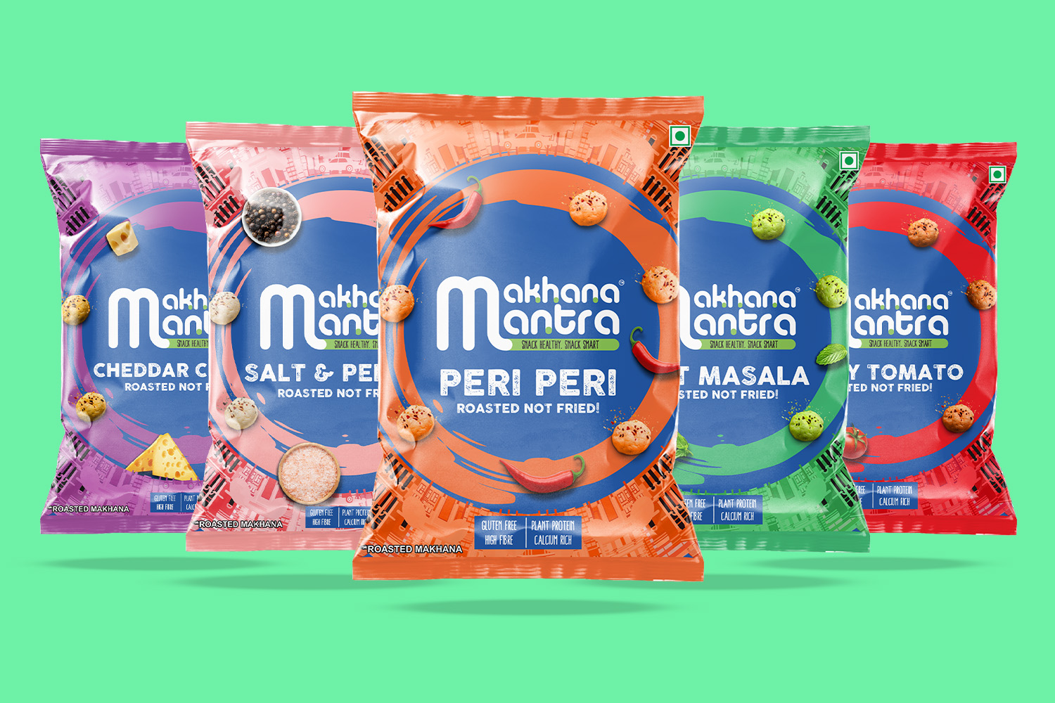
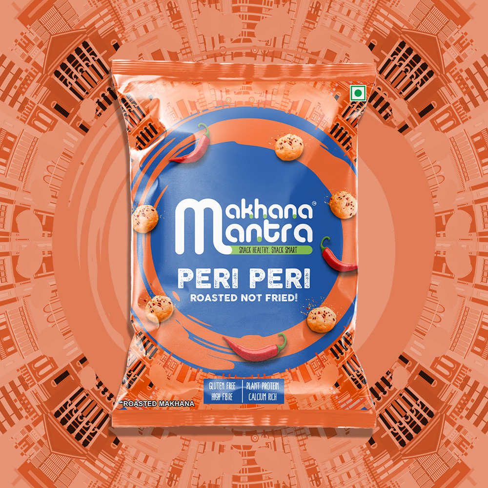
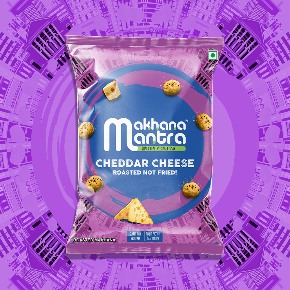
Each flavor is assigned its own striking color palette, allowing consumers to quickly identify variants while maintaining a cohesive brand family across the range. Floating ingredient illustrations and makhana kernels reinforce flavor cues and communicate product authenticity. The clean typography hierarchy highlights key product benefits including Roasted Not Fried, Gluten Free, Plant Protein, and Calcium Rich, supporting the brand’s health-focused positioning.
The overall design balances indulgence and wellness, appealing to urban consumers seeking nutritious alternatives to conventional snacks without compromising on taste. Through bold graphics, premium packaging structure, and a memorable visual language, Makhana Mantra successfully reimagines roasted foxnuts as a vibrant, contemporary snack for the modern market.
Design Services: Brand Identity, Packaging Design, Visual Strategy, Illustration Direction, Variant Architecture, FMCG Design.
Keywords: Makhana, Fox Nuts, Healthy Snacks, FMCG Packaging, Food Packaging, Snack Branding, Roasted Makhana, Premium Packaging, Indian Snacks, Packaging Design, Consumer Goods, Retail Packaging, Brand Identity, Variant System, Sustainable Snacking.
 ANONIMA/
 Armoder Arte y Diseño
 eimanbeh
 Biaa
 Hartson Creative
 Karen Danielyan
 AUN BRANDS
 Studio Zak
 Hey Joe Studio
 Blue.labs
 Jasmine Tsan
 Atiq Alam
 Modern Theory
 Tancybox
 Artrime Graphic Design
 WhiteWarblerCo
 Simple Studio
 M&A CREATIVE AGENCY
 monther al omari
 Husain Studio
 JDO
 INTSIGN
 Agence des Coteaux
 Yaniv Vaknin