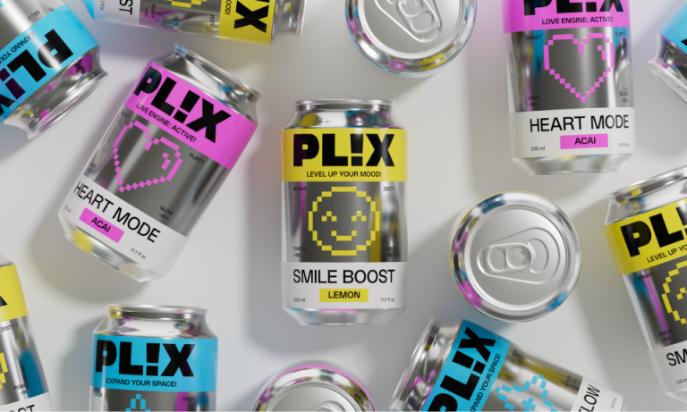

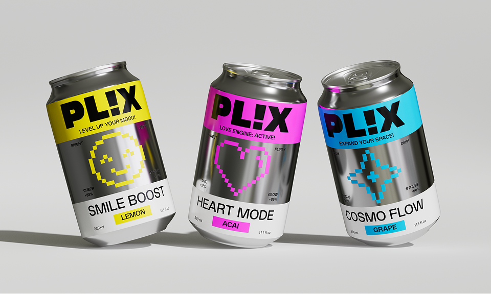
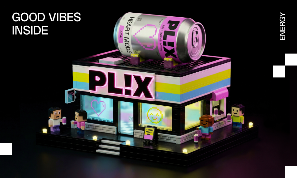
We created a modular identity based on the concept of energy modes. Each mode has its own color, symbol and mood, allowing users to choose their state rather than just a flavor. Pixel graphics and UI-inspired elements bring a sense of play and digital culture, while clear typography keeps the system structured and easy to scale. The result is a bold but friendly identity that works across packaging, merch, digital and outdoor applications.
Curator’s Insight
What makes PLIX stand out is how it treats each variant as its own character rather than a flavor extension. The pixel motifs feel native to the format, not decorative, and the typographic layout uses rotation and scale in a way that gives each can a distinct read while keeping the system cohesive. It sits comfortably between digital streetwear culture and functional product design, which is a hard balance to land.


 NEV
NEV Stefano Bracci
 Alina
Alina monther al omari
 Lizakjx
 JOAOMARCOSDESIGN
 alchimistestudioParis
 Harriet Neild
 octavio rojo
 宏洛图品牌设计HONGLT
 DESIGN CONCEPTS
 Alexander Skurihin
 Studio K95
 ARMBRAND
 Richa Rai
 houseoferas by Miti
 Agence des Coteaux
 Kushi Eaknath
 Ann Treasa
 Xiao Ning
 krrrrrllii
 babyage
 Deep
Deep