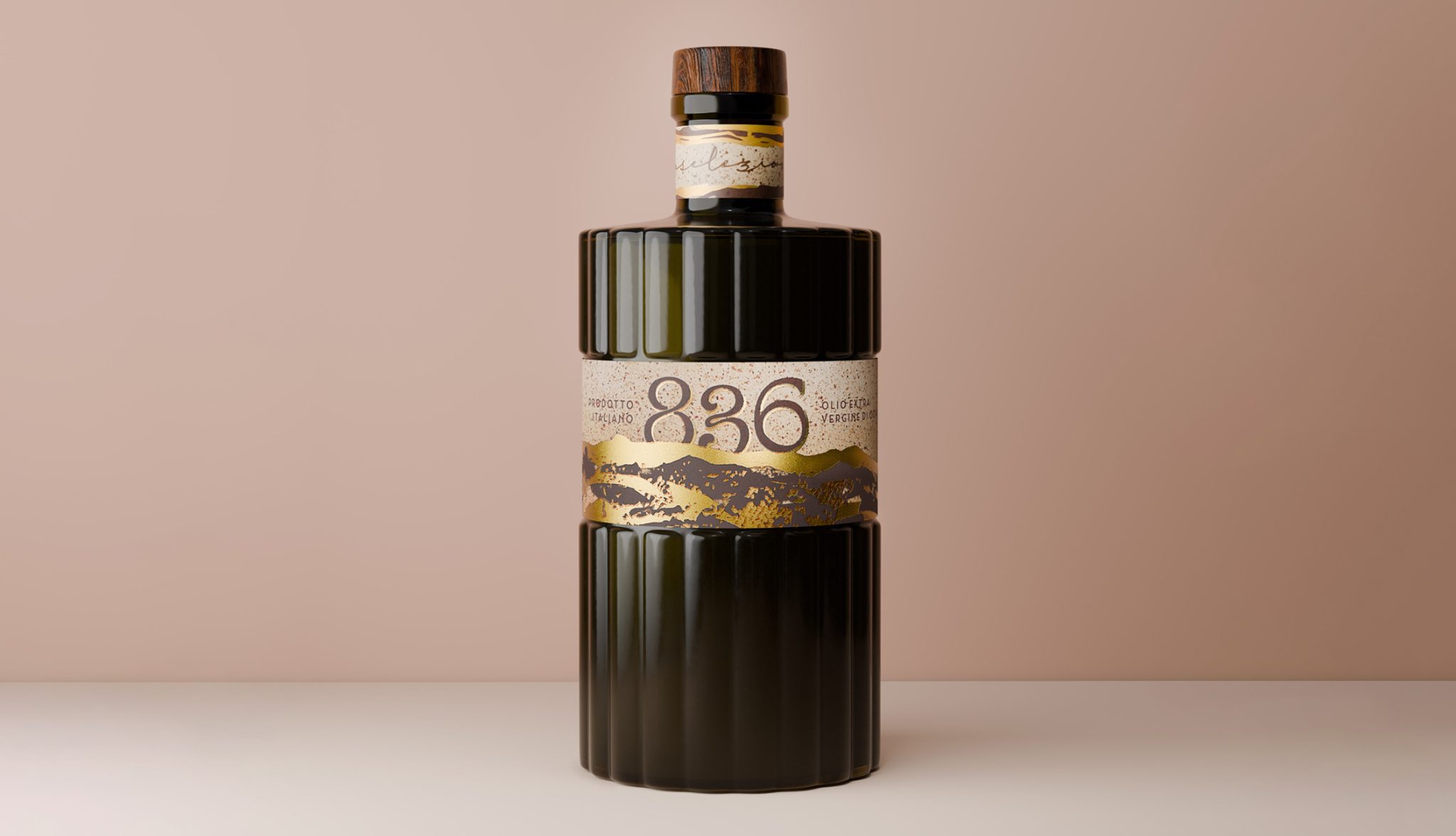

Selezione 836, olive oil packaging – 800 olive trees, 36 years, where a story becomes a vision
Selezione 836 was conceived as a brand identity project that translates a story of care, time, and heritage into both visual and tactile form. The label tells the story of Andrea, who at the age of thirty-six chose to dedicate himself to eight hundred olive trees, transforming a family legacy into a contemporary endeavour. The concept is built around this balance: on one side, memory — his grandfather’s stories, a slower pace of life, and a deep respect for natural cycles; on the other, a modern, conscious, and design-driven vision.
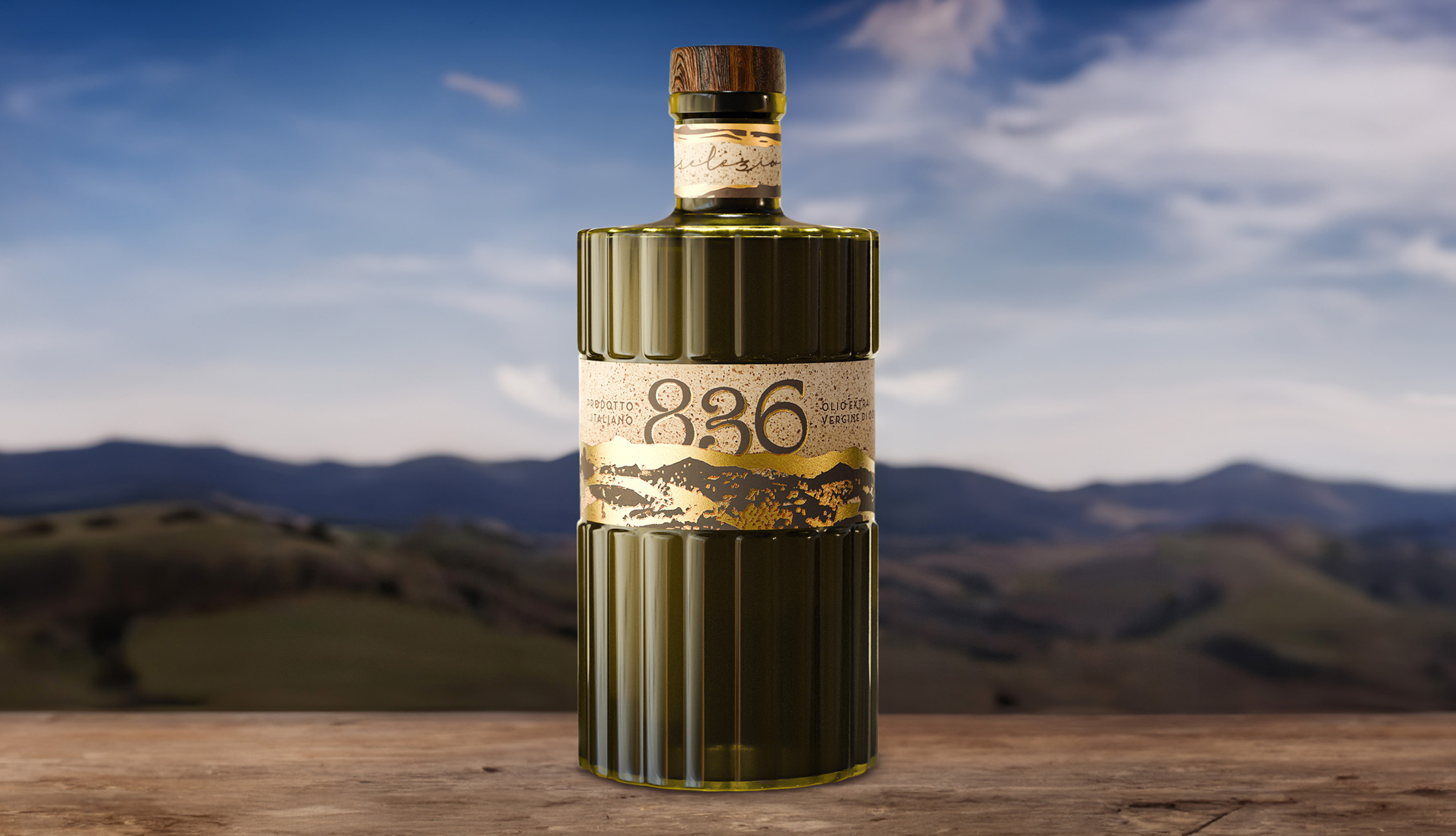
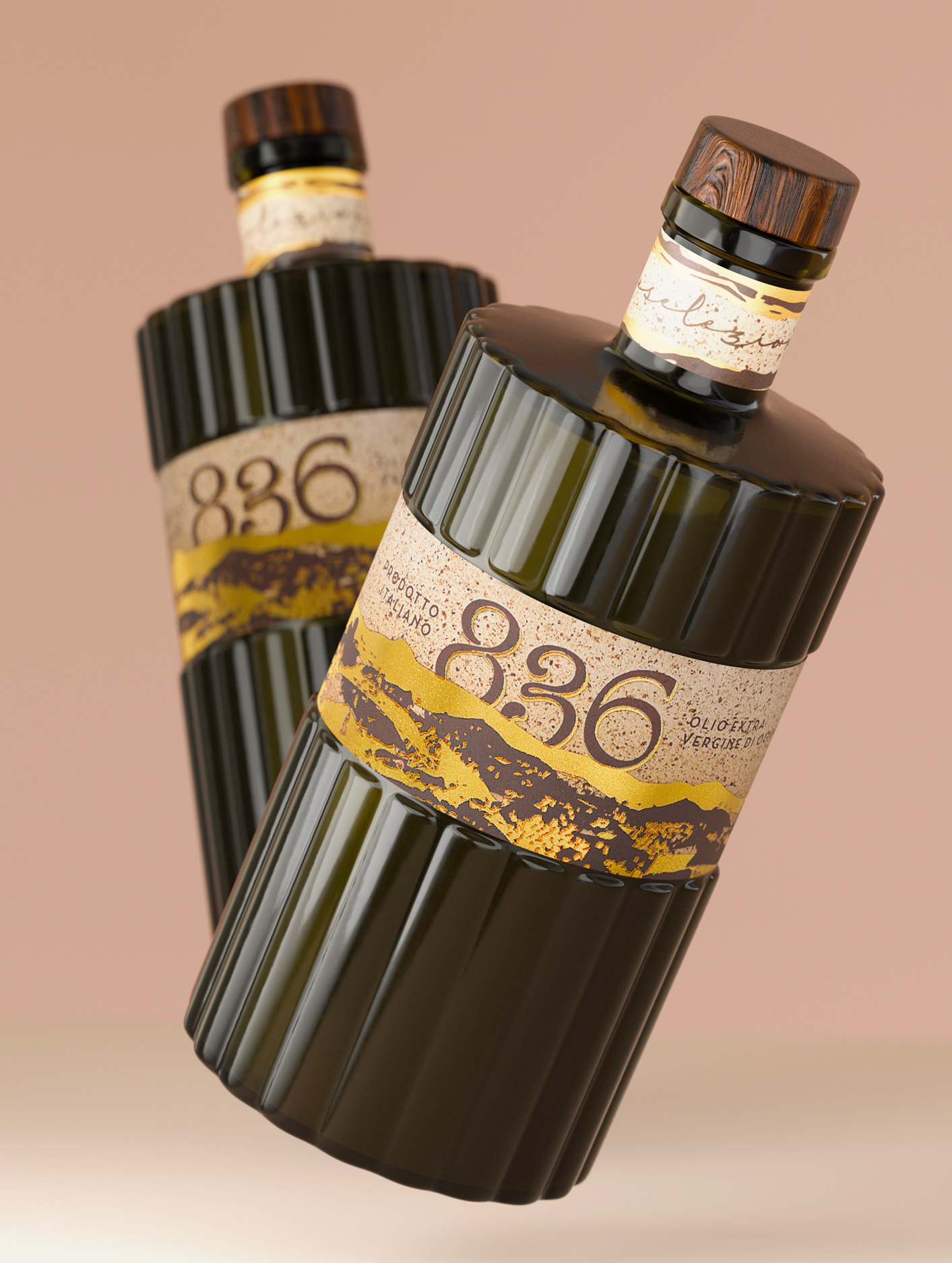
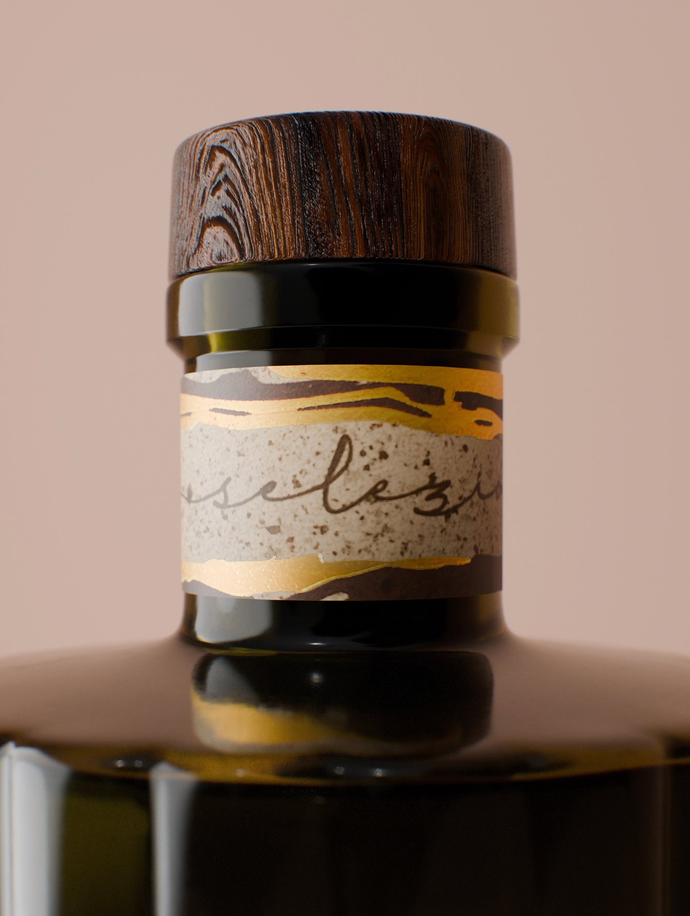
The visual language draws inspiration from the landscapes of the Castelli Romani and the Agro Pontino regions, where the light of dawn and dusk envelops the olive groves in rich, warm hues. This atmosphere is translated into a carefully considered colour palette and printing techniques that engage not only the eye but also the senses. The project is distinguished by its strongly tactile approach. Paper, natural and recycled, becomes a narrative medium, while a combination of embellishments — gold foil, micro-engraving, and a sand-effect screen print — creates a sensory dialogue that evokes the earth, tree bark, and the craftsmanship behind olive cultivation. The choice of bottle represents a deliberate point of contrast. A container traditionally associated with the spirits industry, characterised by contemporary and ergonomic lines, has been reinterpreted for olive oil. The dark green glass is not merely an aesthetic detail but a functional decision aimed at preserving the quality of the product. This interplay between different visual codes strengthens the project’s positioning, making it distinctive and immediately recognisable.
A non-refillable Wengé wood closure completes the design, adding a natural yet sophisticated finishing touch. Selezione 836 ultimately emerges as a branding project that seamlessly combines tradition and contemporary design, where every graphic, material, and structural choice contributes to creating a coherent and deeply sensory narrative.
Curator’s Insight
What stands out here is the restraint. With this many embellishment techniques at play, a design can easily tip into excess, but Selezione 836 holds its balance. The decision to borrow the bottle silhouette from the spirits category is a small but meaningful move, one that repositions olive oil without distancing it from its agricultural roots. The label works as a landscape in miniature, and the number 836 carries real weight precisely because it refers to something specific. This is packaging that has a reason for every choice, and that legibility of intent is what makes it linger.




 monther al omari
 Alexander Skurihin
 Studio K95
 ARMBRAND
 Richa Rai
 houseoferas by Miti
 Agence des Coteaux
 Kushi Eaknath
 Ann Treasa
 Xiao Ning
 krrrrrllii
 babyage
 Deep
Deep Atiq Alam
 TUERCA Studio
 neo creative studio
 Pinot Agency
 Pixels Studio
 Anastasia Cherepanova | xtramez
 awaiskhadim
 Studio Be Design
 Belova Oksana