

SMAC – Inclusive Ice Cream Tub Packaging Design
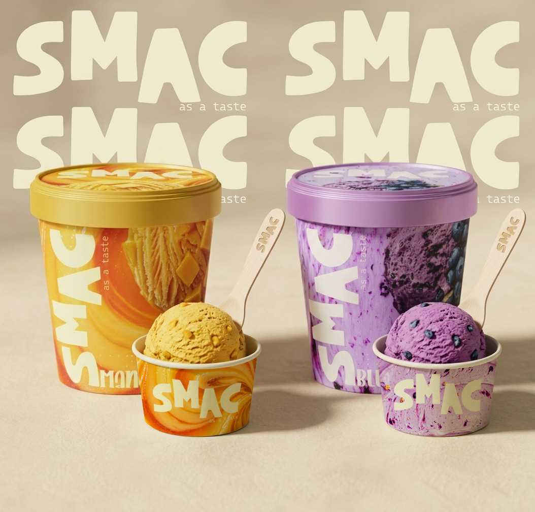
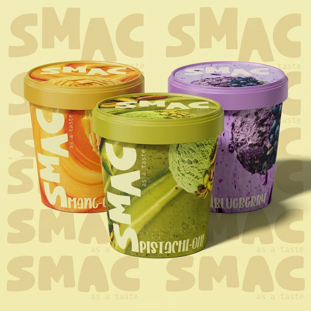
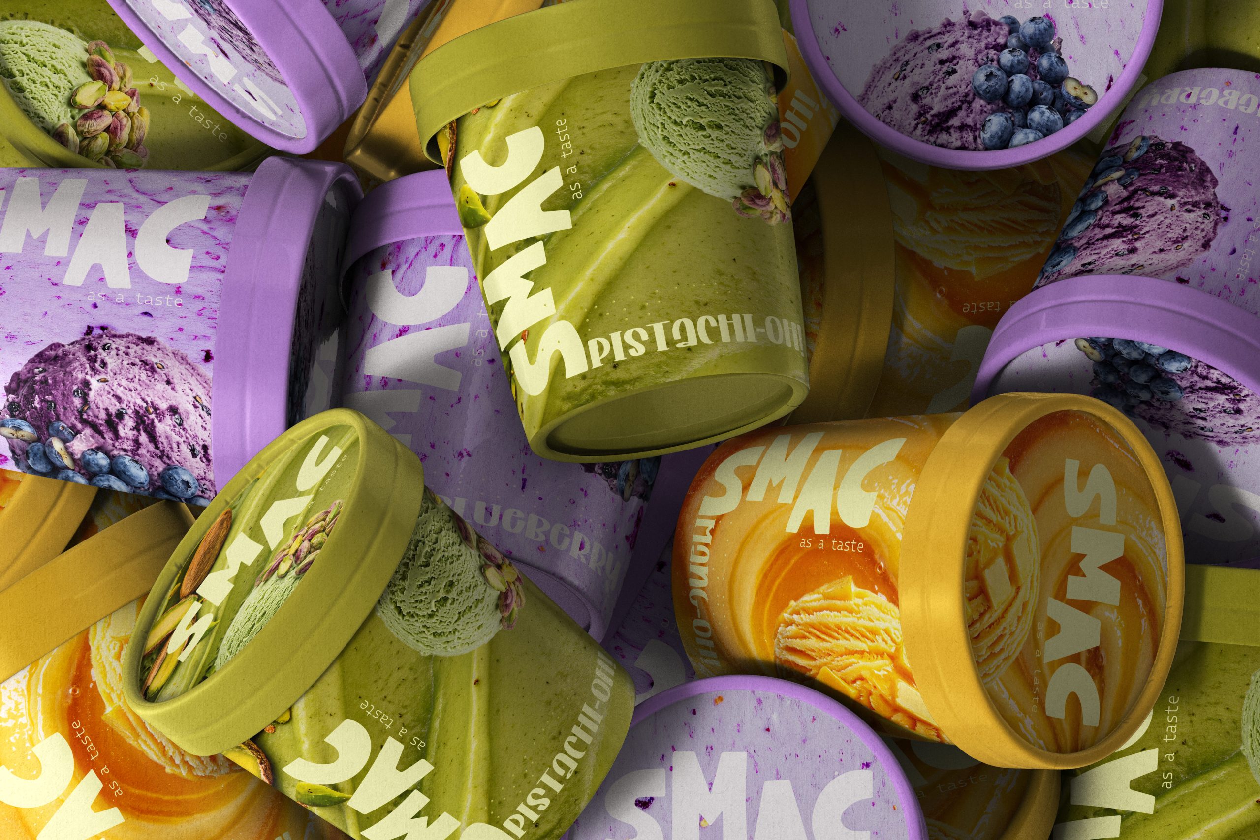
SMAC is a premium ice cream brand designed to be accessible, usable, and appealing to a wide range of people, regardless of their abilities, age, or cultural and gives memorable frozen dessert experience. The product range includes three flavors represented through bold color systems and expressive visual identities. Beyond aesthetics, the project explores how ice cream packaging can become more accessible and inclusive for a wider audience.
The concept was inspired by the idea that packaging should be experienced through more than just sight. Most ice cream products rely heavily on visual communication such as colors, imagery, and typography, making flavor identification difficult for visually impaired consumers.
SMAC reimagines the traditional ice cream tub by integrating tactile-braille letters for flavour indication directly into the packaging structure. The result is a packaging system that combines strong shelf visibility with accessibility-focused design thinking.
The packaging system was designed to help consumers identify products through both visual and tactile interaction.
Each flavor is distinguished using a unique color palette, while raised tactile markers provide an additional layer of communication. These features allow users to recognize flavors and interact with the packaging more independently.
The solution creates a balance between commercial appeal, usability, and inclusive design principles without compromising the overall brand experience.
The visual identity is built around oversized typography, high-contrast color coding, and flavor-led visual storytelling.
The accessibility system was developed through:
- Raised tactile flavor indicators
- High-visibility typography hierarchy
- Distinct flavor differentiation through color and texture
The tactile components are integrated into the overall branding system, making accessibility a natural part of the design rather than a secondary feature.
Unlike conventional ice cream packaging that communicates primarily through visual elements, SMAC introduces a multi-sensory packaging experience.
Key differentiators include:
- Tactile flavor identification system
- Inclusive design approach
- Strong shelf visibility through oversized typography
- Distinctive flavor architecture across the product range
- A balance between functionality and contemporary branding
The project demonstrates how accessibility can become a meaningful design feature while maintaining strong commercial appeal.
SMAC transforms a standard ice cream tub into a more inclusive consumer experience.
The project highlights how packaging can support independent product recognition for visually impaired users while strengthening overall brand engagement. By combining accessibility, functionality, and bold visual communication, SMAC presents a scalable packaging system that encourages more inclusive thinking within the FMCG industry.
The result is a packaging design that is not only visually impactful on shelf but also meaningful in its purpose and user experience.




 Derrick Lin
 monther al omari
 43oz
43oz lilyz design23
 Modern Theory
 Eighteen Brand Studio
 Bhumika Singh
 MohamedMashaly
 Pixels Studio
 Gulya
Gulya UPRISE
 Lizaveta Kharitonyuk
 Bonsanco Creative Studio
 DesignRepublic
 GIRAFA STUDIO
 PiotrWisniewski
 Sophiagdotcom
 CreativeWise
 SoreThumbStudio®
 Modern World Studio
 Palashcc
 Valérie Colace