
StomaDol: an impactful leader is coming
The visual identity that unravels the complexity of gastric issues
Montefarmaco, a long-standing leader in the pharma field, has set its sights on the gastro market: a vast, highly competitive, and expanding arena currently occupied by legacy players.
StomaDol emerges as a direct challenge to the status quo.
The project was conceived to bring a modern solution to a field where one in three people seek treatment for gastrointestinal disorders that are often offered with a generic aesthetic.
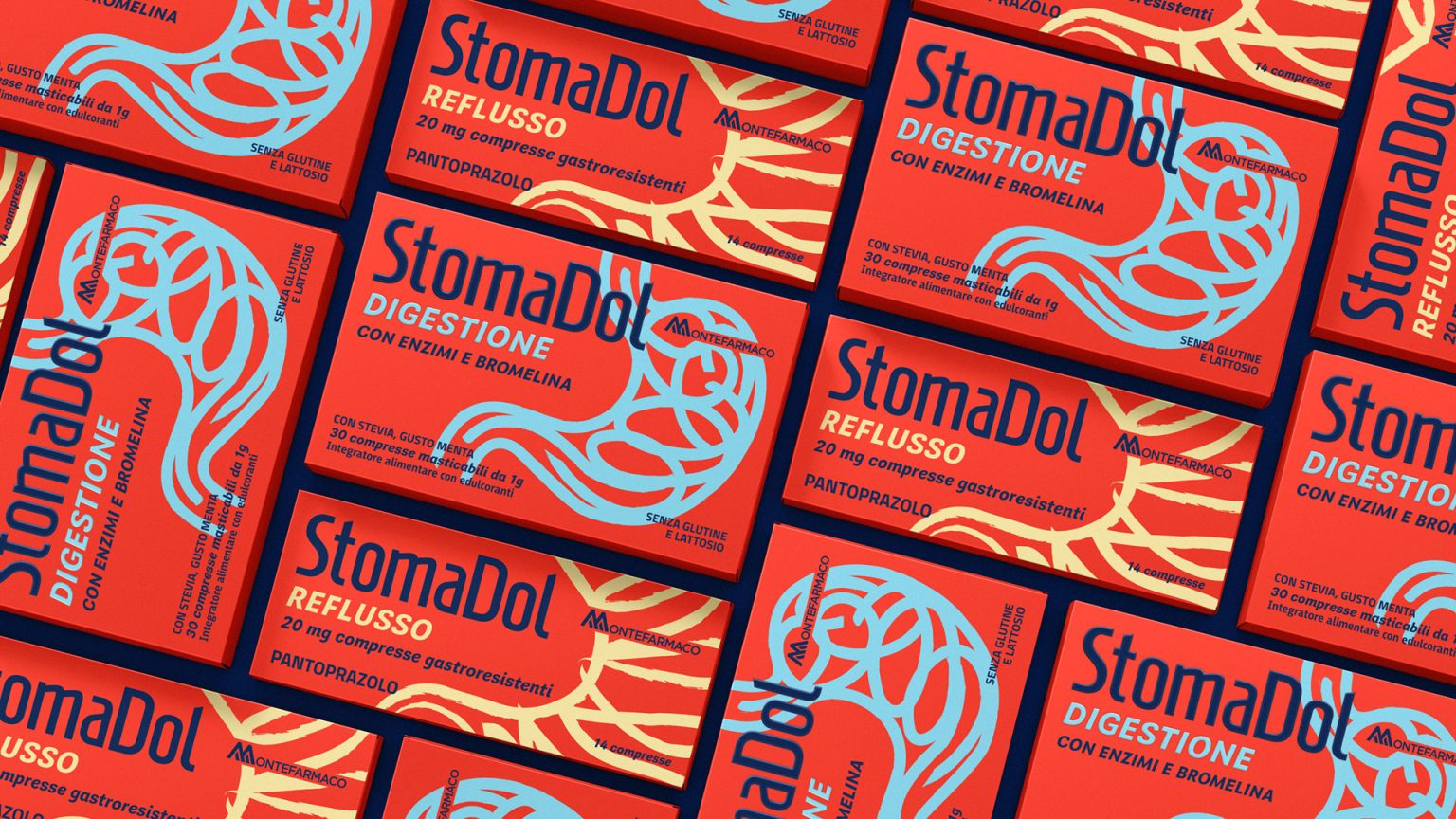
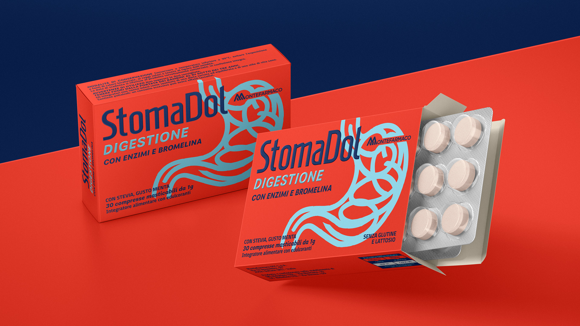
Starting with a symptom-led descriptive naming – union of Stoma (stomach) and Dol (dolor) – we designed the identity of a “technical specialist”.
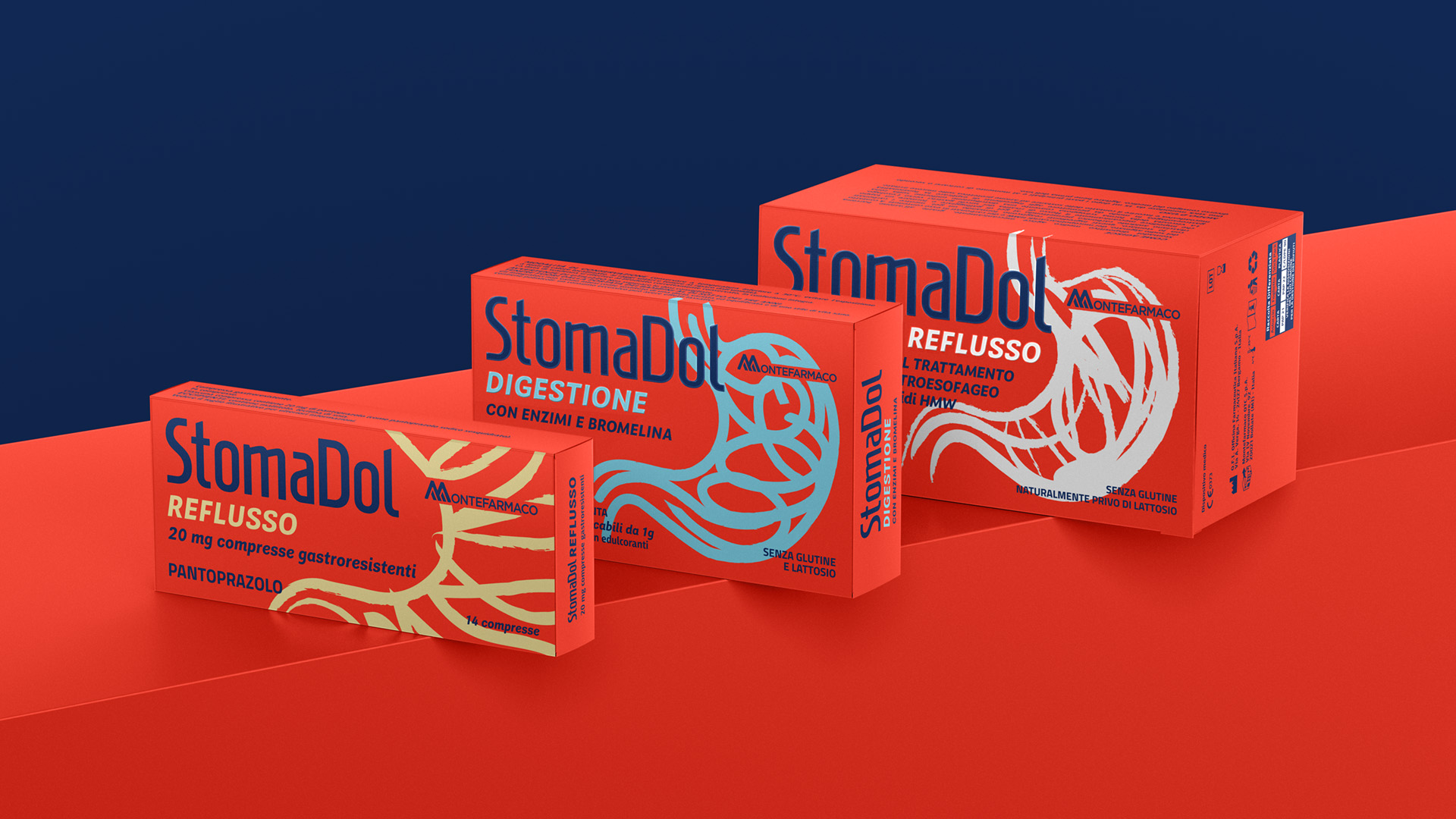
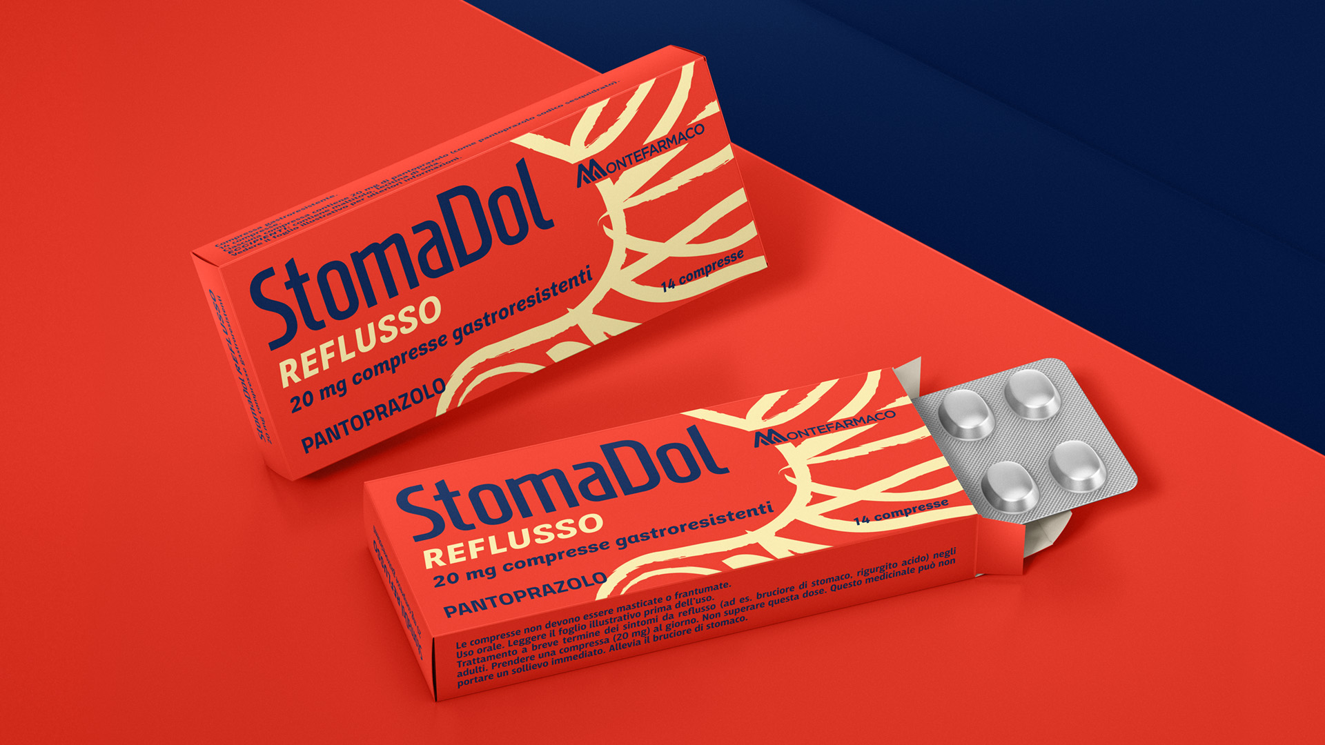
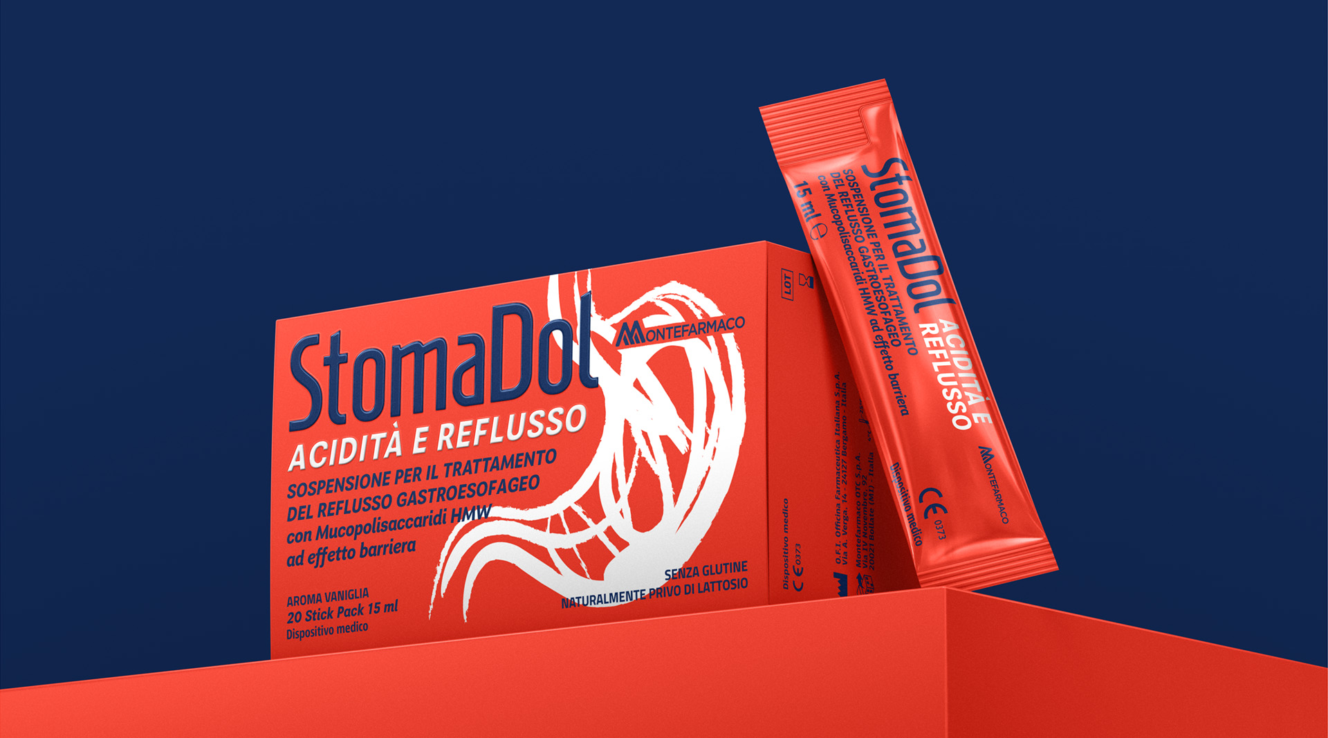
The brand’s positioning is further anchored by the “tangled stomach” visual on the packaging; this transforms the product into a discreet, precise investigator capable of cracking even the most complex gastric cases.
The design serves as the visual manifestation of this mission: intricate lines conceptually represent the disorder, only to find their resolution in the clean simplicity of the logo-as-remedy.
The most disruptive move, however, is the color palette: red.
A bold, attention-grabbing, unique in the pharma market, that ensures instant brand recognition for the line’s debut products (Digestion, Reflux, Acidity).
The goal? Increase consumer visibility and command the pharmacist’s attention through a blunt, high-impact visual identity.
This design flexibility yielded immediate results: just three months post-launch, sell-in figures outperformed budgets by 20%, with the line already securing shelf space in 3,500 pharmacies, shattering all initial forecasts.
StomaDol: untangles the most intricate cases.
 MID-AIR STUDIO
 Heramb Arora
 monther al omari
 Tríona O'Donoghue • Design
 Cocoon Prague
 alchimistestudioParis
 hugo zapata
 Bonsanco Creative Studio
 parawaradesign
 UPRISE
 Brand Society
 Que Cálido Studio®
 Richest Branding Pvt. Ltd.
 STRATEDGY
 Shapers Studio
 Platon Ivantsov
 WPA Pinfold
 giselepereiradesign
 ShalaSketches
 05Creation
 Voit Studio
 SSTO
SSTO