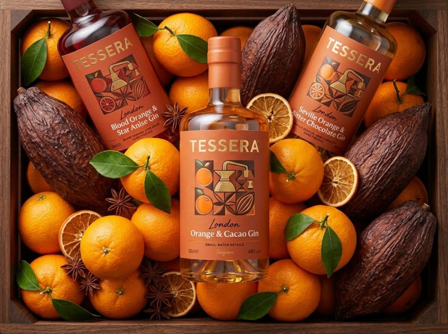

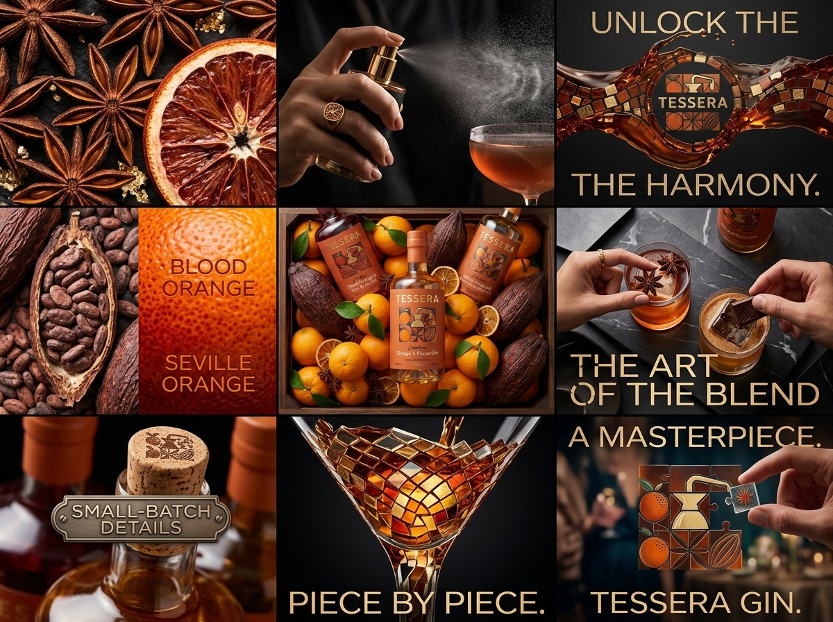
Tessera Gin is a premium spirits concept built around the idea that exceptional gin is created through the careful composition of individual elements. Inspired by the ancient tesserae used to construct intricate mosaics, the brand identity celebrates how botanicals, craftsmanship, flavor, and storytelling come together to form a complete and harmonious experience.
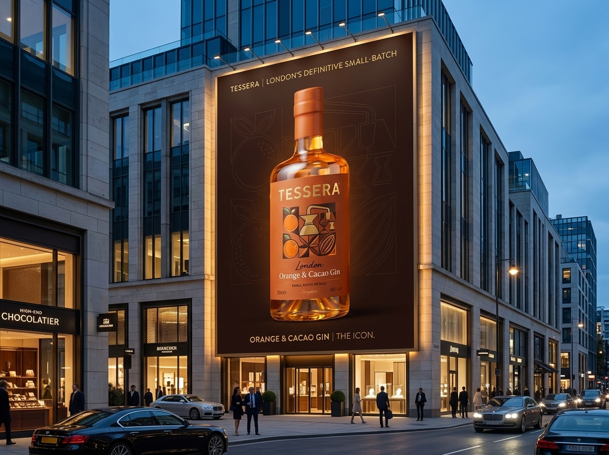
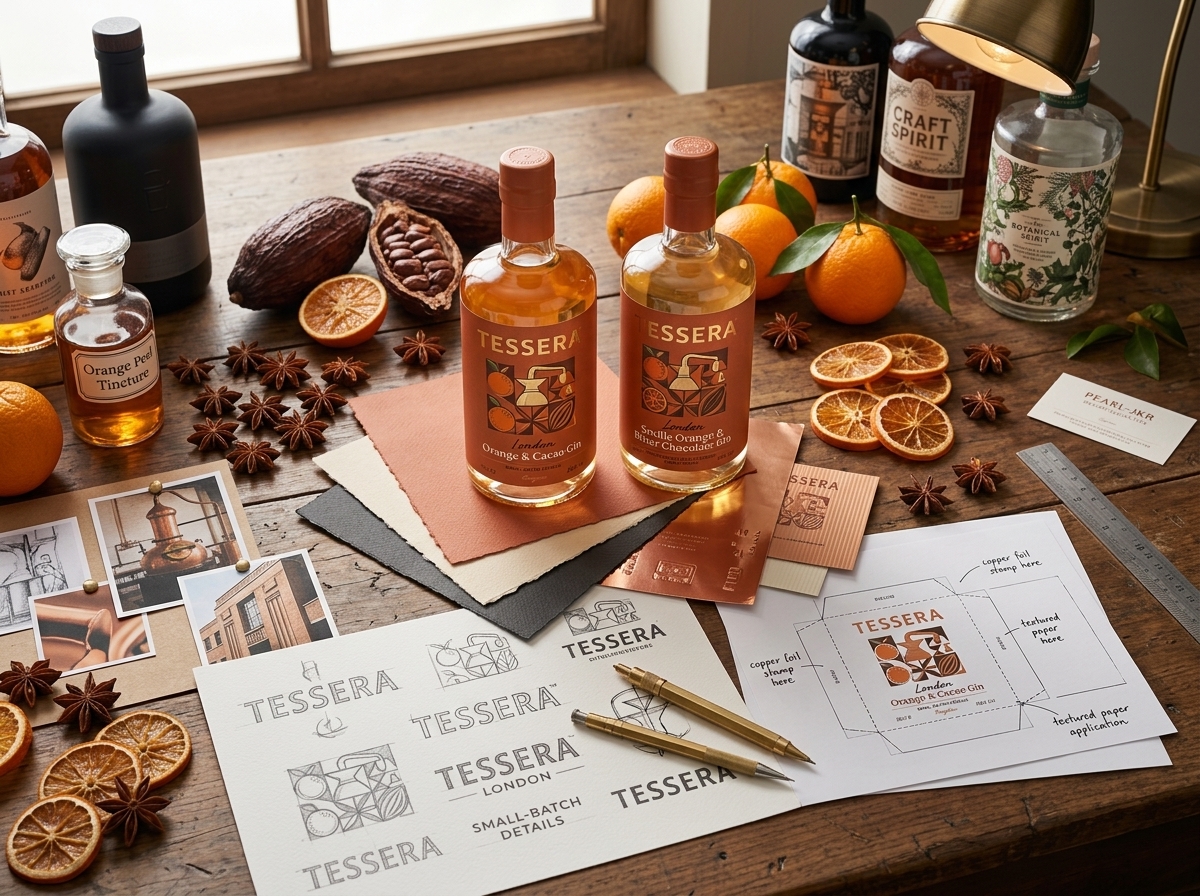
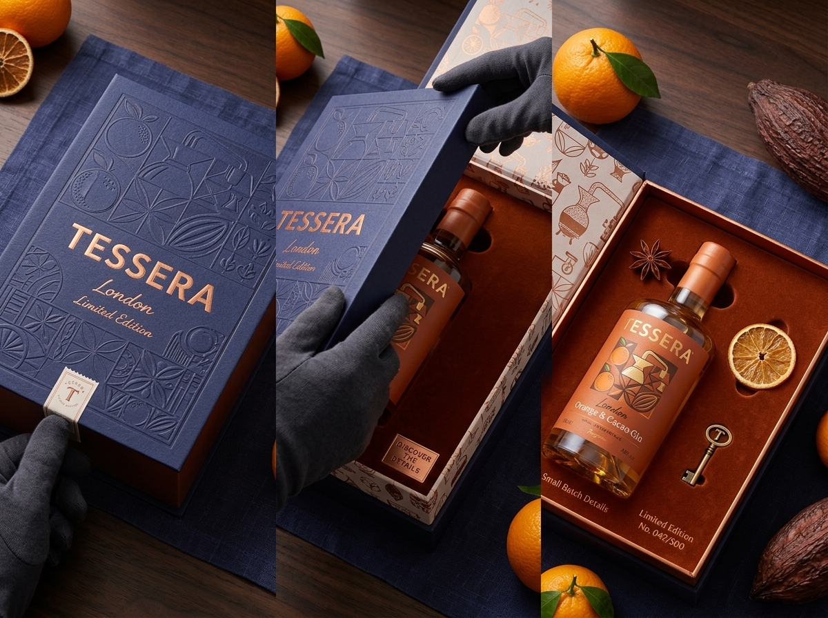
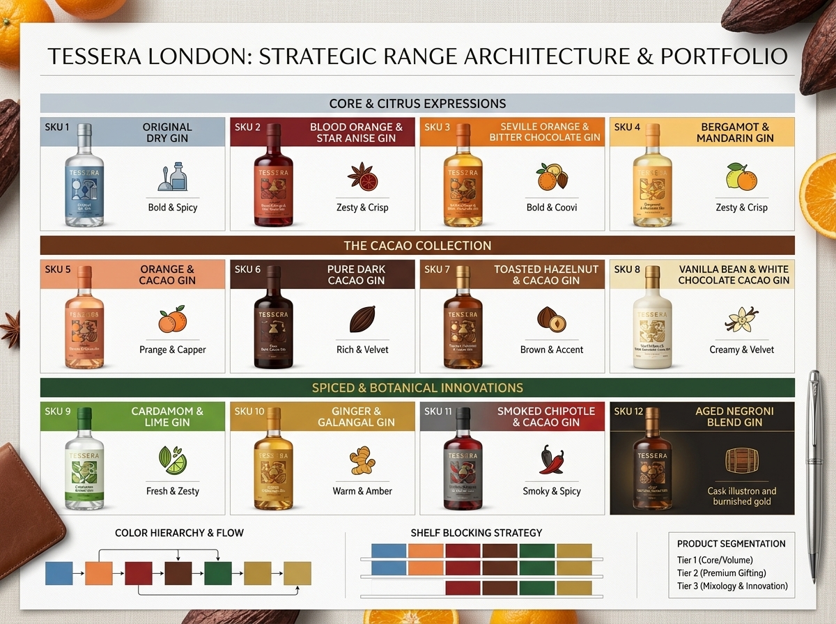
The packaging system was developed to position Tessera Gin within the premium and gifting segments of the spirits market. Drawing inspiration from luxury fragrance houses, architectural ornamentation, and heritage publishing, the design combines geometric precision with rich sensory cues to create a distinctive shelf presence.
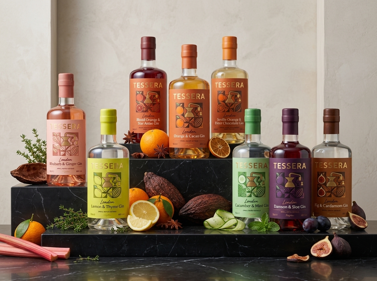
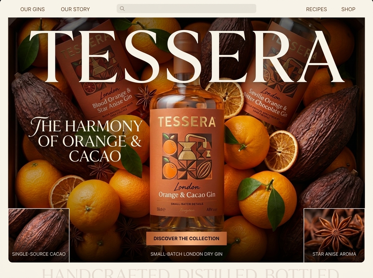
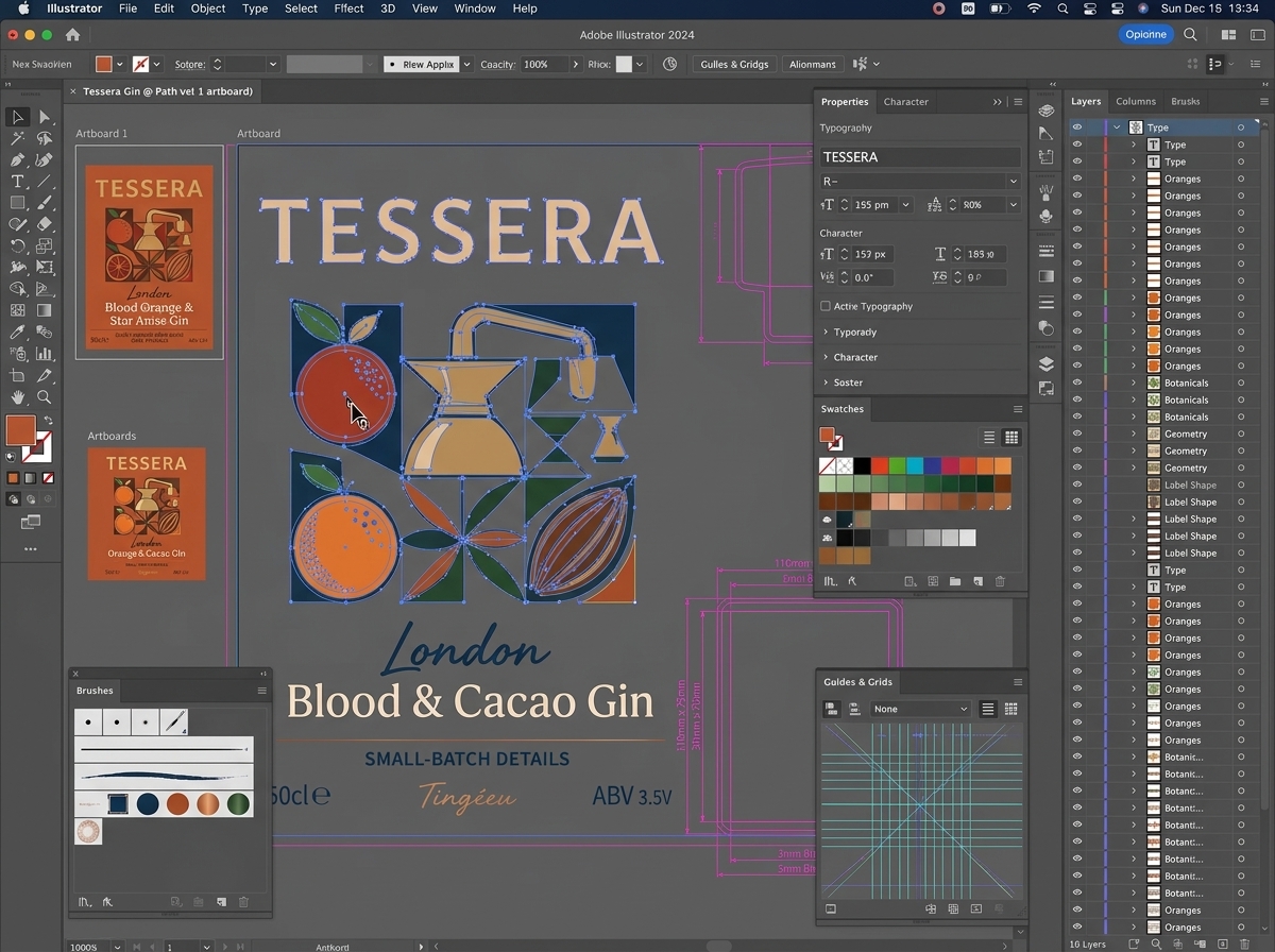
At the heart of the identity is a bespoke geometric emblem composed of interconnected forms representing the brand’s key ingredients and flavor narratives. This symbol acts as a unifying visual asset across the entire range, providing immediate recognition while allowing each expression to communicate its own personality through carefully curated color palettes and ingredient-led storytelling.
Warm copper tones, refined typography, and richly layered graphics were selected to evoke craftsmanship and sophistication. The label architecture balances contemporary minimalism with decorative detail, creating a premium appearance that feels both timeless and contemporary.
The range architecture was designed as a scalable system capable of accommodating future expressions while maintaining strong brand consistency. By combining strategic brand thinking with luxury-inspired packaging design, Tessera Gin demonstrates how a unified visual system can elevate perceived value, strengthen shelf impact, and create a memorable consumer experience across every touchpoint.


 MID-AIR STUDIO
 monther al omari
 Tríona O'Donoghue • Design
 Cocoon Prague
 alchimistestudioParis
 hugo zapata
 Bonsanco Creative Studio
 parawaradesign
 UPRISE
 Brand Society
 Que Cálido Studio®
 Richest Branding Pvt. Ltd.
 STRATEDGY
 Shapers Studio
 Platon Ivantsov
 WPA Pinfold
 giselepereiradesign
 ShalaSketches
 05Creation
 Voit Studio
 SSTO
SSTO Abox Agency