

Thattu Kadai Sweets – Branding & Packaging Design
Bringing a 70-year-old street legacy into modern retail.
Thattu Kadai is not just a name — it’s what people lovingly called a small pushcart sweet shop outside a temple.
While the official name remains Velayutha Nadar Sweet Stall, the brand’s true identity was shaped by its community.
What started as a humble cart serving sweets on metal plates evolved into a third-generation business. Yet, its roots remain untouched — the original cart still exists, preserved as a symbol of its journey.
The Insight
- This wasn’t just about packaging a product.
- It was about packaging memory, nostalgia, and legacy.
The Approach
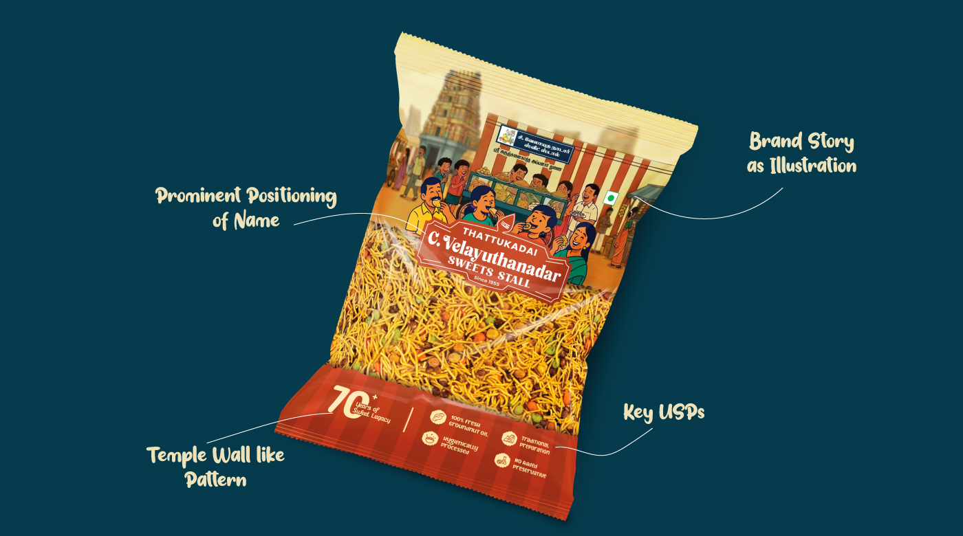
- We translated the brand’s origin into a visual story:
- An illustrated scene of a temple entrance
- The iconic pushcart that started it all
- Children gathered around, reliving a simpler time
Every element was designed to evoke emotion — not just attention.
Design Language
- Illustrations inspired by the brand’s early days
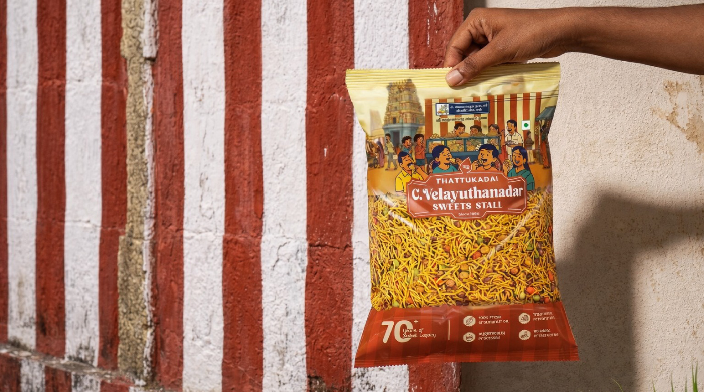
- Stripes & textures derived from traditional temple walls
- Warm, nostalgic tones to reflect heritage and familiarity
Outcome
- A packaging system that doesn’t just sit on shelves — it tells a story of 70 years, in a single glance.
- A traditional sweet stall, reimagined for today’s market — without losing its soul.




 Eva Chistyakova
 Puigdemont Roca
 marianaaworks
 bloomburo
 andreamarinnn
 Alina
Alina Saadmost
 Bruhken
 Maruf Nishat
 Richest Branding Pvt. Ltd.
 Sophiagdotcom
 saifullahmaslool
 Up-Brands
 Atiq Alam
 daniitenaa
 artworkbysofia
 monther al omari
 Valérie Colace
 Tianqii
 Anum
Anum anisameur
 tauqueer
 SOT B&D
 Palashcc
 Derrick Lin