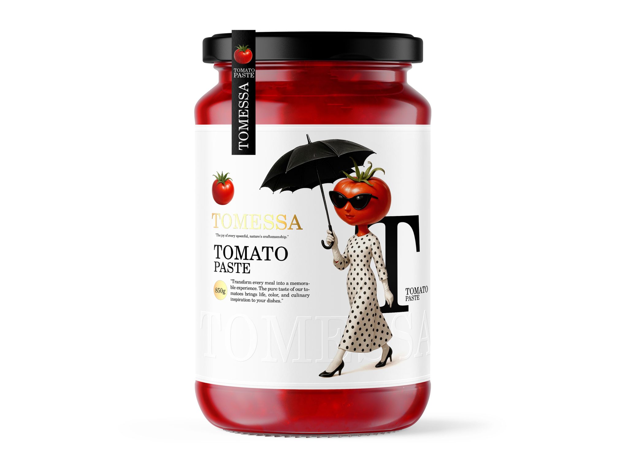

TOMESSA
In a market saturated with conventional food packaging, Tomessa was created to challenge expectations and transform a common pantry staple into a memorable brand experience.
Rather than relying on traditional imagery of tomatoes, farms, or prepared meals, the project introduces a distinctive brand character that embodies confidence, sophistication, and individuality. The goal was to create a tomato paste packaging that feels less like a commodity and more like a premium lifestyle brand.
The Idea
Tomato paste is one of the most familiar products in every kitchen, yet its visual communication has remained largely unchanged for decades.
The concept behind Tomessa was simple: what if the tomato itself became the face of the brand?
By transforming the tomato into a fashionable, charismatic character, the packaging creates an emotional connection with consumers while instantly differentiating itself on the shelf. The result is a playful yet refined identity that captures attention without sacrificing elegance.
Brand Personality
Tomessa is designed around the idea that even everyday products can possess character.
The tomato-headed figure serves as the ambassador of the brand, representing freshness, confidence, and premium quality. Dressed in a timeless polka-dot outfit and carrying a black umbrella, the character introduces a sense of fashion, poise, and modern femininity rarely seen within the food category.
Rather than appearing cartoonish, the character was intentionally crafted to feel sophisticated and aspirational, elevating the perceived value of the product.
Visual Strategy
The visual language balances minimalism with storytelling.
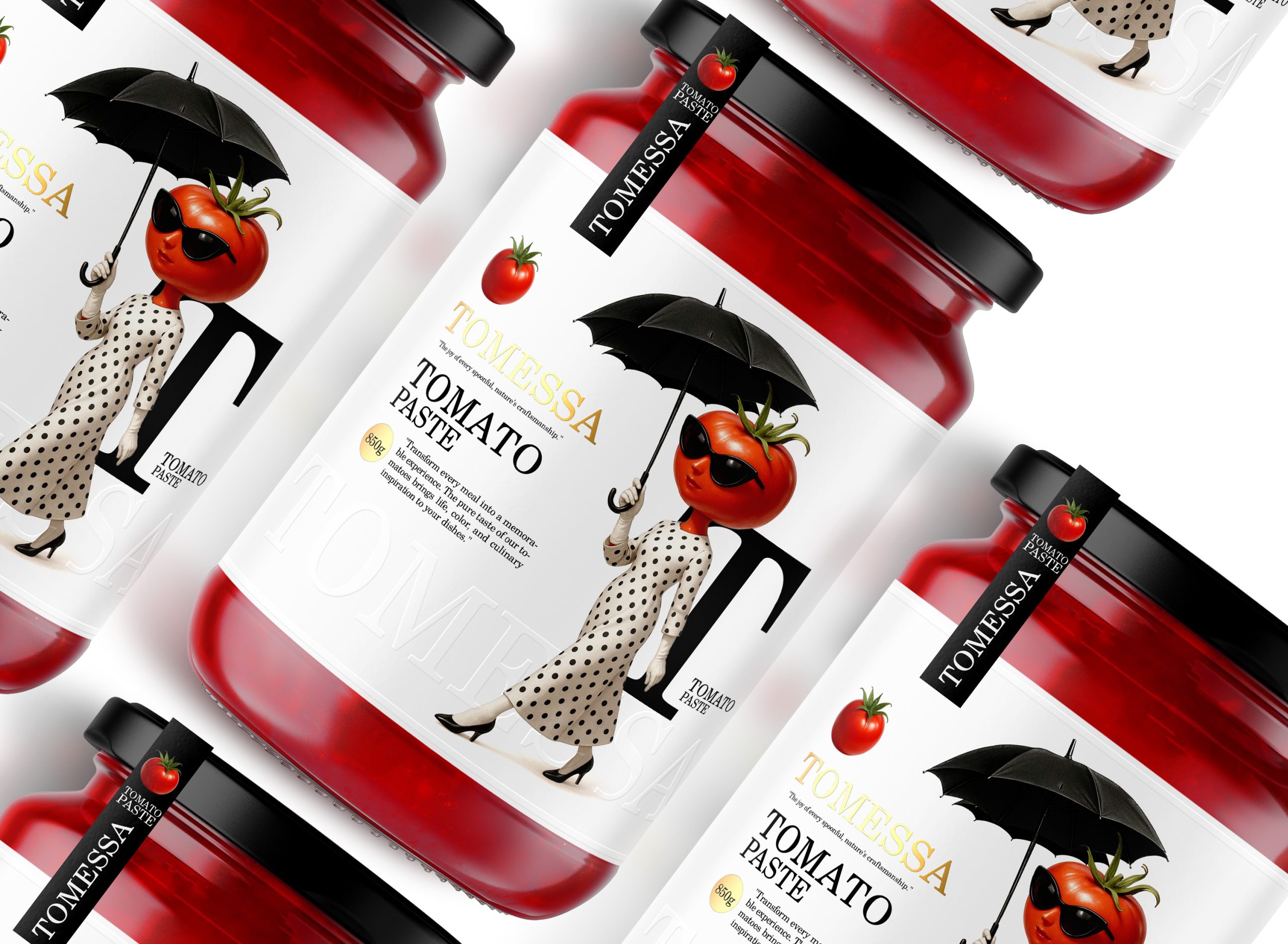
A clean white label creates a premium canvas that allows the character to become the focal point of the design. The transparency of the glass jar reveals the rich red color of the tomato paste itself, turning the product into a key visual asset rather than hiding it behind graphics.
This restrained approach creates a strong contrast between simplicity and personality, resulting in a shelf presence that feels both contemporary and distinctive.
Typography & Color Palette
The typography combines classic serif letterforms with modern composition, creating a visual balance between tradition and innovation.
The color palette remains intentionally minimal. White, black, and subtle gold accents provide an elegant framework, while the vibrant natural red of the product becomes the dominant color element. This strategy reinforces authenticity and highlights the quality of the tomato paste without unnecessary visual noise.
Packaging Experience
The design was developed with shelf impact in mind.
Most competitors rely on predictable category codes and repetitive imagery. Tomessa breaks these conventions through character-driven branding and a strong visual narrative. The packaging invites curiosity, encourages closer inspection, and aims to create a memorable first impression that extends beyond the point of purchase.
Outcome
Tomessa demonstrates how thoughtful storytelling and character-led design can transform an everyday food product into a distinctive brand experience.
By merging premium aesthetics, emotional branding, and contemporary packaging design, the project reimagines tomato paste as more than an ingredient, it becomes a brand with personality, charm, and a story worth remembering.
Short Description
Tomessa is a premium tomato paste packaging concept that reimagines a traditional food category through character-driven branding. By transforming the tomato into a sophisticated fashion-inspired icon, the design combines storytelling, minimalism, and shelf impact to create a memorable and emotionally engaging brand experience.



 Affogato Brand Design
 Backbar Studios
 hello ocean
 POSH FMCG BRANDING
 Luciana
 Valérie Colace
 marjusguza
 Z9BKAdsgn
 Lilith Sivolenko
 Daria Levina
 Masha Kulichkova
 monther al omari
 Yana Chernova
 Atiq Alam
 ezgidesignstudio
 Pips Marin
 Antonia Skaraki
 Ezi Brand Design
 Kanishka Chhajer
 Zachary Kent
 SOT B&D
 Normal studio
 Garry Veda