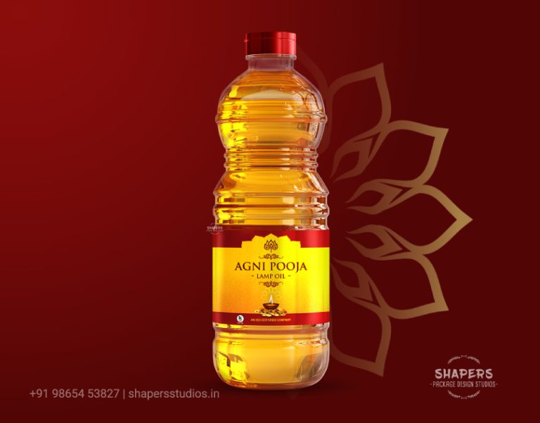

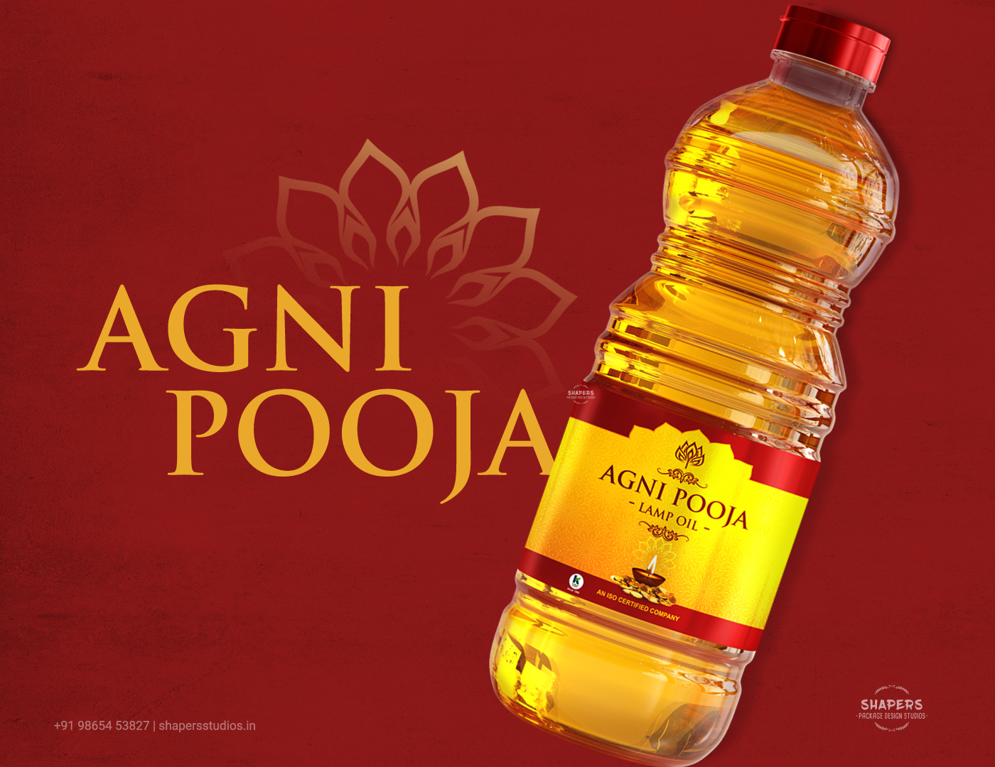
Agni Pooja Lamp Oil Branding / Packaging – Design
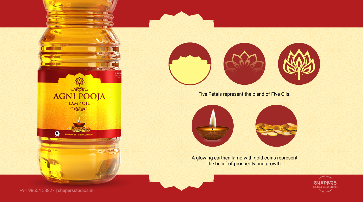
This identity was created for Agni Pooja, a devotional products brand rooted in spirituality, ritual, and temple traditions. The visual language is designed to evoke an immediate sense of sacredness and cultural familiarity.At the heart of the logo is a five-petal form, symbolising the harmonious blend of five sacred oils that come together to create Agni Pooja Lamp Oil.
The design blends symbolism and simplicity through:
- Devotional Color Tone – Soft, muted colors were chosen because devotional products visually connect better with calm, low-intensity palettes that evoke a sacred atmosphere.
- Light-Inspired Visual Mood – The design incorporates a subtle lighting feel, inspired by the glow of lamps used during poojas, creating a warm spiritual presence.
- Floral Symbolism – A flower motif with five petals was used as the central design element, representing purity, devotion, and offerings commonly used in rituals.
- Repetitive Sacred Geometry – The five-petal structure is repeated in the border design, forming five-pointed corners that visually echo the central motif.
- Blend Foil Finish – A foil treatment was used to add a subtle premium shine, reflecting the sacred and ceremonial nature of the product.
- Shape-Based Visual Connection – The design ensures that the shapes and motifs themselves communicate the devotional category even before reading the brand name.
The overall identity focuses on instantly communicating spirituality through color, light, and symbolic forms, creating a packaging language that feels both devotional and distinctive on the shelf.

 Affogato Brand Design
 Backbar Studios
 hello ocean
 POSH FMCG BRANDING
 Luciana
 Valérie Colace
 marjusguza
 Z9BKAdsgn
 Lilith Sivolenko
 Daria Levina
 Masha Kulichkova
 monther al omari
 Yana Chernova
 Atiq Alam
 ezgidesignstudio
 Pips Marin
 Antonia Skaraki
 Ezi Brand Design
 Kanishka Chhajer
 Zachary Kent
 SOT B&D
 Normal studio
 Garry Veda